The network for creativity
Join 1.25M professional creatives like you
Connect with clients, get discovered, and run your business 100% commission-free
Creatives on Contra have earned over $150M and we are just getting started
Back to feedPost
What if Google Maps had been designed in the 1920s? 👀
For the #revival challenge, I reimagined Google Maps through the visual language of Soviet Constructivism.
Routes become bold diagonals, turns become oversized arrows, and ETA and distance become strong typographic statements. Navigation stops feeling like a quiet interface and starts feeling like a piece of graphic propaganda telling you exactly where to go.
Such a fun exercise in taking something extremely familiar and asking how differently it could have been designed in another time.
Your turn!
What modern product would you send back in time, and to which era? 👀


The Constructivist direction makes the map feel like an active piece of visual communication rather than a passive interface. The oversized arrows and tight typographic rhythm give the navigation a wonderfully confident voice.

Curious whether the diagonals fought you at phone size — Constructivist posters were built for one long look from across a room, while a nav screen only gets half-second glances from someone already moving. For your question: airline safety cards, sent back to 1960s Swiss...

Such a good point! The tension between bold visual language and instant readability was definitely part of the experiment 👀 And airline safety cards in 60s Swiss design? I need to see that now hahaha

Vintage took me back in 19th's...🔥

Hmm this kind of design it seems too hard and too much and besides why use red like that
ouch😅


Wow! what a design and motion! What software did you use to creative this amazing motion?
Thanks Alamgir! I made this in Flora, using GPT Image 2.5 for the static, and MiniMax for the motion graphics 😄

I really enjoyed watching it
Thank you Mena!

the shouting woman as the navigation voice is sending me. this is the version i'd actually listen to


Good work👏🔥🔥

Epic

Amazing

Love this concept🎁

this is such a cool way to rethink google maps beacause the typography and those bold arrows really sell the 1920s feeling🔥

I love it! Given the history of the era, "Turn Left" might work better.


This is so cool
The network for creativity
Join 1.25M professional creatives like you
Connect with clients, get discovered, and run your business 100% commission-free
Creatives on Contra have earned over $150M and we are just getting started





Related posts

Winder is a bold brand identity built around a geometric W-inspired symbol, combining sharp angles and forward movement to represent progress, speed, and direction.
The identity uses a striking red and deep burgundy palette, supported by clean typography and a consistent visual system across brand guidelines, digital applications, and product mockups.
Progress in Motion.




Great logo it feels it really has an identity 🎉🎉
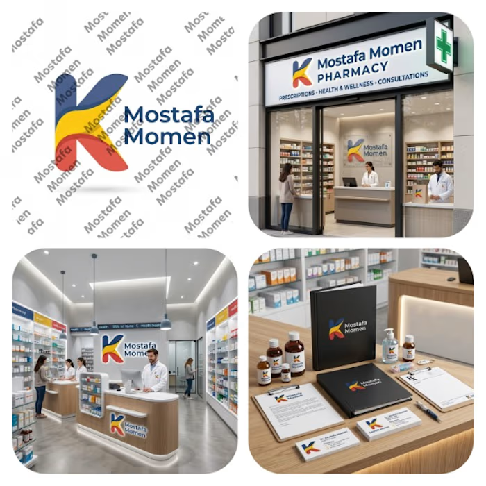
That's my pharmacy logo design it was special by it's color palette and smooth shapes
This design focus on (professionalism, trust, authenticity, showing business identity)
This design is special because it's color palette can be used in the business itself from furniture notes it will be suitable on them
Thanks for everyone who support me ❤️


BEYOND THE FRAME 🎩✨
The cat needs therapy.
The family needs an exorcist.
And the memories? They've started spelling things out.
Even AI ran out of patience. And credits. 😂
Three stories. One questionable reality.
Created with AI, finished with human stubbornness.
Reject the Ordinary.
#TheTriadicStudio #invideocontrachallenge #CreativeEditing #AIAnimation


Awesome Video