The network for creativity
Join 1.25M professional creatives like you
Connect with clients, get discovered, and run your business 100% commission-free
Creatives on Contra have earned over $150M and we are just getting started
Back to feedPost
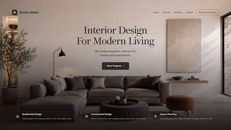
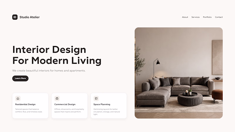
Taste Test
Same content. Two different perceptions. Using the same copy and imagery, two different homepage concepts were created.
Option 1 - Clean, structured, functional
Option 2 - Editorial, atmospheric, premium
The same content can create a completely different perception of a brand depending on composition, typography, spacing, and visual hierarchy.
Which version would you choose, and what emotions does each one evoke for you?
125 votes
Ends in 9h
option two's so sleek & simple, definitely has my vote!
Absolutely agree
Option 2 is more clear and easy to understand, love the visual hierarchy
without any doubt option 2
Option 2 looks cleaner and luxury
Option 1 feels much cozier
seconds option looks more premium
Option 2 looks more professional
The gradient makes it better
Lovely designs
Going with option 1
This is though call but option 2 is better cause full width of the interior. Directly put user inside the room. I like dynamic layout of the room photo. Balancing center layout of the hero. Remind me a lot to zen.
Definitely option 2. The design and feel are way better.
option 2 feel more premuim and balanced
Option 2 looks good
Option 2
Ya i love option 2 you are in the design it has a nice feel
Great comparison. Design shapes first impressions, but QA shapes the experience after users start clicking. Both matter.
I like the structure of Option 1
Option 1
Option 2 speaks visually
Will go for Option 2
Option 1
Option 2
Looks great
Option 1
Definitely option 2, option 1 doesn't give you that "modern living" emotions
The network for creativity
Join 1.25M professional creatives like you
Connect with clients, get discovered, and run your business 100% commission-free
Creatives on Contra have earned over $150M and we are just getting started
Related posts
Another client sent us an AI-built page asking if we can "spruce it up." Hold our beer. 🍺
Designer vs. AI, who takes it?
Also, comment if you've been gifted one of these beautifully bland masterpieces produced by Claude to spruce up.
9 voted
14%
56 voted
86%
65 votes
Closed
Who even voted AI 😭
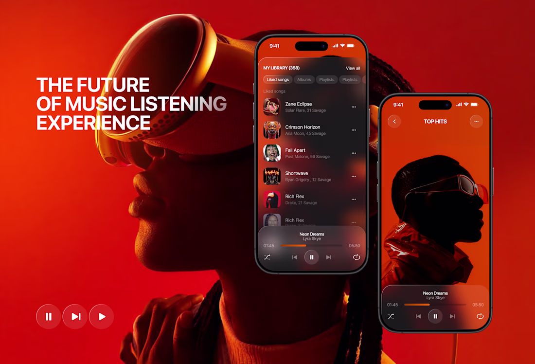
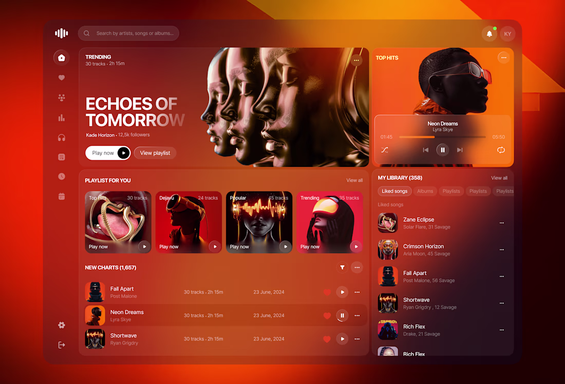
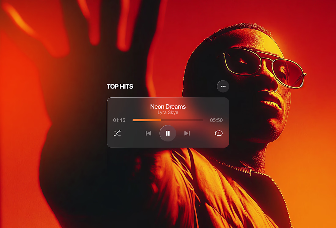
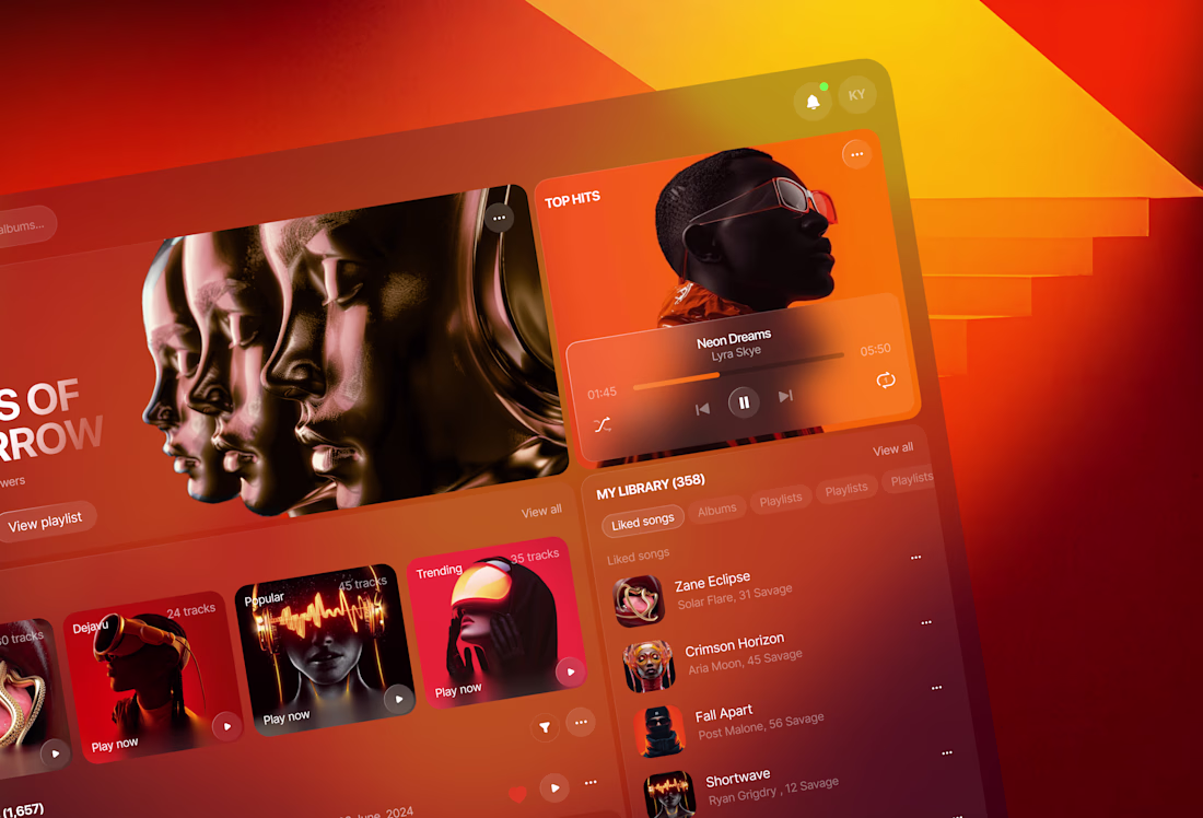
Music streaming platform concept 🎧
Music has always been emotional. The interface around it should be too.
This is a concept for a music streaming platform built around one idea — immersion. Not just in the music, but in the visual experience of discovering and listening to it.
The warm palette of deep reds, burnt oranges, and dark backgrounds wasn't accidental. It creates a mood. It makes you want to stay, scroll, and listen.
What I focused on:
→ A dashboard that surfaces the right content without overwhelming
→ A "now playing" experience that feels cinematic
→ Mobile screens that carry the same visual weight as desktop
→ Typography and hierarchy that guide without interrupting the vibe
This is a concept — but built on real UX logic. Because even imaginary products deserve thoughtful design. 🎧🖤
#MusicApp #UIDesign #ProductDesign #DarkUI #AppDesign #UXDesign #MobileDesign
This palette is an absolute dream! The burnt orange and deep red tones mixed with that sleek dark UI create an incredibly warm, midnight-session vibe. It perfectly captures how music feels. Brilliant work! 🎧🔥
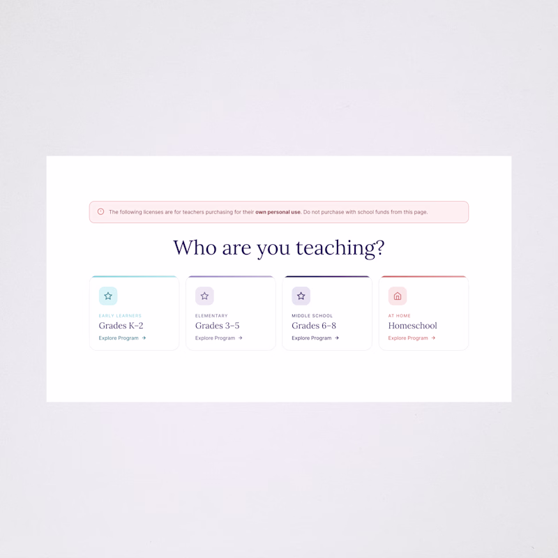
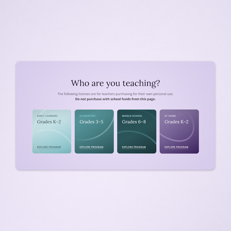
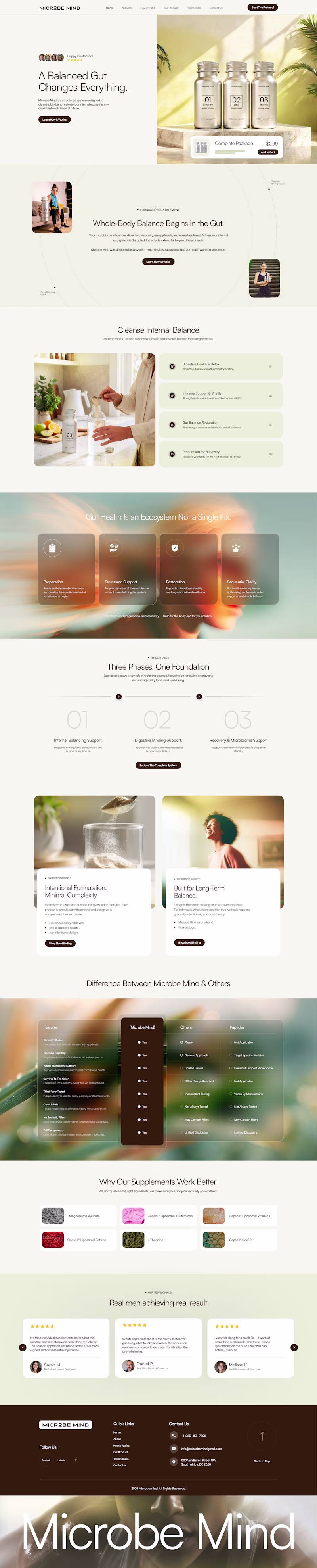
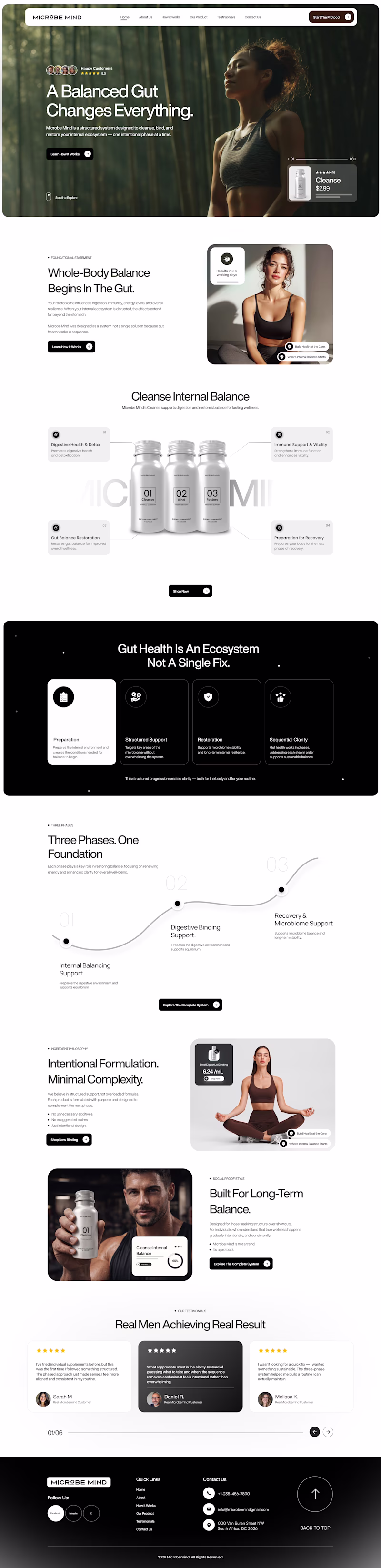
I've been exploring two full-page Shopify directions for Microbe Mind a gut health supplement brand built around the message:
"A Balanced Gut Changes Everything."🌿
Which direction would make you add to cart? 👇
23 voted
61%
15 voted
39%
38 votes
Closed
Warm and organic for me. 🌿 The earthy palette just feels right for gut health, calm and easy to trust. I'd buy from that one.
Trending
Claude
Claude has entered the design space. How are you using Claude Design?
Contra University
Learn from expert creatives how to earn more using next-gen AI tools.
MagicPath
The canvas is infinite, and exploration is becoming the workflow. How are you using MagicPath?
creativeaiflow
Creative AI workflows are evolving. What tools do you use, and what are their strengths and weaknesses?
freelancerlife
Freelancer life is wins, pivots, and everything in between. What’s yours right now?