The network for creativity
Join 1.25M professional creatives like you
Connect with clients, get discovered, and run your business 100% commission-free
Creatives on Contra have earned over $150M and we are just getting started
Back to feedPost

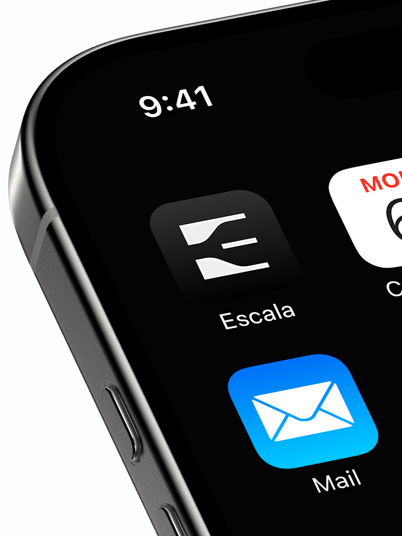
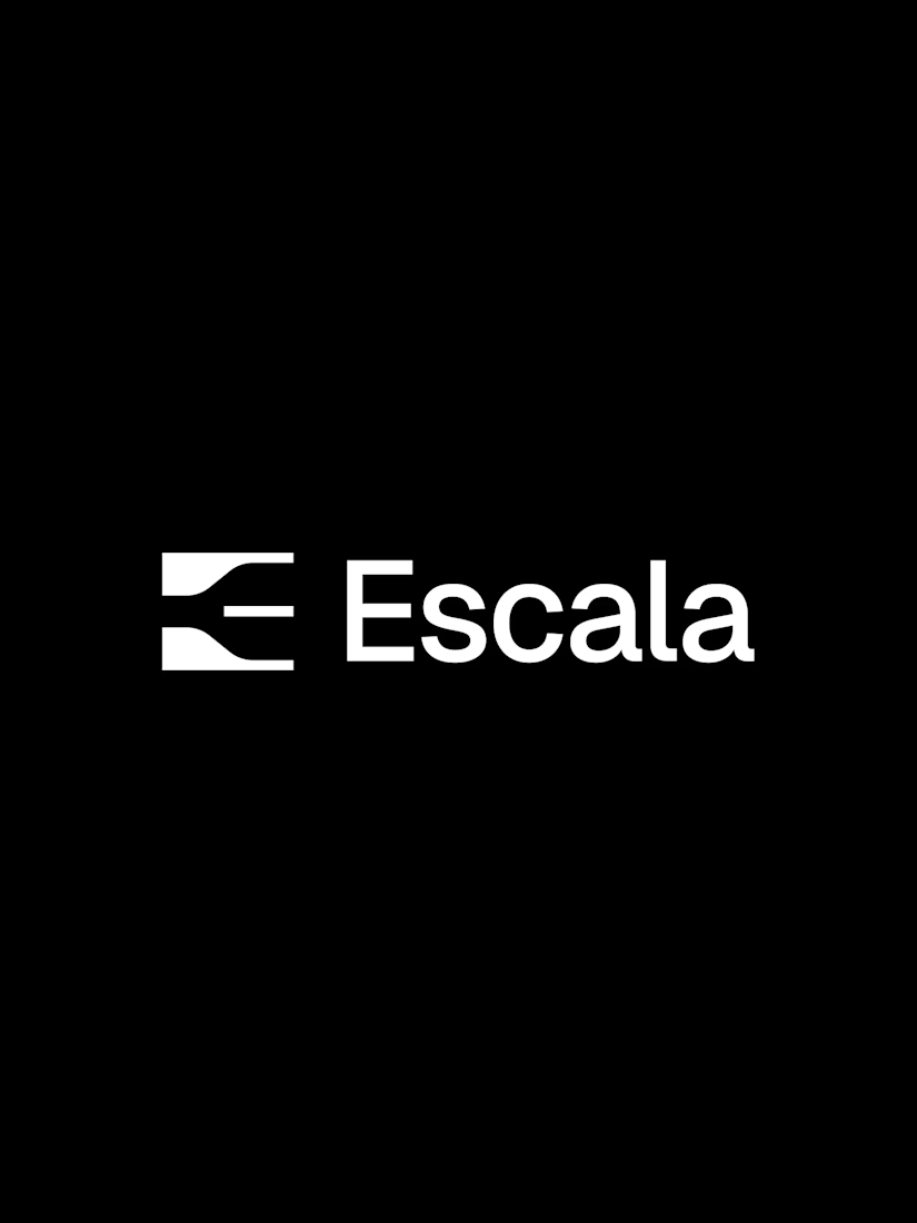
Unused E lettermark, but too good not to share

i love this, the innovation shines through!

That E doubling as an arrow or flow mark is clever, it still reads as a letter first though, which is the hard part. Was Escala the client who passed on it, or did you shelve it yourself before it even got pitched?
The network for creativity
Join 1.25M professional creatives like you
Connect with clients, get discovered, and run your business 100% commission-free
Creatives on Contra have earned over $150M and we are just getting started








Related posts

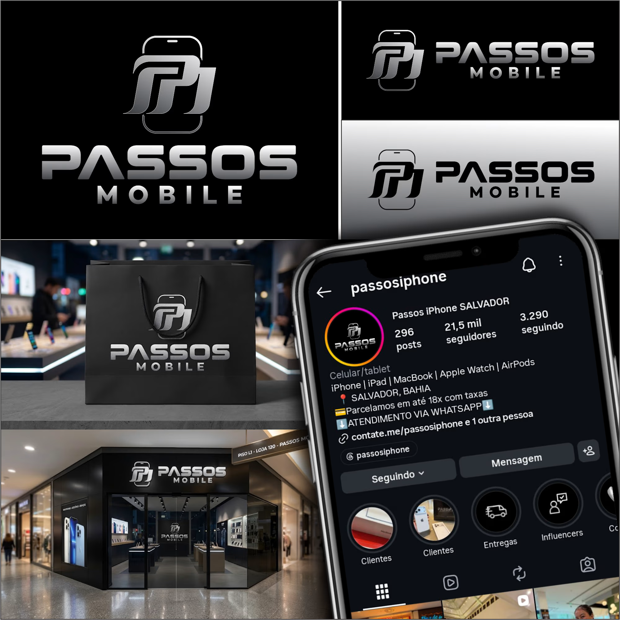
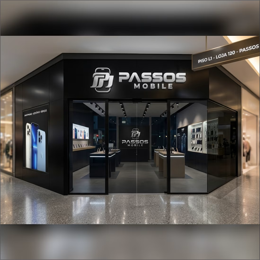
Brand identity created for PASSOS MOBILE, a premium iPhone store.
Challenge: The client needed a modern, minimal and luxurious logo that conveys trust and high value to stand out from common tech stores.
Solution: I designed a clean, memorable wordmark with a premium feel. The concept focuses on minimalism and strong typography to position the brand as an Apple-level store.
Deliverables: Primary logo, secondary logo, black & white versions, and brand mockups.
Designed to help tech stores sell more by looking more premium.




Awesome

Customers never measure a logo. They still notice when it's off.
For Magnus, a barber supply brand, I built the whole mark on one unit: x, the width of a single letter stem.
The gap between the icon and the wordmark: 3x.
The icon rises above the letters: 0.5x.
Why it matters for the business: one rule instead of a hundred decisions. Whoever puts the logo on packaging, the shop or other spaces - doesn't have to guess spacing. It always comes out the same.
Barbering is a craft of precision. The brand should be built the same way.


That opening line is brilliant. Customers never measure a logo, but they notice when it's off. The x-unit system is such an elegant way to make the brand self-governing, no more guessing on spacing. Did the client buy into the system straight away, or did you have to sell them on why the spacing rules matter?

Dear Guest, a week later 🏠
I asked for an outside audit of my #Base44Challenge entry, acted on it, then kept going:
- The guest's essentials (door code, wifi, directions and a button to call the host) now sit on an enamel sign on the roof. Each still follows its postcard's rule: the code only appears on arrival day. After dark, a spotlight lights each compartment.
- The postcards are the heart of the house, so they got the most care: brighter colours, white icons, a real perforated stamp, and each one sits in a terracotta window box that flowers once the guest has arrived.
- The front door has its house number above the arch, a travertine step and a lantern that lights up at night.
- A real person is one tap away: call or WhatsApp the host, separate from the AI.
- When the house doesn't know an answer, the host replies to that guest on their own page. Adding it to the manual for everyone is a separate choice.
- On wide screens the extras live in the bottega next door: a lit shop window with the extras on display.
- The street came alive: slow paper clouds, a cat on the roof, neighbours on the pavement. All of it can be paused.
- The walkthrough now plays on a retro TV, with a new voice and a soft piano underneath.
Host side, no sign-in: https://dearguest.bytelegion.site/host?demo
#Base44Challenge
