The network for creativity
Join 1.25M professional creatives like you
Connect with clients, get discovered, and run your business 100% commission-free
Creatives on Contra have earned over $150M and we are just getting started
Back to feedPost


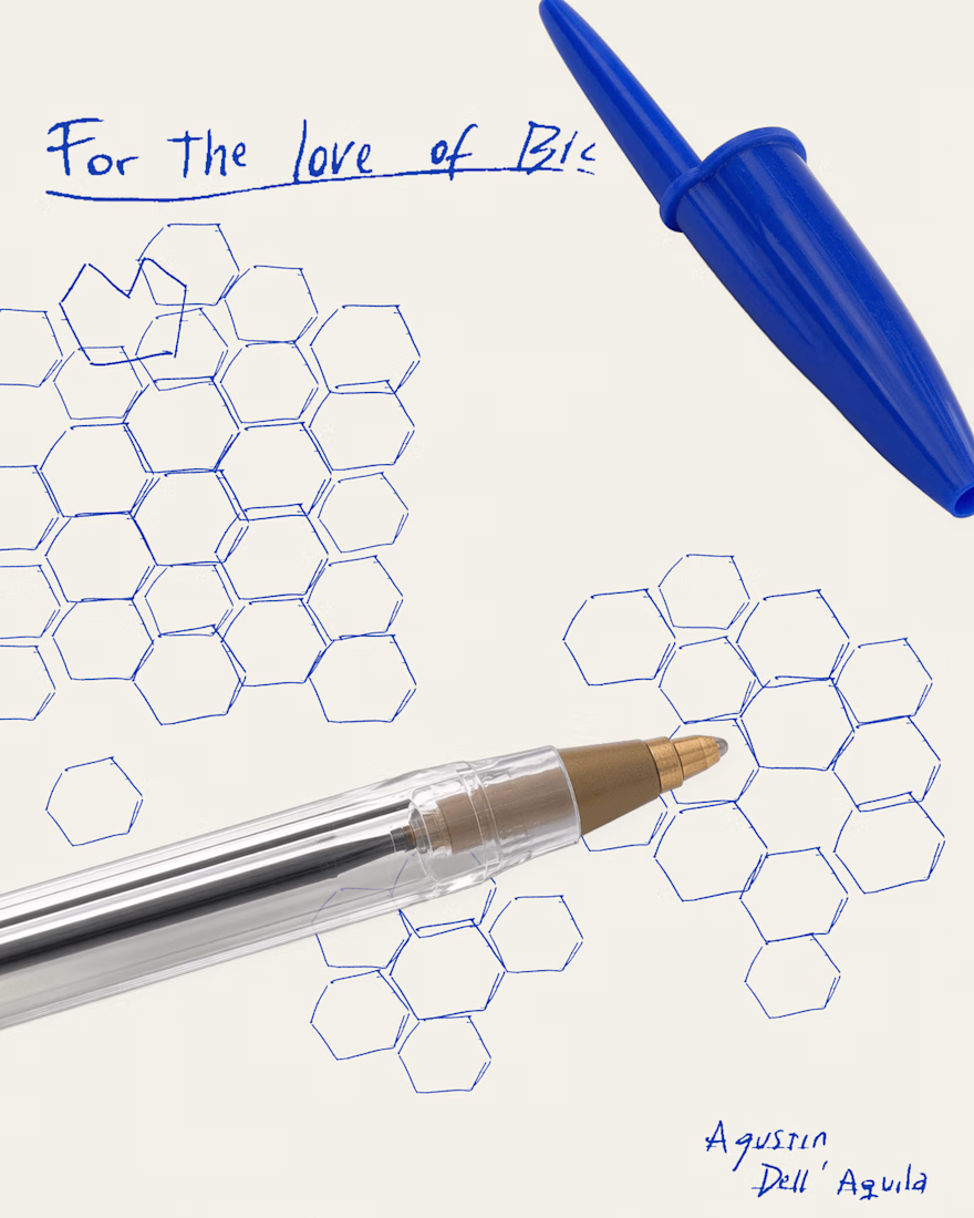
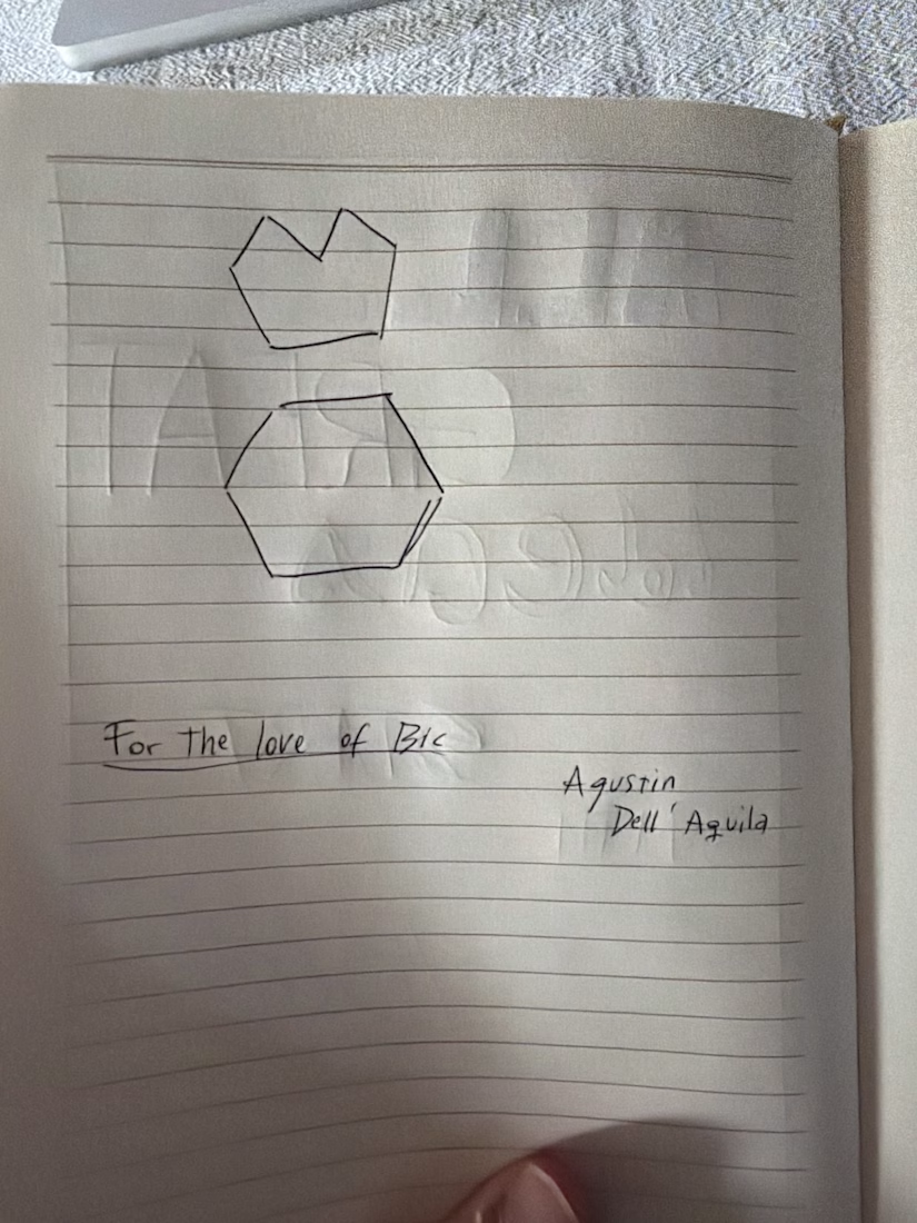
For me there's always a Bic pen within reach, half chewed, cap missing, ink running low. It's cheap, it's everywhere, and it never gets in the way of the idea
So this one's for the love of the Bic. 🖊️
What's yours? Drop your "For the love of ___" below 👇

For the love of Framer.


the missing cap is too real
The network for creativity
Join 1.25M professional creatives like you
Connect with clients, get discovered, and run your business 100% commission-free
Creatives on Contra have earned over $150M and we are just getting started





Related posts

A little sentimental today, 🥹 but I promise there are some useful resources at the end.
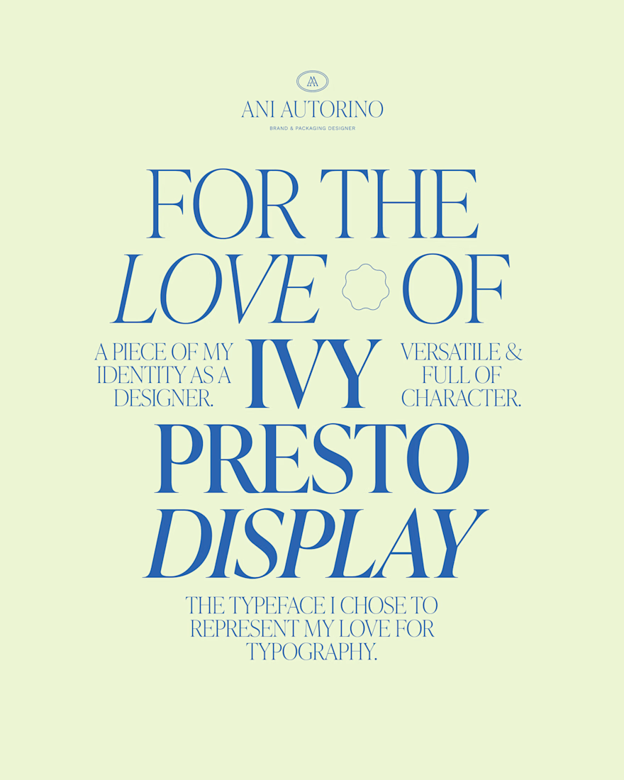
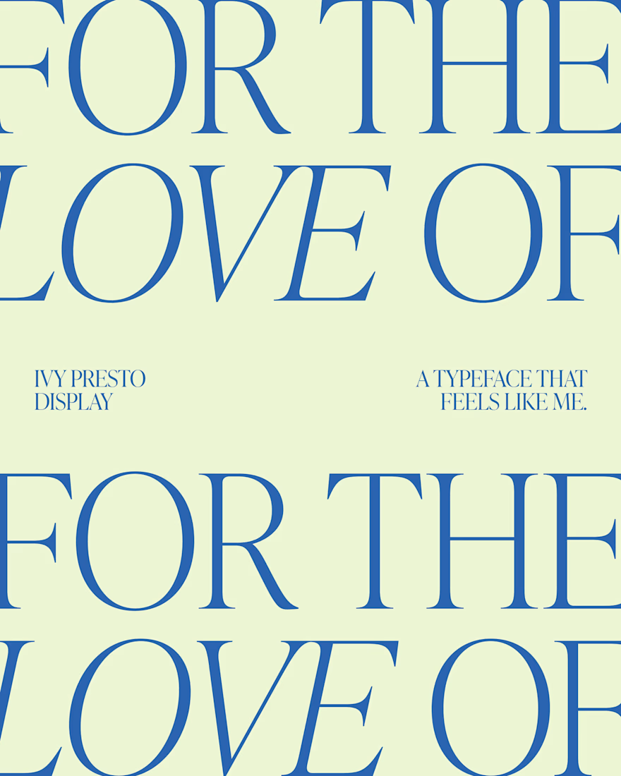
I was coming back to my first steps as a brand and packaging designer and when I was looking for a typeface for my own logo, I wanted something delicate that reflected my love for typography and the kind of work I do: Ivy Presto Display felt right, and it’s been part of my visual identity ever since. 🥰
And since we're talking about favorite design resources, two more I keep coming back to are:
✳️ Creatoom for mockups and inspiration.
✳️ Pixel Surplus for finding beautiful typefaces, especially when looking for something new to experiment with.
It’s funny how a typeface can become more than just a design choice. Sometimes, it becomes part of how you see yourself as a designer.
What's a resource or typeface you feel personally attached to?


This font fits you very well! Thanks for the ressources 💯


Who said color inspo has to come from a Pinterest board?
The eyedropper tool might be my most-used design tool, but it's also changed the way I see color everywhere. Buildings, flowers, books, even your morning coffee.
Because good design starts with paying attention.
What's one tool that's changed the way you see the world?

Colour inspo is everywhere.

Drawn by hand, carefully chosen or gently reshaped: every letter here was made for one specific name. ♥
Almost since the very beginning of my career, letters have been my favourite part of the job: stretching a curve, cutting a counter, letting two letters hold hands.
Not every brand needs an artistic typeface, and that's fine. But there's always room for one delicate detail that makes a logo feel like it couldn't belong to anyone else. That's the part I love most (and secretly, I'm happy every time I find a special way to connect letters).
If your brand deserves letters with character, let's talk.