The network for creativity
Join 1.25M professional creatives like you
Connect with clients, get discovered, and run your business 100% commission-free
Creatives on Contra have earned over $150M and we are just getting started
Back to feedPost
Taste Test

Choosing a hero section for a project I’m currently working on.
Which feels better, ☀️ Light or 🌑 Dark?
75 voted
48%
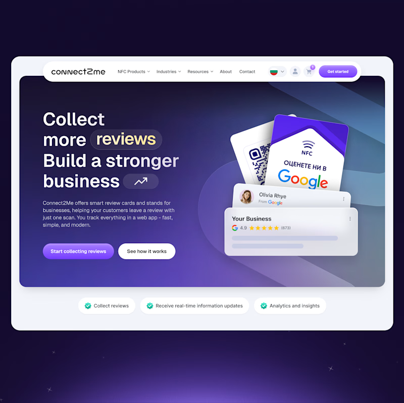
82 voted
52%
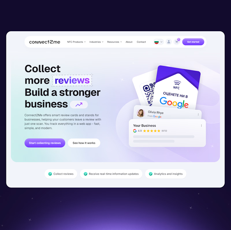
157 votes
Closed

Both are solid

Light feels better to me. It gives room for readability, I can read everything about the page even from afar, it's minimalist, aesthetically pleasing and still function better.

Light looks awesome Denitsa 🔥

Dark looks really nice, Great work!!

Always leaning toward the dark version!

Dark looks more interesting on the light bg 🔥

I'm always a fan of dark mode, but this light mood is awesome.


agreed!!

Go with the lighter one, or if your brand allows, try a bit darker background. That might work for dark, but currently the light works better for the eyes.


The light mode caught my attention faster. Nice work on both!


Light mode is great


Since there is a lot of information, the light mode is easier to see and scan through.

Light mode is a lot less distracting

Love dark mode, but the light one is great.

Well done on this 👏

The light mode feels cleaner


Light is really nice, but the dark one is the winner for me.

Dark Mode wins easily

The light mode for sure

Light mood here is much more on-brand for Google based product + more inviting overall! Great job on both though 🙌


same here

I lean Light for this use case. Reviews + trust signals usually benefit from clarity and openness, and the light version makes everything feel more straightforward and credible at first glance

I like the dark version, it goes well with the brand message


The white one is cleaner, but for me since this is a hero, I'll choose the dark one, it gives user more attention to the headline.

I like the contrast from the first one!


Light hero looks fantastic, super clean.

They both look good but i prefer light mode here


light mode signals clarity, credibility, and ease.
dark felt too heavy for the goal.
The network for creativity
Join 1.25M professional creatives like you
Connect with clients, get discovered, and run your business 100% commission-free
Creatives on Contra have earned over $150M and we are just getting started











