
Sebastian Trujillo
Web & Video Specialist improving SEO, performance, and ROI.
Ready for work
Sebastian is ready for their next project!
Check out this Animation
Created this asset for a client to promote attendance to a trade-show via social.
What do you think? Too simple or just enough to get the message across?
1
68
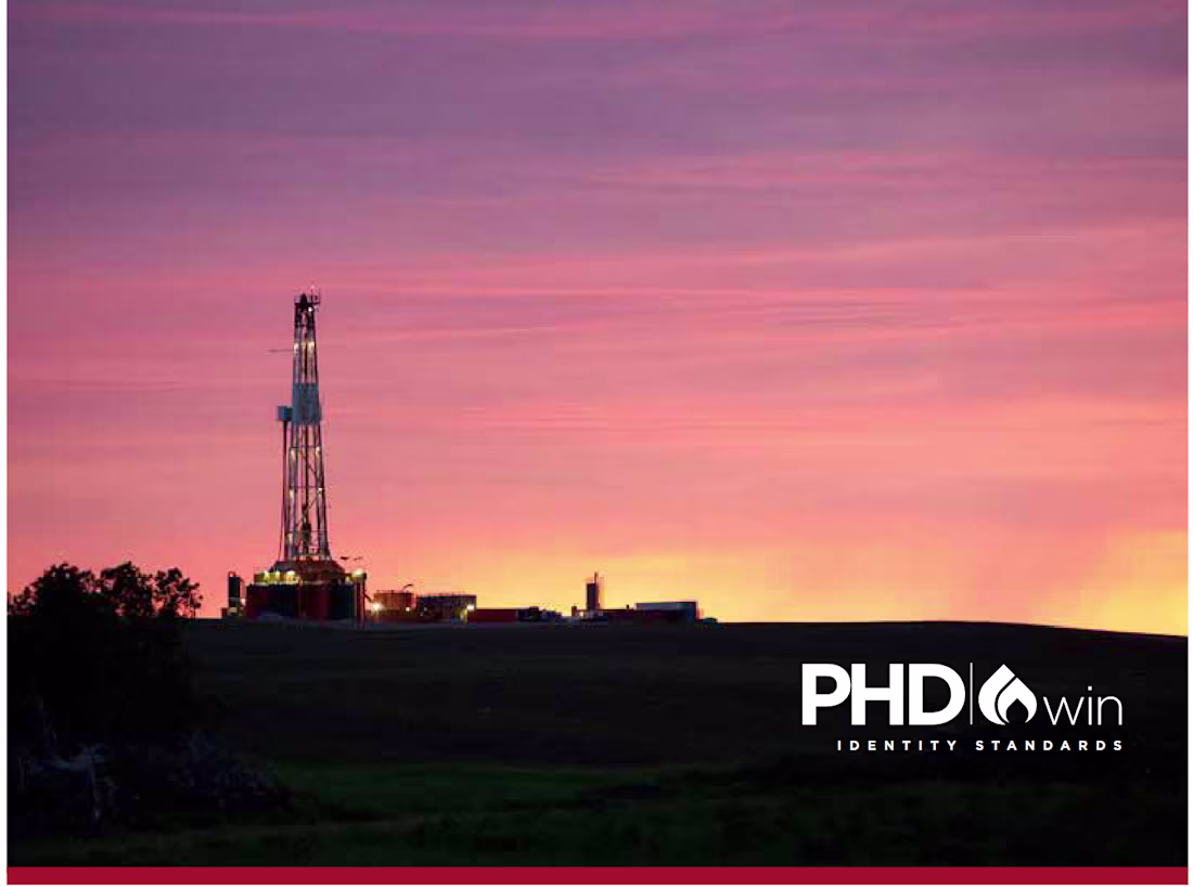
Client Spotlight: PHDwin (TRC Consultants L.C.)
Sharing an early look at one of our long-term enterprise clients: PHDwin, the reserves & economics software trusted by petroleum engineers, A&D teams, consultants, and energy investors worldwide. For 30+ years, PHDwin has been the backbone for evaluating assets and supporting high-stakes engineering decisions. If you've ever used energy, odds are it came from an asset evaluated with PHDwin.
Design System Sneak Peek
Ahead of our full case study on the redesign of PHDwinDownload.com (http://PHDwinDownload.com) and PHDwin.com (http://PHDwin.com), here’s a preview of the updated visual system guiding the new brand direction.
What are we sharing next?
A breakdown of the PHDwin logo, its construction, symbolism, and updated usage standards. Follow for more!
11
159
Behind the Design: Foundation Energy Advisors Rebrand
This project started in an unexpected place, a live stream conference I run each year for a client in oil and gas reserves.
That’s where I met Dwayne Stewart, P.E., of Foundation Energy Advisors. After the event, he reached out and said he wanted the same clarity, structure, and creative execution applied to his firm’s brand and website.
From there, we built a collaborative identity system rooted in his mission: stability, technical depth, and forward-thinking guidance in a changing energy landscape.
We landed on a clean, vertical geometric mark using a custom Marcellus font.
It took a few versions and pitching but I think we landed on something timeless. I would love any feedback! The final logo is the last vertical logo.
Will share the final website design shortly!
24
310
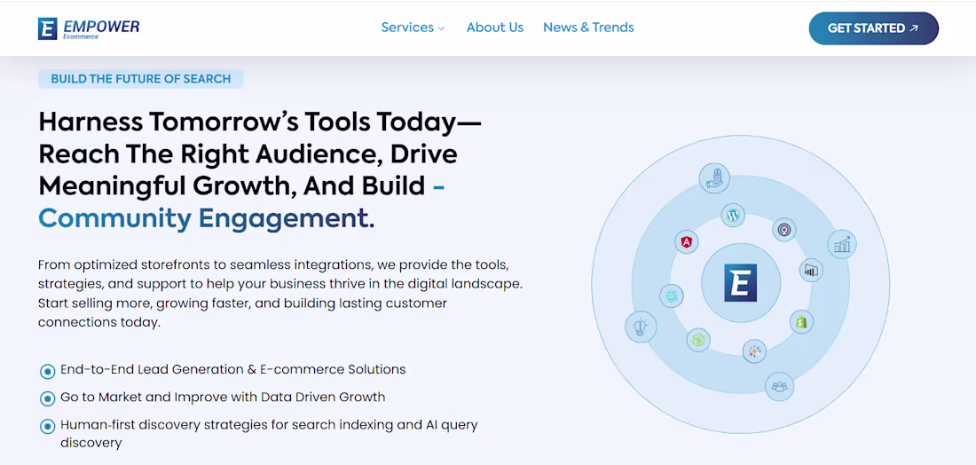
Empower Ecommerce | Brand & Homepage Redesign
This year we launched a new hero direction for my agency Empower Ecommerce built around clarity, modern search behavior, and a unified brand system.
We focused on:
a) Clear positioning (what we do + who we serve)
b) Human-first messaging instead of jargon
c) SEO-aligned copy based on real search intent
d) Iconography that visualizes the entire digital landscape
e) A scalable design system for upcoming service pages
💬 I’d love input from other web designers, product marketers, and UX leads here:
If you were evolving this homepage further, what would you prioritize next, stronger brand storytelling, more product clarity, or social proof?
Curious how other builders think about “Phase 2” after a major homepage refresh. Let me know if you'd like the full website link!
14
222