The network for creativity
Join 1.25M professional creatives like you
Connect with clients, get discovered, and run your business 100% commission-free
Creatives on Contra have earned over $150M and we are just getting started
Back to feedPost
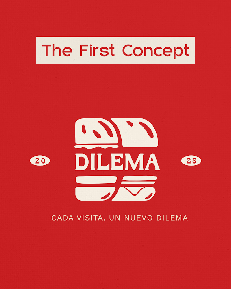
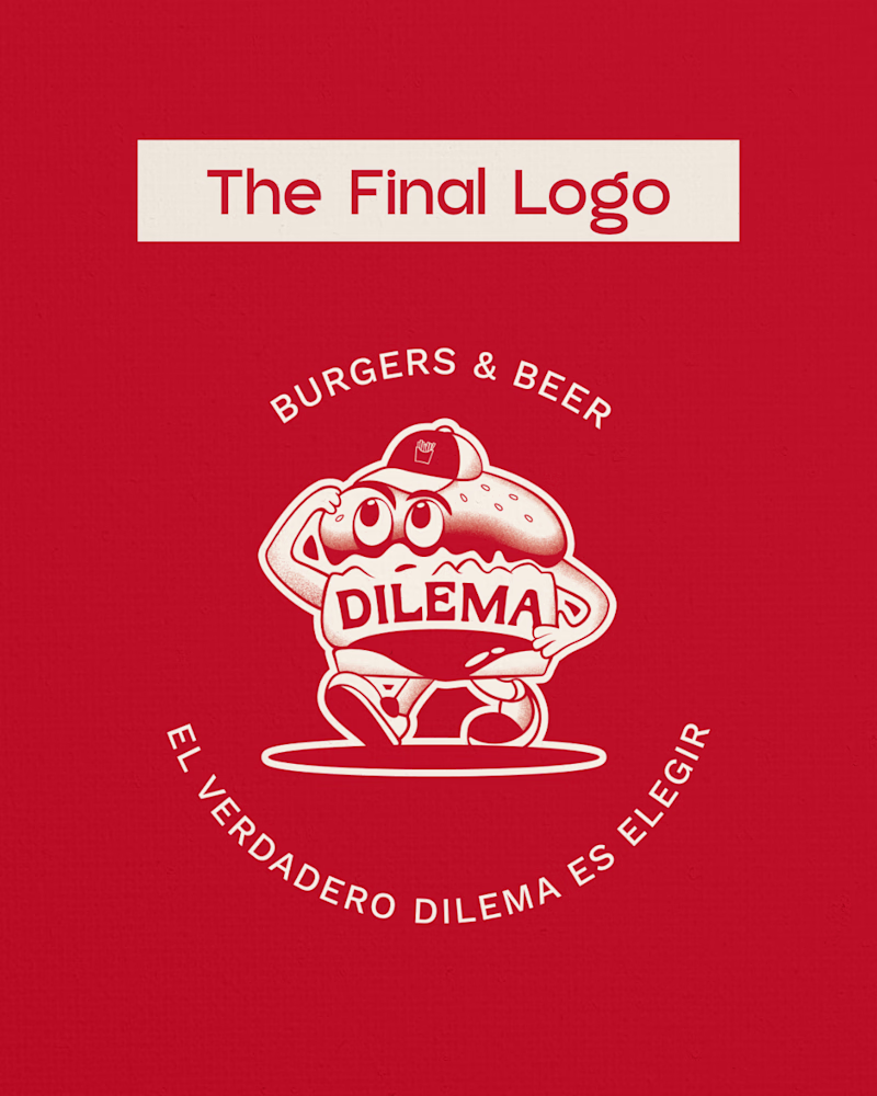
Taste Test
This isn’t a redesign. It’s evolution.
Dilema Burgers started as a simple 2D burger mark. Then the brief changed and the idea transformed into a mascot with personality. Logos rarely end where they begin. Strong design isn’t protected. It’s challenged.
Which do you prefer?
30 voted
30%
69 voted
70%
99 votes
Closed
Final logo looks better
Ah thank you! It's what the client went for 🙌
The new logo has sooo much personality! You should definitely make some stickers with it!
The stickers idea is good one...........
Thank you Sabrina! I've already started making them 😍
Sure is! 😍
it's more catchy now 😊
Thank you 🙌
This shows maturity in the design process and responding to a changing brief instead of protecting an early solution. The personality added by the mascot is a big win.
Thank you so much! I often find the best ideas come when you don't cling to a single design and you're open to coming up with new ideas or developing current ones.
Thank you!
Well done! the final logo looks really nice and more friendly than the concept💯.
Thank you! I think so too 🙌
The final option definitely wins in between the two. The first concept - I get the burger idea, but it's hard to even see those are burgers and it's not even unique/memorable.
The burger character, on the other hand, is memorable, infinitely brandable, presents a ton of real...
Thank you Aleksandrs 🙌 I appreciate the feedback. The client loved it. I also loved making this mascot. Something different from my usual style but allowed me to explore something new 🔥
Prefer the Final Logo — the mascot direction gives the brand more room to express personality across touchpoints.
Thank you 🙌 and 100% agree with you! It gives the brand so much potential.
The Final one has its own aura. Such a brilliant thing.
There should also be a version without transition of color/masking of the artwork to make it more suitable for print purpose.
Thank you so much! And you're 100% right. I'll making a flat version of this too 🙌
Final logo, for sure!
Really nice logo. Was that hand drawn or a like a vector drawing ?
It's a vector illustration 🙌
like your first draft not crazy about he font on 2nd one
Are you referring to the primary font or the body text font? (The primary font is the same as the first concept 🙌 )
i' m still going with final logo
Thank you!! 🙌
hahaha thank you 😍 🙌
Love the final logo
Thank you! That's the one the client chose 🙌
It's very Cool!!🔥
Thank you 🙌
Good 👍
Thank you!
Good
Thanks 🙌
Nice Logo Design!
Thank you!!
I think it could definitely would work for a different minimalist brand aesthetic 🙌
The network for creativity
Join 1.25M professional creatives like you
Connect with clients, get discovered, and run your business 100% commission-free
Creatives on Contra have earned over $150M and we are just getting started
Trending
Claude
Claude has entered the design space. How are you using Claude Design?
Contra University
Learn from expert creatives how to earn more using next-gen AI tools.
MagicPath
The canvas is infinite, and exploration is becoming the workflow. How are you using MagicPath?
creativeaiflow
Creative AI workflows are evolving. What tools do you use, and what are their strengths and weaknesses?
freelancerlife
Freelancer life is wins, pivots, and everything in between. What’s yours right now?