
UXNoraiz Shahid
Let's transform your ideas into Stunning Reality
Ready for work
UXNoraiz is ready for their next project!
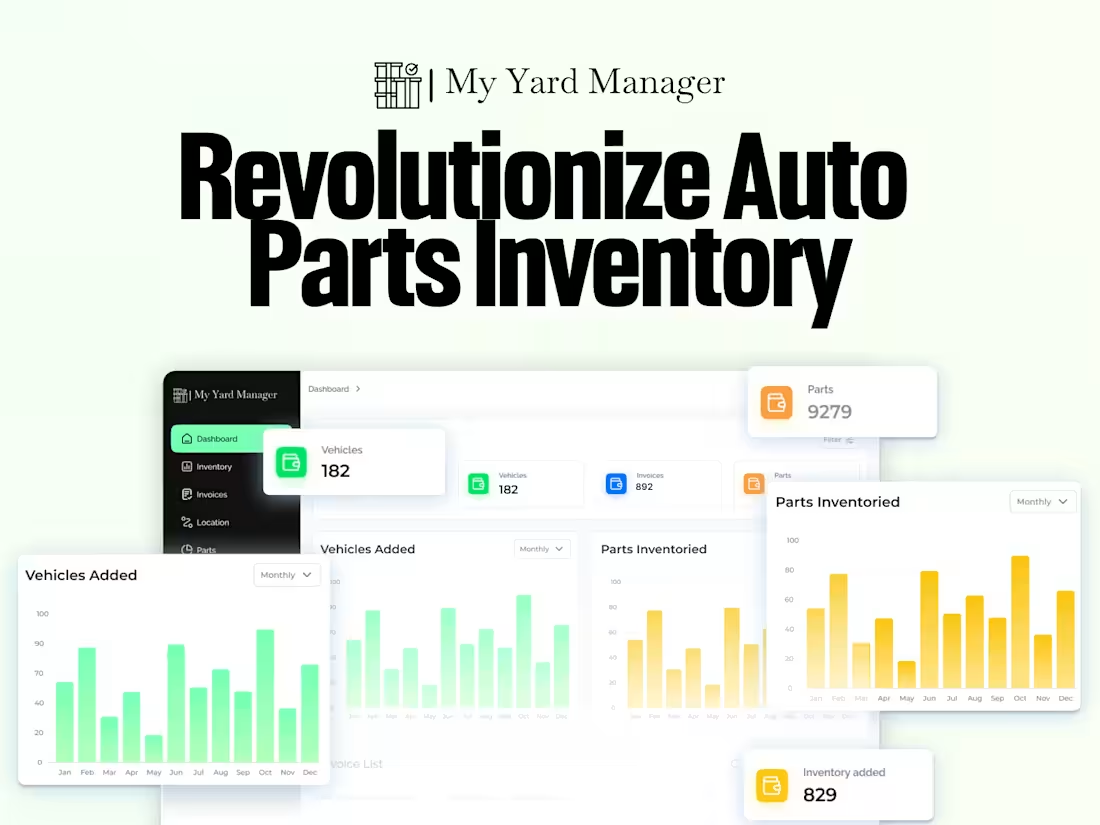
Reinventing Auto Parts Inventory — one workflow at a time.
Building My Yard Manager wasn’t about adding dashboards or charts…
It was about giving auto-yard teams a system that finally thinks the way they work.
A dashboard where every number feels alive.
Inventory visuals that actually tell a story.
Flows that turn chaotic lists into clear, track able movements.
And an interface that feels modern without getting in the way.
This wasn’t a “design refresh.”
It was a complete shift from clutter → clarity — so teams can focus on decisions, not data digging.
Let’s build something that feels this effortless.
#SaaSDesign #DashboardDesign #DesignCaseStudy #UXDesign #UIUXDesigner #EnterpriseUX #WorkflowDesign #DataVisualization
Check it out (https://contra.com/p/U2RWssWq-automobile-website-uiux-design-or-modern-web-experience)
3
173
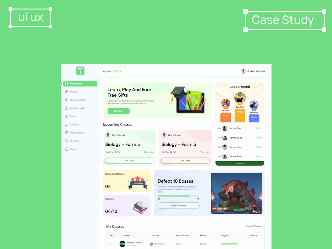
A learning app designed to make studying feel lighter, not harder 📚
I built this dashboard around one question:
How do we make students actually enjoy tracking their progress?
So I combined clean structure with small rewards — missions, points, leaderboards, classes, and a clear roadmap of what’s next. The goal was simple: give students clarity and motivation at the same time.
Looking at it now, I’m curious —
Which part of this design feels most useful to you, and where do you see room to improve?
#UIUXDesign #EdTechDesign #ProductDesign #LearningExperience #DesignForImpact #StudentDashboard #UXCaseStudy #EducationApp
Check it out (https://contra.com/p/msgEbZvm-fintech-app-uxui-case-study-wireframes-to-final-ui)
3
187
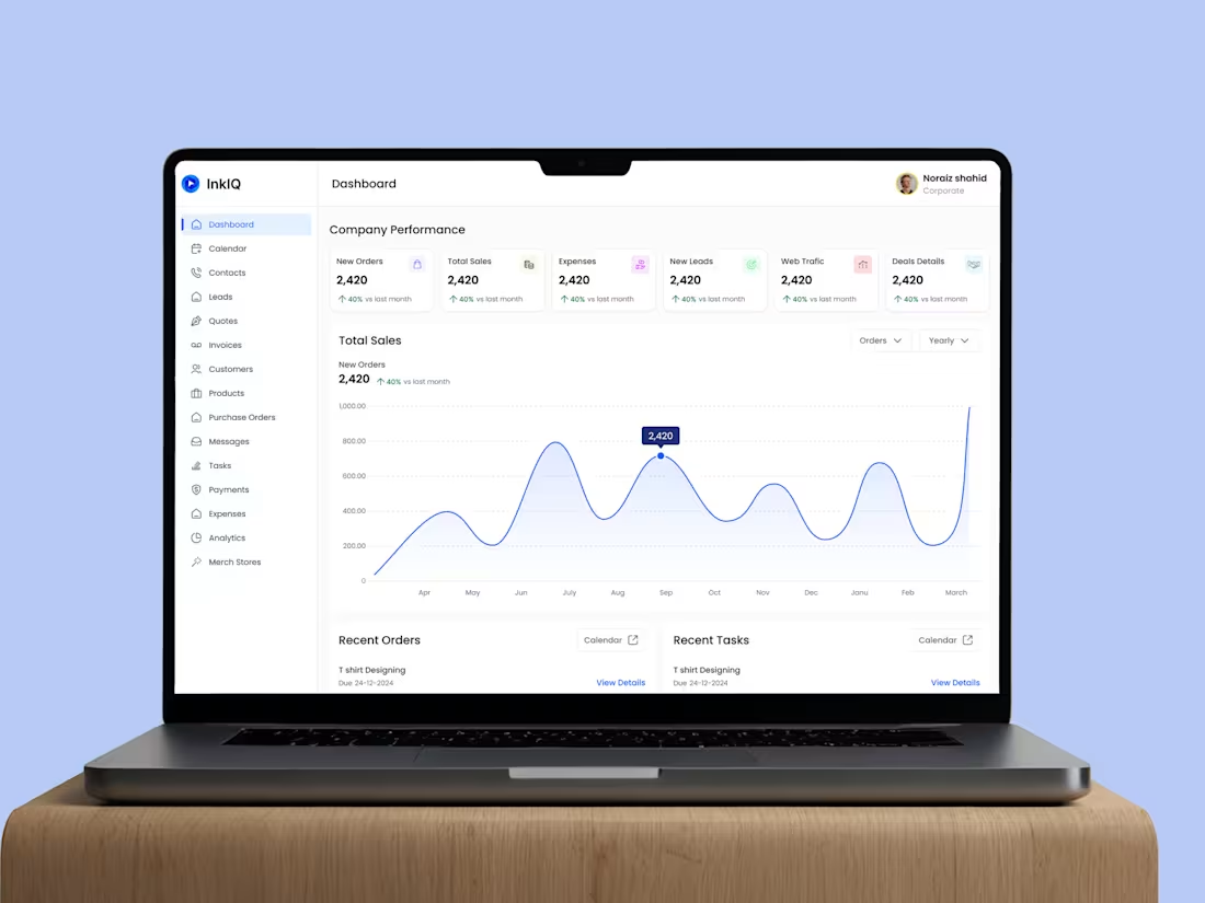
InkIQ — where creativity meets opportunity.
This project started with one goal: to make the connection between creators and clients feel effortless.
InkIQ isn’t just another marketplace — it’s a space where creativity, collaboration, and opportunity come together.
I designed the experience to empower creators to showcase their work confidently while helping clients find the right talent without the usual friction.
From the visual tone to the dashboard flow, every detail was built to feel intuitive, modern, and human.
Bringing artistry and innovation to the forefront — that’s what InkIQ stands for.
Check it out (https://contra.com/p/Olvc7YcF-marketplace-dashboard-uiux-design-web-and-ux-case-study)
4
233
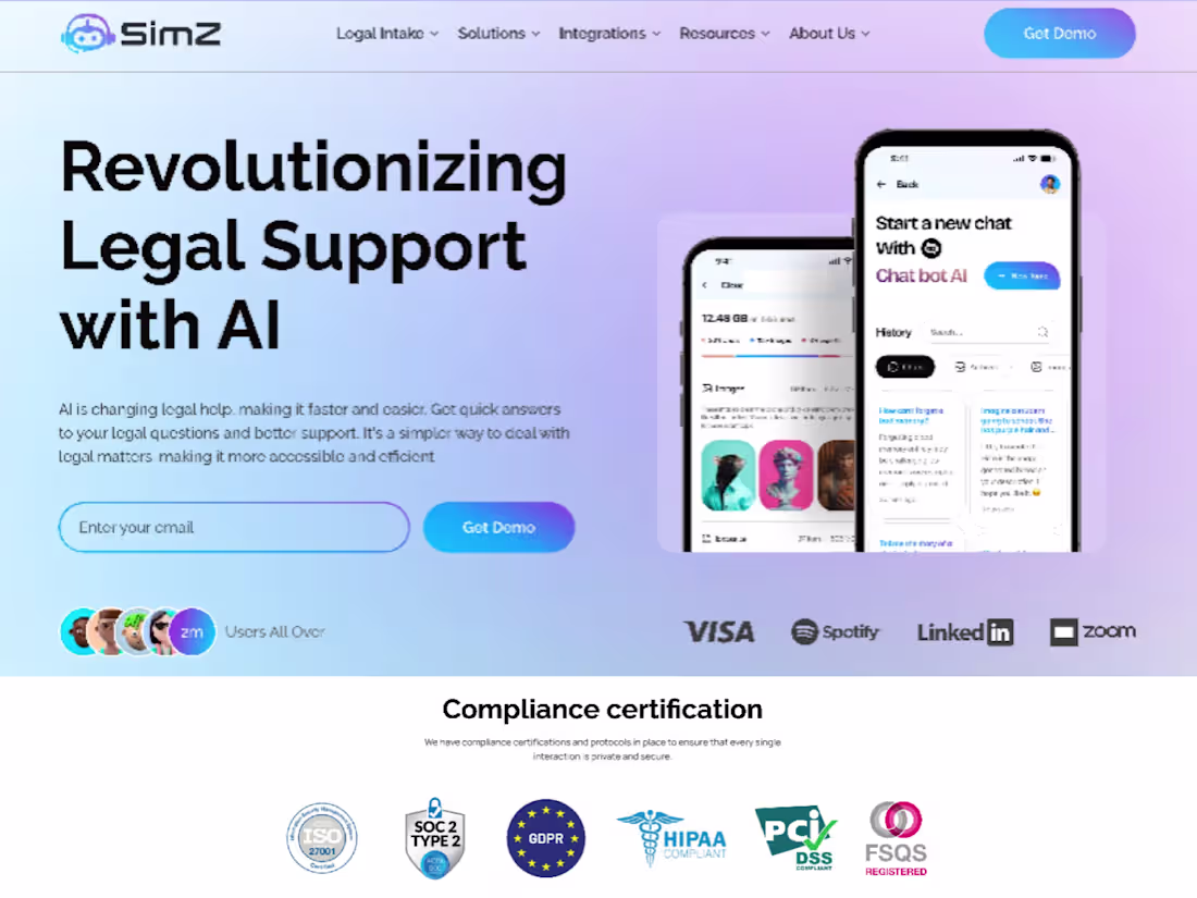
Turning Conversations into Conversions with AI 🧠
When we started working on SimZ, the goal was clear — help businesses automate customer calls without losing the human touch.
We built an AI-powered voice agent that handles repetitive inquiries, follow-ups, and reminders — saving hours of manual work every week.
The result?
📈 45% drop in response time
💰 Significant cost savings on support operations
💬 Happier customers who get instant replies
SimZ isn’t just automation — it’s smarter communication that actually drives ROI.
Check it out (https://contra.com/p/ZWErA3WX-ai-powered-uiux-design-for-sim-z-voice-agent)
1
194
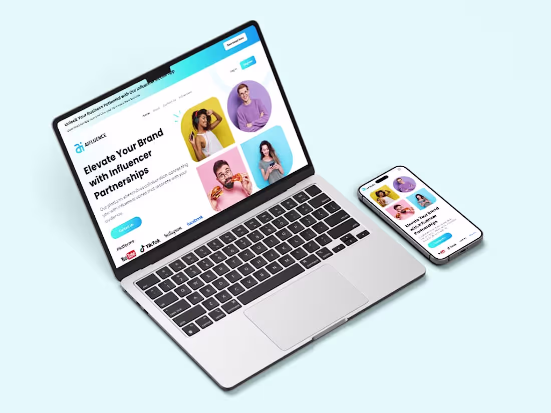
When I first started working on AIfluence, one thing was clear — influencer platforms often look busy but feel empty.
Too many buttons. Too little clarity.
So I flipped the question.
What if managing influencer partnerships could feel as simple as chatting with one?
From there, everything flowed —
clean structure, calm colors, and interactions that guide instead of overwhelm.
Now, brands and creators can connect, collaborate, and measure campaigns with ease — across web and mobile.
That’s what good UX should do — make complex systems feel effortless.
Check it out (https://contra.com/p/beYYEUEQ-uiux-case-study-modern-website-design-approach)
2
2
215
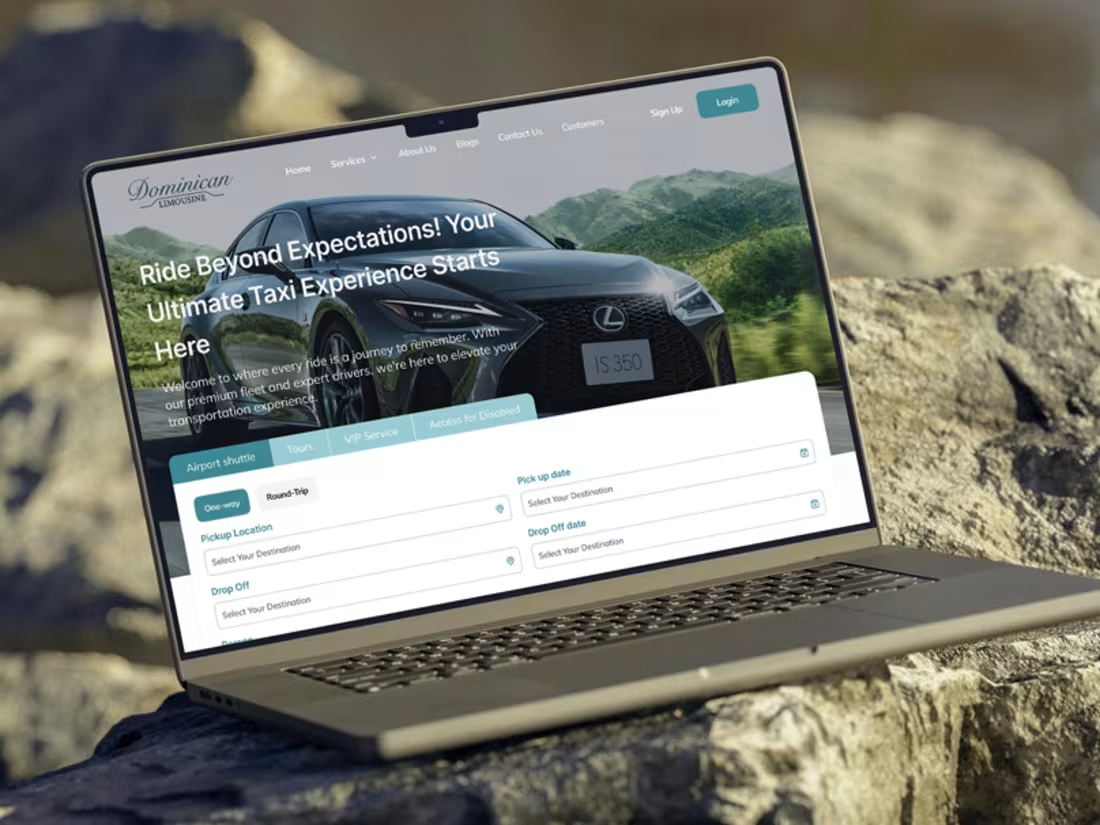
🚕 A taxi booking experience that feels effortless
When I started designing Dominican Limousine’s web app, the challenge was clear — make booking a premium ride feel as smooth as the ride itself.
The old flow had too many steps and scattered inputs.
So I simplified it into a single, focused layout — everything from pickup to drop-off now happens on one screen, with clear hierarchy and intuitive field grouping.
The result?
A booking experience that feels instant, premium, and stress-free.
Check it out (https://contra.com/p/bgmPsB3q-taxi-app-uiux-case-study-or-modern-ride-booking-design)
1
209
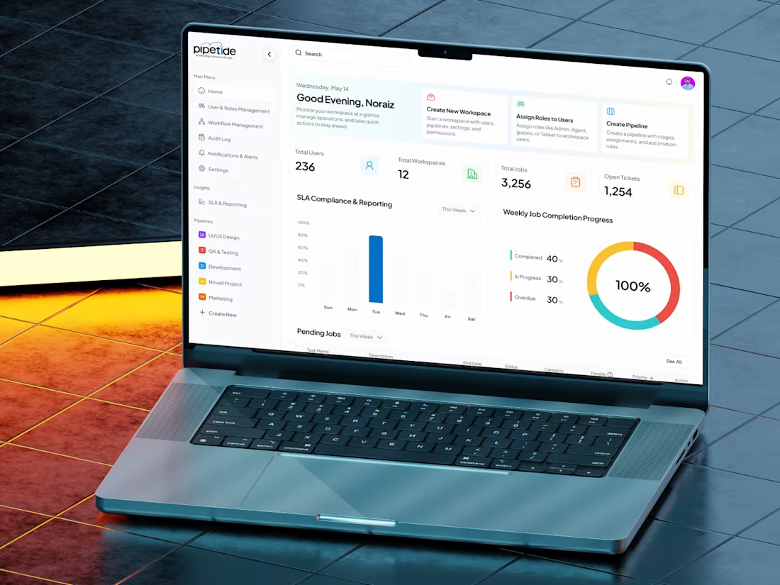
Pipetide Dashboard — making complex workflows feel simple.
I redesigned their workspace dashboard to bring clarity to data-heavy operations.
Clean visuals, better flow, and an easy overview of what matters most — users, workspaces, and progress.
The goal? Let teams focus on work, not on finding their way around it.
Check it out (https://contra.com/p/vLUABUlW-pipe-tide-work-flow-management-system)
1
225
Designing a motion graphics website that balances energy and ease.
The challenge was to capture Pupyl’s creative spirit while keeping navigation clean and conversion-focused.
The final design blends smooth gradients, confident typography, and interactive flow — turning motion into a user experience.
Check it out (https://contra.com/p/RemkN3Bv-agency-landing-page-design)
1
241
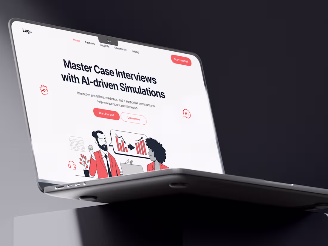
Case Cracker — Designing Clarity for Complexity :
This project started with a simple goal: make interview prep feel less like pressure, more like progress.
The challenge? Turning a complex, data-heavy simulation tool into something that feels calm and intuitive.
I stripped away the noise, restructured the flow, and built a layout that guides users naturally through each step.
The result — an interface that feels clear, confident, and built to help users focus on what really matters: growing through every challenge.
#UIDesign #UXDesign #ProductDesign #WebAppDesign #InterfaceDesign #AIDesign #CleanUI #CaseStudy
Check it out (https://contra.com/p/lcq3mXRR-case-cracker-modern-uiux-web-design-case-study)
1
228
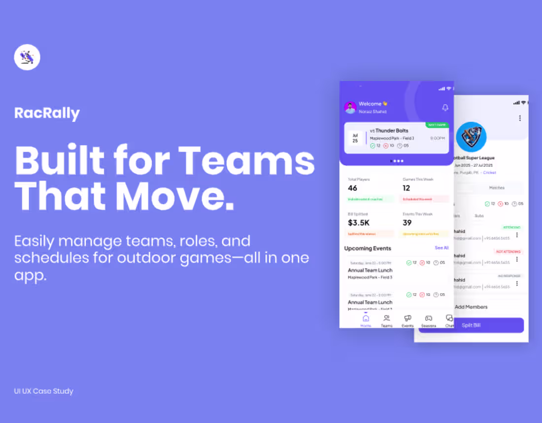
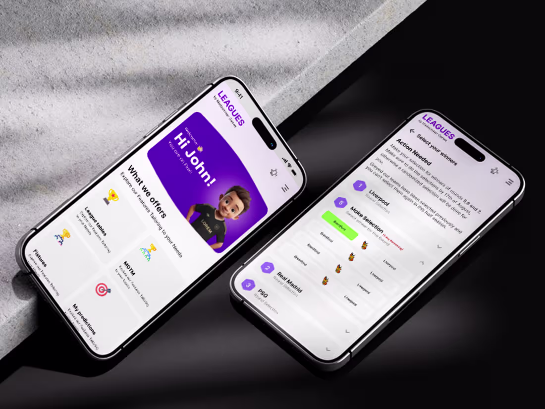
Recrelly Mobile App Design
2
7