The network for creativity
Join 1.25M professional creatives like you
Connect with clients, get discovered, and run your business 100% commission-free
Creatives on Contra have earned over $150M and we are just getting started
Back to feedPost

New sales page shipped 🥳
Long-form sales page, optimised for clarity, hierarchy, and decision-making rather than just aesthetics.
The focus was on making dense content easier to read, guiding attention through layout, and reducing friction for both cold and warm traffic... Not jsut saying "the copy is too long".
I shared a deeper breakdown of the thinking behind this build on LinkedIn here → link to LinkedIn post


The network for creativity
Join 1.25M professional creatives like you
Connect with clients, get discovered, and run your business 100% commission-free
Creatives on Contra have earned over $150M and we are just getting started











Related posts


EarthHub – A Platform for Nature Expeditions ⛰️
Stumbled upon this project in my hard drive, had to publish!


Top to bottom nice work

The team is cooking
Motion design for the logo we are making for Nation e-commerce


Wou


HEATD is a heated Pilates and yoga studio in Mableton, Georgia. The name already said it all, so we made one decision from day one: the heat would be the whole brand 🔥
Amazing project and amazing team.
Collab with @gerbzagency


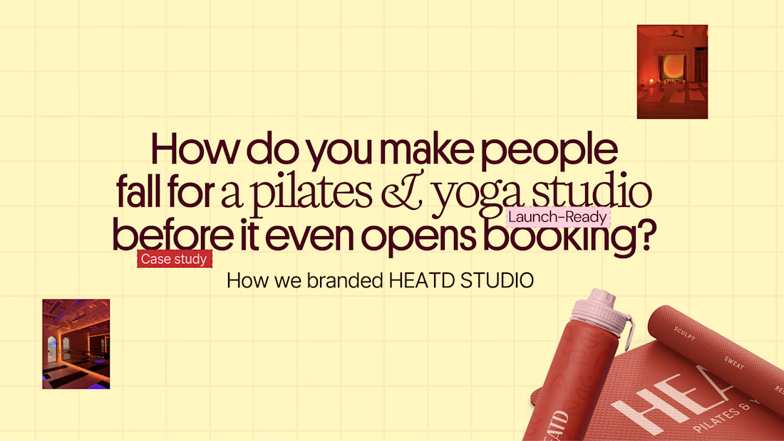
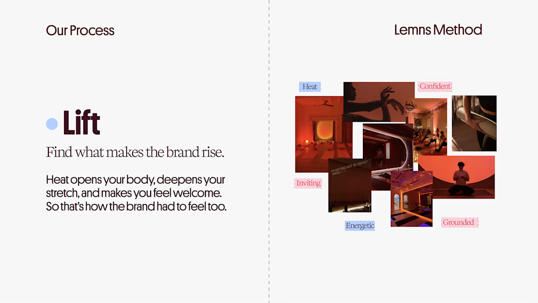
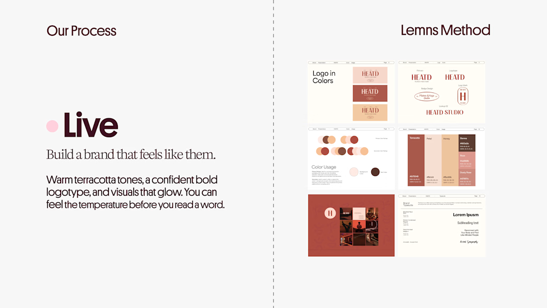
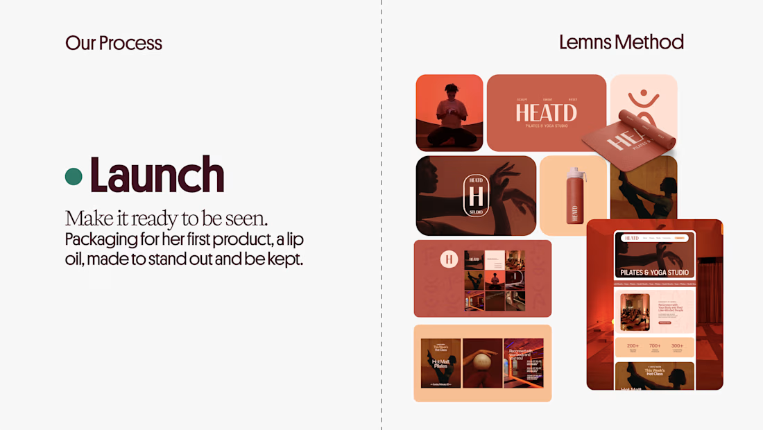

Curious how the terracotta palette got settled here: did the colour come first and the type follow, or the other way round? The heat idea reads as much through the warm tones as through the name itself.