The network for creativity
Join 1.25M professional creatives like you
Connect with clients, get discovered, and run your business 100% commission-free
Creatives on Contra have earned over $150M and we are just getting started
Back to feedPost
Taste Test

Now I'll show you a design that was created based on the principle that “the most important thing is not to scare the patient before it's time.”
This is a pharmaceutical project, so the design is very understated. But even with this approach, I want to make the product look more appealing. Which option stands out more?
#storyboard
9 voted
75%
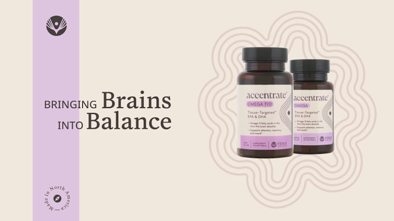
3 voted
25%
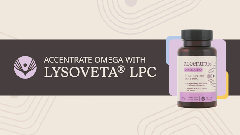
12 votes
Closed

definitely option 1 for me! far easier to understand re: copy!
Simplicity is important here. Thanks

Thanks for useful comment 🙌


I’d go with the more understated option. It feels calm and trustworthy, which makes a lot of sense for a pharmaceutical product.
Kabir, thanks for the detailed answer

Option 2 imo - that dark banner makes the bottle pop so much more, feels more premium too
Thanks for your explaining

I love the option 2
Thanks, Zeenah
You're welcome 🙂


option 2
The network for creativity
Join 1.25M professional creatives like you
Connect with clients, get discovered, and run your business 100% commission-free
Creatives on Contra have earned over $150M and we are just getting started


Trending
retrofuturism
Share your favorite designs from the past exploring the distant future. Or your own take on the aesthetic 🚀
halftone
Dots. Texture. Grain. Let's see your designs using the halftone technique.

Midjourney
Creatives are showing off what they're making with Midjourney.
colorgrade
Video editors sound off: How do you enhance the mood of your video in color grading?
Related posts

I've developed two menu options. Which is better?
Option A. When you hover over 3D printers, a list of printers appears; when you hover over a printer model, its photo appears.
Option B. When you hover over 3D printers, both the photo and the model name appear.
0 voted
0%
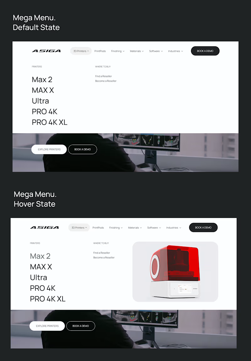
3 voted
100%
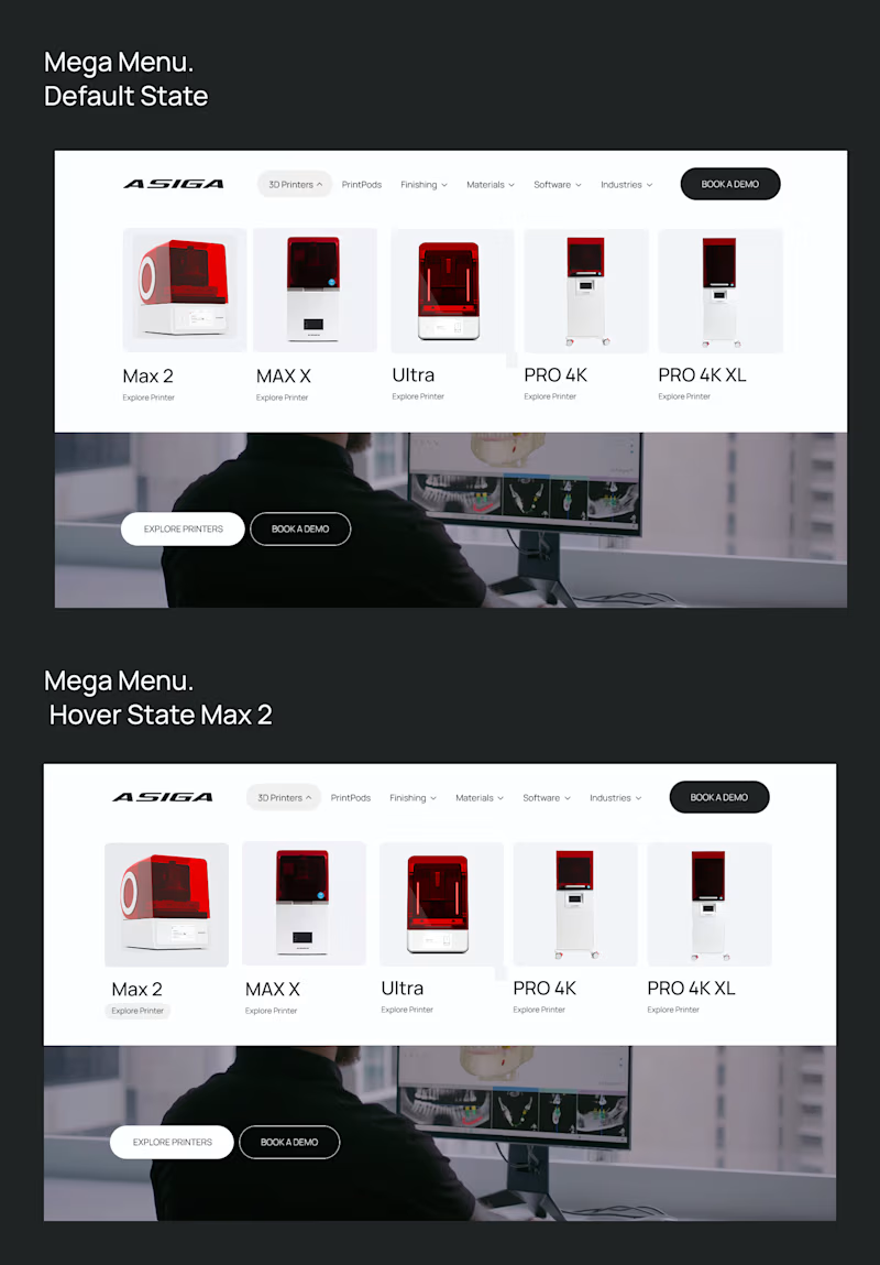
3 votes
Closed

Option B. It instantly shows what products are available so I dont have to scan through a list first. It also feels much sharper and more polished visually.


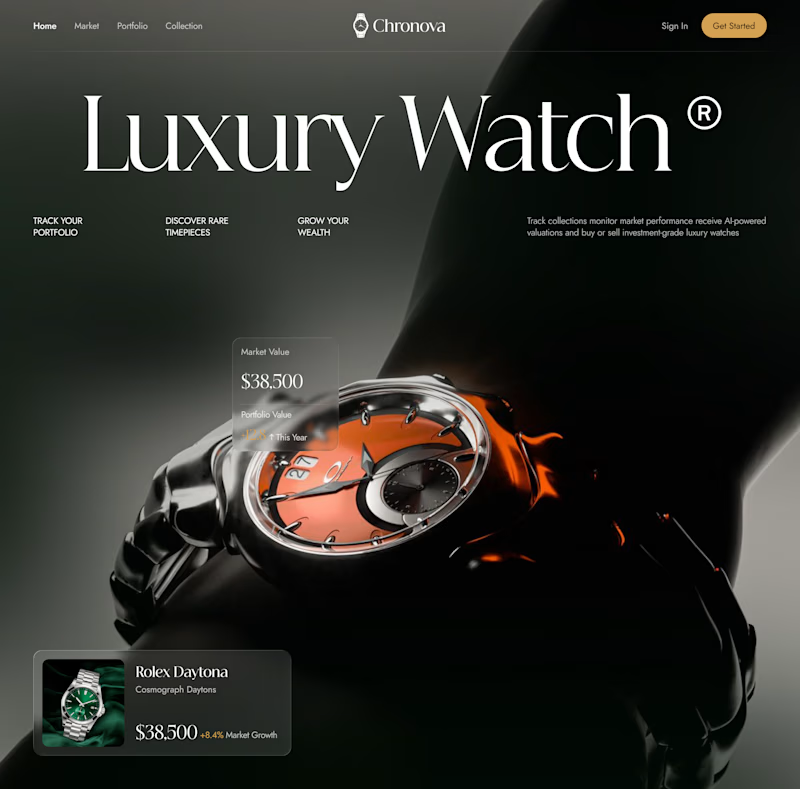
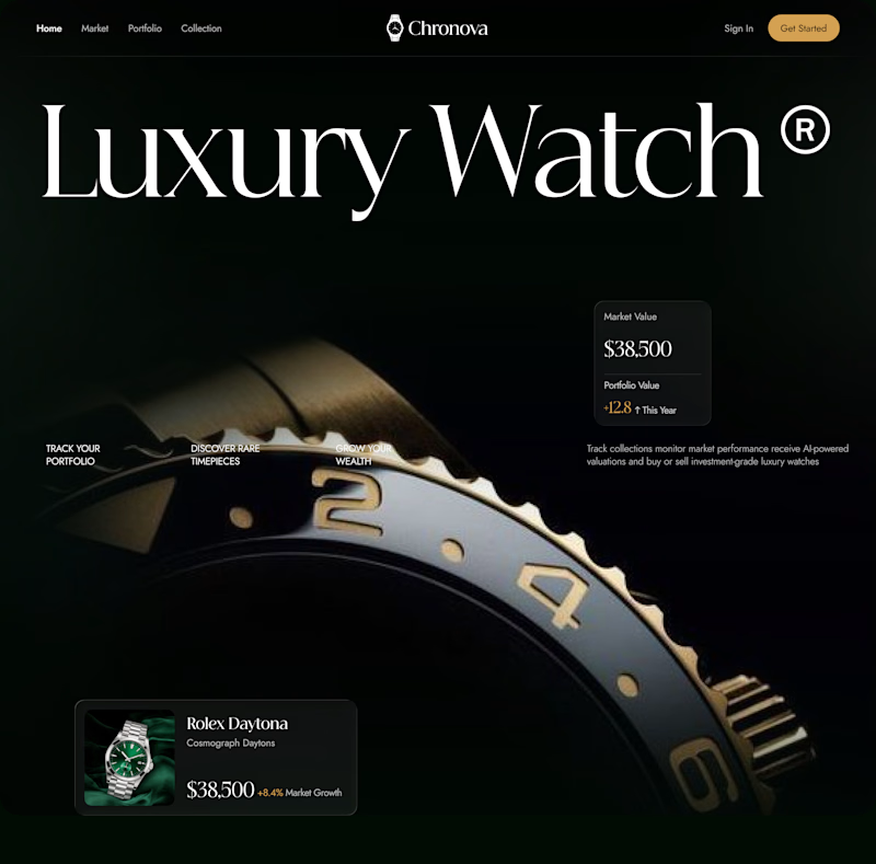

I’m leaning 1. The stronger product focus makes the watch feel more distinctive and instantly grabs attention.

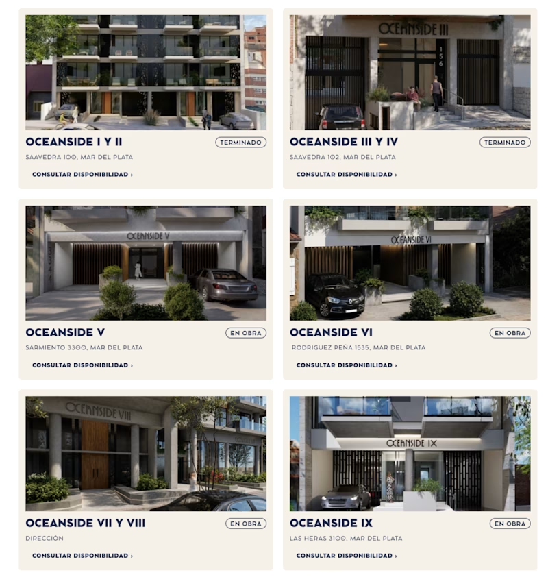
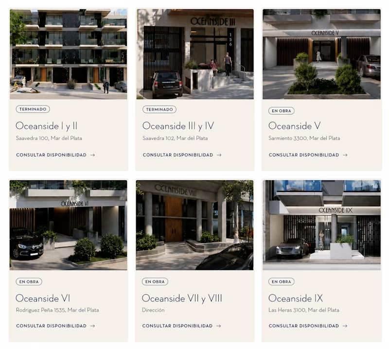
Testing this Oceanside project layout. Same content, two totally different feels. 👀
Version A: bold, all-caps, tighter grid. It feels more corporate and structured.
Version B: softer typography, more breathing room. It feels more premium and editorial.
Small typography and spacing choices change how trustworthy and high-end a project reads.
Which version would make you click "consultar disponibilidad"?
2 voted
40%
3 voted
60%
5 votes
Closed
Okay had to translate the whole thing first, phew.
Softer for me. 🙌
The extra breathing room and elegant typography is making the properties feel more high-end and easier to trust.