The network for creativity
Join 1.25M professional creatives like you
Connect with clients, get discovered, and run your business 100% commission-free
Creatives on Contra have earned over $150M and we are just getting started
Back to feedPost
Taste Test


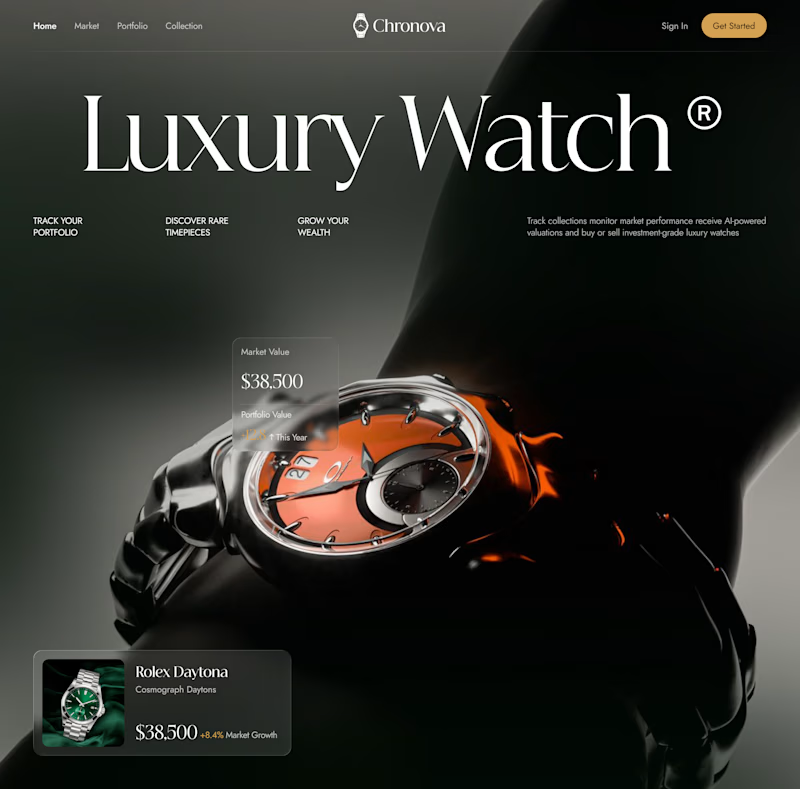
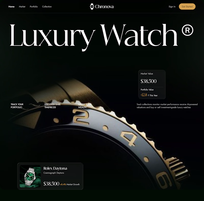

I’d go with 2. The refined direction feels more luxurious and gives the watch enough space to feel premium.

I’m leaning 1. The stronger product focus makes the watch feel more distinctive and instantly grabs attention.

Definitely 2! The editorial composition gives the whole watch room to breathe and feels far more high-end.

1🔥 🔥

1 without any second guesses! stronger product focus plays huge role in conversion.


1 for me. The composition feels more refined and the wider product shot gives the watch more presence without fighting the typography. It feels closer to a luxury editorial campaign at first glance.

i love option 1, the product is more stand out 🔥


I’d lean toward 2. The editorial direction feels more premium to me, especially for a luxury watch brand. It has that quiet, high-end feel.

Both directions sound strong, but for a luxury watch brand, I’d lean toward the refined editorial approach. It tends to communicate sophistication and timelessness more naturally while giving the product room to feel premium.
The network for creativity
Join 1.25M professional creatives like you
Connect with clients, get discovered, and run your business 100% commission-free
Creatives on Contra have earned over $150M and we are just getting started

Challenges
View all


Related posts


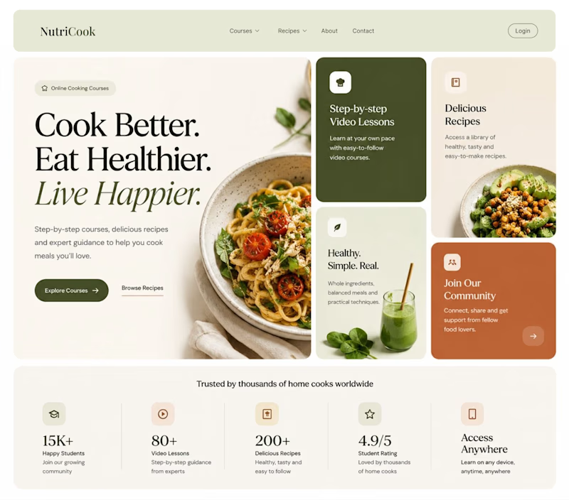
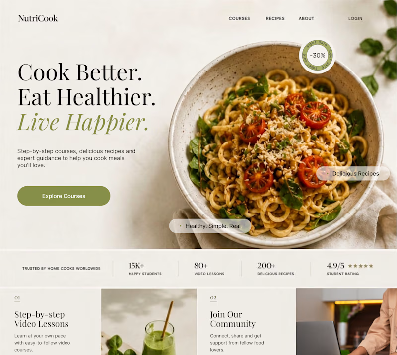
Same content. Two completely different vibes.
What happens when you keep the course content the same, but change the structure, typography, and color palette?
Two hero sections. One course. Two different visual experiences.
Which one would you choose? 1 or 2?
29 voted
41%
42 voted
59%
71 votes
Closed

Option 1 works well , the heirarchy and card layout on the hero is very smart


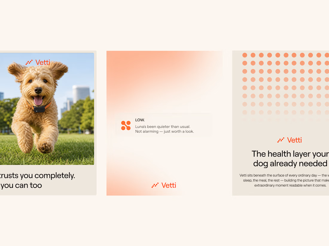
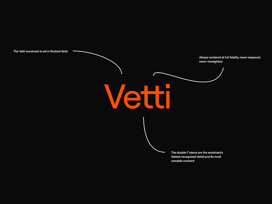
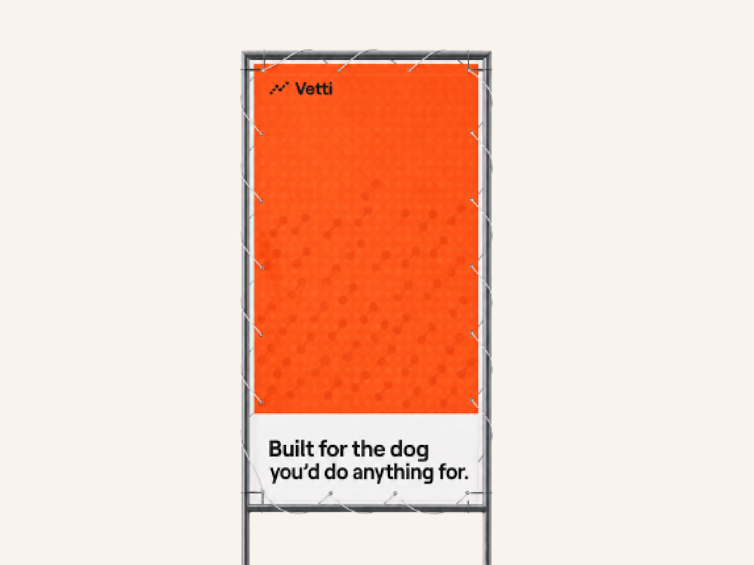
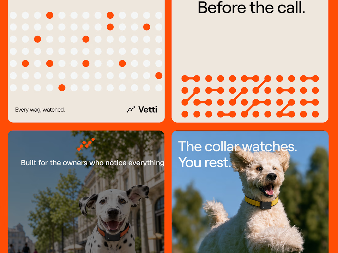
A fuller look at the brand identity work we for Vetti, a dog health monitoring brand.
The connected dots carry through the whole identity. They form the mark, expand into patterns and give the campaign a recognisable language of its own. Sometimes they fill the layout.
Paired with warm orange and cream the system has room for both the technology and the dogs it’s there for.
Looks very nice welldone

Which design theme would you prefer to select?
4 voted
50%
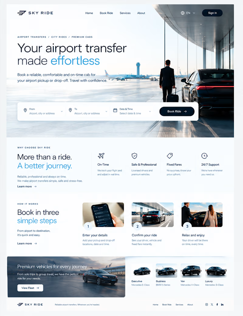
4 voted
50%
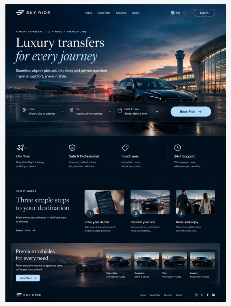
8 votes
Closed


Awesome design !