The network for creativity
Join 1.25M professional creatives like you
Connect with clients, get discovered, and run your business 100% commission-free
Creatives on Contra have earned over $150M and we are just getting started
Back to feedPost

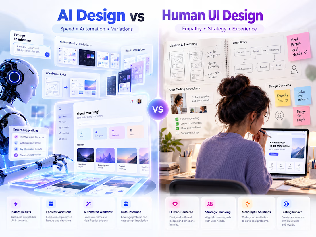
AI can generate screens fast. Humans design experiences that make sense.
AI is great for speed, variations, and automating repetitive design work. But strong UI/UX still needs empathy, user research, product thinking, and real understanding of user behavior.
The future isn’t AI vs Human Design.
It’s AI + Human Design.
Designers who use AI as a tool — while keeping research, strategy, accessibility, and human needs at the center — will create better products faster.


The network for creativity
Join 1.25M professional creatives like you
Connect with clients, get discovered, and run your business 100% commission-free
Creatives on Contra have earned over $150M and we are just getting started





Related posts

Which hero direction feels right for this founder-focused brand?
While working on the homepage for Sean Parsons, a brand focused on empowering non-technical founders to launch tech startups, I explored two different visual directions for the hero section. Same message, same structure, just a different mood and color system.
Option 1 - Warm Olive. Dark, grounded, and editorial, giving a warm, established, expert feel.
Option 2 - Light Purple. Clean, modern, and vibrant, giving a fresh, SaaS-like, approachable feel.
Would love your honest UX/UI take, which direction feels more trustworthy, engaging, and aligned with a founder-focused brand, and why?
25 voted
69%
11 voted
31%
36 votes
Closed

I like worm Olive most because it has different personality

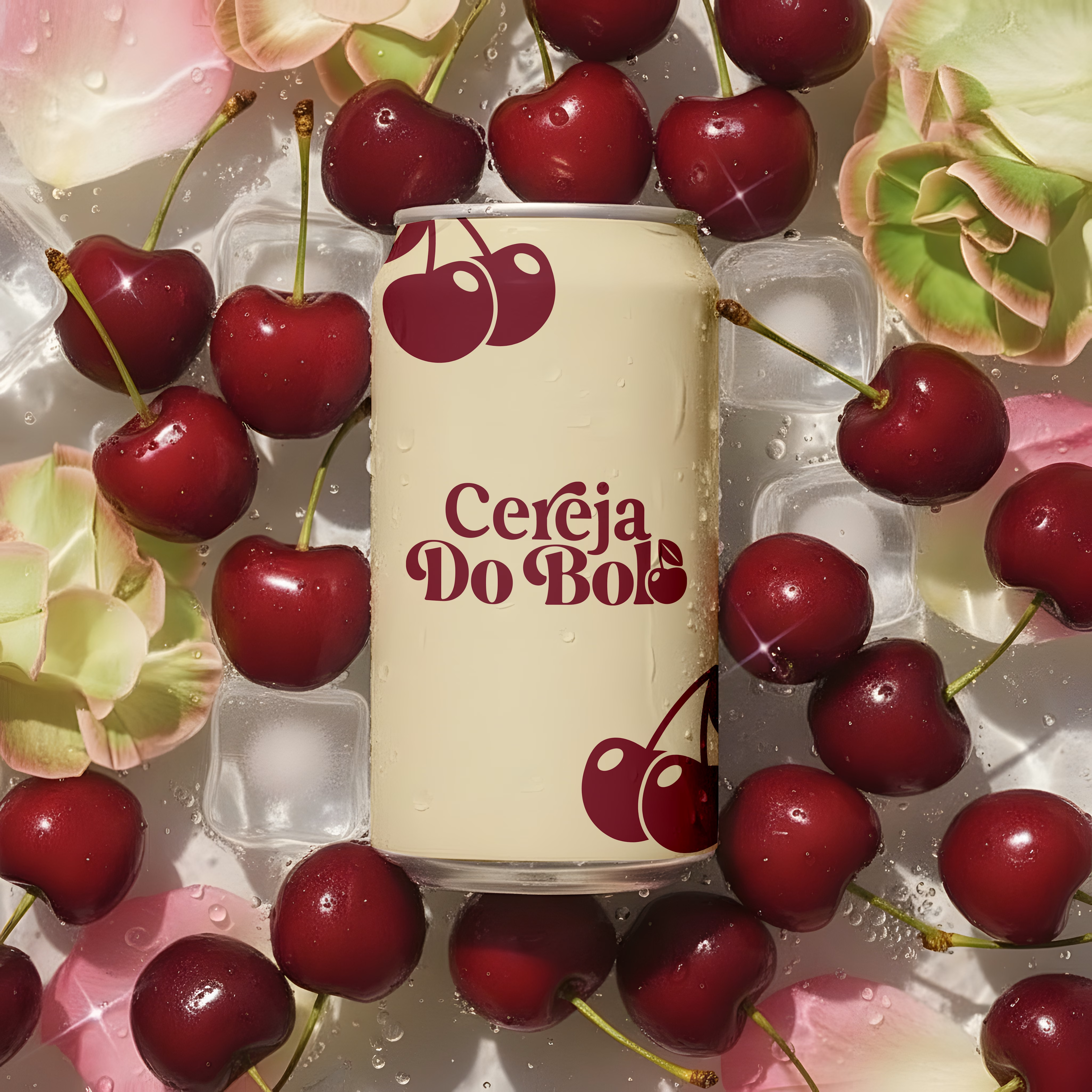
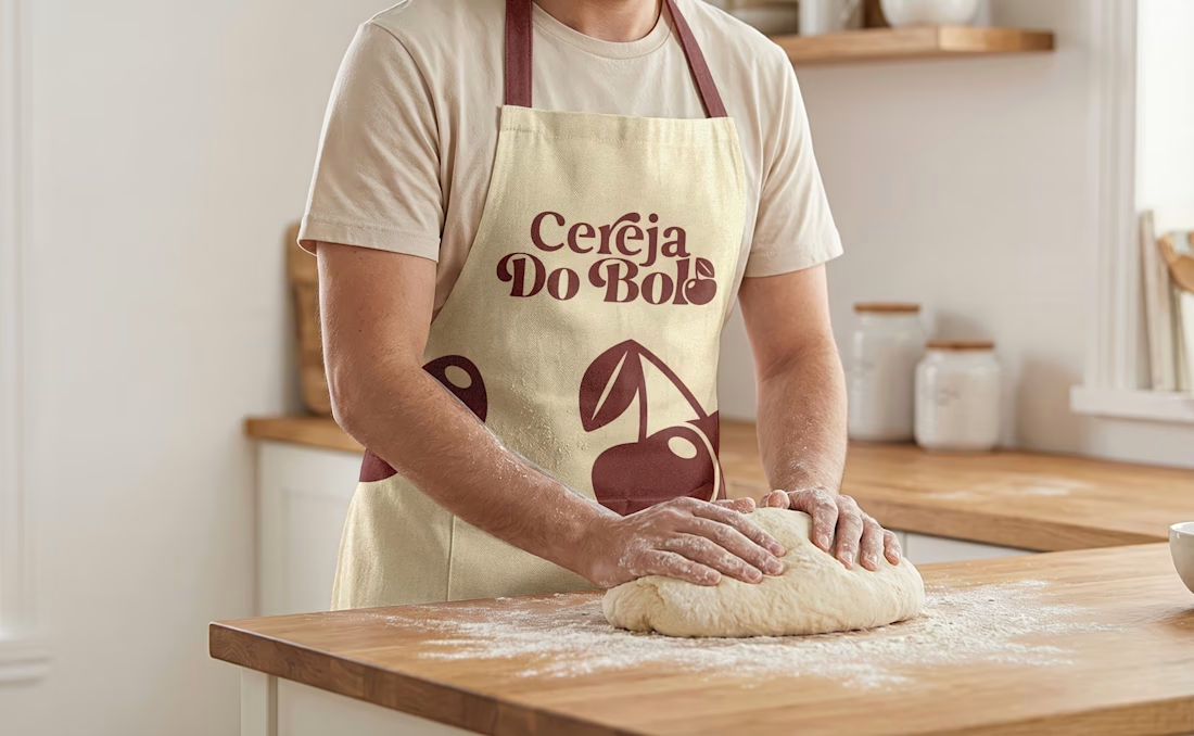
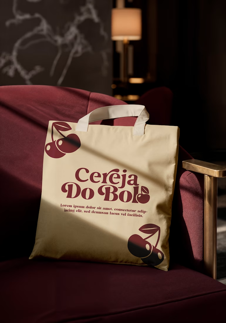
Brand Identity & Packaging Design
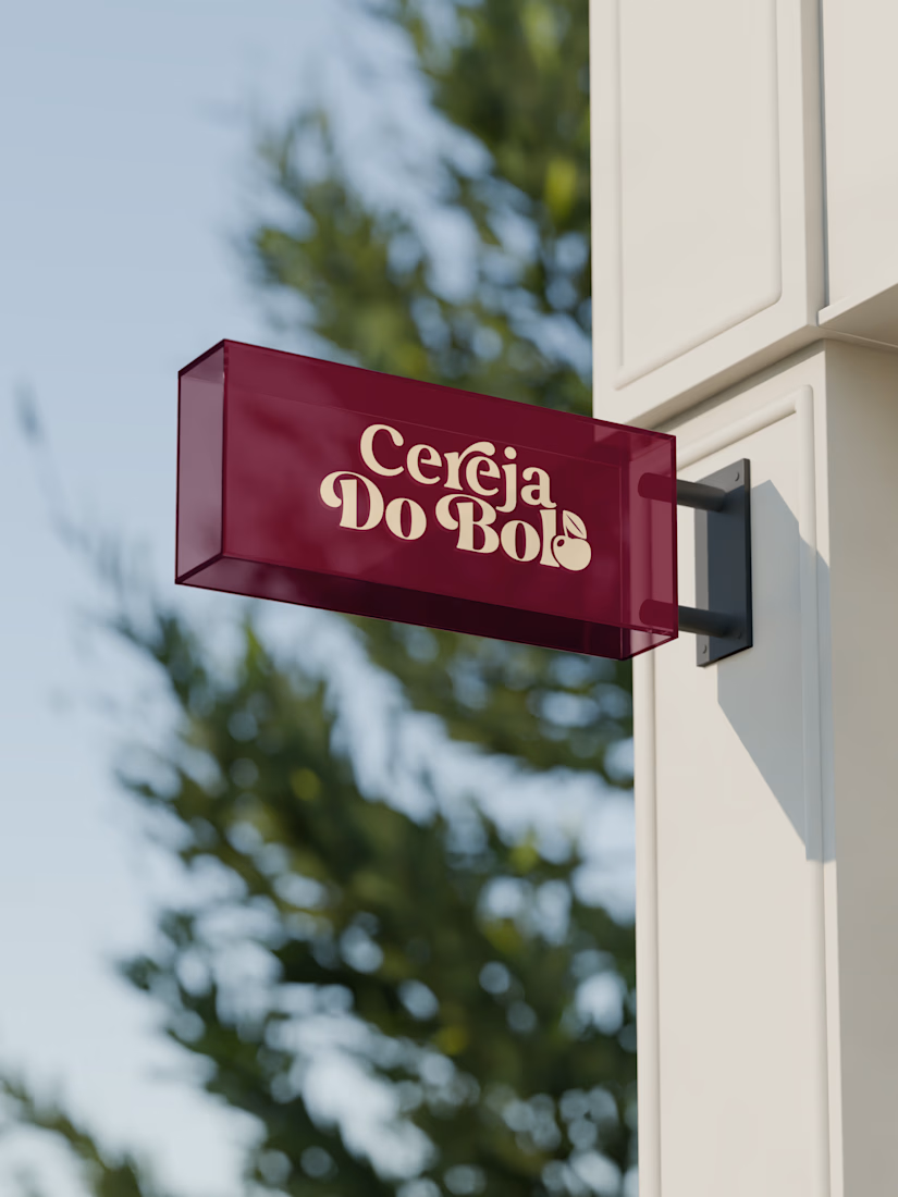
A complete visual identity and packaging concept for Cerveja do Bolo, including branded packaging, merchandise, and outdoor signage. I developed the visual direction and applied the brand consistently across multiple touchpoints to create a cohesive and recognizable identity.


Wow, love it

My kids loves Block Blast, so I decided to try making my own version for them.
It's not perfect but it was a fun experiment. My kids weren't impressed. Tough crowd.


Kids are the harshest QA you can hand a puzzle game to, and they reject on feel long before they reject on difficulty. Most homemade Block Blast clones get the rules right and still feel wrong, because the piece follows the finger instead of the grid and the snap lands late....