The network for creativity
Join 1.25M professional creatives like you
Connect with clients, get discovered, and run your business 100% commission-free
Creatives on Contra have earned over $150M and we are just getting started
Back to feedPost

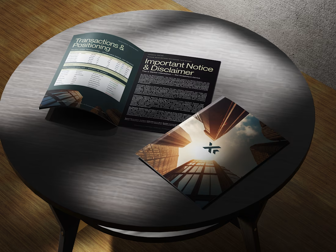
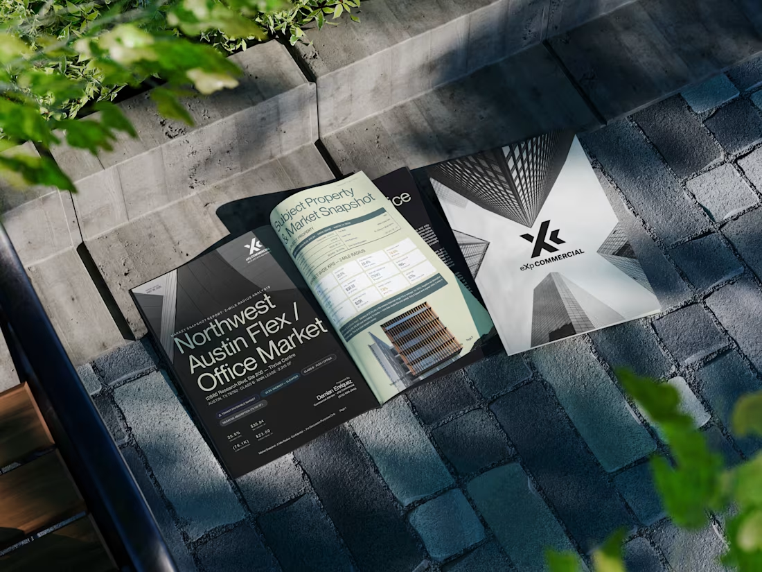
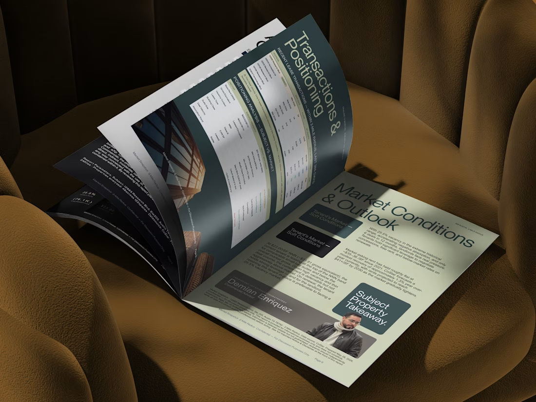
Designed a commercial real estate market report for a client, transforming dense property data, market insights, lease comparables, and positioning analysis into a clean, premium editorial experience.
The goal was to make a data-heavy report feel less like a spreadsheet and more like a publication, using strong typography, structured layouts, visual hierarchy, and architectural imagery while keeping the information easy to navigate.


The network for creativity
Join 1.25M professional creatives like you
Connect with clients, get discovered, and run your business 100% commission-free
Creatives on Contra have earned over $150M and we are just getting started











Related posts

Not every client comes to me for a brand identity and not all my clients are skincare or cosmetic brands.
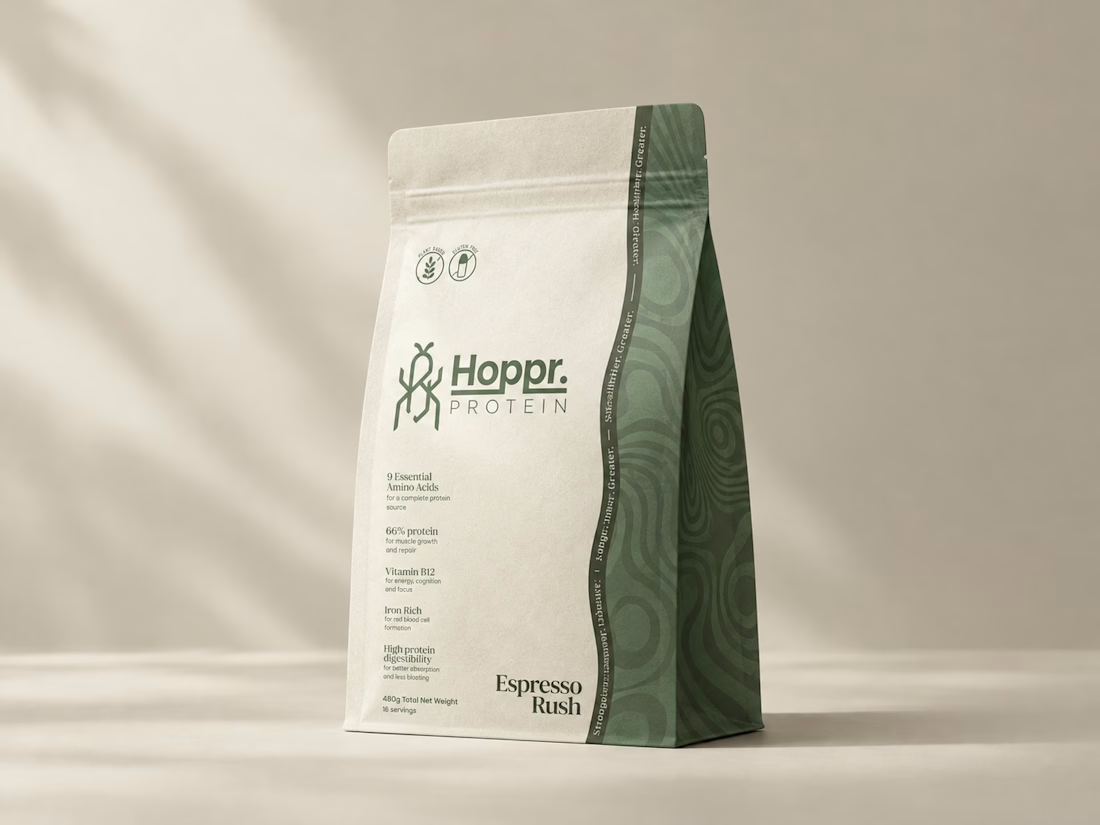
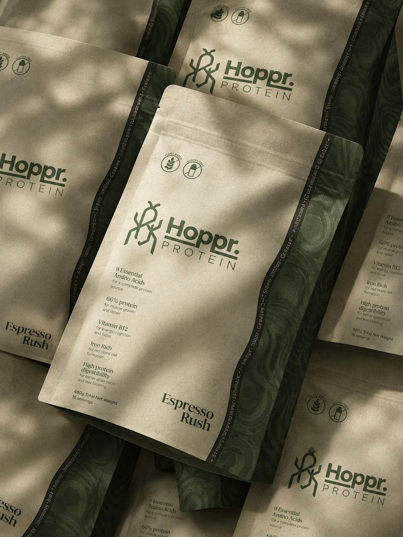
That was the case with Hoppr, a protein powder brand made from crickets. 🦗 YES, CRICKETS!
Sometimes the logo, colors, and visual system are already there and my job is to bring them to life on packaging and see how far I can push them.
I love projects like this because I get to play with typography, layout, and materials while working within an existing identity.
How much freedom do you think a designer should have when working with an established brand?

Great packaging work, nice job

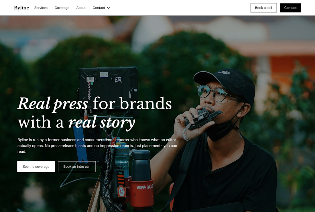
Built this in Framer as a concept project. Goal was to make it feel run by ex-journalists. Choices: editorial serif (Libre Baskerville), a dark photo with one color accent, and copy that positions against blast-style PR.
Where I’m unsure: text legibility over the photo and whether the two CTAs compete. What would you change?



That's great design it feels professional I like how the background mixed with interface ❤️❤️
Great job Cheree🎉🎉

That's really great visual branding 🔥🔥