The network for creativity
Join 1.25M professional creatives like you
Connect with clients, get discovered, and run your business 100% commission-free
Creatives on Contra have earned over $150M and we are just getting started
Back to feedPost
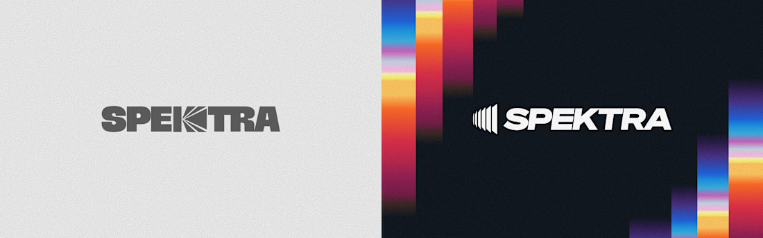
Taste Test


Both are nice. I prefer the light option. It has a great feel. Which one do you like?


White winnig here.

Both looks good but Voted a Dark one which grabs one shot attention!!


Light looks more composed😍 . Val!

light one kills it man, awesome


Nice design !

Dark looks better. The white font POP with background

Light one 🙌


Light mode

LIGHT ONE LOOKS MORE GOOD

Dark one looks better from my own perspective.


on the light one your photo blends into the banner.. the dark one keeps the circle

Dark looks great!

light works well tho

Dark version wins for me, the contrast makes soonafter pop so much more against that gradient. Curious what tipped you into testing both instead of just trusting instinct, was there client pushback on an earlier direction?

Light

I like dark

The dark mode has a more premium feel

The gradient on the light one frames the statement and pulls my eyes towards it, but I actually like the dark colours more. (just to be difficult 😅)

Dark look more realistic

Lighter is better with your background color of your picture

Dark

Great job delivering a cohesive experience.

The font is goooddddd

Dark won by a hair here but honestly it makes sense for a studio brand, it reads more confident at a glance.
The network for creativity
Join 1.25M professional creatives like you
Connect with clients, get discovered, and run your business 100% commission-free
Creatives on Contra have earned over $150M and we are just getting started





Related posts

Same prompt. Two builders.
One site made with Lovable, one with Google AI Studio. A Flemish still-life snack brand, gilt frames, GSAP scroll, the works.
Which one is better?
33 voted
67%

16 voted
33%

49 votes
Closed


The thing I keep relearning: a design is never finished because someone ran out of ideas. It's finished because someone decided to stop. Knowing when to stop is the hardest part.
Damn.... Crazy colors 👏😍

Next intelligence. A brand you can feel.
Ice blue, deep black and refracted glass bring texture, depth and a sense of touch to an invisible technology. An identity designed to be recognised. And felt.
Brand identity and visual direction for Niwos, a platform that brings AI agents together as a digital workforce.
Five modules. One W. A simple idea at the heart of the identity: working as one.
I’ve really enjoyed working on this project with Muhammed. His trust in my design judgement and openness to new ideas gave me the creative freedom to explore fully.
Here’s hoping this is just the first chapter of an exciting journey with him and his team.


👍 nicely done