The network for creativity
Join 1.25M professional creatives like you
Connect with clients, get discovered, and run your business 100% commission-free
Creatives on Contra have earned over $150M and we are just getting started
Back to feedPost
Recruitment is a people business. The brand should feel the same way.
Wayforce connects top talent with businesses and needed an identity that spoke to both sides at once. Sharp enough for the companies hiring. Human enough for the candidates being placed.
The mark does two things: reads as W, moves like a direction. Acid yellow that stands out in a category full of grey corporate sameness.
Not another recruitment agency. A force that knows where you’re headed.

TOP!!

Thanks!

Amazing!
Thank you!

That two-sided brief is the hard one — you can't just lean corporate or lean warm and call it balanced. The mark holding both feels earned, and you can tell the logotype is doing the heavy lifting on the human side while the construction keeps it sharp enough for the...

Great business identity I like modern stuff 🎉🔥

adore this!


Nice work🔥👏👏

This is wonderful man. love the branding
Thank you man!
Most welcome buddy


love the thinking behind this. sharp for companies, human for candidates - that balance is so hard to nail. mark looks really strong too


The network for creativity
Join 1.25M professional creatives like you
Connect with clients, get discovered, and run your business 100% commission-free
Creatives on Contra have earned over $150M and we are just getting started
Challenges
View all


Related posts


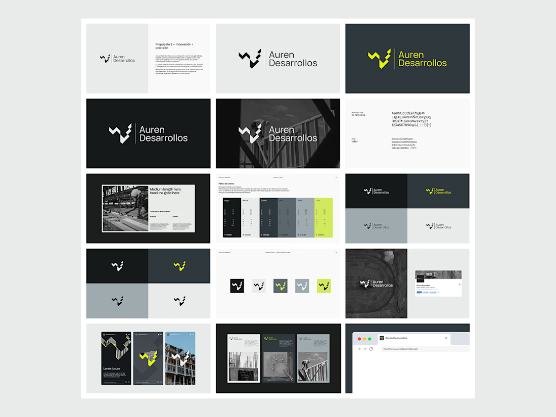
Not every direction makes it to the final brand.. this was one of the directions we explored for Auren Desarrollos, a new construction and development company we’re currently working with on its branding and website.
I’ll be sharing the final result soon, and I think the difference will be interesting to see.
What do you think?



Great!

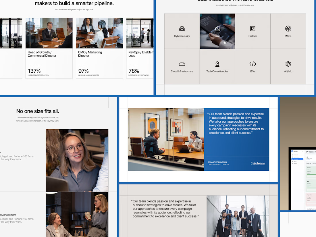
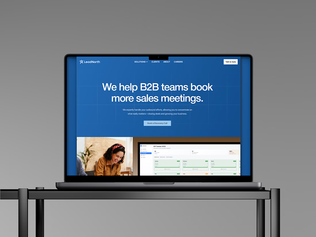
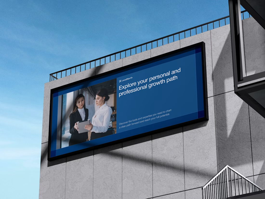
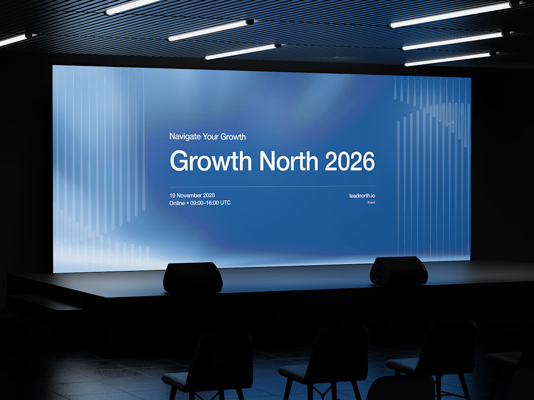


That saturated cobalt blue carries cleanly from the laptop hero onto the outdoor billboard and the Growth North 2026 stage screen.

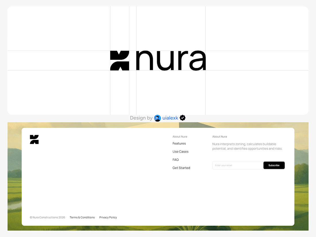
Branding design and Framer Development for an AI real estate tool
See full Case study


amazing work!🚀