The network for creativity
Join 1.25M professional creatives like you
Connect with clients, get discovered, and run your business 100% commission-free
Creatives on Contra have earned over $150M and we are just getting started
Back to feedPost
VANTA — Independent Cinema Logo Direction
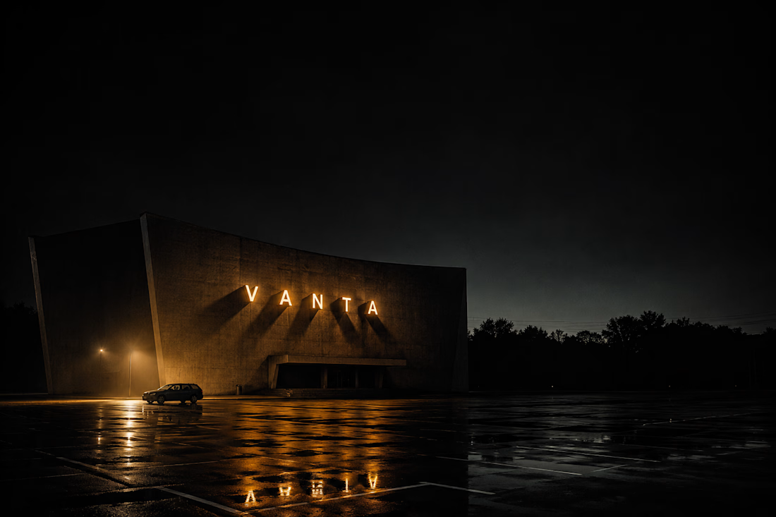
VANTA is a logo direction for an independent cinema production house built on a single principle: that film is the most direct route into real experience. The brief demanded a mark that felt inevitable — as though it had always existed and only needed to be uncovered.
The mark is a circle intersected by a single diagonal slash at exactly 67.5°. The circle is the reel, the lens, the iris. The slash is the aperture blade, the projector beam, the cut between frames. Together they describe cinema in its most irreducible geometry. No decoration earns its place here. Only the essential.
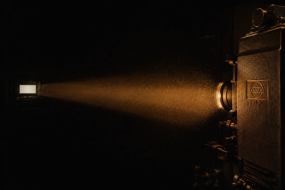
The Atmosphere Lock across all AI frames — a single tungsten source at 3,200K from the upper left, Kodak 5219 pushed one stop, Roger Deakins' chiaroscuro discipline married to Hiroshi Sugimoto's architectural stillness — creates a visual world that makes the identity feel as though it was found in a projection room rather than designed in a studio.
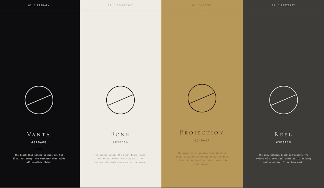
The color world runs on four tones: Vantablack for silence, Bone for the screen before the film, Projection amber for the moment the light hits the dust, and Reel grey for the seriousness of the work being done.
M N LOKESHWAR REDDY, Creative Director.



Link to the full project:
https://www.behance.net/gallery/249928719/VANTA-Independent-Cinema-Logo-Direction
The network for creativity
Join 1.25M professional creatives like you
Connect with clients, get discovered, and run your business 100% commission-free
Creatives on Contra have earned over $150M and we are just getting started
Related posts




Love this!





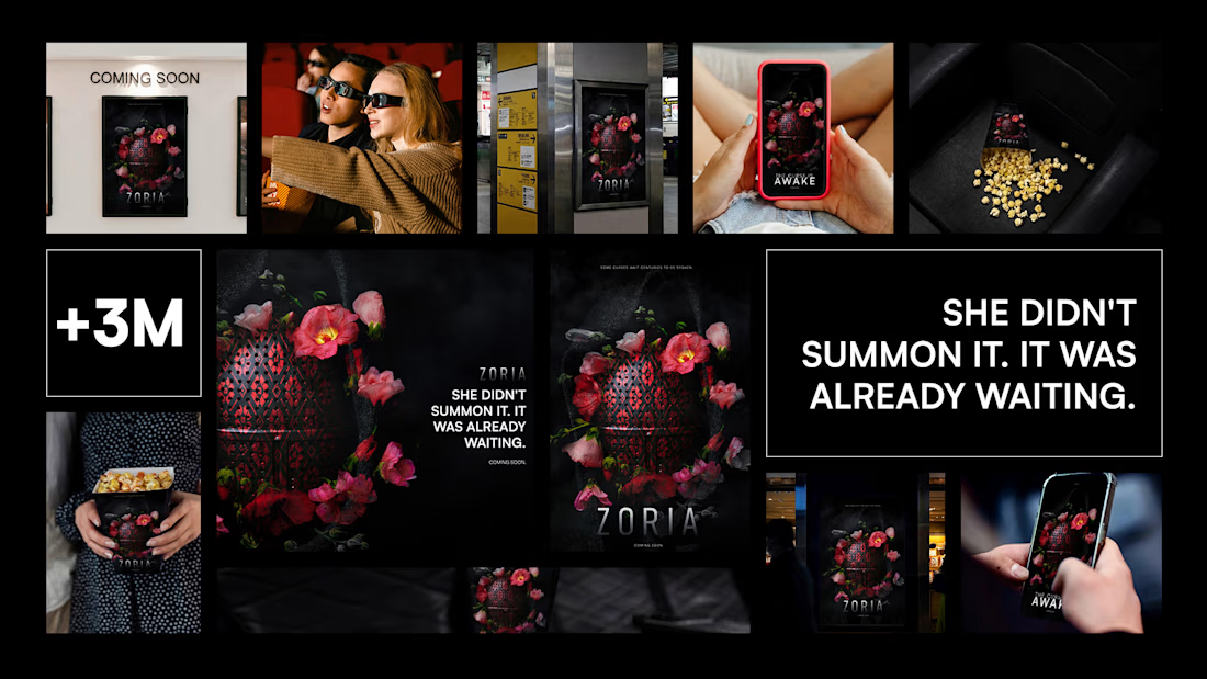
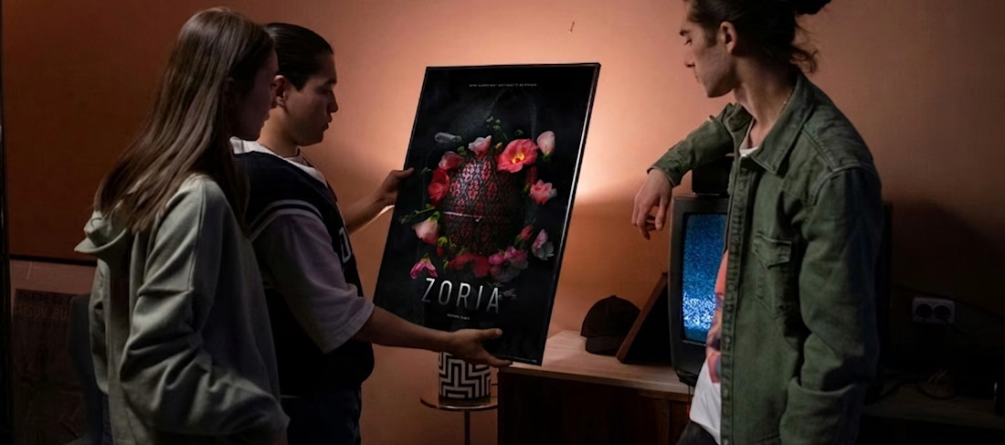
You've seen Slavic mythology before. Folk patterns, red corsets, candlelit forests. You already know how that story looks.
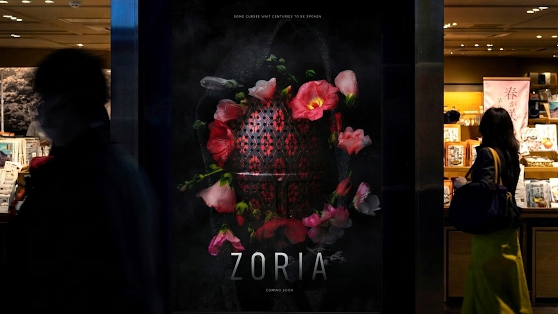
Zoria is different — and the poster had to prove it before a single frame was screened.
The challenge: create a visual identity for a dark fantasy short that feels nothing like what came before. No illustration. No folklore clichés. Just one image that pulls you in and makes you need to know how it ends.
A latticed ceremonial object. Flowers that shouldn't be blooming. A curse that was already there before you noticed it.
Some curses wait centuries to be spoken.
portfolioreviewfreelancerlifemovieposterBrand DesignGraphic DesignProduct DesignAdobe After EffectsAdobe IllustratorAdobe Photoshop



Obsesseddddd!!!








Trending

Claude
Claude has entered the design space. How are you using Claude Design?

Contra University
Learn from expert creatives how to earn more using next-gen AI tools.
creativeaiflow
Creative AI workflows are evolving. What tools do you use, and what are their strengths and weaknesses?
portfolioreview
The best portfolios tell a story, not just show a grid. Share yours for feedback.
freelancerlife
Freelancer life is wins, pivots, and everything in between. What’s yours right now?