The network for creativity
Join 1.25M professional creatives like you
Connect with clients, get discovered, and run your business 100% commission-free
Creatives on Contra have earned over $150M and we are just getting started
Back to feedPost
Taste Test

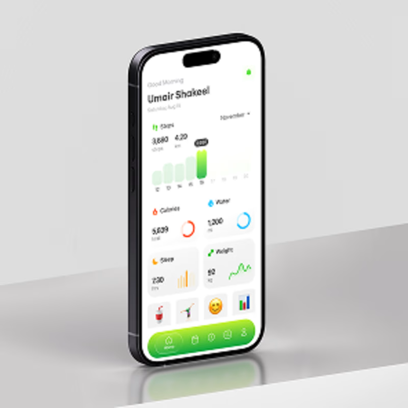
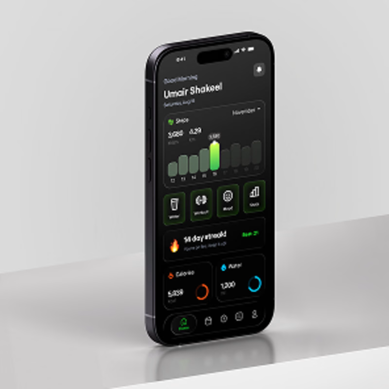
Same health & fitness dashboard. Two completely different moods.
☀️ Light Mode feels clean, fresh, and easy to scan.
🌙 Dark Mode feels focused, immersive, and gives the activity data more
visual punch.
For a fitness product, both directions can work but the choice changes how the entire experience feels.
If you were using this app every day, which one would you choose?
Poll:
☀️ Light Mode
🌙 Dark Mode
UI/UX design for a health & fitness mobile app in both light and dark mode.
And I’m curious what made you choose it? 👇
#UIDesign #UXDesign #ProductDesign #MobileAppDesign #Figma #FitnessApp #HealthApp #DarkModeUI #LightModeUI #MobileUI #AppDesign #ProductDesigner #UIUXDesigner #DesignInspiration #FitnessUX
3 votes
Ends in 1d
The network for creativity
Join 1.25M professional creatives like you
Connect with clients, get discovered, and run your business 100% commission-free
Creatives on Contra have earned over $150M and we are just getting started
Trending
retrofuturism
Share your favorite designs from the past exploring the distant future. Or your own take on the aesthetic 🚀
halftone
Dots. Texture. Grain. Let's see your designs using the halftone technique.

Midjourney
Creatives are showing off what they're making with Midjourney.
colorgrade
Video editors sound off: How do you enhance the mood of your video in color grading?





Related posts

Designed the landing page UI for Agent OS — a next-generation AI platform that helps art directors, designers, and studios streamline their generative workflows.
B2B AI tools often fall into the same trap — they look like overly complex, highly technical dashboards. The goal was to build an interface that actually appeals to creative professionals, balancing advanced AI capabilities with a premium, highly aesthetic visual language.
An editorial art direction that blends modern sans-serif fonts with elegant serif italics, paired with striking, organic floral visuals. I used a glassmorphic chat overlay to showcase the AI's prompt-to-image generation feature directly in context. It proves that generative tools can feel deeply human, inspiring, and beautiful rather than purely functional.
What's in the interface:
— Contextual glassmorphic chat overlay
— High-contrast editorial typography system
— Seamless blend of organic photography and precise UI elements
— Clean, conversion-optimized top navigation
The process:
— Midjourney: Generated the vivid, high-fashion floral photography and campaign assets.
— Jitter:Crafted the smooth UI motion and interactions for the floating chat interface.
— Figma: Designed the entire layout, typography, and UI system.
A case in making artificial intelligence feel like a creative partner, not just a software tool.


stunning work, the animations flow so well!

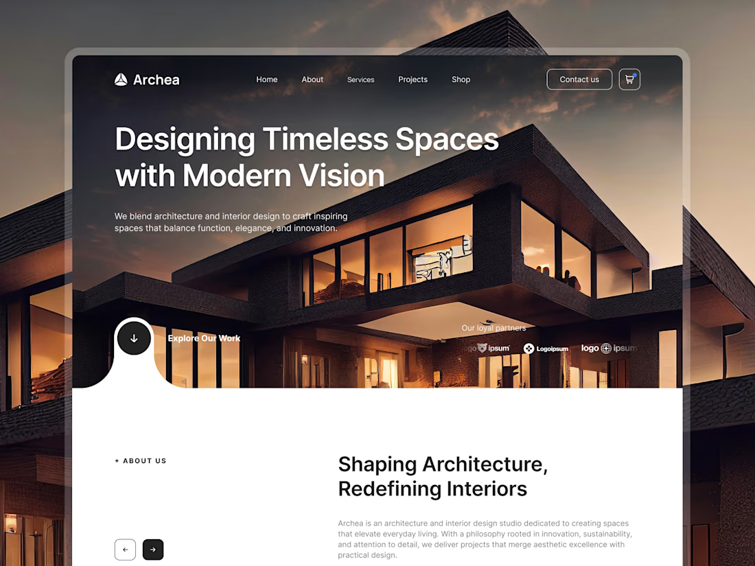
New case study is live: Archea - Architecture Studio Website 🥳
23 pages, 3 build phases, 4 homepage variations, all tied together with Tailwind variables for consistent spacing across every block and button.
Full case study is up now, link below. Let me know which homepage variation is your favorite 👇

Great job

What makes people fall in love with a new product? Simplicity and care🫸🏻🫷🏻
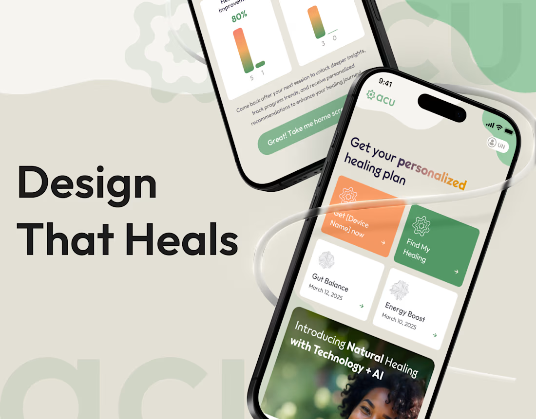
Our team has recently finished the design for a new AI wellness app. When it comes to health, people are naturally cautious. So our main goal was to make the whole experience feel safe and approachable.
We put the full design story into our new case study. Unpack it!🍿
And hey, if you're building something in health, wellness or AI, we're all ears. Send us a message and let's make it worth every dollar you invest.


Orange and green are such a premium, distinctive combination , You have used them perfectly.💖🔥