The network for creativity
Join 1.25M professional creatives like you
Connect with clients, get discovered, and run your business 100% commission-free
Creatives on Contra have earned over $150M and we are just getting started
Back to feedPost
COCO Specialty Coffee Cosmetics
It was our first project together with Anna as Heed Collective
Feels especially meaningful to finally reveal it to the world!
We’ll share more details in the next posts, but for now — a little teaser of what we’ve been building together 🖤


Looks amazing, great job! The animation is very captivating and makes complete sense among all the branding material


thank youuu! adding some motion is my favourite final touch in design projects 🤌

Love this!

Great work!
thaaanks! 🫶


Wow this turned out so well @Stacy · Heed Collective and @Anna Gudvin · Heed Collective ! 👏 what inspired the color palette? Lovely and surprising

Thank You @Alex Ginsberg 🙌 We started by building the palette from the material itself — choosing aluminium to reduce plastic within the budget. From there, it became about finding an interesting, distinctive pairing that works in synergy with the aluminium and acts as a strong accent across the system.

So stylish!

COCO Specialty Coffee Cosmetics is such a brilliant concept — the intersection of wellness and specialty coffee culture is so on-trend right now. Can't wait to see more! Congrats to you and Anna on your first Heed Collective collab!


oooh love this! so good! 🔥

Thaaanks! 🥰

La touche !

Love it!

Wow looks great! And the video is super effective, what tool did you use to create it?
Figma, After effects
The network for creativity
Join 1.25M professional creatives like you
Connect with clients, get discovered, and run your business 100% commission-free
Creatives on Contra have earned over $150M and we are just getting started

Challenges
View all


Related posts


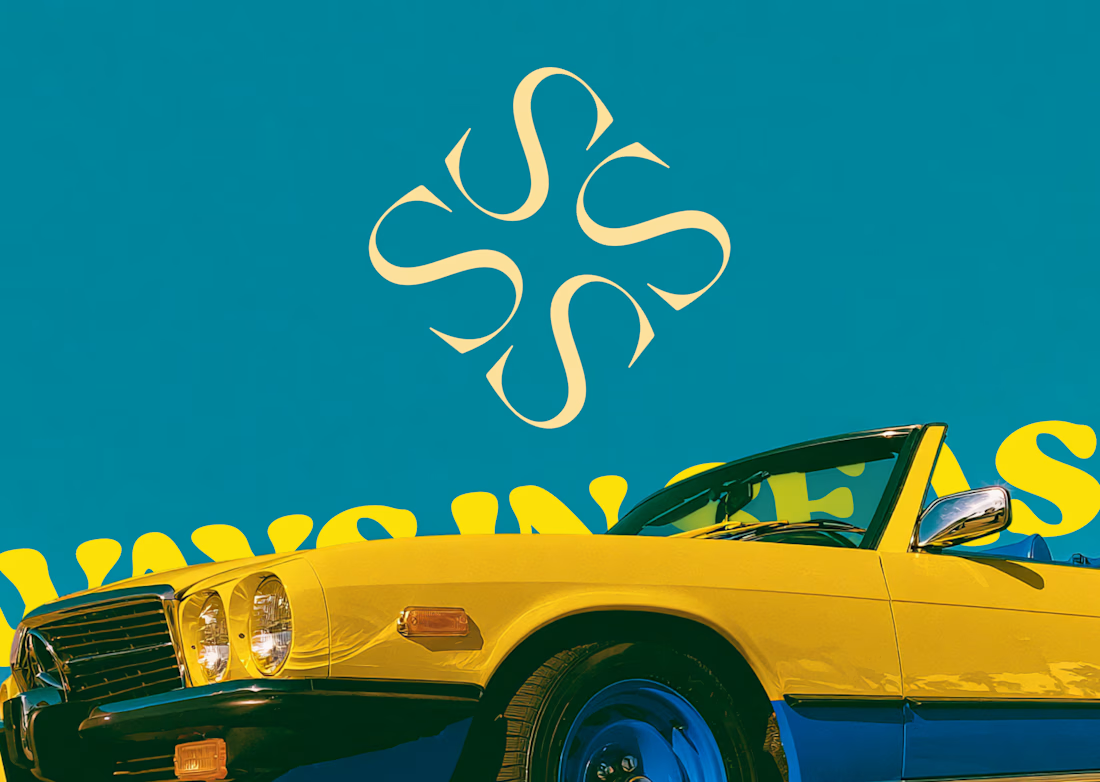
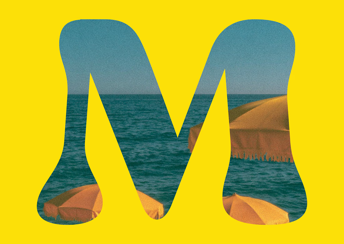
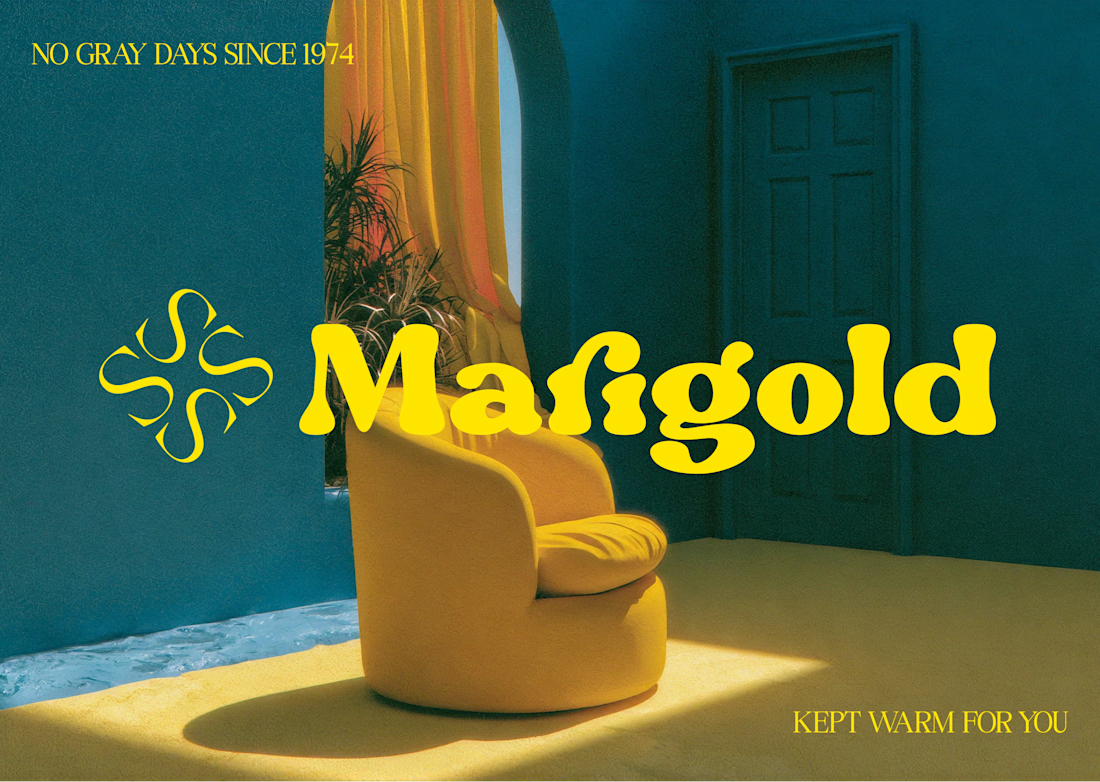
Marigold is a one day concept for envato's human by design challenge. i set the direction in real photography first then generated against that standard.




Client’s choice vs. Designer’s choice 👀
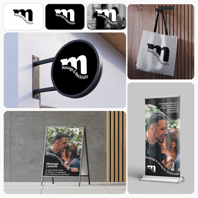
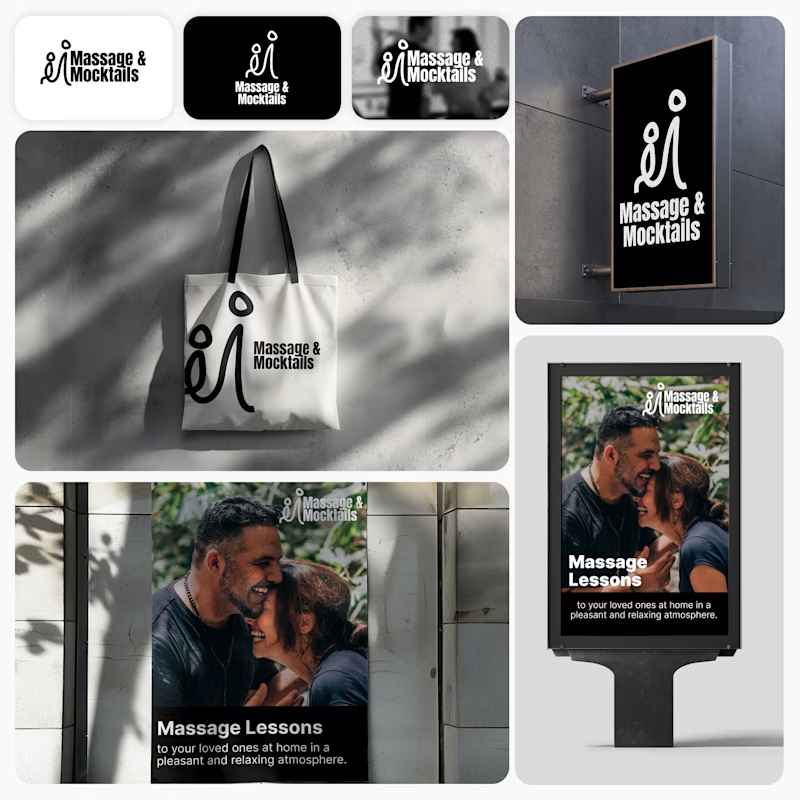
I’m currently working on a branding project for Massage & Mocktails — a concept built around couples learning massage together in a relaxed, social atmosphere.
These are two early, black & white directions from Stage 2 of my branding process, before moving into color, typography, and the full visual system.
The interesting part?
My client chose Concept 1. I chose Concept 2.
Now I’m curious what other creatives think.
Which direction would you choose — 1 or 2? And why?
Sometimes the most interesting part of branding is seeing how differently a client and a designer respond to the same brief.
21 voted
44%
27 voted
56%
48 votes
Closed

Concept 2 for me. That interlocking figure mark reads as two people meeting, which is the actual brief here, so it gives you more to build a system on. Concept 1 is the safer, more literal pick, which is usually why clients reach for it.

One idea, held all the way through: name, object, photography, palette, motion.
That's the whole pitch for how I work.
AQUILIFER — a brand I built around this: jewelry as something carried, not worn.
The name comes from Roman military rank. The aquilifer carried the standard, the one thing the legion couldn't afford to drop.