The network for creativity
Join 1.25M professional creatives like you
Connect with clients, get discovered, and run your business 100% commission-free
Creatives on Contra have earned over $150M and we are just getting started
Back to feedPost

Just published Melu, a skincare identity that swaps clinical for citrus.
Rounded wordmark, a gradient for each product, and oranges, pears and seed pods across the packaging.
A little care. A brighter day.
Full case study on my profile.
The network for creativity
Join 1.25M professional creatives like you
Connect with clients, get discovered, and run your business 100% commission-free
Creatives on Contra have earned over $150M and we are just getting started



Related posts


Niceee


ESE GIN — Between the Dunes | Visual Identity & Packaging
ESE GIN draws its curves from the dunes. The signature S catches the light in sculpted olive glass and leaves its imprint in wax.


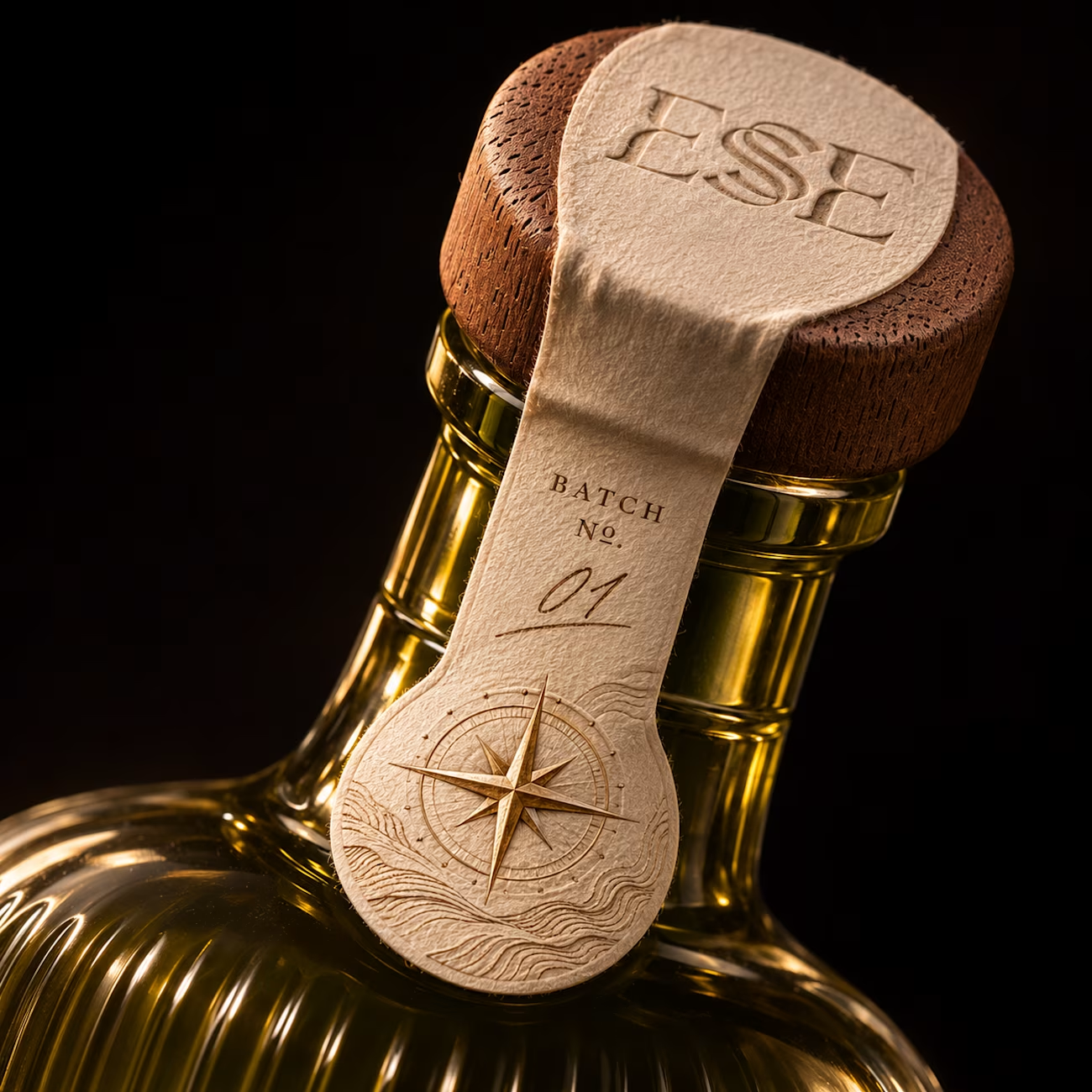
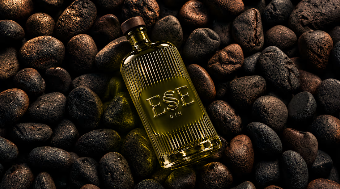
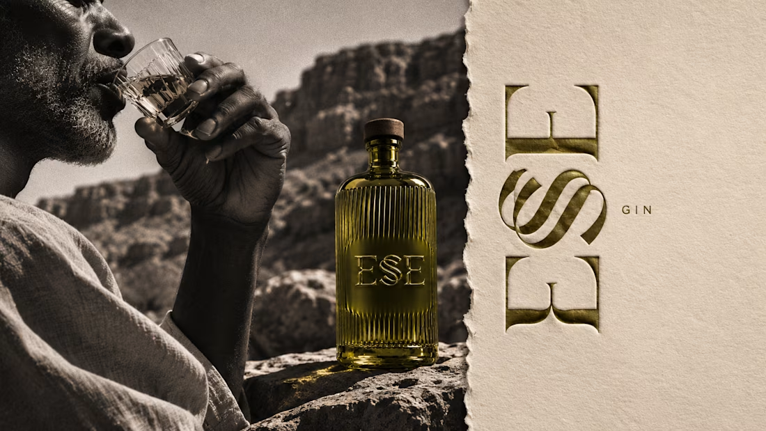
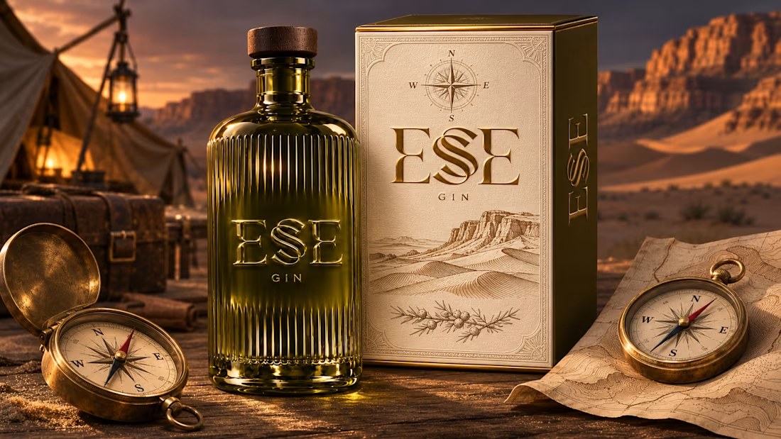

This is gorgeous, Maya — the sculpted olive glass with that S catching the light is such a clever way to carry the dunes into the bottle itself. And the wax seal imprint is a beautiful finishing touch, it gives the whole thing a crafted, almost apothecary feel. Really cohesive...

A migration is not complete when the pages have moved. It is complete when the customer journey still makes sense.
For DVA, the work brought a Wix website, two lead funnels, a client portal, and segmented nurture automations into a clearer Kajabi experience.
Five checks I use before launch:
Map every public page and redirect.
Rebuild forms, tags, and follow-up paths.
Test offers and product access with a real user journey.
Check mobile pages and portal navigation.
Document what the client will manage after handoff.
#Kajabi #PlatformMigration #CourseCreator


two funnels, a portal, and nurture in one move. thats a lot of moving parts
