The network for creativity
Join 1.25M professional creatives like you
Connect with clients, get discovered, and run your business 100% commission-free
Creatives on Contra have earned over $150M and we are just getting started
Back to feedPost

Project Type: Course Portal Design | Kajabi Development | Digital Learning Experience
Project Overview
Designed and customized a branded Kajabi course portal for Master Leadership Systems, creating a structured and engaging learning environment for its Goal Setting and Achievement Series.
Design Approach
Cohesive branding: Teal, white, and consistent typography create a professional, unified learning experience.
Intuitive course navigation: Organized modules, lessons, and progress tracking help students easily access their training.
Multimedia integration: Video lessons, downloadable workbooks, and supporting resources enhance the learning experience.
Personalized layout: Instructor information, course previews, and clearly defined content sections create an inviting member experience.
The Result
A professional, user-friendly digital learning portal that transforms educational content into an organized, accessible experience, helping students navigate lessons, track progress, and engage with course materials.


A well-organized learning portal makes such a difference for course completion, Karina. The cohesive teal branding with progress tracking gives students a clear path through the material. Professional work.
The network for creativity
Join 1.25M professional creatives like you
Connect with clients, get discovered, and run your business 100% commission-free
Creatives on Contra have earned over $150M and we are just getting started








Related posts


Would you buy a course if you couldn't see what's inside?
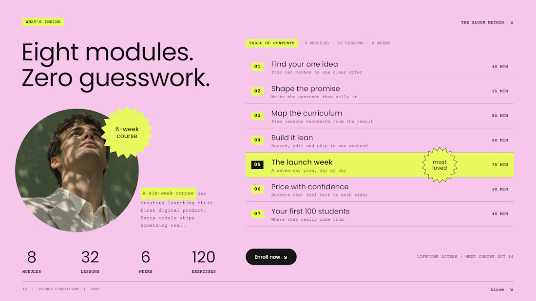
On most Kajabi sales pages, the curriculum sits in a collapsed accordion, and most visitors never open it. So we designed it as an open table of contents: the whole course, readable at a glance.
Three decisions make it work:
1. Numbers you can scan. Big module numbers on a highlight turn eight modules into a path, not a wall of text.
2. Time next to every module. Effort is part of the price. "75 min" answers a question buyers are shy to ask.
3. One module in the spotlight. The signature lesson gets the star. The rest stay calm, so the eye knows where the value peaks.
And one quiet fix: neon lime on pink looks bold but reads at about 1.1:1 contrast. We keep lime as a marker behind dark text, never as the text itself.
A curriculum is the product. Show it like one.
Do you open course accordions, or scroll right past them?

Beautiful Kajabi work execution and presentation.

Built something that isn’t client work for a change.
Flowkidz. Short games that teach kids design, websites, AI, code and internet safety.


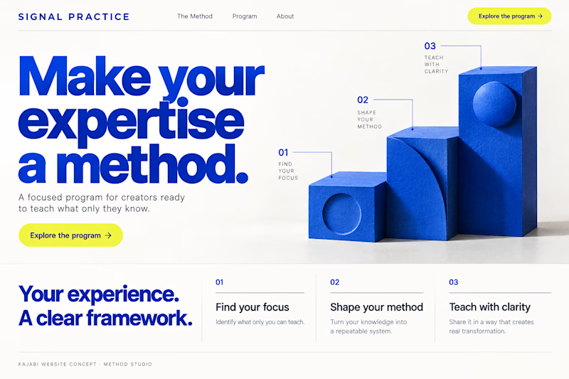
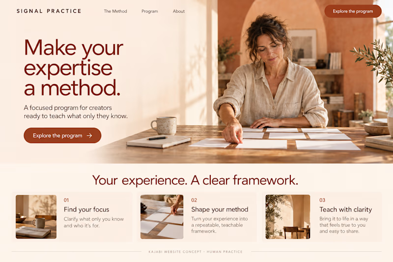
Which Kajabi direction makes a signature program feel more compelling?
Signal Practice is a coaching brand for established creators turning their expertise into a teachable method. Two original AI-generated website redesign concepts: Method Studio pairs cobalt geometry with a clear framework; Human Practice brings warmth, tactile imagery and a personal feel.
Same offer, two first impressions. Which would you explore—and why? Concept work, not a client build.
15 voted
54%
13 voted
46%
28 votes
Closed

Human practice looks good