The network for creativity
Join 1.25M professional creatives like you
Connect with clients, get discovered, and run your business 100% commission-free
Creatives on Contra have earned over $150M and we are just getting started
Back to feedPost
Would you buy a course if you couldn't see what's inside?
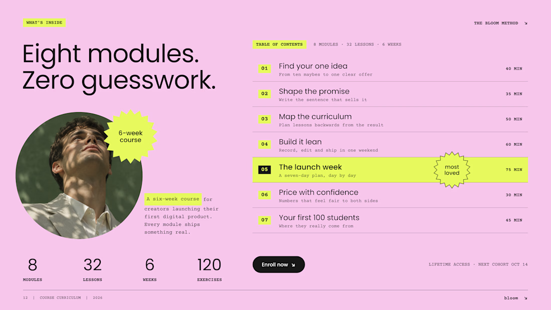
On most Kajabi sales pages, the curriculum sits in a collapsed accordion, and most visitors never open it. So we designed it as an open table of contents: the whole course, readable at a glance.
Three decisions make it work:
1. Numbers you can scan. Big module numbers on a highlight turn eight modules into a path, not a wall of text.
2. Time next to every module. Effort is part of the price. "75 min" answers a question buyers are shy to ask.
3. One module in the spotlight. The signature lesson gets the star. The rest stay calm, so the eye knows where the value peaks.
And one quiet fix: neon lime on pink looks bold but reads at about 1.1:1 contrast. We keep lime as a marker behind dark text, never as the text itself.
A curriculum is the product. Show it like one.
Do you open course accordions, or scroll right past them?


This execution deserve only praise. high end work

Showing the time next to every module is such a good detail. It answers the "how much work is this" question before the buyer has to ask.


Really like the thinking behind this! Making the curriculum visible upfront reduces friction and helps buyers evaluate both the content and time commitment. The highlighted module also creates a clear focal point. Definitely prefer this over hiding everything behind an accordion. Nice work👏


nice work

Beautiful Kajabi work execution and presentation.

Xtylish

The network for creativity
Join 1.25M professional creatives like you
Connect with clients, get discovered, and run your business 100% commission-free
Creatives on Contra have earned over $150M and we are just getting started







Related posts


Which Kajabi music-course design makes you want to hit play?
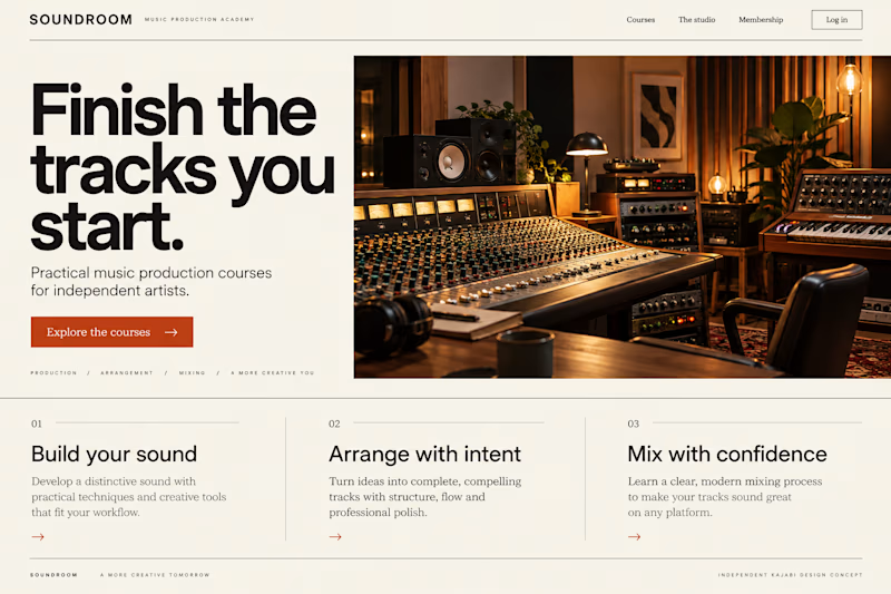
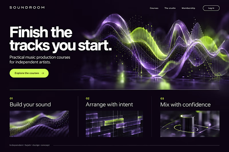
Two original AI-generated website concepts for Soundroom, a fictional music-production academy. Analog Studio pairs warm recording-room imagery with cream and burnt orange. Digital Rhythm brings luminous waveforms, midnight plum and acid lime. Same course, two different first impressions.
Which direction would you choose?
28 votes
Ends in 14h

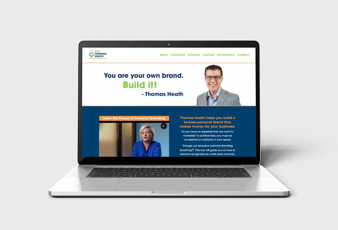
Kajabi website design and development for personal branding coaches, consultants, speakers, and business professionals who want to establish authority, showcase their expertise, and attract potential clients. This website features a professional layout with a strong personal brand message, video content, client testimonials, media features, trusted partner logos, and a clear call to action to encourage visitors to schedule consultations.
Designed to build credibility and communicate value, the website includes a structured service presentation, authority-building content, a featured branding roadmap, responsive layouts, and strategic conversion sections that guide visitors toward taking action.
Features & Functionality:
Custom Kajabi website design and customization
Responsive desktop, tablet, and mobile layouts
Personal branding and service presentation
Video content integration
Client testimonials and social proof
Media features and trusted partner logos
Consultation booking call-to-action
Authority branding roadmap presentation
Strategic content sections for lead generation
Clear navigation and user-friendly structure
Social media integration
Conversion-focused page layout



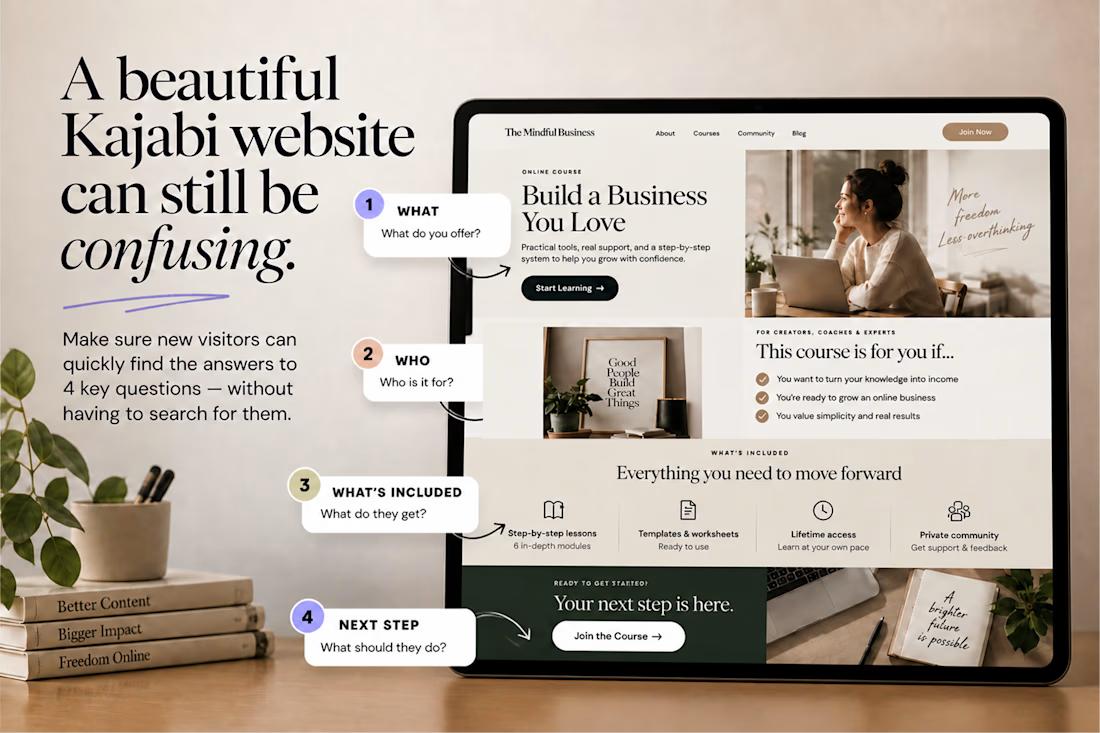
A beautiful Kajabi website can still be confusing.
One simple test:
👉 Can a new visitor understand what you offer, who it’s for, what they get, and what to do next without having to figure it out? If not, the problem may not be your design.
It may be your information hierarchy. Good UX doesn’t just make a Kajabi website look polished. It makes the right information impossible to miss.

Nice work, love it