The network for creativity
Join 1.25M professional creatives like you
Connect with clients, get discovered, and run your business 100% commission-free
Creatives on Contra have earned over $150M and we are just getting started
Back to feedPost


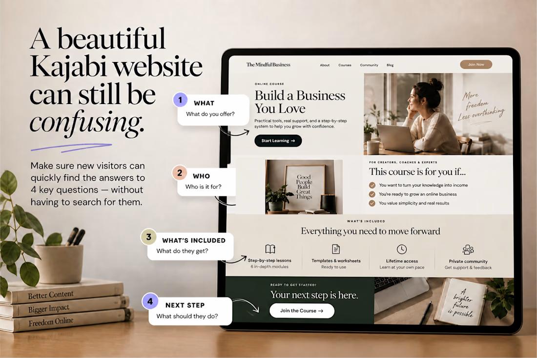
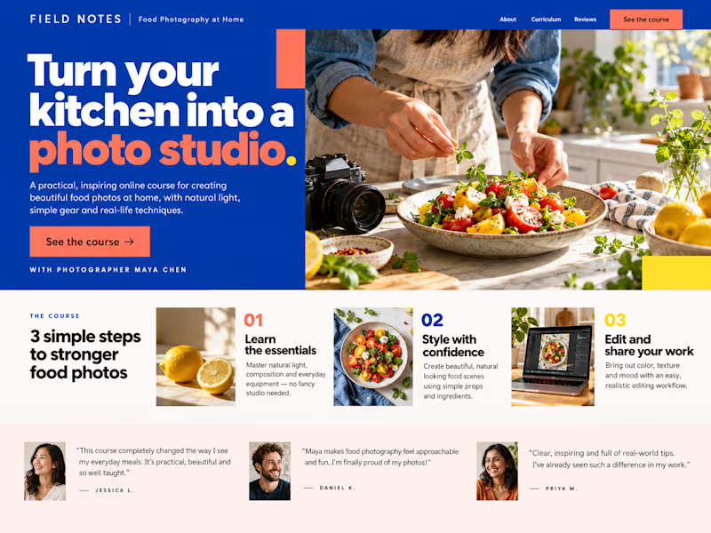
A beautiful Kajabi website can still be confusing.
One simple test:
👉 Can a new visitor understand what you offer, who it’s for, what they get, and what to do next without having to figure it out? If not, the problem may not be your design.
It may be your information hierarchy. Good UX doesn’t just make a Kajabi website look polished. It makes the right information impossible to miss.


Nice work, love it

good test, and it works for almost any site. i'd add one more question: what does it cost? hiding the price loses the people who were ready to buy.


so true. beautiful doesn't mean clear, that 4 question test is gold. saved this

This is a great example of how thoughtful design can elevate an online learning experience.
The network for creativity
Join 1.25M professional creatives like you
Connect with clients, get discovered, and run your business 100% commission-free
Creatives on Contra have earned over $150M and we are just getting started

Challenges
View all


Related posts


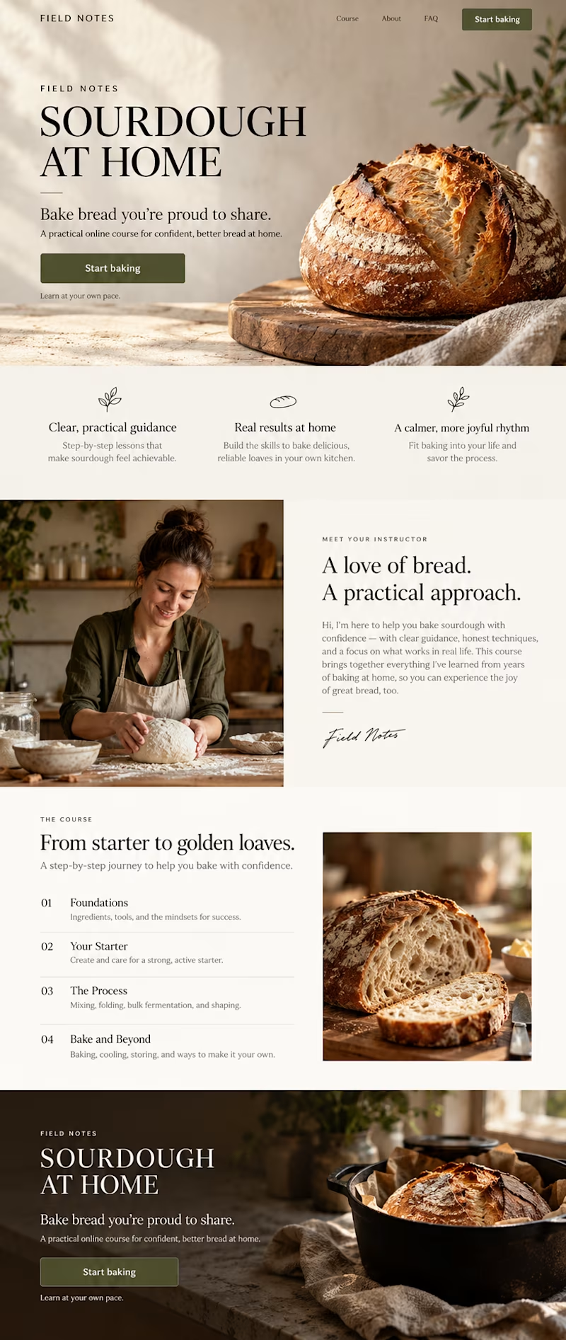
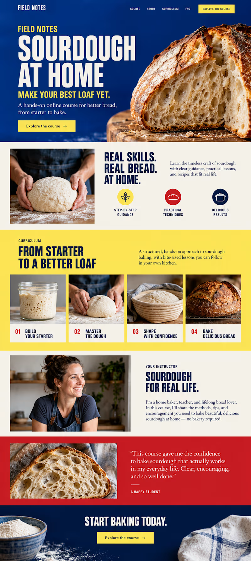
Which direction would you choose for a sourdough course sales page in Kajabi?
34 voted
59%
24 voted
41%
58 votes
Closed

B- Bold color is good
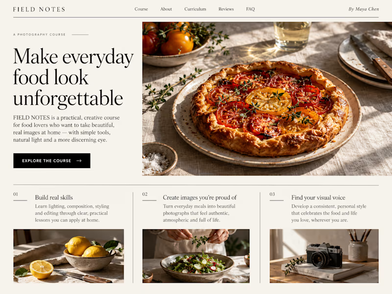
Which Kajabi sales page design would you choose for this course? Vote for A or B and tell me what made the difference.
23 voted
50%
23 voted
50%
46 votes
Closed

B still could be polished though...maybe try giving the text section little bit more real estate..I don't know


Product first or brand first? 🤔
We're cutting the promo reel for our case study and can't agree on its start. ✨
Which product ad opening would make you stay past the first 3 seconds?
Vote and tell why! 👇
Product DesignSoftware DevelopmentAdobe After EffectsCinema 4DFigmaBrand DesigncreativeaiworkflowUX Design


15 voted
25%
46 voted
75%
61 votes
Closed

I think both is important, but good product first.