The network for creativity
Join 1.25M professional creatives like you
Connect with clients, get discovered, and run your business 100% commission-free
Creatives on Contra have earned over $150M and we are just getting started
Back to feedPost
Taste Test


Which direction would you choose for a sourdough course sales page in Kajabi?

34 voted
59%
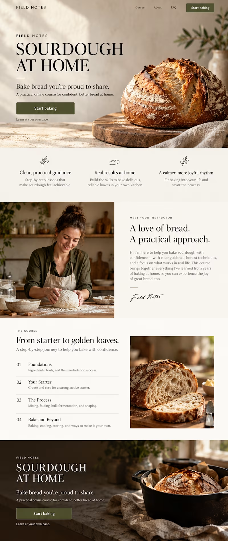
24 voted
41%
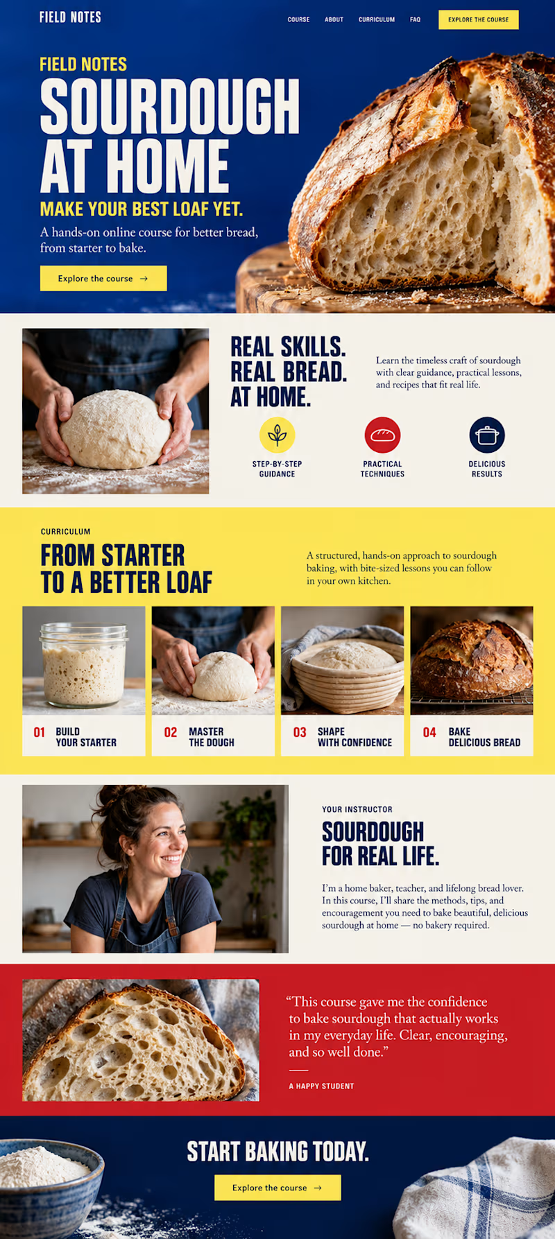
58 votes
Closed

Bold color is more attractive ❤️❤️

B- Bold color is good


A Warm Editorial giving a good vibes of the project!!

Great work

A-Warm Editorial. Its giving a warm/soothing feels

warm because mostly i took most of the time on the site with colors that resembles their products so for me the warm one is perfeclty balanced

creative one is B and minimal and clean one is A

Warm editorial feels right for sourdough. It matches the slow, handmade feel of baking.

I would choose A. It looks nice and neat.

Warm editorial is the best one.

Go with the bold design ❤️❤️


going with the warmer one

Warm like fresh sourdough coming out of the oven.

b button with bold color just stands out, with every thing suddenly having beige and brown color.

Good work Mathias, I answered A Warm Editorial, because it is more easy to read, has better flow and blocks have more space. I like B Bold Color but it depends on brand personality, if brand personality is bold, I would add more space to blocks.

Warm editorial ---- ( A ) 🔥

B feels intentional. A feels like a template (AI-slop).
The network for creativity
Join 1.25M professional creatives like you
Connect with clients, get discovered, and run your business 100% commission-free
Creatives on Contra have earned over $150M and we are just getting started





Related posts
Which Kajabi sales page design would you choose for this course? Vote for A or B and tell me what made the difference.
23 voted
50%
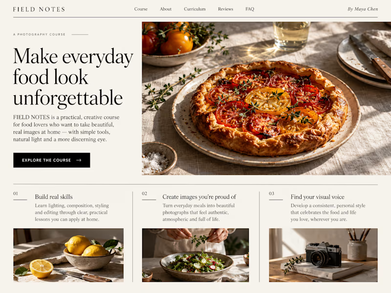
23 voted
50%
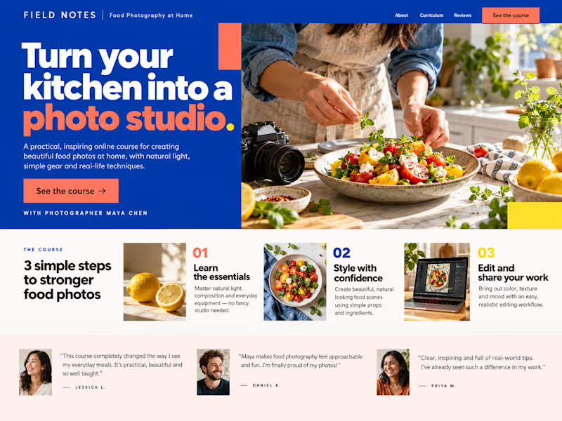
46 votes
Closed

B still could be polished though...maybe try giving the text section little bit more real estate..I don't know

Two color directions for an AI governance explainer. A draft AI use policy becoming the questions nobody can answer yet.
20 voted
77%
6 voted
23%
26 votes
Closed

blue for sure 💯

Kajabi Gym & Fitness Website Design
The client needed a modern fitness website that could present their gym, training programs, and membership options in a clear and engaging way. Their goal was to create a stronger online presence while making it easier for potential members to understand the services and take the next step.
I designed and built the website in Kajabi with a fitness focused visual direction, clear content hierarchy, intuitive navigation, responsive layouts, and strategically placed calls to action. I structured the key sections around the visitor journey from discovering the gym and its programs to understanding the benefits and getting started.
The result was a polished Kajabi gym website that gives the brand a more professional online presence and provides visitors with a clearer path from exploring the fitness offering to taking action.
#Kajabi #KajabiWebsite #KajabiWebDesign #KajabiFitness #KajabiGym #FitnessWebsite #GymWebsite #FitnessWebsiteDesign #GymWebsiteDesign #FitnessWebDesign #FitnessBusiness #GymBusiness #FitnessCoach #FitnessCoaching #PersonalTrainer #PersonalTraining #FitnessProgram #GymMembership #FitnessLandingPage #GymLandingPage

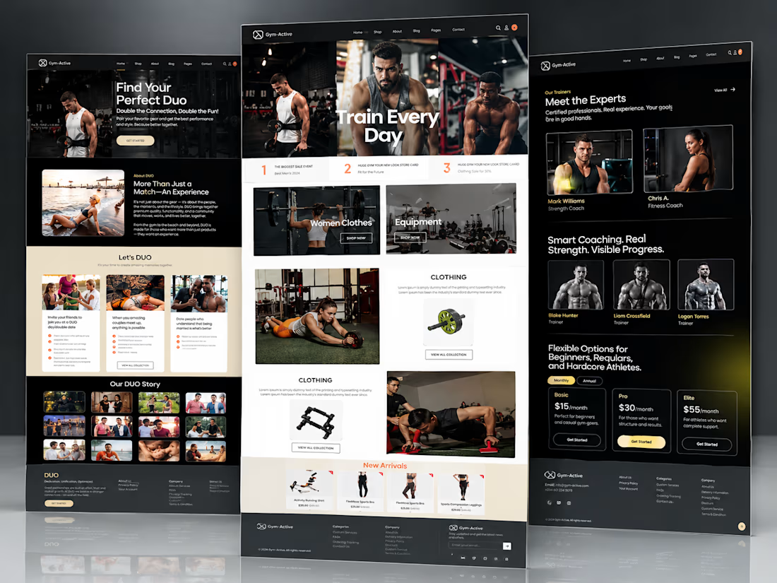


Well structured gym website