The network for creativity
Join 1.25M professional creatives like you
Connect with clients, get discovered, and run your business 100% commission-free
Creatives on Contra have earned over $150M and we are just getting started
Back to feedPost

POV: you're a designer but all you like to do is create delicious textures for ambitious clients ready to take a risk.
In the tech world where we're governed by minimalistic and sharp design, a new era is coming. The era of bold, colorful and textured design, where tech becomes... appealing 🍭


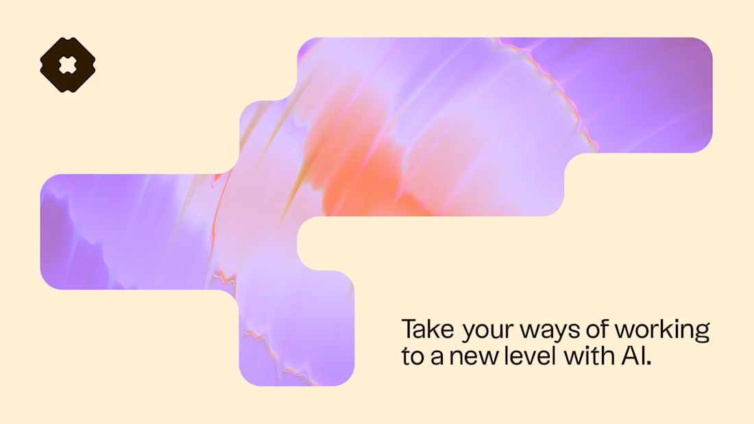
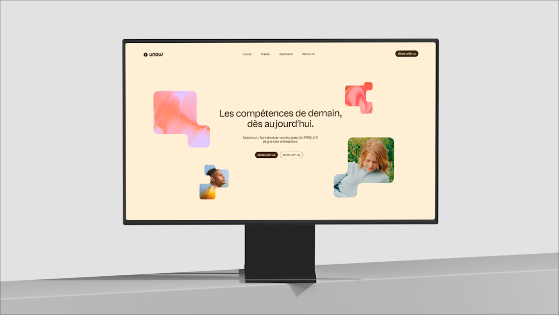
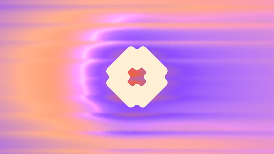
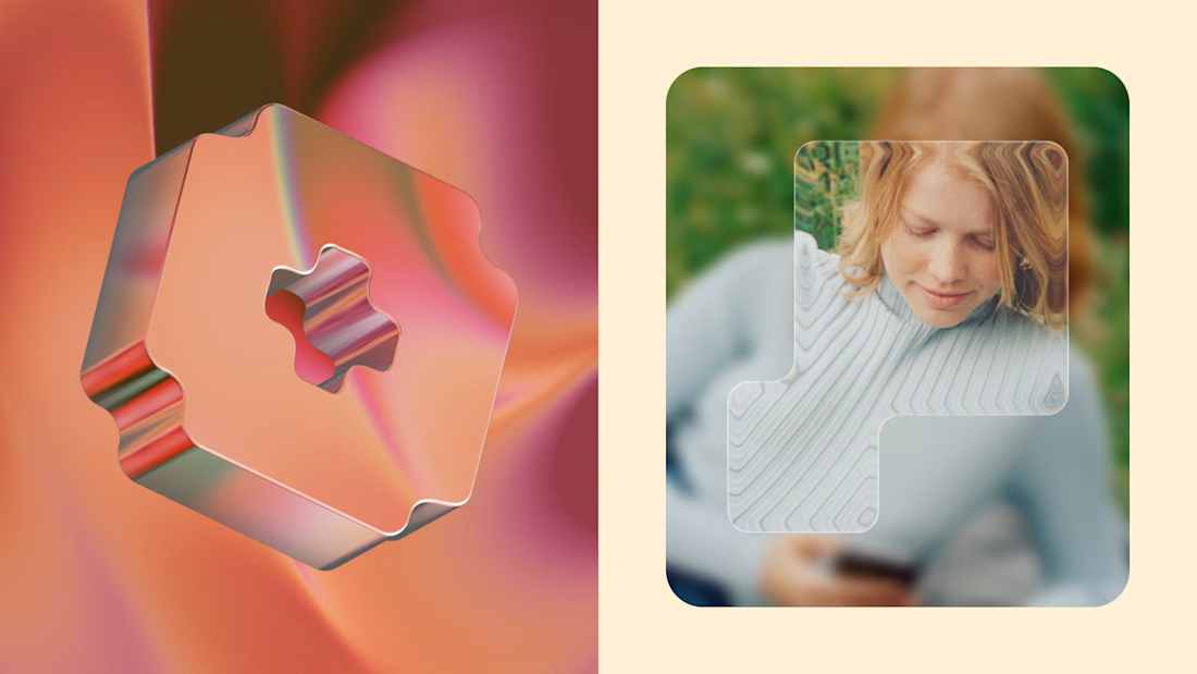

The real gatekeeper for textured brands is usually the product team, not the client — heavy texture tends to get traded away the moment someone raises load times or dark mode. The work that survives keeps the texture in marketing surfaces and lets the UI carry a quieter version....
Thanks for your comment! The textures will mainly be used for marketing and website. The product itself remains minimalistic because there will be data visualization.
But the tool that I'm using for the textures is made for UI integration and can be animation and/or interactive so super interesting.

Awesome 😍

The pendulum swinging back toward texture after years of flat minimalism feels overdue. Is this an easier sell now, or are you still convincing clients whose brief starts out safe?
I must be lucky because my clients recently all have the same brief - they want to stand out and lean towards going all in with colors and textures. A common ground is also to feel super warm and human so attractive colors also help.

I am loving the colors and vibe here!

this looks fantastic!

Thanks! No I used Unicorn Studio.

Good work

Love it

Love this! The textures, gradients, and 3D elements work so well together🔥


Outstanding work👏🔥🔥


Very thoughtful design.


Nice design !

Fantastic visuals! 🫶

I think this really calls for a vote. I posted something similar as well,.

This deserves more than just liking, this deserves to be featured! 🏆 Bringing rich, colorful textures into tech branding breaks the mold in the best way.

nice work

Really like how the mark is extended on to the other applications of the brand! Good palette selection too👌

Awesome!

nice.

Nicely done👏


Delicious is right. Well done, Julie!


yes, more of this please.

Amazing!!
wow


Elegant results

The bold textures and dreamy gradients feel fresh, expressive, and full of personality; such a strong visual direction. ✨


Complete agree with you on the new era of tech! I'm currently building a tech platform and we're soooo colorful and I just love using it hahahaha
The network for creativity
Join 1.25M professional creatives like you
Connect with clients, get discovered, and run your business 100% commission-free
Creatives on Contra have earned over $150M and we are just getting started







Related posts



Visual identity revision for a psychology and management consulting firm


handsome works! anyway did you use any ai to generate mockups on that? or you did manual

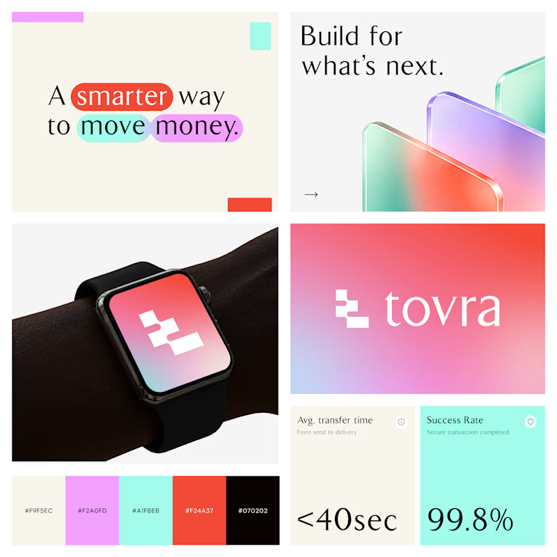
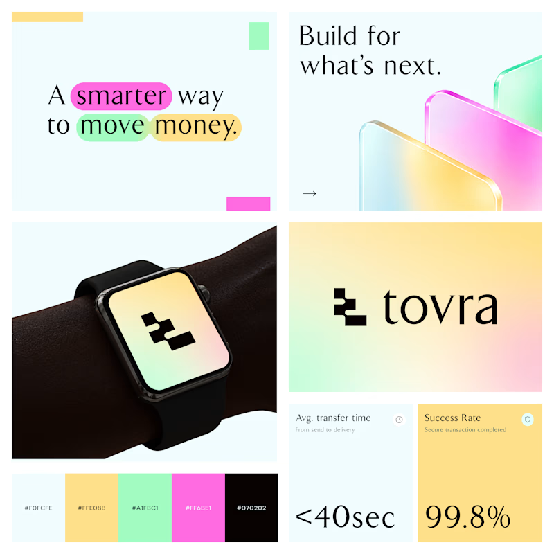
Two Color Directions. One Brand Identity.
Exploring two visual directions for Toyra, a modern fintech brand focused on making money movement smarter and simpler.
Both concepts feature bold typography, vibrant colors, playful gradients, and a clean visual identity.
Which color direction works better for Brand Option A or Option B? 👀
19 voted
40%
29 voted
60%
48 votes
Closed


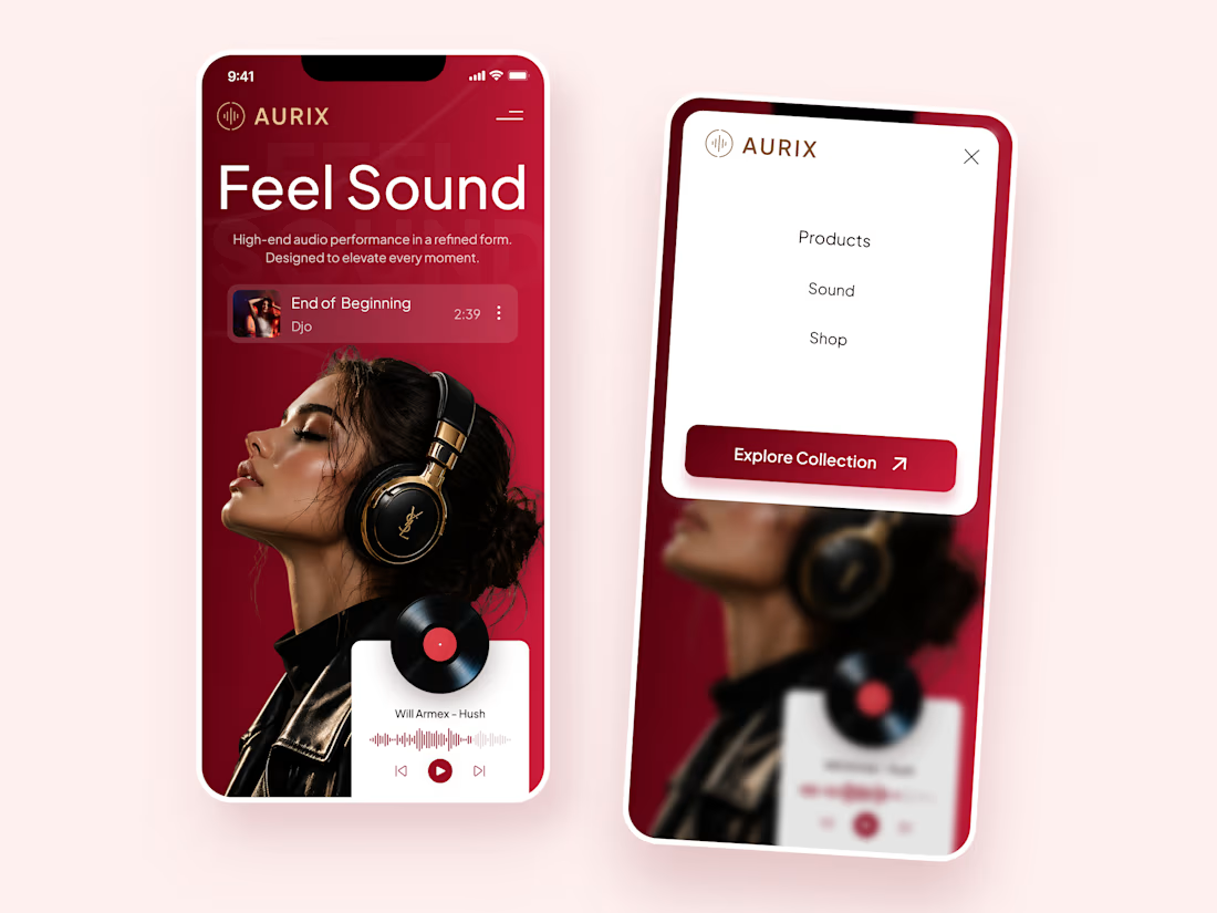
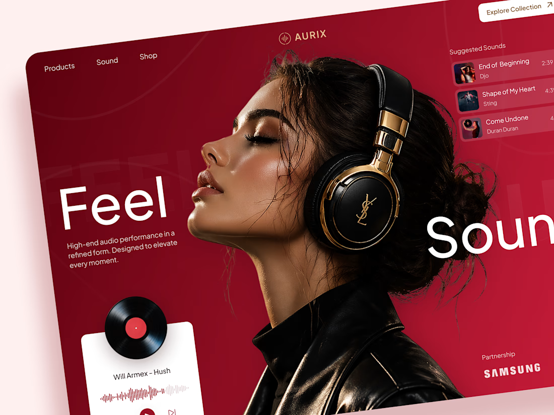
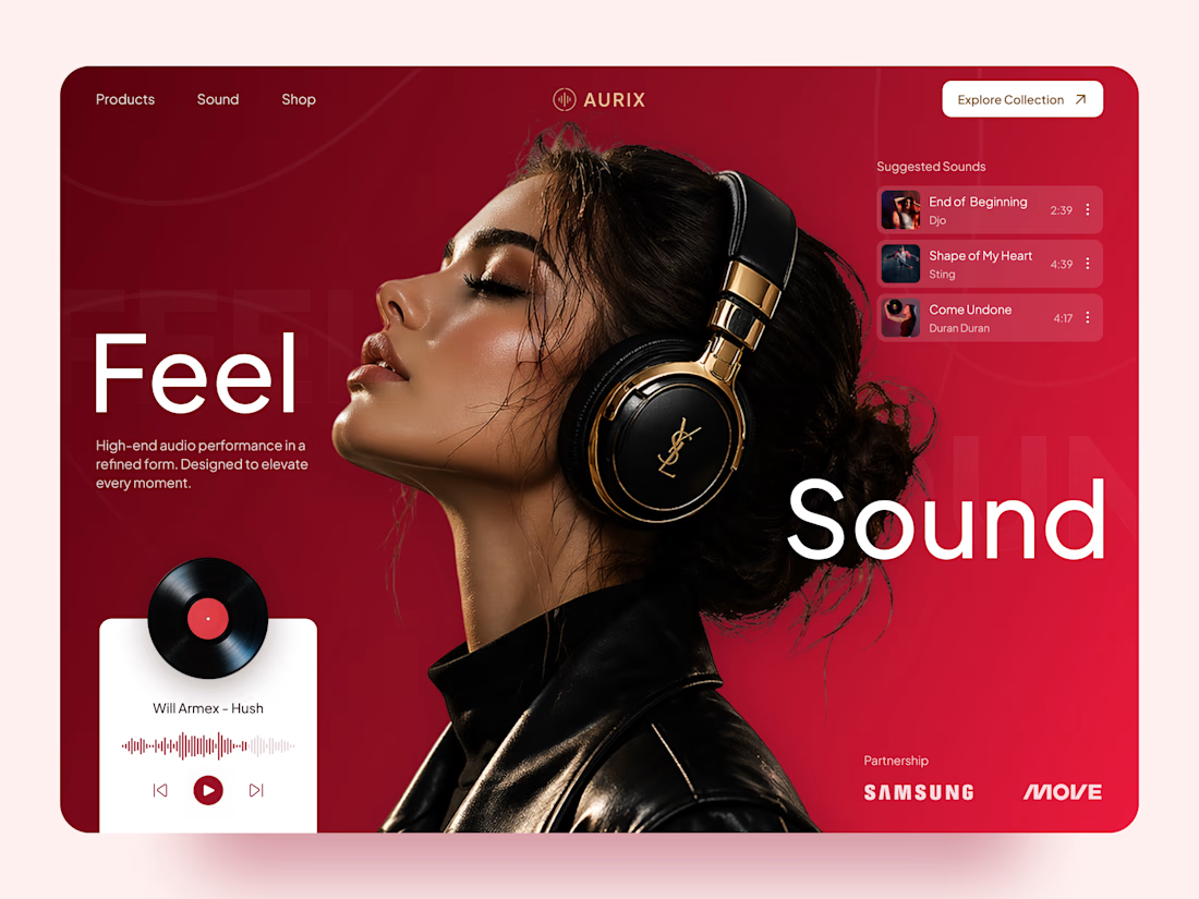
AURIX — Premium Headphones Landing Page 🎧❤️
A bold landing page concept for a premium audio brand, combining luxury headphones, music, and a strong lifestyle aesthetic
The design brings together deep red tones, elegant black and gold details, oversized typography, and immersive lifestyle imagery to create a modern, fashion-inspired experience
Special attention was given to:
• Bold lifestyle-focused hero composition
• Rich red and gold color palette
• Clean, oversized typography
• Music player and suggested tracks
• Premium product presentation
• Responsive mobile experience
• Minimal navigation and clear CTA
The result is a stylish, immersive landing page that connects premium audio with fashion, music, and everyday lifestyle ✨


Love the style!