The network for creativity
Join 1.25M professional creatives like you
Connect with clients, get discovered, and run your business 100% commission-free
Creatives on Contra have earned over $150M and we are just getting started
Back to feedPost

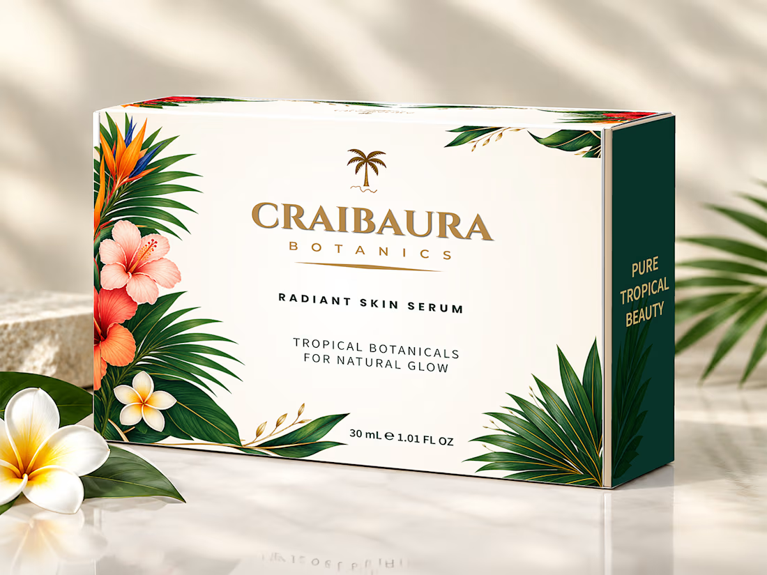
Print-Ready Skincare Mailer Box & Structural Dieline Design
One 2 mm dieline error or wrong color profile can ruin a $10,000 packaging print run. Pretty visuals mean nothing if your files fail at the press.
Problem & Solution:
US and EU skincare founders hiring a remote packaging designer need press-ready precision. For Craibaura Botanics Radiant Skin Serum (30 mL / 1.01 FL OZ), I engineered a custom mailer box system for zero-defect global production.
Technical Image Breakdown:
Hero 3D Presentation: Styled view with US/EU dual net-weight formatting that builds instant DTC buyer trust.
Prepress Artwork Sheet: Full dieline layout with the EU e-mark, bleed zones, and exact CMYK ink values ready for press approval.
Open Box Interior: The double-sided layout accounts for 3 mm board folding so the dark green interior and flaps align without ink cracking.
3D Exterior Mockup: Calibrated CMYK color profiles for matte lamination ensure tropical botanicals print cleanly without muddy shifts.
Top-View Layout: Clean top-panel view of the Craibaura Botanics logo on isolated vector layers for accurate Spot UV or foil plate creation.
Structural Dieline: Drawn at 100% scale (220x150x60 mm) for a 3 mm E-flute board with exact cut lines, fold lines, and glue areas to prevent machine jamming.
Available for remote projects; hire me on Contra for packaging files that pass prepress checks on day one.


The network for creativity
Join 1.25M professional creatives like you
Connect with clients, get discovered, and run your business 100% commission-free
Creatives on Contra have earned over $150M and we are just getting started
Related posts

🍨 Meet MORA — artisanal gelato with a softer side.
Bold typography, creamy tones, and playful flavor-inspired packaging designed to make every scoop feel special.
Explore the full project on my Contra profile and let me know your thoughts!
#BrandIdentity #PackagingDesign #FoodBranding #GraphicDesign #BrandDesign

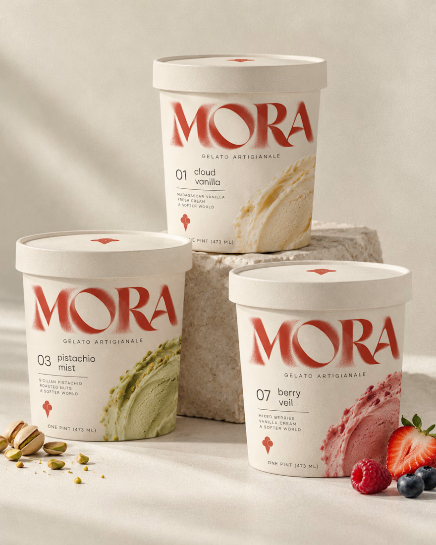
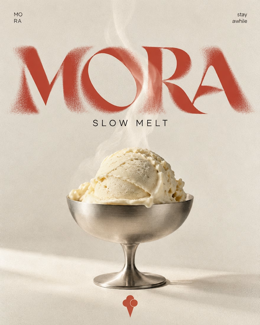
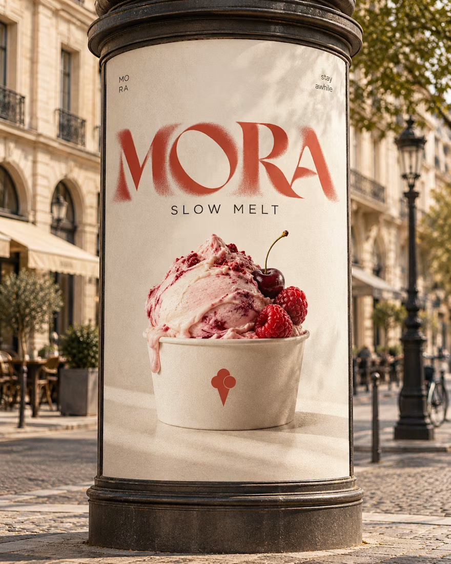

Love this MORA identity! 🍦 The bold typography against the creamy tones is such a perfect balance - feels artisanal yet playful. The flavor-inspired packaging with the watercolor smears for cloud vanilla / berry veil is a really nice touch, makes each scoop feel special as you...

Nothing rots in salt.
So I put a skincare brand in a salt flat and let it crystallize. Name, mark, palette, campaign, packaging. One idea, zero moodboards.
HALITE. Case study live soon.
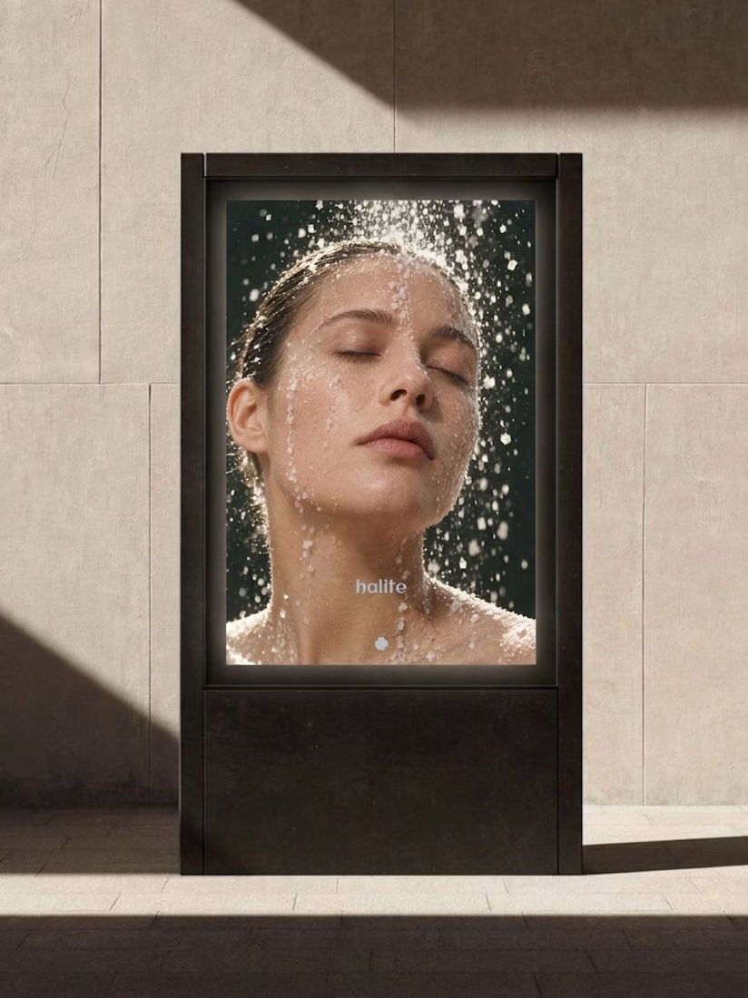
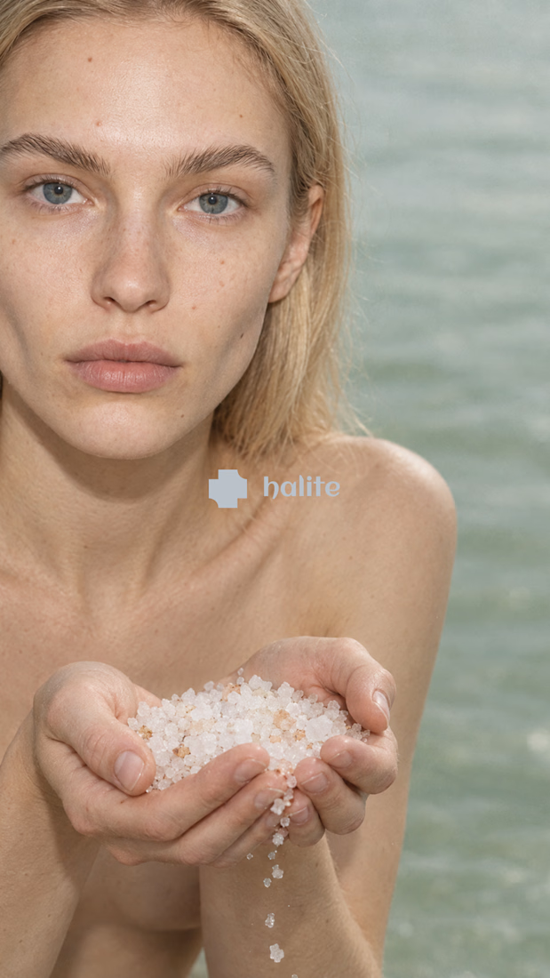
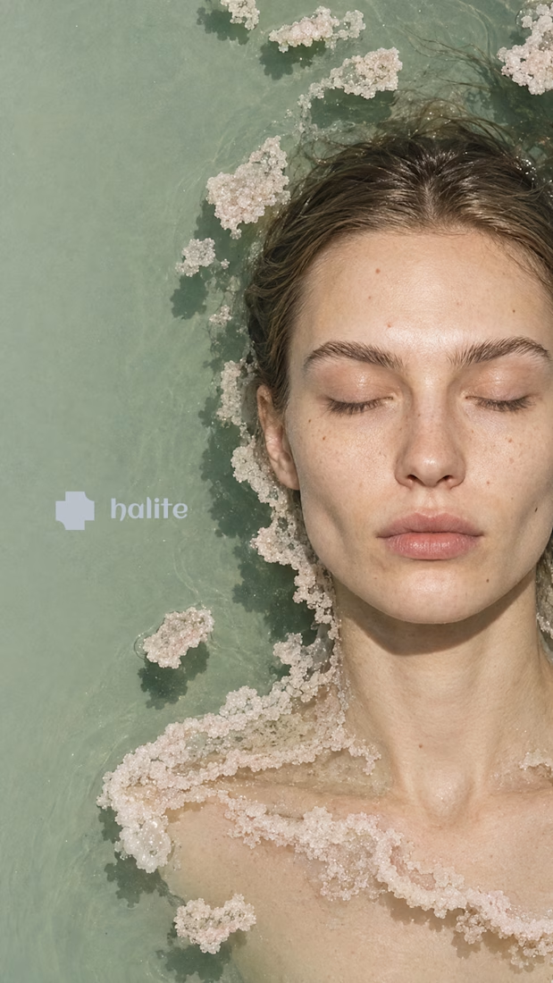
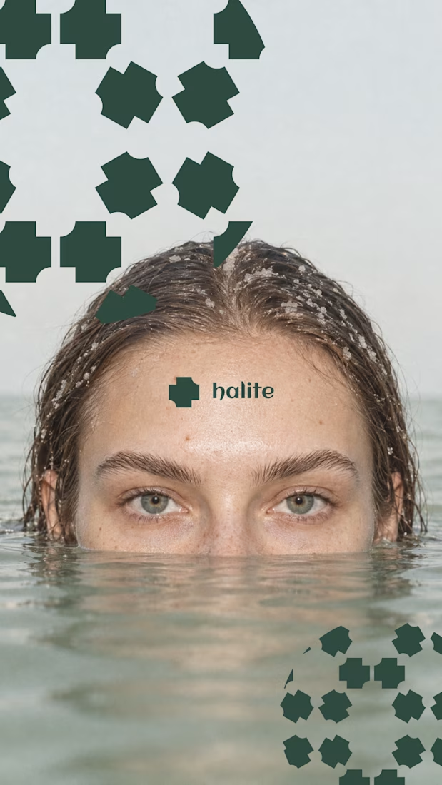

Salt as the core idea is clever. It says preservation, purity and texture in one move, which is exactly what skincare is trying to say. Curious how the crystal motif holds up at small sizes, like a cap or a sachet. Looking forward to the full case.

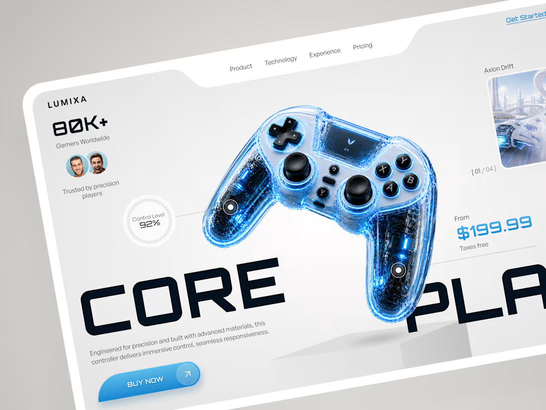
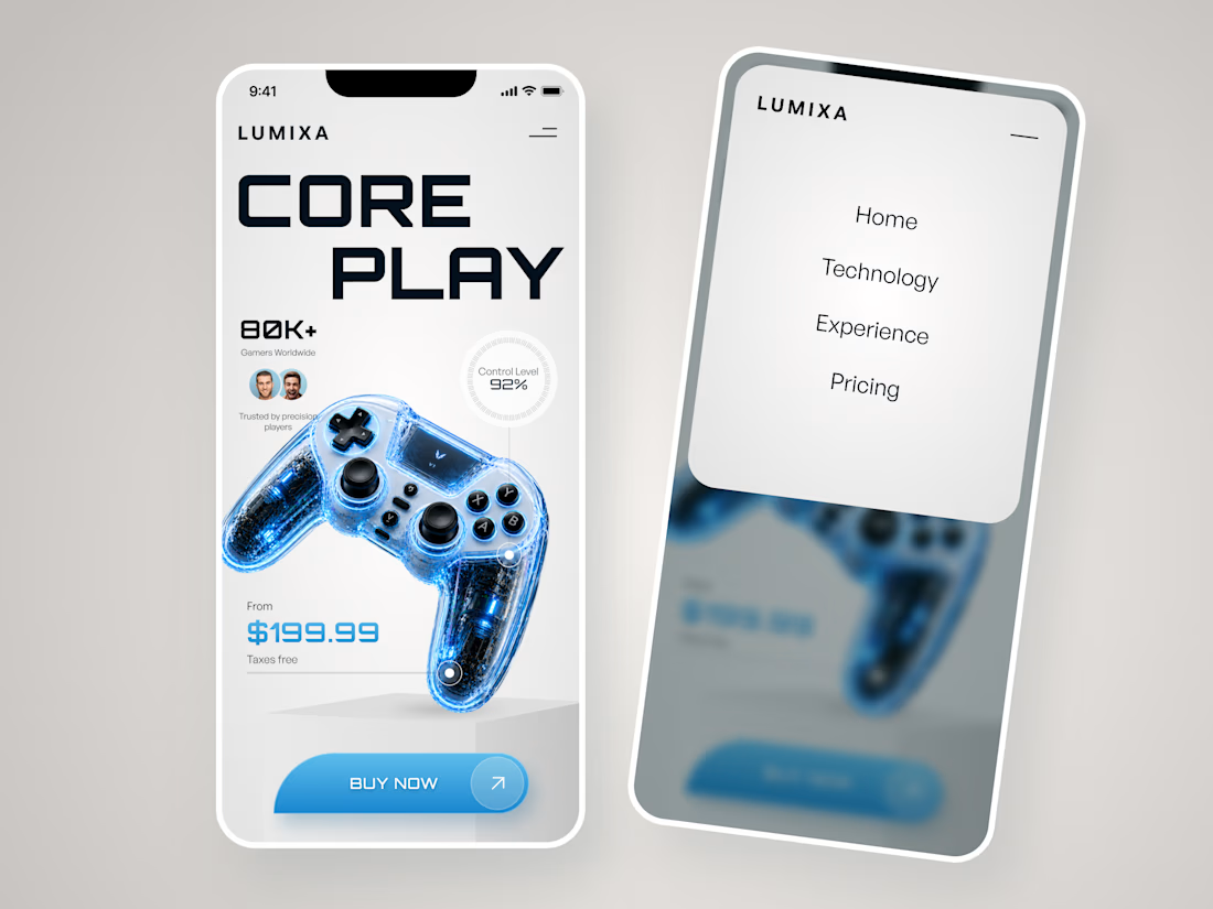
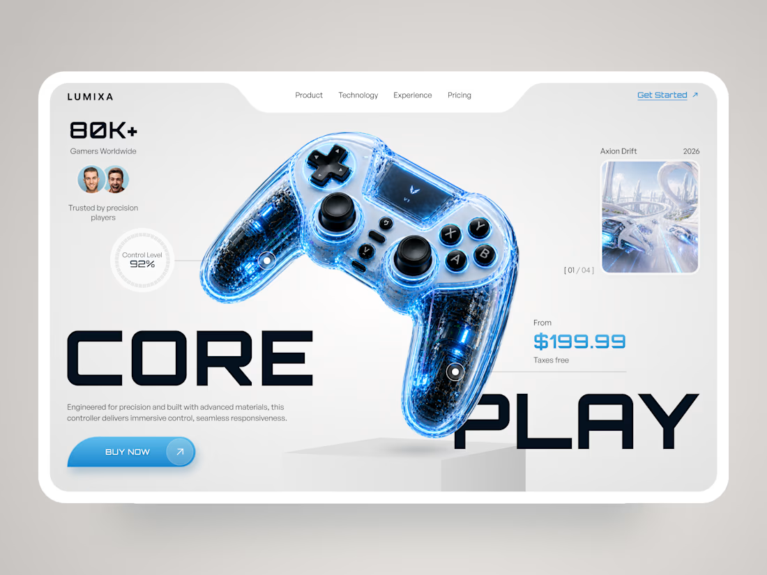
Strong product focus, bold typography, and a clear path to purchase. 🎮 LUMIXA brings gaming energy into a clean landing page concept. Great work by Klym Yevtushenko!

LUMIXA — Gaming Controller Product Landing Page 🎮⚡
LUMIXA is a futuristic product landing page concept created for a premium gaming controller built around precision, performance, and immersive play.
The goal was to make the product itself the center of the experience while...