The network for creativity
Join 1.25M professional creatives like you
Connect with clients, get discovered, and run your business 100% commission-free
Creatives on Contra have earned over $150M and we are just getting started
Back to feedPost
"Design is a young person's game."
I've been thinking about this a lot lately.
At 20, it seemed like a confirmation.
Today, at 33, the words make me feel a little anxious.
Not because I'm old, but because we work in an industry obsessed with innovation: new tools, new trends, new frameworks every week.
I see designers mastering software released yesterday morning.
Fast, hungry, and technically formidable.
Honestly, a little intimidating.
So I find myself wondering if I'll actually be able to keep up, or if I'll quietly become 'obsolete'.
But then I look at the real work.
The work of clients and their requests and needs.
The work they pay me for.
Clients don't hire me to open the latest Figma plugin and produce 10 variations overnight.
They need someone who already knows which 9 to discard and saves them time and weeks of indecision.
This doesn't mean you stop learning.
Curiosity still matters, and it's what keeps you in the game.
I'm saying that knowing what to cut is part of the job.
And it usually takes years to get there.

33 is old? Damn, then I'm from the Cretaceous period 😂

I literally wrote “Not because I’m old”
For some reason, I read it differently. It felt like it had a different connotation.


This really hit home. Knowing what to remove and what actually matters comes with experience, and I think that’s something no new tool can replace.
totally agree

Knowing what to cut is probably the most underrated skill in this job, clients rarely ask for it by name but it's what they're actually paying for. Do you think that judgment can be taught faster to juniors, or does it just take the reps?
Practice and experience.
Making mistakes is part of the process.

The line about clients paying you to already know which 9 variations to discard is the whole job in one sentence. That kind of judgment doesn't show up in a portfolio though, how do you even signal it to someone who's never worked with you before?
I think it's all about how you communicate, what you show online and the relationship you build with him

Ciao Antonio! I think the design field evolves incredibly fast, and new plugins and software create a lot of noise when they're released or suddenly go viral. I think it's important to stay steady, ignore the noise, and only start exploring new tools when they seem to have real...
You made me think of that bookmark folder on social media, full of tutorials, shortcuts, and saved tools that we all have. We keep adding things to it, but we never actually go back and look at them, so it just sits there, quietly forgotten.

Knowing which 9 to cut is the skill clients actually pay for, and 19 years in I have never seen a plugin replace it.
all true !


Do agree. Younger designers bring incredible speed and fresh energy but experienced designers bring clarity and risk management.

Thank you for this honest post Antonio🙌

I agreed with that

I can agree. 😃 But at 33 you are still young! It's not about how old are you, it's about the time we live in.
I'm 42, but I remember that the 3 main design applications that I've used back in 2005-2015 din't changed the design industry so fast as now every tool that appears...
The network for creativity
Join 1.25M professional creatives like you
Connect with clients, get discovered, and run your business 100% commission-free
Creatives on Contra have earned over $150M and we are just getting started

Challenges
View all


Related posts

Client’s choice vs. Designer’s choice 👀
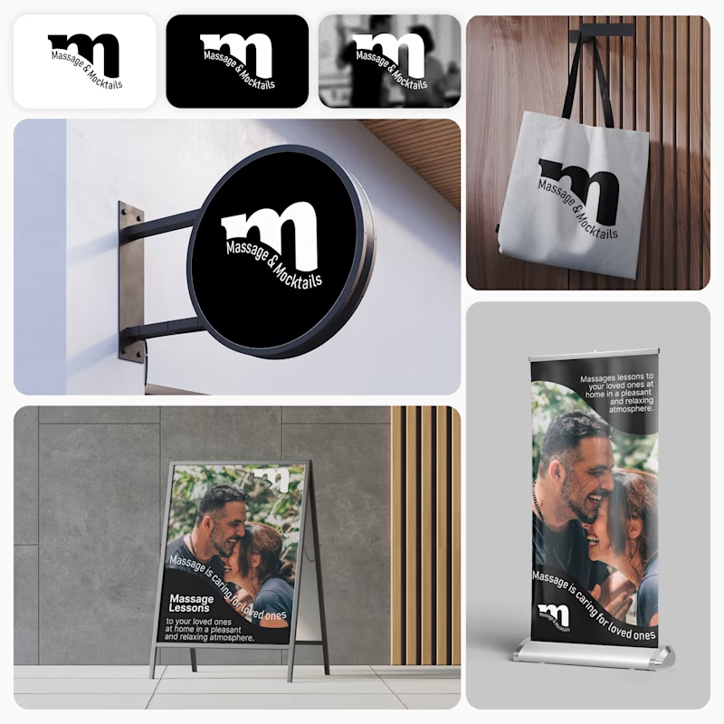
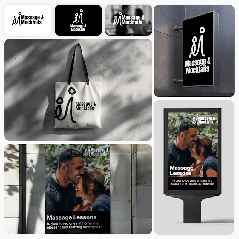
I’m currently working on a branding project for Massage & Mocktails — a concept built around couples learning massage together in a relaxed, social atmosphere.
These are two early, black & white directions from Stage 2 of my branding process, before moving into color, typography, and the full visual system.
The interesting part?
My client chose Concept 1. I chose Concept 2.
Now I’m curious what other creatives think.
Which direction would you choose — 1 or 2? And why?
Sometimes the most interesting part of branding is seeing how differently a client and a designer respond to the same brief.
21 voted
44%
27 voted
56%
48 votes
Closed
Concept 2 for me. That interlocking figure mark reads as two people meeting, which is the actual brief here, so it gives you more to build a system on. Concept 1 is the safer, more literal pick, which is usually why clients reach for it.


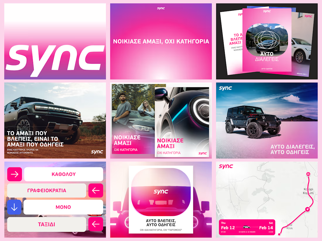
A few more pieces from my work on Sync’s identity.
The idea was to give this Greek car rental brand enough polish to sit next to the big names, with a personality of its own.
The pink was already there. I gave it more space and paired it with bold Greek typography and a frame inspired by a car’s side mirror.
Here’s a closer look at how it works across the layouts.

“We started with just a name and some vague ideas. They left us with a brand.” That’s how our client described their experience working with us on The Growth Fit.
There was no existing identity to refine. Our job was to take an early-stage idea, understand what the brand needed to stand for, and turn it into a visual system with enough clarity and character to grow with the business.
That meant exploring, challenging our own decisions, and going back to the drawing board when something wasn’t landing well. The result was a system built around one central idea: the right fit, carried consistently through the identity, motion and brand touchpoints.
The complete project is live. If you’d like to see how the idea developed into the full identity system, you can explore the case study here: The Growth Fit


I love the colors!