The network for creativity
Join 1.25M professional creatives like you
Connect with clients, get discovered, and run your business 100% commission-free
Creatives on Contra have earned over $150M and we are just getting started
Back to feedPost


A few more pieces from my work on Sync’s identity.
The idea was to give this Greek car rental brand enough polish to sit next to the big names, with a personality of its own.
The pink was already there. I gave it more space and paired it with bold Greek typography and a frame inspired by a car’s side mirror.
Here’s a closer look at how it works across the layouts.
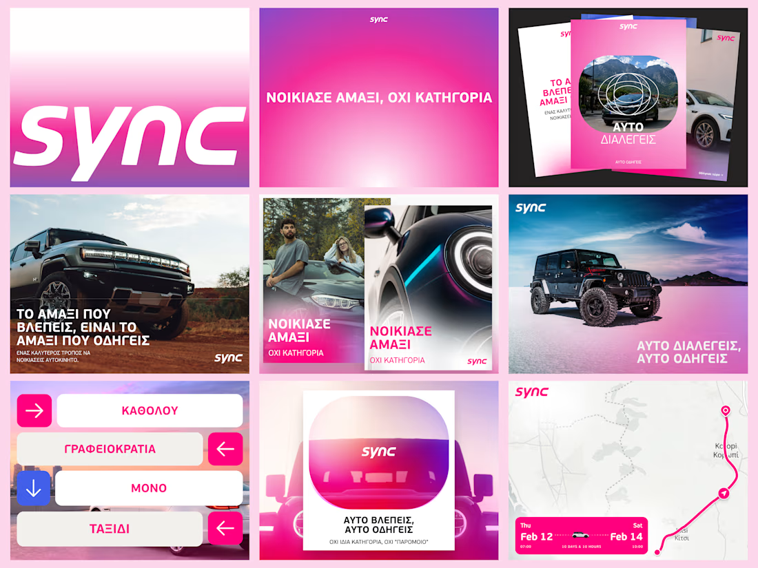

Love how the bold typography and side-mirror-inspired frame turn the existing pink into a distinctive and memorable identity.

The system feels cohesive across very different applications: the oversized Greek type and hot pink give it a distinct voice, while the modular framing keeps the car imagery from feeling generic. The mirror-inspired frame is a great connective detail.

[@Daniel G Bright] The visual design is modern. But what is the story behind the logo? I don't see anything special about the logo to help me remember it.


Great work but here's a question, why'd you go for sharp shocking pink when you can go with a slight darker or comfortable choice in pink? Was that brand's requirement or you have a thought behind it? It looks great though just want to know the thought.
The network for creativity
Join 1.25M professional creatives like you
Connect with clients, get discovered, and run your business 100% commission-free
Creatives on Contra have earned over $150M and we are just getting started

Challenges
View all


Related posts

New Brand Guidelines delivered.
While it may seem trivial, this asset remains a key component of our final deliverables for every project. We offer a recommended guide for the proper use of the brand, with various layout options permitted within the visual language. This ensures the brand can expand over time with a truly functional visual system.
We always strive to be as concise as the brand allows, establishing the foundation for its effective use. This empowers the client to make informed decisions and implement each brand element in the ideal scenario with optimal adjustments.


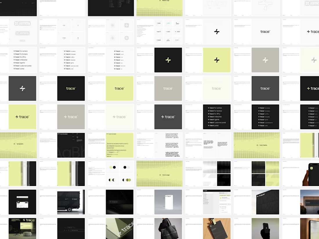

"As concise as the brand allows" is the hard part, because the guidelines that get ignored are almost never the thin ones. Curious whether you pair the PDF with a live component library so the document only has to explain the rules and doesn't also have to enforce them - that split has saved me a lot of pages.
Which cover for a new case study do you like more?
19 voted
40%

29 voted
60%

48 votes
Closed

Really inspiring work!

Not every growing brand needs to look dynamic to feel ambitious.
With Auren, the challenge was almost the opposite.
The brand needed to work across real estate, development and wellness without becoming a generic identity trying to fit everything.
So the direction became more restrained, solid and precise.
Less visual noise.
More consistency to support different sides of the business.
For me, that’s one of the most interesting parts of building brands meant to last:
flexibility doesn’t have to mean losing personality.
Full project: https://www.behance.net/gallery/255378471/Auren
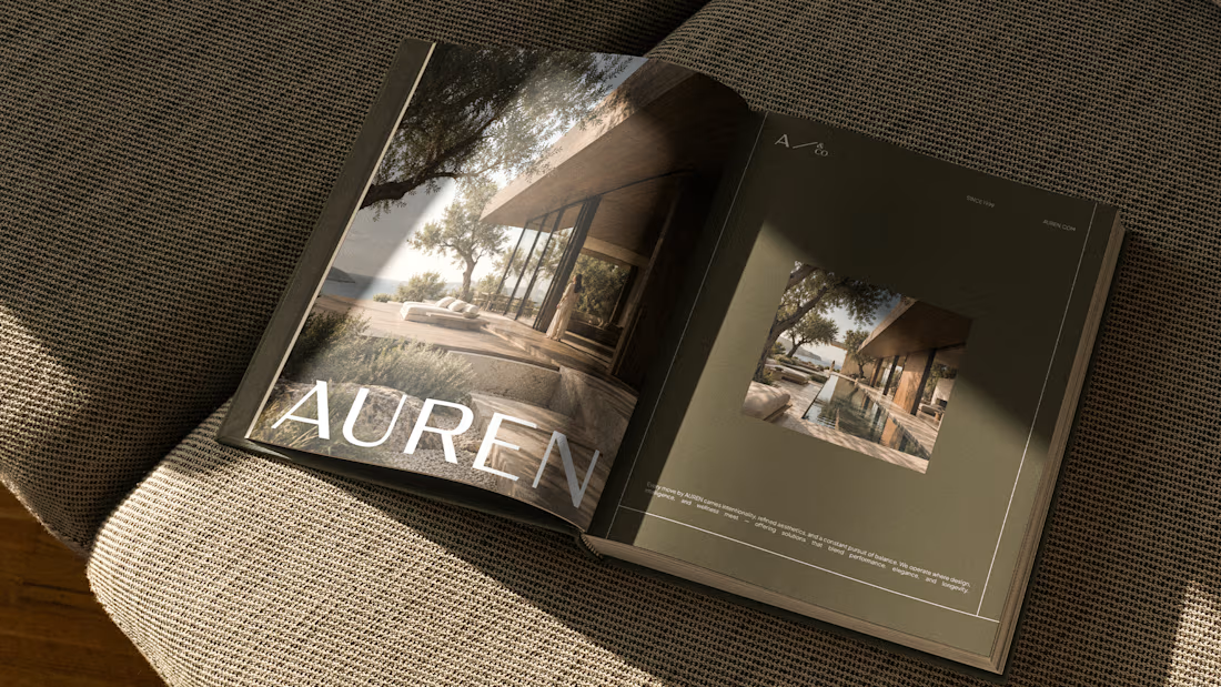
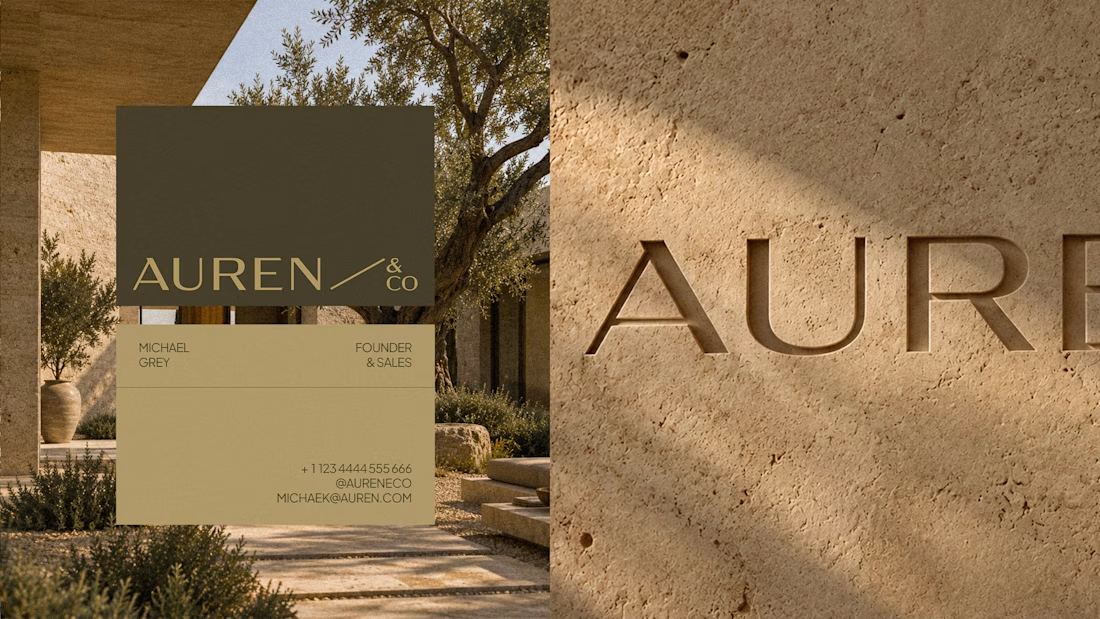


the Auren book mockup looks nice. did you make the logo too?