The network for creativity
Join 1.25M professional creatives like you
Connect with clients, get discovered, and run your business 100% commission-free
Creatives on Contra have earned over $150M and we are just getting started
Back to feedPost

Brand exploration for the company Ever, a lifestyle and clothing brand

Cool!


beautiful work!

Like how personalized the brand feels even with the AI visuals! Great art direction 👏

brilliant

Really like that you're showing Ever inside actual app icon contexts instead of just a static logo lockup, it tells you so much more about how the brand will actually live day to day. For a lifestyle and clothing brand, was digital even part of the original brief or did that come later?

Such thoughtful creative work!

Wow! So beautiful and professional work!👌


Thank you!

Beautiful!

Sleek!

Classic!

Wonderful

Beautiful

Love it 🧡

Amazing like always!

Attractive creation💯

So refreshing👀❤️
Thank you!

Mindblowing work

One of the best designs I’ve seen today. Really solid work 👏 The branding direction feels so clean and effortlessly high-end.


Thank you!

Love the direction of this exploration 👏 The identity feels modern and versatile, with a strong lifestyle character that could translate beautifully across clothing, packaging, and digital.
The network for creativity
Join 1.25M professional creatives like you
Connect with clients, get discovered, and run your business 100% commission-free
Creatives on Contra have earned over $150M and we are just getting started
Challenges
View all


Related posts
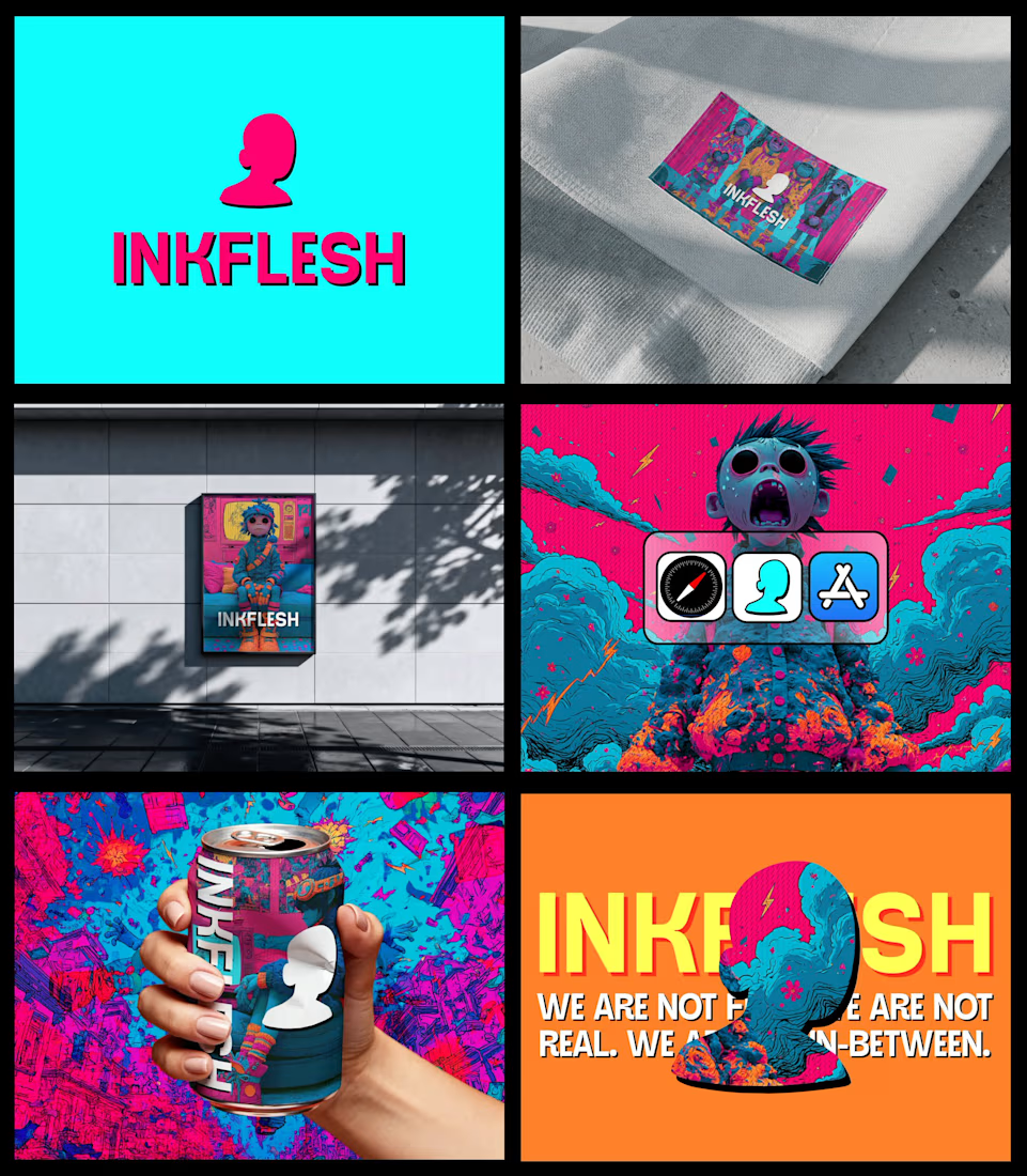
In my INKFLESH identity work, the wordmark runs off the can's curve and gets partly hidden behind artwork on posters. That crop asks the rest of the identity to carry more recognition. The mark has a job when the name is only partly there.



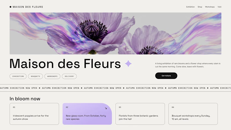
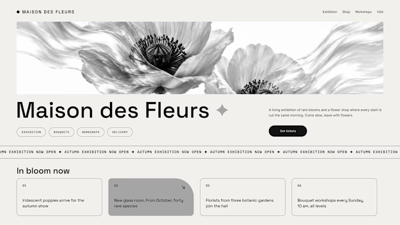
Should a flower shop ever go black and white?
Same flower house, same layout. We only took the color out.
1. Full color. The iridescent petals do the selling: lilac, pink, a little shimmer. The photo is the brand, and every accent on the page borrows from it.
2. Monochrome. No color at all. Shape, texture and typography have to carry everything, and the page suddenly reads like a gallery catalogue.
Color sells the flower. Monochrome sells the exhibition.
Which one would get you through the door?
67 voted
91%
7 voted
9%
74 votes
Closed

The problem with monochrome is that, throughout computer history, it has conditioned users to associate gray and monochrome with being disabled, dysfunctional, or something to ignore and avoid.

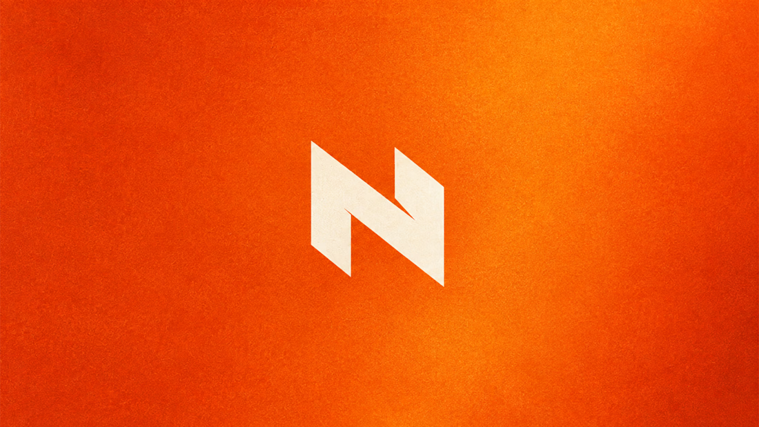
My Top Featured Projects on @Contra Labs 🔥
⚡| NEXVOLU
⚡| HYDRUM VEIL
⚡| NOIRÉ
Each project explores a different direction, but the goal stays the same: build brands that stand out.
Which project is your favorite?
Drop the name below 👇


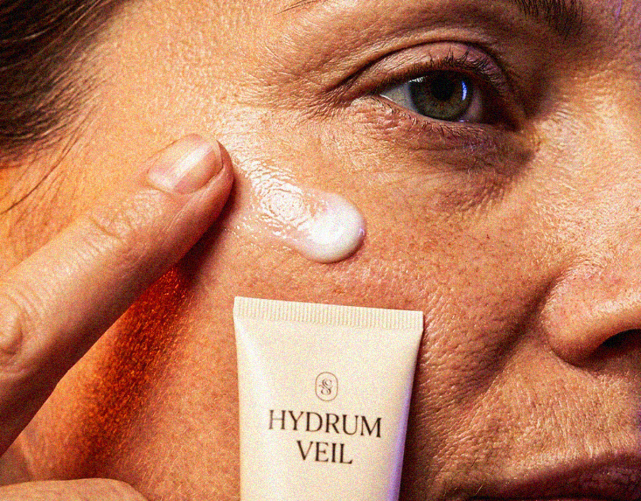
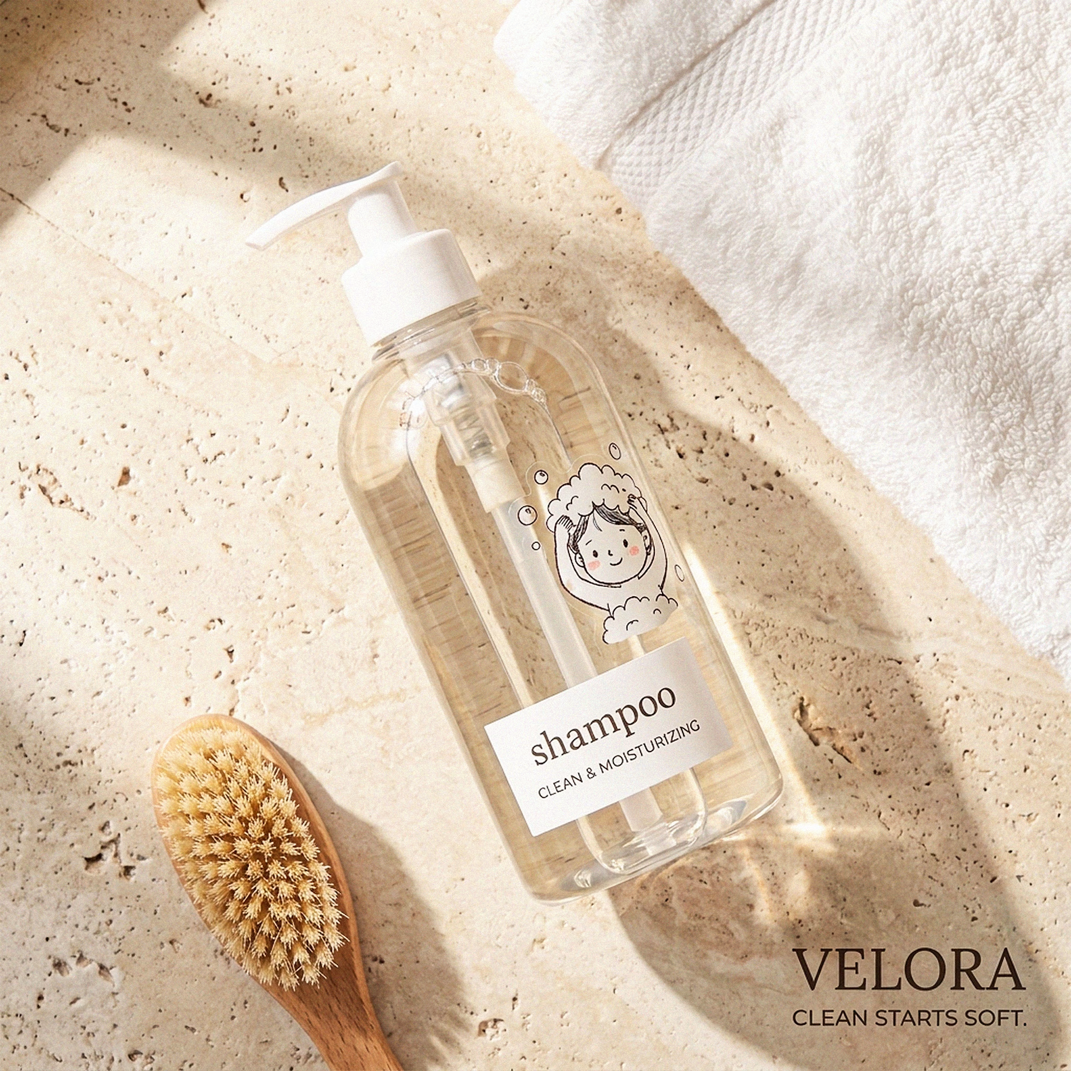
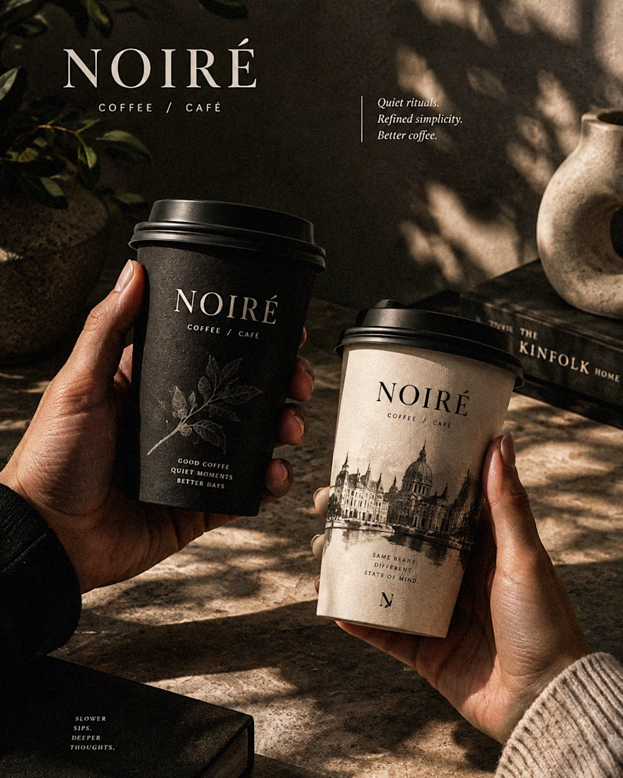

These are 🔥 Mine are all fav 🙌
Congo for Featured on @Contra HQ & @Contra Labs ... 😍