The network for creativity
Join 1.25M professional creatives like you
Connect with clients, get discovered, and run your business 100% commission-free
Creatives on Contra have earned over $150M and we are just getting started
Back to feedPost
Taste Test

Taste test for The Candid Crow Photography Co.
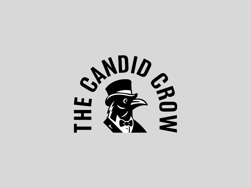
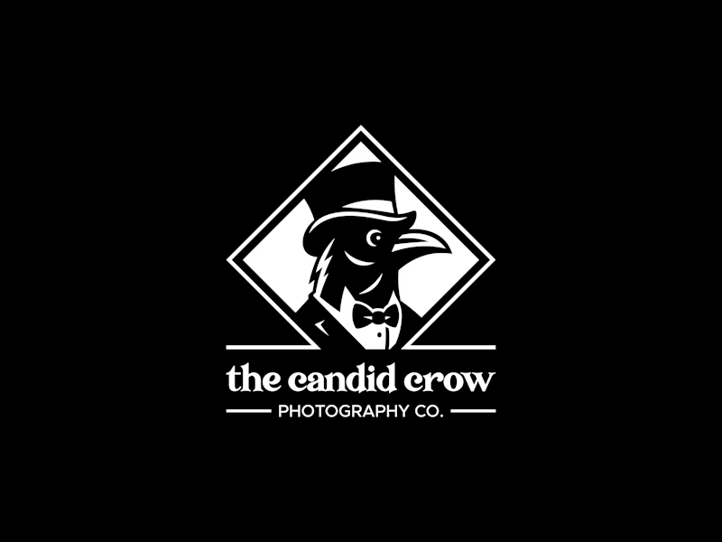
Two directions built around the same crow character, but with very different personalities.
Version 01 takes a cleaner, more modern approach with the name wrapping around the character and a stronger badge-like feel.
Version 02 leans more classic and established, pairing the crow with a diamond frame, serif typography, and a more traditional photography brand feel.
Same brand. Two different directions.
Which one are you taking: 01 or 02?


3 voted
33%
6 voted
67%
9 votes
Closed

The diamond badge on Version 01 feels more timeless for a photography brand, but Version 02 reads cleaner at tiny sizes like a social profile icon. Which one do you think actually ends up on business cards versus just the Instagram avatar?

the heritage mark adds a touch of bolder personality to the mascot!
The network for creativity
Join 1.25M professional creatives like you
Connect with clients, get discovered, and run your business 100% commission-free
Creatives on Contra have earned over $150M and we are just getting started





Related posts

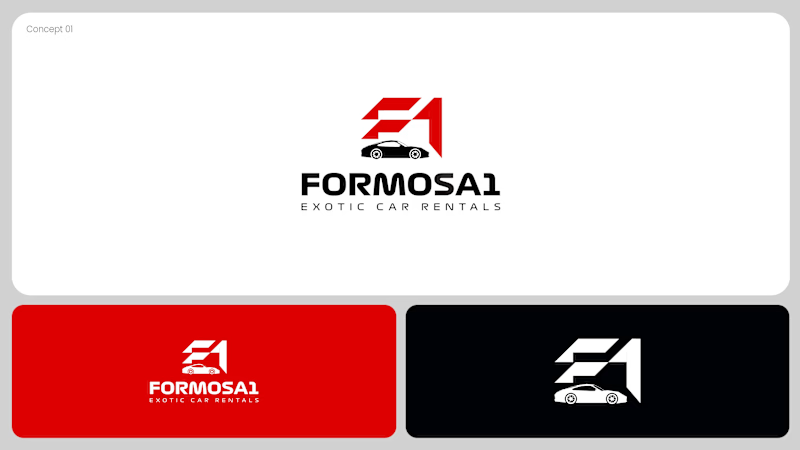
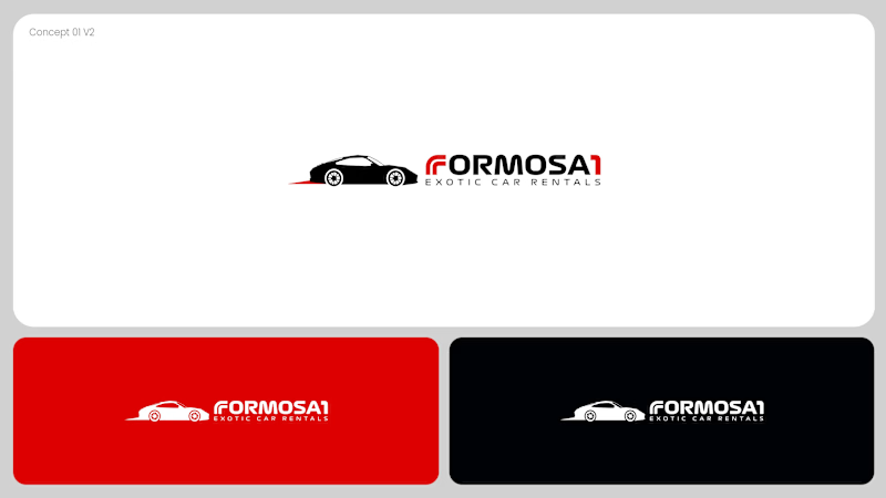
Two logo concepts for Formosa1 Exotic Car Rentals. Which one wins?
A: bold geometric F1 monogram, car tucked inside the mark. Strong and iconic.
B: car silhouette leads, red wordmark with a speed streak. Fast and clean.
Drop your vote 👇
17 voted
53%
15 voted
47%
32 votes
Closed

Both are great but I feel that was something special in the bottom one that's why I choose it❤️❤️

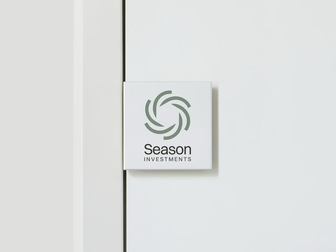
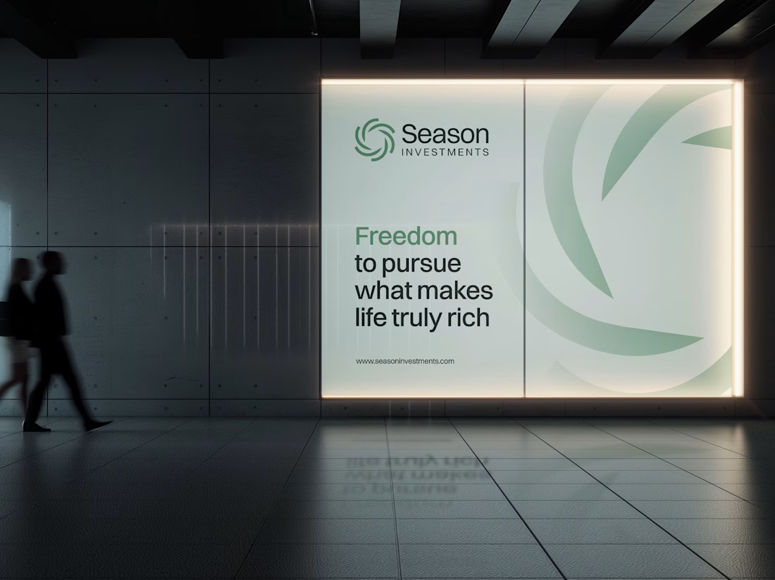
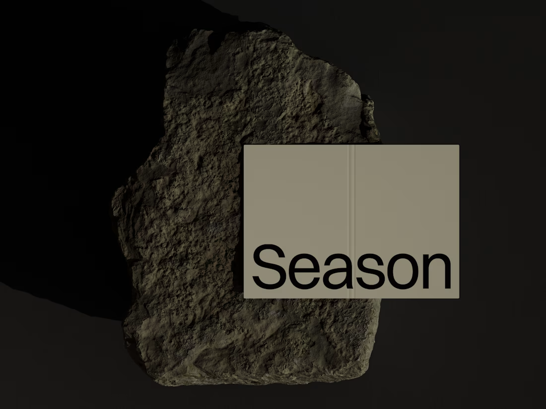
The Rebranding Challenge - Season Investments
One of the key challenges was deciding what to change and what was worth preserving.
Rather than starting from scratch, the new identity retains a visual connection to Season Investments’ heritage, but reframes it for a more contemporary and flexible brand system.
A major improvement was creating a symbol that can work independently from the wordmark. This gives the brand a stronger presence across investment platforms, digital interfaces, profile images, and other compact applications where the previous identity was difficult to use.
The result is a more adaptable system that moves the brand forward without losing its familiarity.



Love how adaptable this feels across compact digital spaces. Really well done. Any plans to post the original before version for comparison?

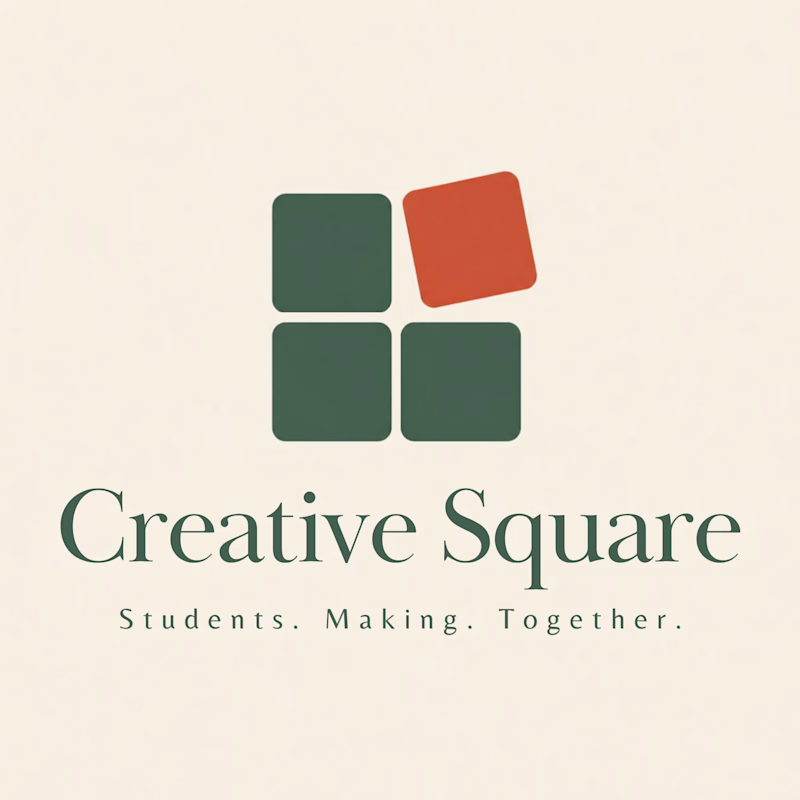
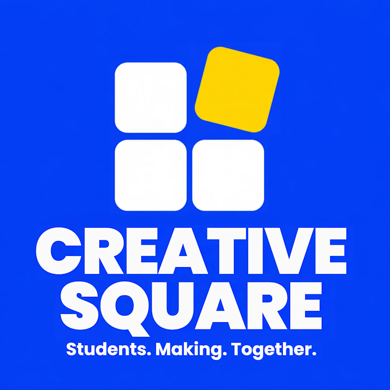
Meet Creative Square, a logo for university students. Same mark, two personalities: loud and energetic, or calm and editorial. Which one would you pick?
13 voted
48%
14 voted
52%
27 votes
Closed
The bold are so attractive that's incredible I choose it ❤️❤️