The network for creativity
Join 1.25M professional creatives like you
Connect with clients, get discovered, and run your business 100% commission-free
Creatives on Contra have earned over $150M and we are just getting started
Back to feedPost
Taste Test
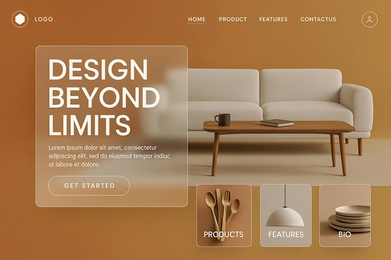
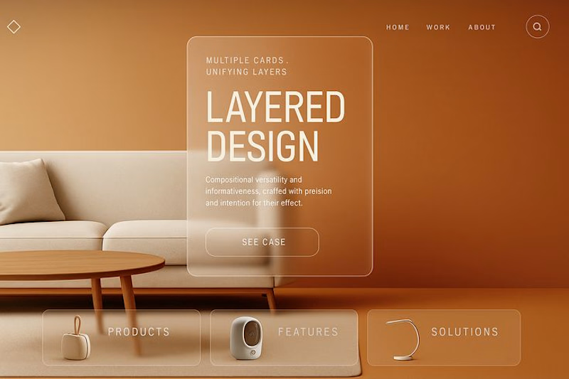
Modern Ballet Landing Page Design with Elegant Features
A sleek landing page design featuring a white sofa and wooden coffee table, set against a vibrant gradient background. Includes a logo, menu, and call-to-action button. This image can be edited with Al assistant, try it
on our site. No designer skills needed.
10 voted
91%
1 voted
9%
11 votes
Closed

1 feels super aligned!

Thank you very much 🔥

This was a tough decision for me cause they both look really good but the visual balance in option 1 just feels much better in my opinion. Really great concepts all round!
Thank you very much. Our goal is always to provide you with the best. ☺️✅️

Option 1
Thank you ☺️

Both look good but option 1 visuals looks put together, it makes the design look balanced
Thank you ☺️❤️
The network for creativity
Join 1.25M professional creatives like you
Connect with clients, get discovered, and run your business 100% commission-free
Creatives on Contra have earned over $150M and we are just getting started

Challenges
View all


Related posts


HOW MUCH GUIDANCE DOES A PASSWORD FIELD NEED?
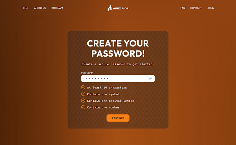
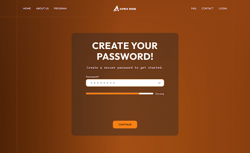
For this desktop sign-up screen, I explored two ways to guide users while creating a password:
A - Detailed. A checklist displays every requirement and updates as the user types.
B - Minimal. A strength indicator provides quick feedback while keeping the interface cleaner.
The checklist offers more clarity, while the strength bar reduces visual noise.
Which approach would you choose - A or B?
39 voted
66%
20 voted
34%
59 votes
Closed

Detailed layout entails a guide to help users create strong passwords. Not everyone is good at crafting passwords, and this approach can makes them find it easy to remember.

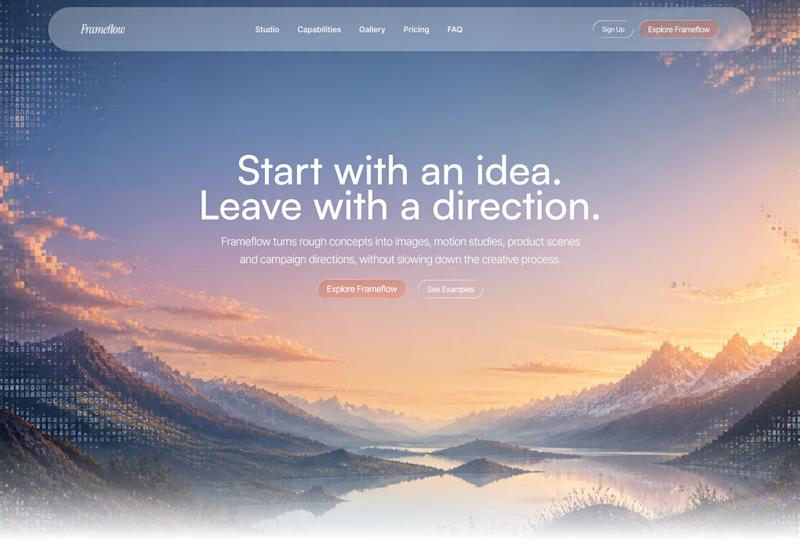
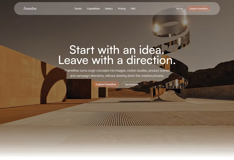
Explored two different visual directions for the same SaaS landing page.
The structure stays consistent, while the imagery, mood and art direction shift the overall brand feel.
Interested to know which direction feels stronger.

11 voted
73%
4 voted
27%
15 votes
Closed

Woww... What a precious design priyansh bro.😍 💯 🔥 🎉

Client’s choice vs. Designer’s choice 👀
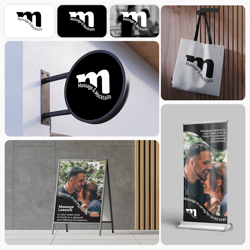
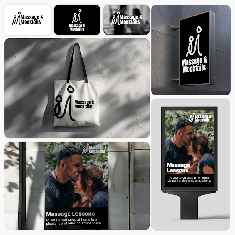
I’m currently working on a branding project for Massage & Mocktails — a concept built around couples learning massage together in a relaxed, social atmosphere.
These are two early, black & white directions from Stage 2 of my branding process, before moving into color, typography, and the full visual system.
The interesting part?
My client chose Concept 1. I chose Concept 2.
Now I’m curious what other creatives think.
Which direction would you choose — 1 or 2? And why?
Sometimes the most interesting part of branding is seeing how differently a client and a designer respond to the same brief.
21 voted
44%
27 voted
56%
48 votes
Closed

Concept 2 for me. That interlocking figure mark reads as two people meeting, which is the actual brief here, so it gives you more to build a system on. Concept 1 is the safer, more literal pick, which is usually why clients reach for it.