The network for creativity
Join 1.25M professional creatives like you
Connect with clients, get discovered, and run your business 100% commission-free
Creatives on Contra have earned over $150M and we are just getting started
Back to feedPost

I’ve been experimenting with product presentation in a more magical, fantasy-inspired setting. Instead of a classic, sterile studio look – a dense forest floor, mysterious glowing mushrooms, and dynamic lighting.
Everything was modeled and rendered from scratch in Blender (100% human-made art, no AI tools used).
What do you think of this alternative approach to product visualization? I’d love to hear your feedback!
#blender3d #3dart #productdesign #cgi #digitalart #b3d #3drender #noAI #humanart


The network for creativity
Join 1.25M professional creatives like you
Connect with clients, get discovered, and run your business 100% commission-free
Creatives on Contra have earned over $150M and we are just getting started




Related posts

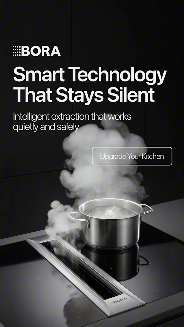
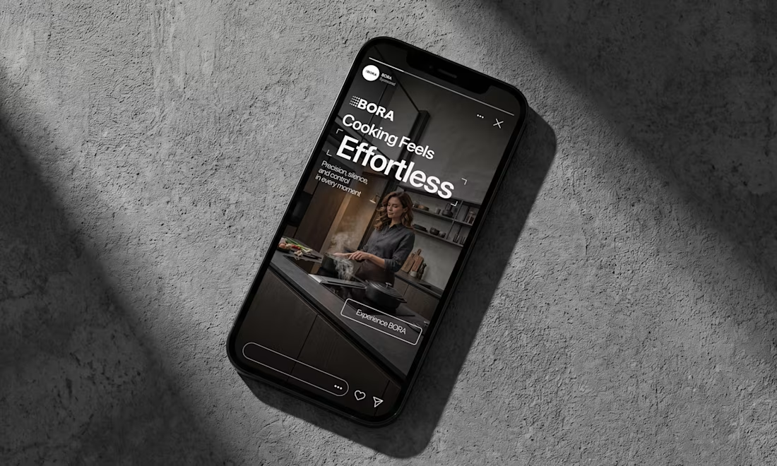
BORA – Ad Creative Concept
Most kitchen appliance ads sell you the warm family dinner. I wanted to try the opposite.
Built this BORA concept as a portfolio piece, treating the product like architecture instead of tech – dark marble, concrete, no hands, no food styling. Just a pot, steam, and silence.
The steam does all the movement in the motion piece. Typography stays out of the way – one line, low CTA, nothing fighting the composition. Turns out when you strip out the lifestyle, the price point sells itself.



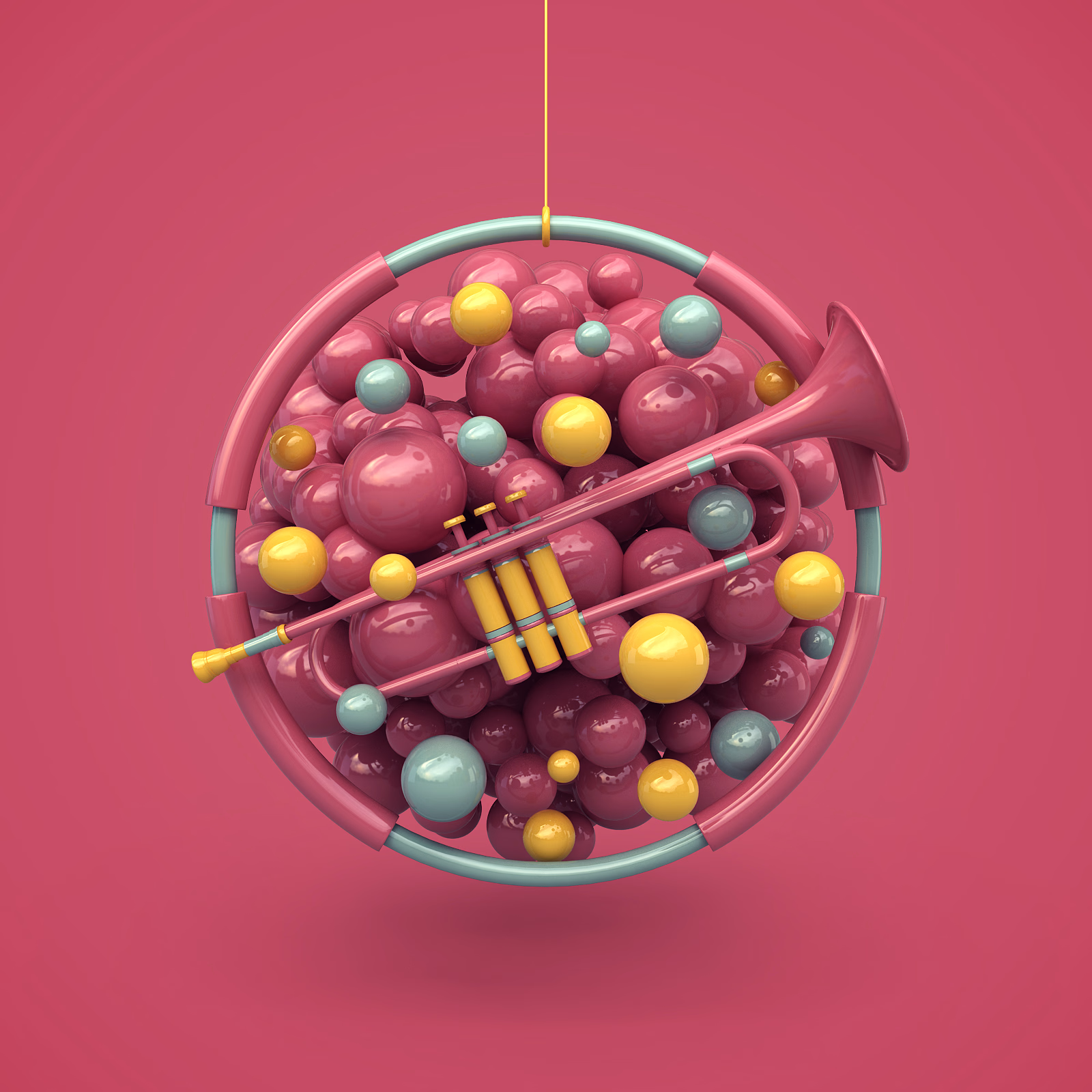
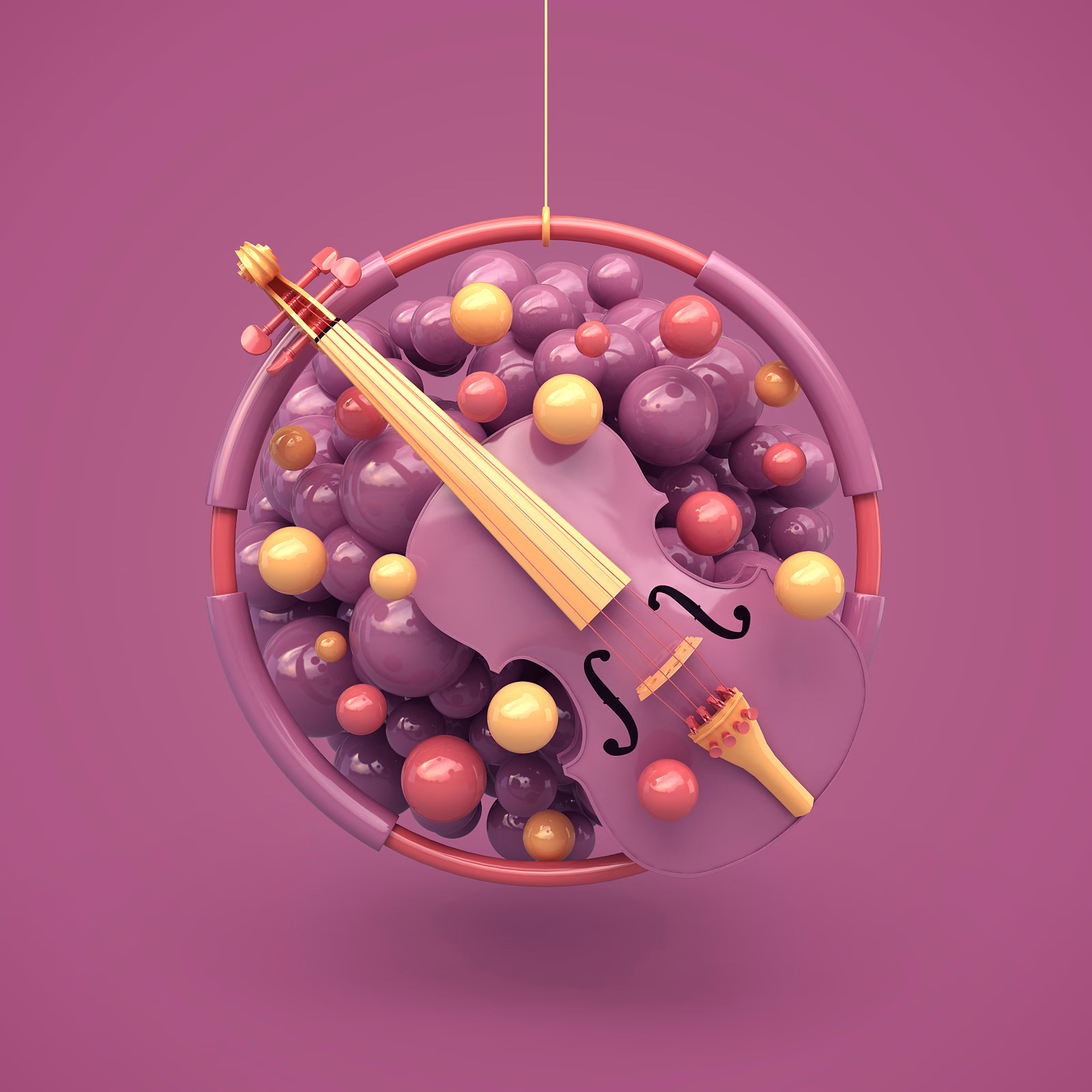
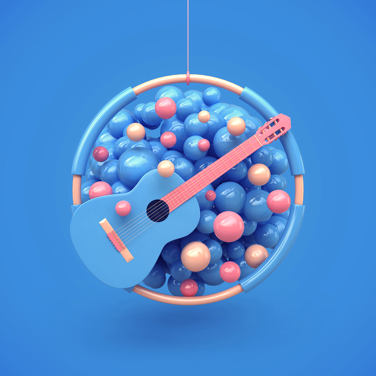
3d music icons I created for a music festival.



Help me decide the best visual direction for this 3D Product Hero Section:
Option A: Bold red accent with high visual impact
Option B: Subtle orange tone with smooth lighting focus
If you're building luxury e-commerce platforms, which UI aesthetic do you prefer?
Let’s hear your thoughts below! 👇


16 voted
52%
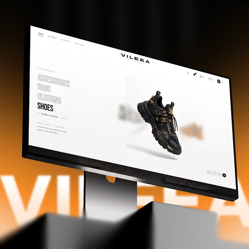
15 voted
48%
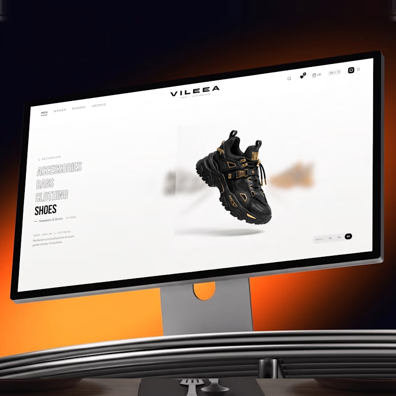
31 votes
Closed


Option A commands immediate attention for high-impact visual campaigns, but Option B feels much more aligned with luxury e commerce. A subtle, warmer tone creates a refined, high end look that keeps the product front and center without overwhelming the interface.