The network for creativity
Join 1.25M professional creatives like you
Connect with clients, get discovered, and run your business 100% commission-free
Creatives on Contra have earned over $150M and we are just getting started
Back to feedPost
Taste Test

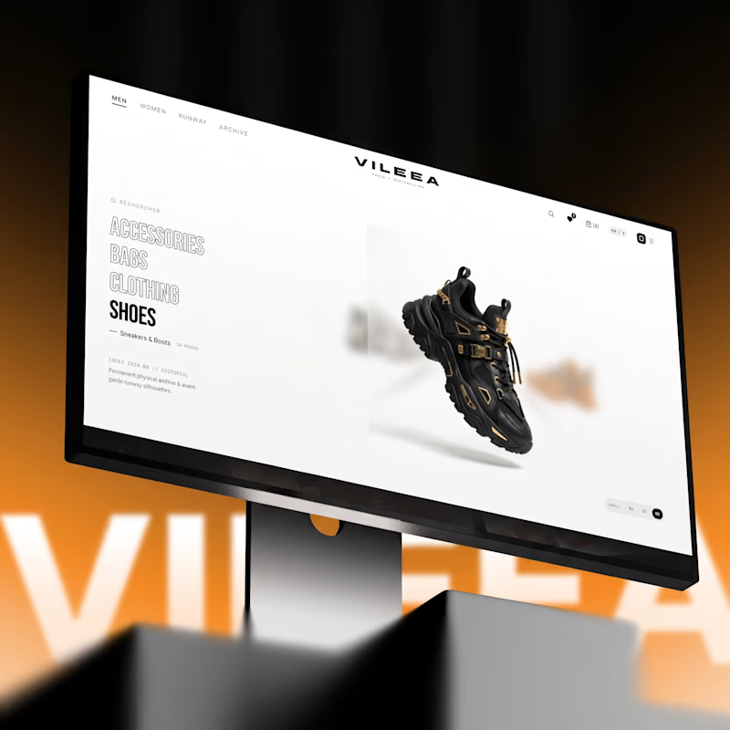
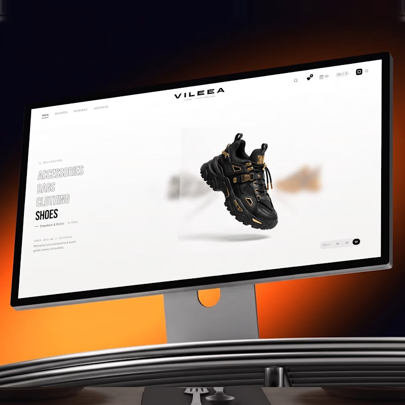
Help me decide the best visual direction for this 3D Product Hero Section:
Option A: Bold red accent with high visual impact
Option B: Subtle orange tone with smooth lighting focus
If you're building luxury e-commerce platforms, which UI aesthetic do you prefer?
Let’s hear your thoughts below! 👇


12 votes
Ends in 1d


Option A commands immediate attention for high-impact visual campaigns, but Option B feels much more aligned with luxury e commerce. A subtle, warmer tone creates a refined, high end look that keeps the product front and center without overwhelming the interface.

option B

The network for creativity
Join 1.25M professional creatives like you
Connect with clients, get discovered, and run your business 100% commission-free
Creatives on Contra have earned over $150M and we are just getting started

Challenges
View all


Related posts

My previous poll showed unexpected results (I am very grateful to everyone who took the time to vote and comment 🤍).
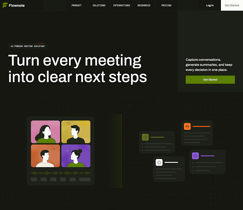
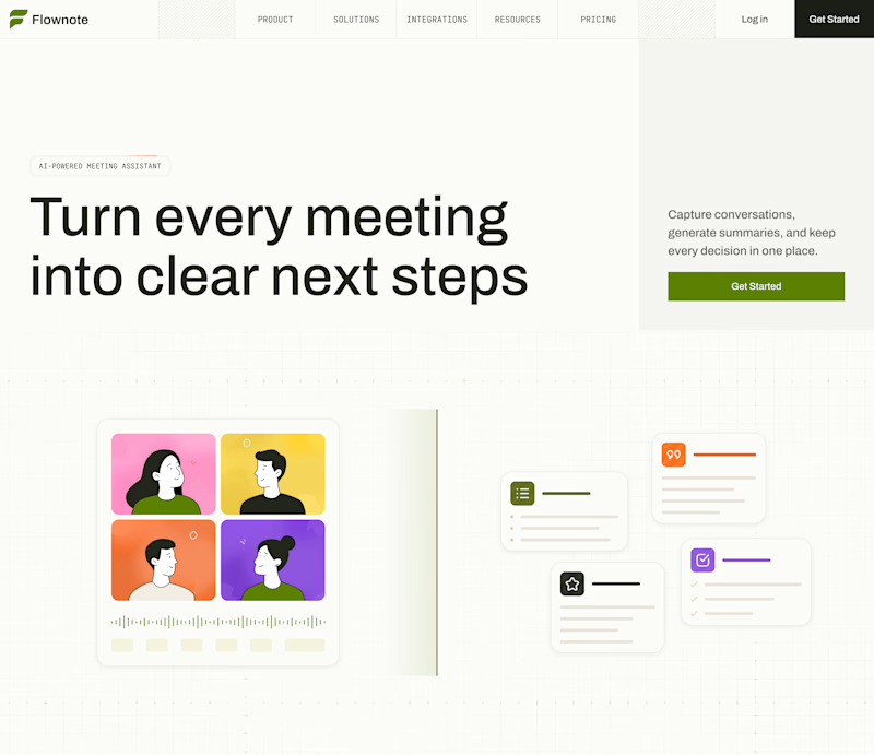
Now I am curious about your opinion on the color mode for this hero section. I definitely like a light theme. What about you?
By the way, I made a nice animation for this design. You can see it on my profile

28 voted
54%
24 voted
46%
52 votes
Closed

To be honest the dark mode looks really good


Hugeeee
Congratulations!!

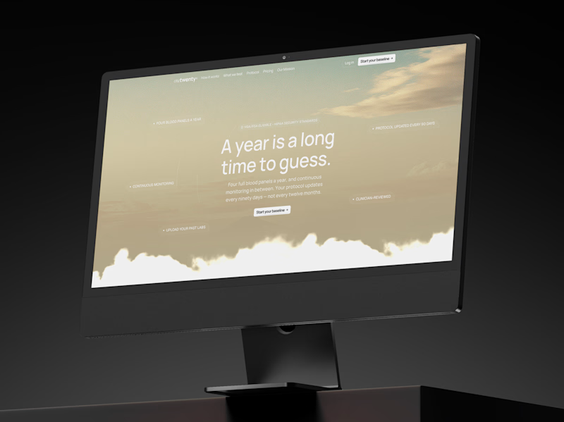
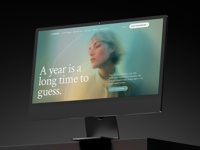
a longevity health membership asked me for the first ten seconds of their site. two opinionated directions, not four safe ones.
A · the instrument: https://onetwenty-direction-a.framer.website/
opens with how it works, shown through real product interface. the clearest version of what the category already does.
risk: one more health dashboard.
B · the publication: https://onetwenty-direction-b.framer.website/
opens with the reader's doubt, then explains. a big serif headline, one photo, a section that plays the idea out as you scroll.
risk: drifting into wellness.
the copy is nearly identical in both, on purpose. so the question isn't which one looks better:
which one would make you trust a health company with your blood and your data?
vote, and tell me why below.
10 voted
17%
49 voted
83%
59 votes
Closed

B look similar to this https://templatoria.com/templates/clearpath
templatoria.com
ClearPath — Framer Template for Therapists and Coaches
ClearPath is a warm Framer template for therapists, coaches, and personal growth professionals. Built for services, client stories, journals, and booking-focused websites.