The network for creativity
Join 1.25M professional creatives like you
Connect with clients, get discovered, and run your business 100% commission-free
Creatives on Contra have earned over $150M and we are just getting started
Back to feedPost
Taste Test
Which direction feels more premium?
Evaluating two UI approaches for Aura AI. Vote based on design quality, hierarchy, usability, and overall product feel.
0 voted
0%
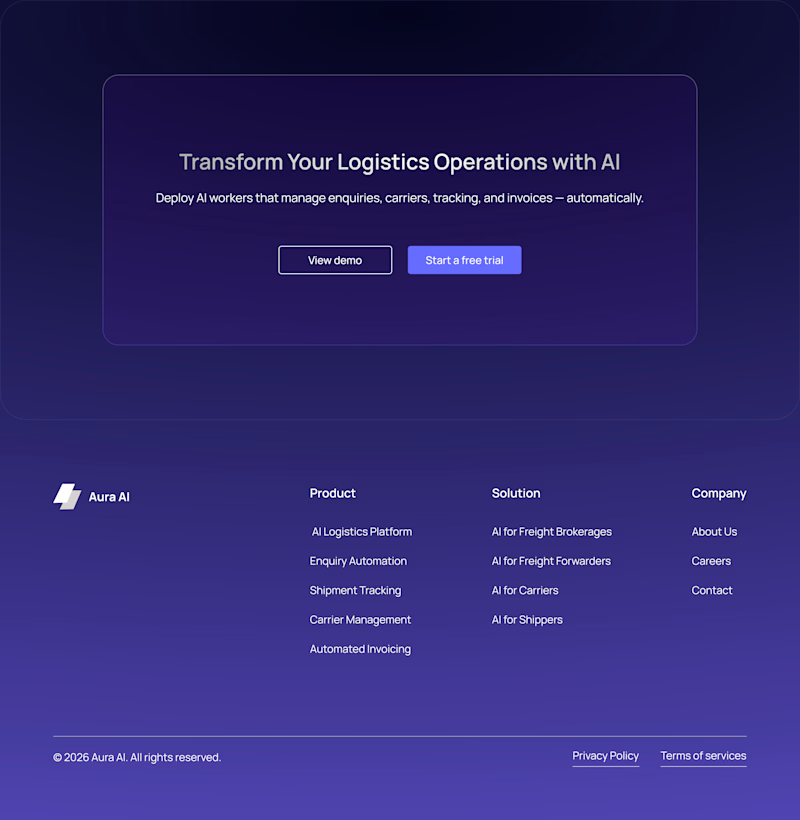
3 voted
100%
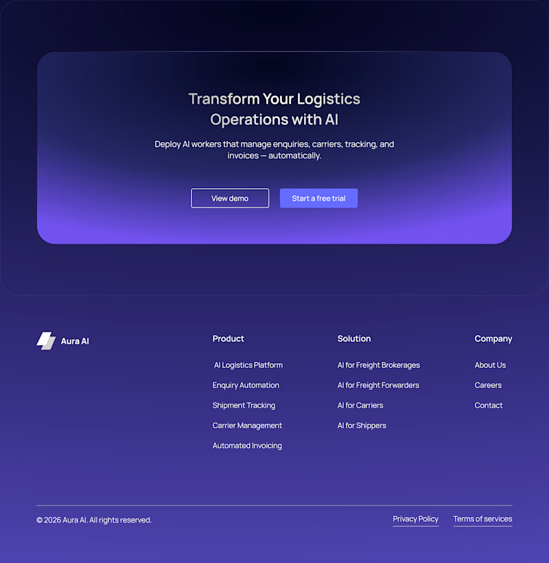
3 votes
Closed

Premium usually comes from what you remove, not what you add. Radiant Flow reads richer, though for an AI product the glow risks competing with the data once real content fills the screen. Minimal Glow tends to age better as the interface gets denser. Did you test either with live data, or only on the hero?


Thanks! That was one of the key goals behind the exploration.

I definitely prefer the radiant flow direction. Being a AI based website i think the rich purple gradient better suits the vibe.
Thanks for the feedback! That was exactly the thinking behind the direction.

Radient flow got my vote..... Clean, sharp, and really well executed 🔥 This feels like it belongs in a top-tier portfolio. Love the attention to detail here, excited to see what you create next
Thank you @Boluwatife Delight! Glad the Radiant Flow concept stood out for you. Really appreciate the encouragement and feedback—it means a lot. 🙌
The network for creativity
Join 1.25M professional creatives like you
Connect with clients, get discovered, and run your business 100% commission-free
Creatives on Contra have earned over $150M and we are just getting started
Trending

Claude
Claude has entered the design space. How are you using it?

Contra University
Learn from expert creatives how to earn more using next-gen AI tools.
Brand Design
The best brand designers are on Contra. Scroll to see what's trending in brand design. What are you building?
creativeaiflow
Creative AI workflows are evolving. What tools do you use, and what are their strengths and weaknesses?
freelancerlife
Freelancer life is wins, pivots, and everything in between. What’s yours right now?



Related posts


Amazing

I’m exploring two visual directions for Together, an app concept for the Flowstep challenge focused on helping friends make plans, vote, and keep track of what’s coming up.
For this comparison, I wanted to test how much the overall visual theme changes the feel of the product.
The dark version feels bolder, more energetic, and more nightlife-driven.
The light version feels cleaner, more approachable, and easier to scan.
Dark mode: bold, social, energetic
Light mode: clean, friendly, approachable
Since this app is all about making plans with friends, the visual direction needs to feel fun without becoming overwhelming.
Which version feels stronger for a social planning app?

6 voted
55%
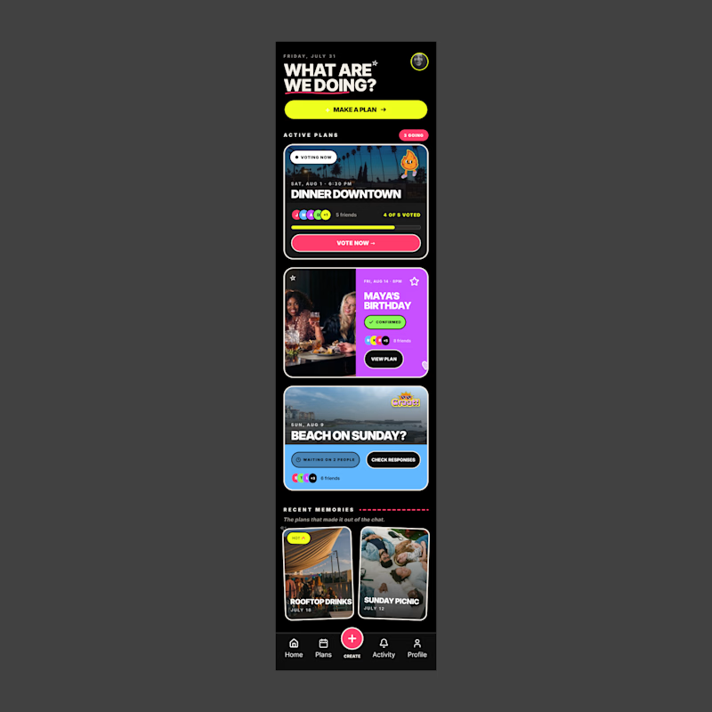
5 voted
45%
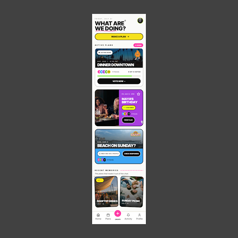
11 votes
Closed

Cause of my habits… dark mood for me always

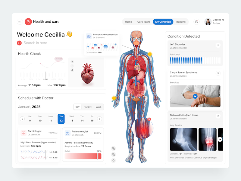
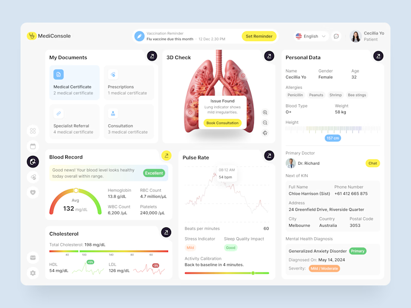
I've been exploring healthcare product design recently, and these are my top 2 healthcare dashboard concepts.
Which dashboard is your favorite: Option A or Option B? Why?
2 voted
33%
4 voted
67%
6 votes
Closed

Incredible work!