The network for creativity
Join 1.25M professional creatives like you
Connect with clients, get discovered, and run your business 100% commission-free
Creatives on Contra have earned over $150M and we are just getting started
Back to feedPost
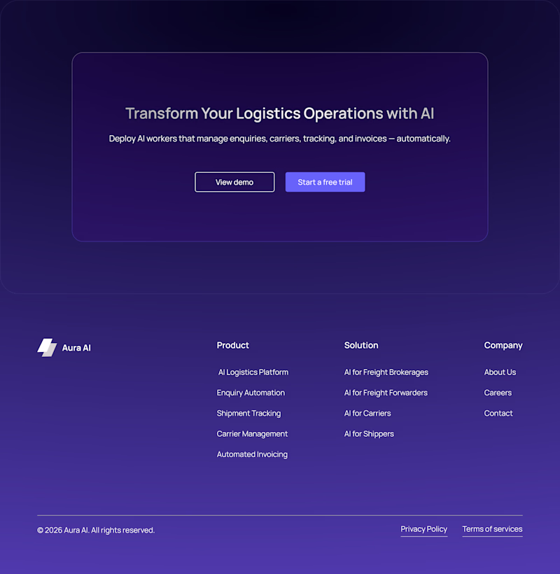
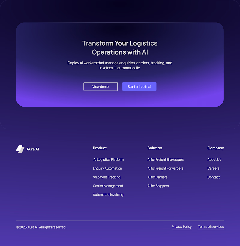
Taste Test
Which direction feels more premium?
Evaluating two UI approaches for Aura AI. Vote based on design quality, hierarchy, usability, and overall product feel.
3 votes
Ends in 19h
I definitely prefer the radiant flow direction. Being a AI based website i think the rich purple gradient better suits the vibe.
Thanks for the feedback! That was exactly the thinking behind the direction.
Thanks! That was one of the key goals behind the exploration.
Radient flow got my vote..... Clean, sharp, and really well executed 🔥 This feels like it belongs in a top-tier portfolio. Love the attention to detail here, excited to see what you create next
Thank you @Boluwatife Delight! Glad the Radiant Flow concept stood out for you. Really appreciate the encouragement and feedback—it means a lot. 🙌
The network for creativity
Join 1.25M professional creatives like you
Connect with clients, get discovered, and run your business 100% commission-free
Creatives on Contra have earned over $150M and we are just getting started
Related posts
Ciao, Contra! 🚀
New here and currently filling out my profile — so please excuse the work in progress 😄
I'm a UX/UI designer based in Kyiv. I have 3+ years of experience in design, and I'm here to connect, collaborate, be inspired and grow. Design for me is not just about making things look good, it's about making them feel right. Outside of work I exploring AI tools, travel whenever I can, paint on the walls, grow flowers, and drive with no particular destination in mind. And yes, I jumped out of planes 🪂😂 So taking on new challenges? Never been a problem.
I'm open to projects in different areas. I genuinely enjoy working across industries because every new field brings a fresh perspective.
Looking forward to connecting with fellow designers, creatives, and businesses of all kinds on this platform. Whether it's a new project or just a conversation - I'm here for it🙌
Together I think we can make things a little more functional, a little more beautiful, and a little more human😊
So, your turn! Tell me a bit about yourself)
Let`s start! See you around🚀
Welcome aboard! 🚀
Love your approach to new challenges. As someone who's been DJing since 2004, I can relate to the idea that the best experiences often happen when you step outside your comfort zone.
That said... skydiving is still a level above most of my adventures 😄
What's...
The Female Focused feels more engaging
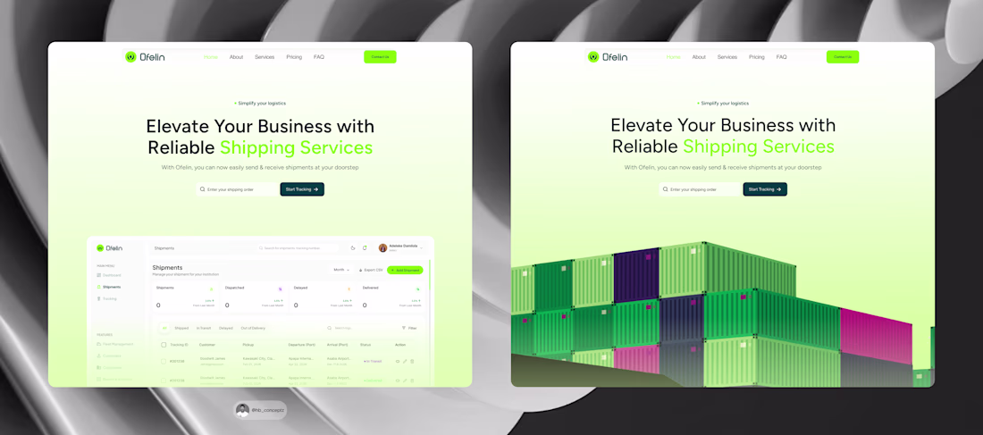
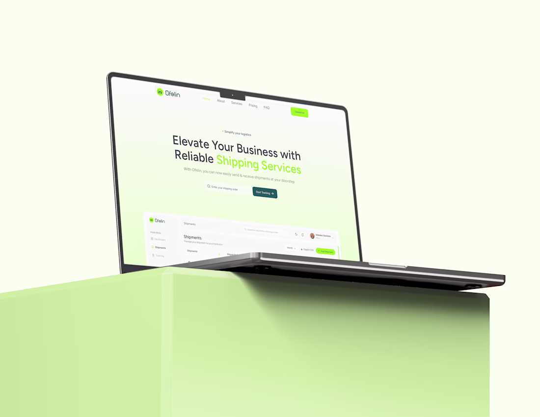
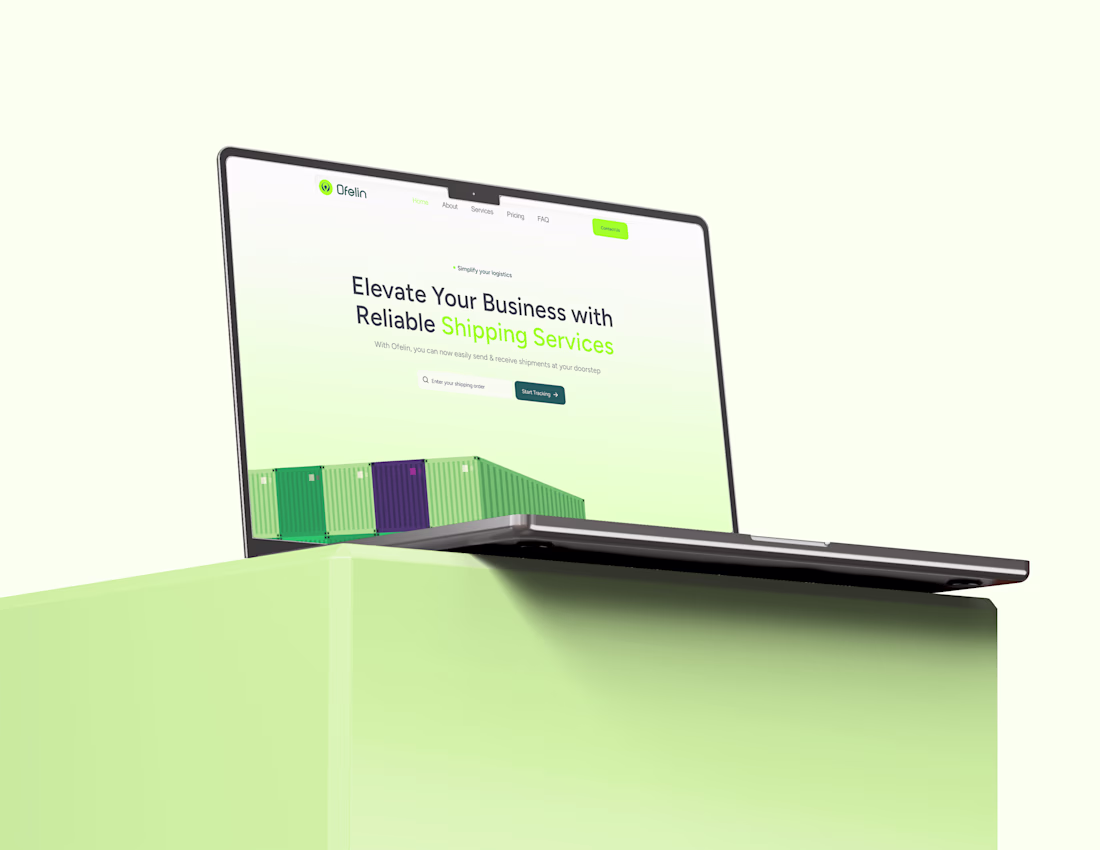
Which hero section works better for Ofelin?
1️⃣ Left: Uses a preview of the shipment admin dashboard, giving users an immediate look at the platform and its capabilities.
2️⃣ Right: Uses a shipment container illustration, creating a stronger visual connection to the logistics industry.
Which approach would you choose, and why? I'd love to hear your thoughts. 🚢💡
#uiux #designthinking #userresearch #uidesigner #uxdesigner #shipment #shipmentdashboard #shipmentwebsite
Its super amazing
Trending
Claude
Claude has entered the design space. How are you using Claude Design?
Contra University
Learn from expert creatives how to earn more using next-gen AI tools.
MagicPath
The canvas is infinite, and exploration is becoming the workflow. How are you using MagicPath?
creativeaiflow
Creative AI workflows are evolving. What tools do you use, and what are their strengths and weaknesses?
freelancerlife
Freelancer life is wins, pivots, and everything in between. What’s yours right now?