The network for creativity
Join 1.25M professional creatives like you
Connect with clients, get discovered, and run your business 100% commission-free
Creatives on Contra have earned over $150M and we are just getting started
Back to feedPost
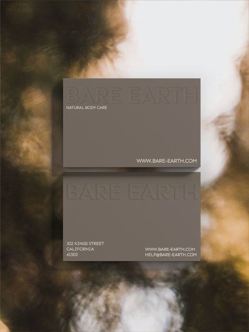
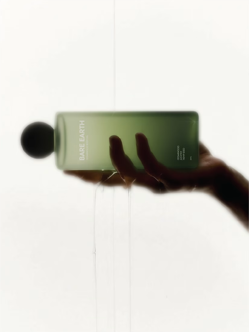
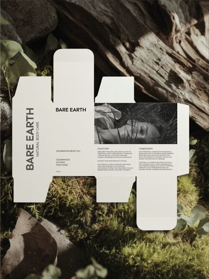
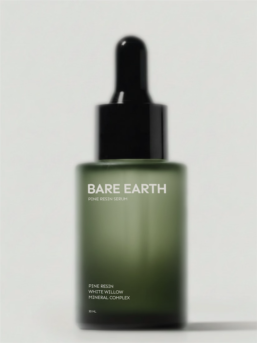
Not every body care brand needs to glow.
Bare Earth explores strength as a brand decision, not just a formula claim. Forest extracts, mineral clays, pine resins; translated into a restrained visual system.
Mockups by me, available soon
I think it makes such a big difference when a brand is created with care and purpose. Great work 🎉
Love this restrained, earthy aesthetic! The brand positioning around strength over shine is brilliant. Natural, grounded visuals that perfectly match the product philosophy.
Appreciate you! Thanks!✨
Love the packaging May
Thank you Diego!!
Love this direction.
The muted tones and restraint make it feel grounded and confident. Strong, minimal, and very intentional 🌿
Love this brand direction! The restrained, earthy aesthetic is so refreshing in a market saturated with glossy "glow" brands. The muted tones, minimal typography and natural texture photography all work together beautifully. "Bare Earth" really walks the talk here.
The network for creativity
Join 1.25M professional creatives like you
Connect with clients, get discovered, and run your business 100% commission-free
Creatives on Contra have earned over $150M and we are just getting started
Related posts
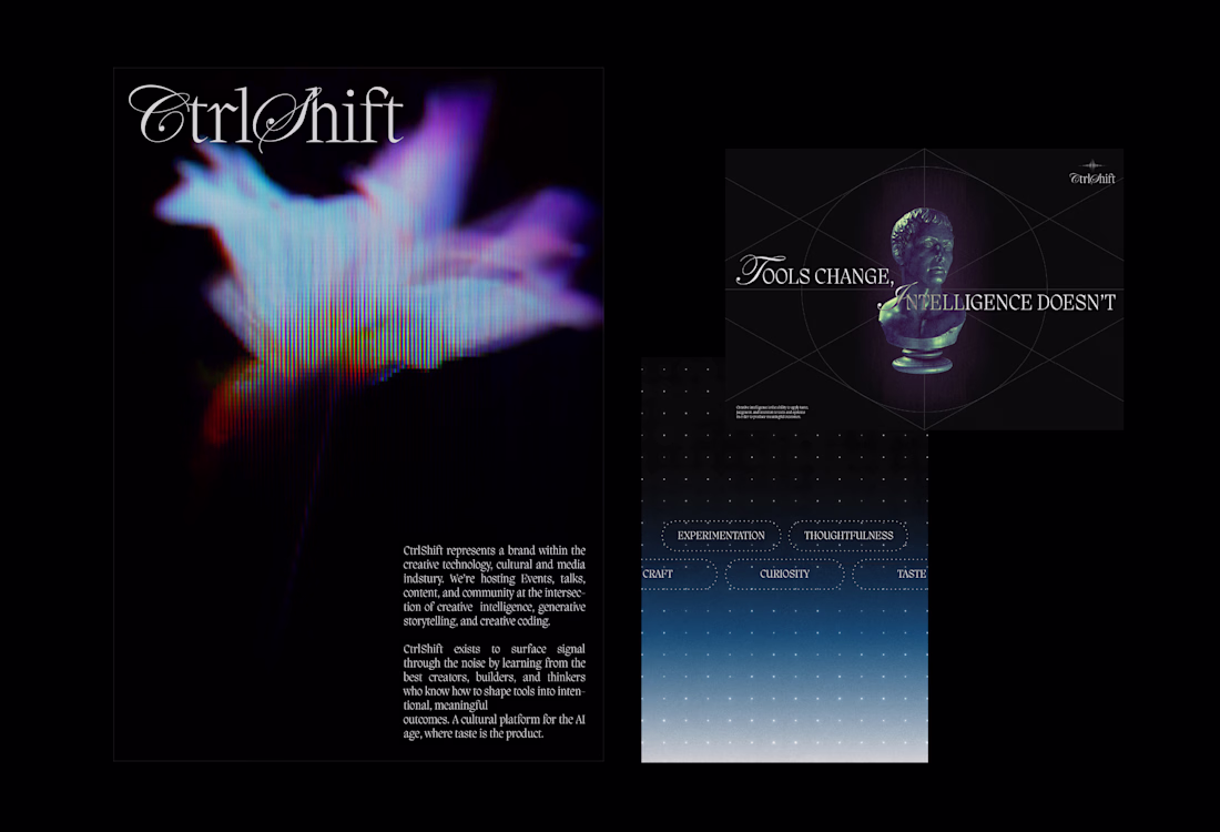
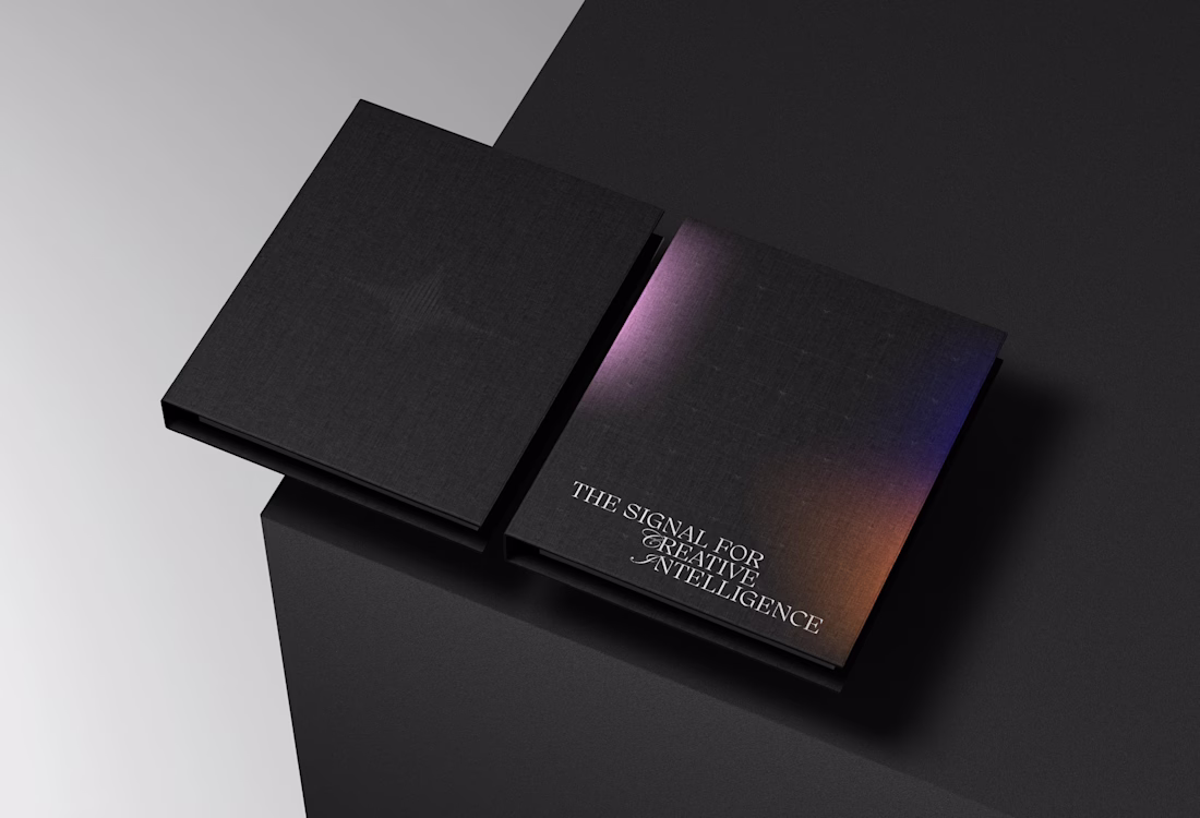
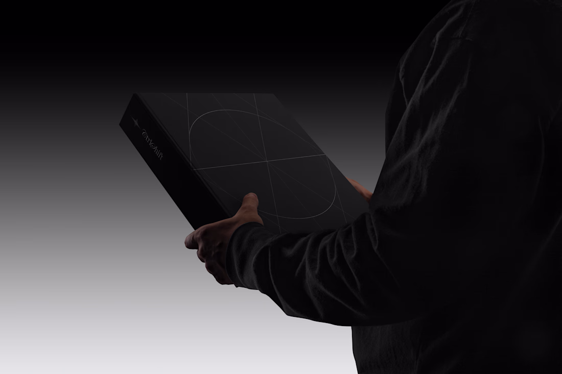
Second brand identity concept for CtrlShift.
A brand within the creative technology, cultural and media indstury. We’re hosting Events, talks, content, and community at the intersection of creative intelligence, generative storytelling, and creative coding.
The logo features a modern, intelligent logomark built around a three-phased star symbolizing curiosity, signal throught the noise, and transformation. Constructed from sharp vertical lines with varying stroke weights, it creates a subtle optical illusion that reflects the brand’s core idea of clarity emerging from complexity. The three phases are conceptually tied to the brand name - Ctrl, Shift, and the final outcome: taste. This is paired with a confident, taste-led wordmark blending script and serif typography to spark intrigue and character.
Disclaimer: As you may notice, this concept contains some elements of the graphic language we ended up with in the final (previously posted concept), since it was a product of a unification among the first and the second direction. As a recommended solution, after couple of iteration sets, the goal was to adopt majority of the elements from this concept and harmonize them with the selected one to create one unity and expand the entire design system.
If you haven't, you can see the final direction here.
Feel free to like, comment your opinion and follow, kindly appreciated.
Love this mixing of type in the logo! That is something that will always draw me in.
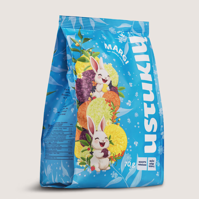
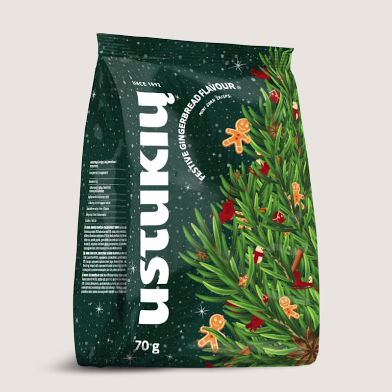
Two seasons, one brand. Here's how that works.
So Ustukių Malūnas came to me twice: once for spring, once for the holidays. Two completely different vibes. Spring is all lightness and fresh starts. Holiday is cozy, warm, gingerbread-scented everything.
The fun part? Making both feel like them while telling two very different stories.
Here's what I leaned on:
The brand's bones stayed the same (layout, type, core elements)
Color and illustration carried the seasonal mood
I love this kind of problem. How do you keep a brand recognizable when the energy shifts completely? That tension between consistency and surprise is where the good stuff happens.
Which packaging do you like more?
33 voted
49%
35 voted
51%
68 votes
Closed
Holidays one looks more premium, elegant but I picked the Spring one, because of its colors & more fun visuals! 👍
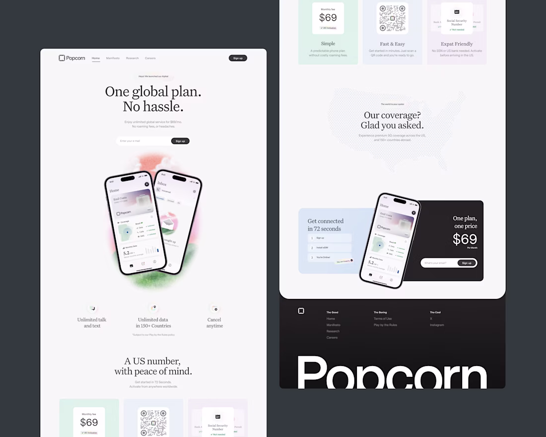
Take a good look at my work for Popcorn live while you can!
New website is coming sooner than you think 🧐
Amazing work
Trending
Claude
Claude has entered the design space. How are you using Claude Design?
Contra University
Learn from expert creatives how to earn more using next-gen AI tools.
creativeaiflow
Creative AI workflows are evolving. What tools do you use, and what are their strengths and weaknesses?
portfolioreview
The best portfolios tell a story, not just show a grid. Share yours for feedback.
freelancerlife
Freelancer life is wins, pivots, and everything in between. What’s yours right now?