The network for creativity
Join 1.25M professional creatives like you
Connect with clients, get discovered, and run your business 100% commission-free
Creatives on Contra have earned over $150M and we are just getting started
Back to feedPost

A wellness brand walking into an F1 partnership pitch needs more than a good product.
It needs a deck that belongs in that room. Gannu is a precision wellness brand built around neurological performance and recovery. The science had to land. The brand had to hold its own next to one of the most recognizable logos in sport.
Every slide had to feel like it belonged in that world. A deck built for a room where milliseconds matter and so does every design decision.
If you have a high-stakes partnership pitch coming up, let us take a look.
Custom-built. Fully editable. No templates.


Amazing work!

Wowww that is wilddd 🎉

The network for creativity
Join 1.25M professional creatives like you
Connect with clients, get discovered, and run your business 100% commission-free
Creatives on Contra have earned over $150M and we are just getting started











Related posts

Bento Grid is not an aesthetic trend.
It is a weapon for B2B sales.
Most founders still believe that presentation design is just about making slides look modern. They dump a massive wall of text and data onto a single canvas, hoping the investor will somehow sift through the noise and find the right metrics. But a disorganized data dump is never a pitch deck.
When a slide is packed with noise, control of the room is instantly lost.
Commercial design does not build aesthetics.
It engineers attention.
The core mechanic of the Bento layout is absolute visual isolation. When specific numbers are locked inside their own rigid containers, the buyer's focus is completely hijacked. It stops being a game of hoping they see the value, and becomes a system of directing exactly where their eyes go.
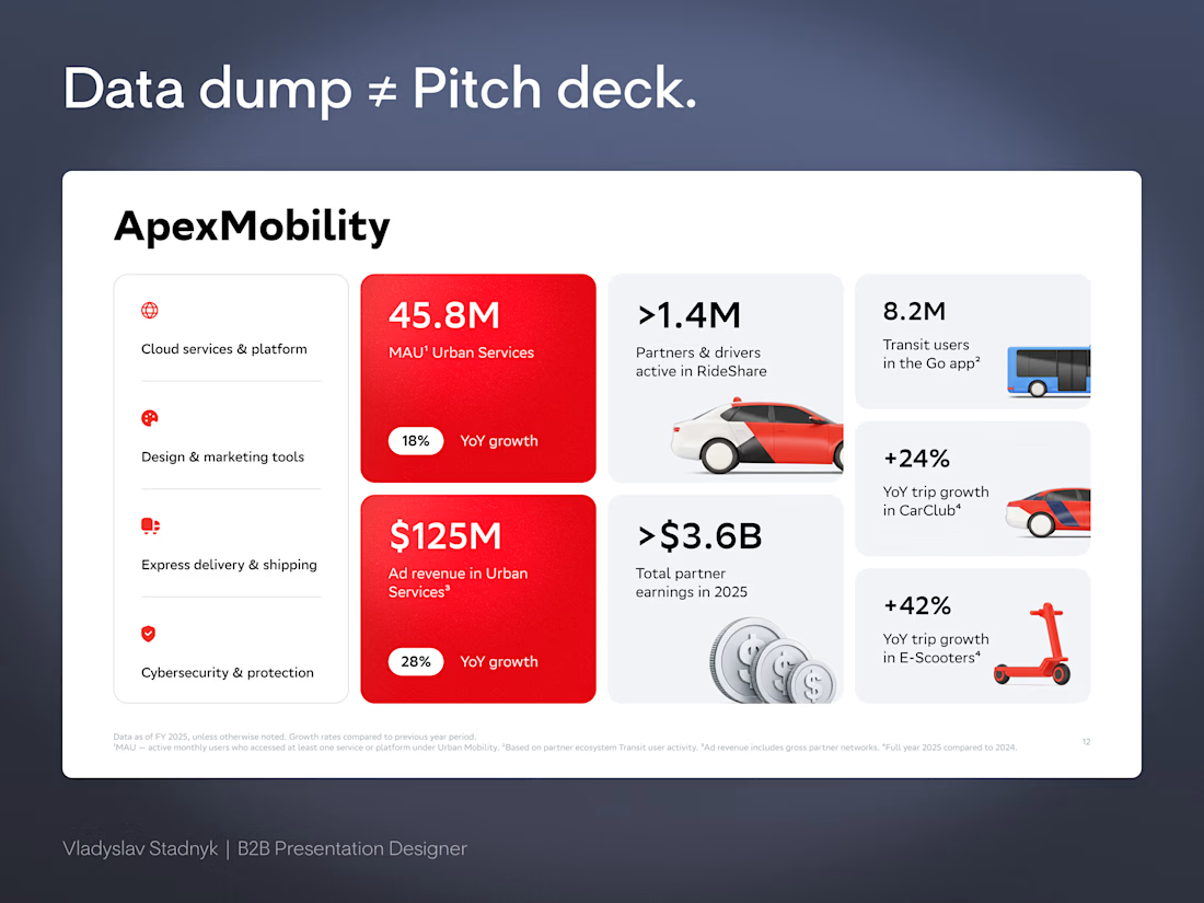
Take the ApexMobility slide structure as an example.
Before the brain even processes the details, the eyes are dragged straight to the heavy red squares.
45.8M users.
$125M in revenue.
The main argument is sold in a fraction of a second. All the lighter blocks around those red squares serve only as quiet background context for anyone who wants to dig deeper into the metrics later.
There is no need to hope an investor reads the most important number.
They are physically forced to see it.
Real design is the ruthless discipline of controlling exactly where people look.
If you are ready to stop dumping data and start directing attention, send me a DM 📩


Commercial design does not build aesthetics. It engineers attention is a line worth saving. The ApexMobility example is brilliant, locking the key numbers into their own rigid containers so the buyer's focus gets hijacked before the brain even processes the details.

Jordan Racing concept.
What if Jordan Brand launched its own racing team? We imagined the full launch, from the Speed Demon campaign and posters to a telemetry inspired website, racing streetwear and a flagship research facility. Basketball heritage meets Formula 1 speed.
Designed by Studio /03
Concept project, not affiliated with Nike or Jordan Brand.
Art Direction, Brand Identity, Campaign Design, Web Design, Poster Design, Apparel Graphics, Motorsport, Concept


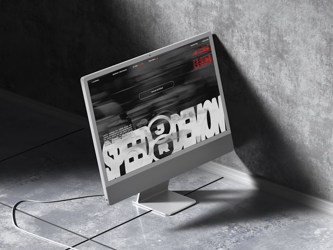
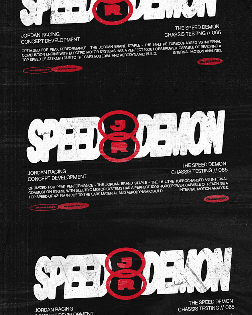
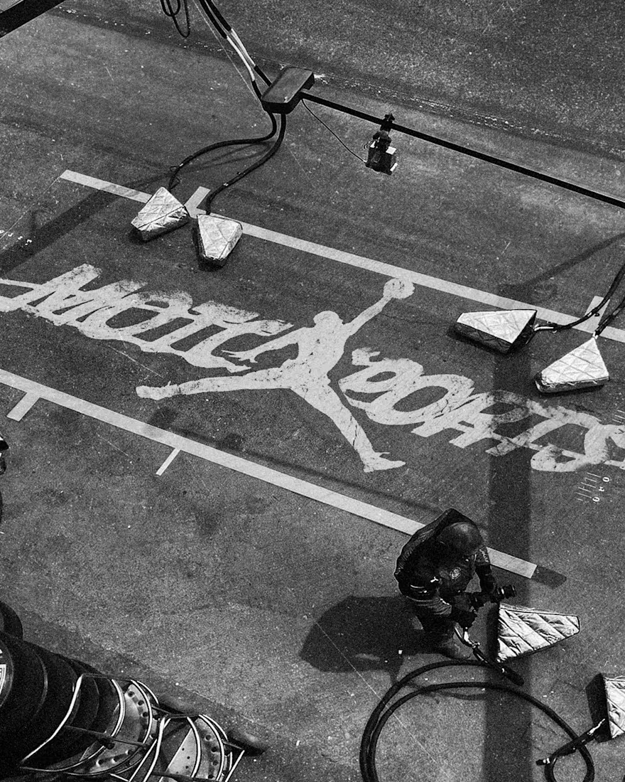
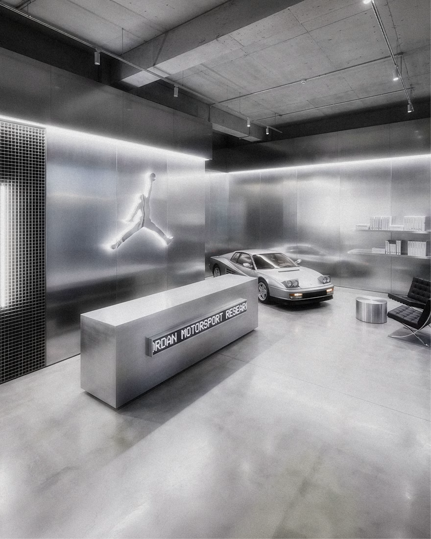

The grayscale with that one red accent keeps the whole system tight. Telemetry style site is a smart touch.

⚽ ONE KICK. THREE BRANDS. ONE ANIMATION.
What if one animation could tell three completely different brand stories — without rebuilding it from scratch?
Introducing ONE KICK, my third entry for the SVGator Animation Template Challenge on Contra. 🚀
The idea was simple: Build once. Design to change.
I created a football-inspired animated template that transforms across three distinct brand identities while keeping the same core motion, timing, and animation structure.
🟠 FIZZA — Bright, playful, and full of personality.
🟢 STRYKA — Bold, energetic, and performance-driven.
🔵 MATCHDAY+ — Dynamic, modern, and built for matchday excitement.
What's behind the concept?
One reusable animation system featuring seven scenes, adaptable branding, customizable text, colors, logos, and visual assets — designed to make brand personalization faster and easier.
From the opening kick to the final branded call-to-action, the goal was to show that great motion design doesn't have to be created from zero every time.
Where it shines: Sports campaigns, promotional ads, social media content, product launches, and animated brand storytelling. The template is designed for creators who want polished motion while keeping the freedom to make it their own.
The challenge I set myself: Could one animation feel like it was custom-made for three completely different brands?
The showcase is my answer.
3 BRANDS. 1 TEMPLATE. 0 REDRAWS.
Built with SVGator. Designed for reuse. Made to work again.
Would love to hear which identity you think works best! 👀
@SVGatorApp #svgatorchallenge #SVGator #Contra #DesignChallenge


The animation is so amazing!