The network for creativity
Join 1.25M professional creatives like you
Connect with clients, get discovered, and run your business 100% commission-free
Creatives on Contra have earned over $150M and we are just getting started
Back to feedPost

Monika Chrustek Portfolio, Design & Development
Client: Monika Chrustek
Role: Web Designer / Framer Developer
Timeline: May–June 2026
Deliverables: Full site design, custom gallery components, hover/click-to-expand interactions, light-to-dark mode transition, motion system, responsive build, image optimization
Challenge & Scope
Monika Chrustek is a photographer known for atmospheric, analog-leaning work — much of it shot for music artists (Chivas, Szpaku) in staged, cinematic settings. She needed a portfolio that didn't just display images in a grid, but felt like an extension of her photography itself: moody, tactile, and unhurried, with room for each shot to breathe.
The brief was to design and build the site end-to-end in Framer — no template, no existing design system to inherit. Every layout decision, interaction, and transition had to be built from scratch around the photography, not around it.
Approach & Implementation
I owned both the design and the development, working directly in Framer rather than handing off a static design first. That let me test interactions and pacing in the browser as I built, rather than guessing how a mockup would feel in motion.
A Gallery Built Around the Photos, Not a Grid
Rather than a conventional thumbnail grid, I built a custom horizontal gallery where a single image expands on hover to reveal detail, with a click-through into a full case view — "hover to expand, click to expand" as the guiding interaction. This kept the homepage from feeling like a wall of thumbnails while still letting visitors browse quickly.
Light-to-Dark Scroll Transition
As the visitor scrolls from the hero into the work section, the site transitions from a light background into a dark, near-black theme with a subtle starfield texture — mirroring the mood shift in Monika's more staged, artificial-light photography. This wasn't a toggle; it's a scroll-driven environment change built to feel cinematic rather than mechanical.
Typography & Tone
Bold serif display type for the name and headlines, paired with a plain sans for supporting text, gives the site an editorial feel closer to a photo book than a typical portfolio template.
Motion & Micro-interactions
Image reveals, hover states, and section transitions were all custom-built rather than relying on Framer's default effects, keeping the pacing consistent across the homepage, the works index, and individual case pages.
Performance & Structure
Given the site is almost entirely image-driven, careful image sizing and loading were essential to keep the experience fast despite the density of high-resolution photography.
Results
A fully custom-designed and developed portfolio site built end-to-end in Framer
A distinctive gallery interaction (hover/click to expand) that replaces the standard thumbnail grid
A scroll-driven light-to-dark transition that reflects the tonal range of the photography itself
An editorial typographic system suited to a photography-first audience
A fast, image-heavy site that stays smooth despite high-resolution content
Monika now has a portfolio that reads less like a template and more like a curated photo book — built to let the work lead, with design and motion in service of the images rather than competing with them.


The network for creativity
Join 1.25M professional creatives like you
Connect with clients, get discovered, and run your business 100% commission-free
Creatives on Contra have earned over $150M and we are just getting started





Related posts

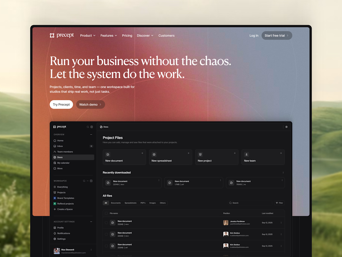
A little peek at the project I started this week.
A new hero section for Precept — a project management tool for creative agencies and studios.
Designed in Figma, with development in Framer planned next.
Very excited to see the whole thing come together 🔥

Modern, modern, modern

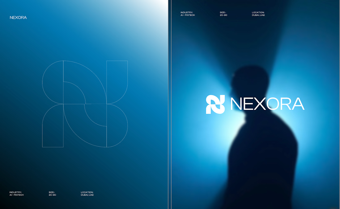
Currently building a new identity for an AI + fintech company in Dubai.
Still early, but this is one of the directions we’ve been exploring for the brand.
The idea was to avoid the usual “AI company” visual language and build something that feels more established, precise, and quietly futuristic.
We’ve been playing with geometry, light, and a much more restrained visual system around the mark.
Still developing this one, so I’m curious:
Would you push this direction further, or keep it this restrained?
Honestly the logo presentation is impressive

Working on a Free Framer component for the marketplace 🙇🏽♀️

Weldone, Florencia