


Shortkings Club — Brand & Website (In Progress)
Client: Shortkings Club
Role: Web Designer / Framer Developer
Status: TBA
Shortkings Club is a brand built around a simple promise: helping creators make real money from short-form content. I'm designing and developing the full site and visual identity from the ground up, giving the brand a bold, confident look to match its message. Full case study coming soon as the project wraps up.
0
32
kobielak.pl (http://kobielak.pl) — Personal Portfolio, Design & Development
Client: Self (kobielak.pl (http://kobielak.pl))
Role: Web Designer / Framer Developer
Timeline: 2026
Deliverables: Full site design, custom 3D rotating logo, micro-interactions, project showcase system, process section, responsive build
Challenge & Scope
As a freelance Framer developer, my own site had to do double duty: sell the work, and prove the craft at the same time. A portfolio that just lists projects in a grid doesn't say much about how someone actually builds — so the goal was to make the site itself the strongest case study, with the kind of motion and detail I'd want a client to see before we ever talk.
The brief I set for myself was simple to state and harder to execute: no template, no stock Framer effects, and every interaction had to feel deliberate rather than decorative.
Approach & Implementation
I designed and built the entire site myself, treating the homepage as a single flow — from first impression, through proof of work, through process, to a clear call to action.
A Custom 3D Rotating Logo as the Hero
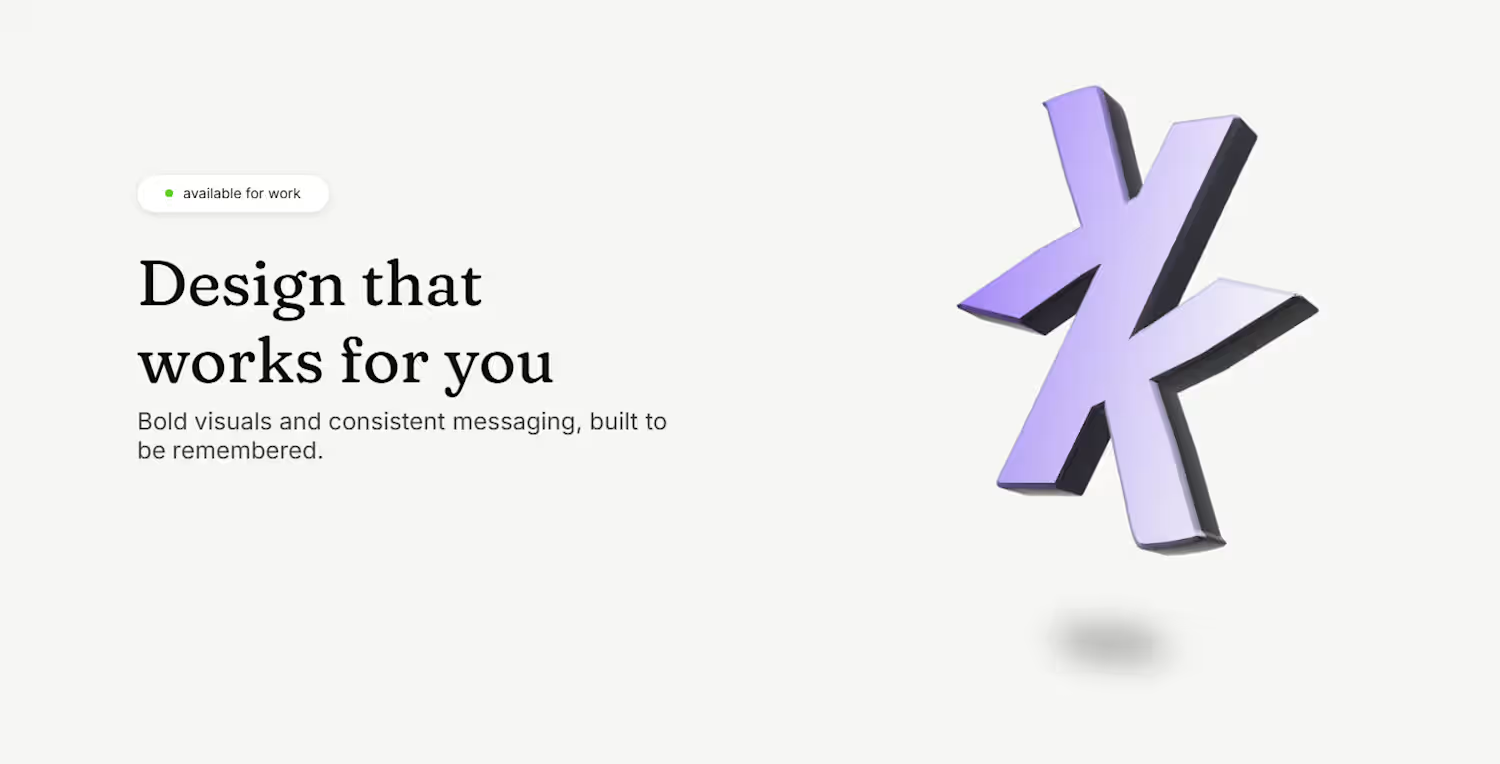
Instead of a static wordmark or a stock illustration, the hero features a custom-built 3D logo that continuously rotates in place, catching light across its faceted surface. It's the first thing a visitor sees, and it's built to signal immediately that this isn't a template site — it's a small piece of engineering in itself.
Micro-interactions Throughout
Small details carry a lot of the site's personality: a cursor-following dotted trail links the logo to the page below, project cards and service cards reveal supporting imagery on hover, and the active nav link underlines in-place rather than jumping. None of these rely on Framer's default effects — each was built and tuned by hand.
A Project Showcase Built for Skimming and Depth
Selected work is presented as large, image-led cards (including the Monika Chrustek and Coffie projects) that let a visitor browse quickly, while still giving each project room to breathe rather than cramming everything into a dense grid.
A Transparent Process Section
Rather than only showing polished outcomes, the site walks visitors through how a project actually happens — Discovery, Design, Develop, Launch — with short, honest descriptions of what happens at each stage, including the fact that everything is built by hand in Framer rather than assembled from pre-made blocks.
Services, Framed as Outcomes
The services section (Design, No-code development, Identity and content) pairs each offering with a short supporting image and one clear sentence of value, keeping the section scannable without feeling like a generic list of capabilities.
A Confident Close
The site ends on a full-bleed, gradient-lit call-to-action panel — "Ready to build something great?" — paired with direct contact options, keeping the final impression bold rather than trailing off with a plain contact form.
Results
A fully self-designed and developed portfolio that functions as its own proof of skill
A custom 3D rotating logo used as the site's signature visual element
A cohesive set of hand-built micro-interactions replacing default Framer effects
A project showcase and process section that build trust before a client ever reaches out
A confident, distinctive site that reflects the same craft clients can expect from a project built with me
kobielak.pl (http://kobielak.pl) was built to answer one question before it's even asked: if this is what my own site looks like, imagine what I can do with yours.
1
46
Coffie — Coffee Shop & Roastery Website (Concept Project)
Client: Personal / Concept Project
Role: Web Designer / Framer Developer
Timeline: July–August 2026
Deliverables: Full site design, storytelling scroll sections, custom hover interactions, parallax image reveals, typography system, responsive build
Challenge & Scope
Coffie is a self-directed concept project imagining the website for a coffee shop and roastery that sources, roasts, and brews everything in-house. The goal wasn't just to make a pretty landing page — it was to design a site that could actually sell the feeling of good coffee: warm, tactile, unrushed, with enough atmosphere that a visitor could almost smell it.
Rather than a generic "hero + menu + contact" template, the brief I set for myself was to build a site structured like a story — from the bean's origin to the cup in your hands — using scroll, imagery, and typography to carry that narrative.
Approach & Implementation
I designed and built the entire site myself in Framer, treating the homepage as a single continuous journey rather than a stack of disconnected sections.
A Warm, Editorial Visual Language
The palette leans into deep espresso browns and near-black backgrounds, paired with a warm serif typeface for headlines. Large, high-contrast photography of espresso extraction, beans, and brewing does most of the talking — text is kept minimal and confident.
From Seed to Cup: A Scroll-Driven Story
The site's centerpiece is a scrolling narrative section — "From seed to your cup" — that walks the visitor through sourcing, roasting, and brewing using staggered, offset images that reveal and reposition as you scroll. It's built to feel like flipping through a coffee journal rather than browsing a product list.
Custom Hover Interactions
Buttons like "More about us" use a custom liquid/blob hover effect instead of a standard state change — a small detail that reinforces the tactile, organic feel of the brand rather than looking like a stock component.
Full-Bleed Photography & Pacing
Sections alternate between full-width statement photography (close-up pours, roasted beans) and quieter text-led moments, giving the page rhythm instead of a constant wall of imagery.
Typography & Tone
A pairing of a classic serif for emotive headlines ("Coffee can take you to many places") with a clean sans for supporting copy keeps the site feeling premium and editorial rather than like a typical local-business template.
Results
A fully self-designed and developed concept site built end-to-end in Framer
A scroll-driven "seed to cup" storytelling section that replaces a standard about page
A custom liquid hover interaction on key CTAs
A cohesive warm, dark visual identity built around photography and serif typography
A page built to prove that even a "simple" coffee shop site can carry real narrative and motion craft
Coffie was built as a showcase of how far a small business site can be pushed — using story, pacing, and small interaction details to make a coffee shop feel like a considered brand rather than a template.
0
51
Monika Chrustek Portfolio, Design & Development
Client: Monika Chrustek
Role: Web Designer / Framer Developer
Timeline: May–June 2026
Deliverables: Full site design, custom gallery components, hover/click-to-expand interactions, light-to-dark mode transition, motion system, responsive build, image optimization
Challenge & Scope
Monika Chrustek is a photographer known for atmospheric, analog-leaning work — much of it shot for music artists (Chivas, Szpaku) in staged, cinematic settings. She needed a portfolio that didn't just display images in a grid, but felt like an extension of her photography itself: moody, tactile, and unhurried, with room for each shot to breathe.
The brief was to design and build the site end-to-end in Framer — no template, no existing design system to inherit. Every layout decision, interaction, and transition had to be built from scratch around the photography, not around it.
Approach & Implementation
I owned both the design and the development, working directly in Framer rather than handing off a static design first. That let me test interactions and pacing in the browser as I built, rather than guessing how a mockup would feel in motion.
A Gallery Built Around the Photos, Not a Grid
Rather than a conventional thumbnail grid, I built a custom horizontal gallery where a single image expands on hover to reveal detail, with a click-through into a full case view — "hover to expand, click to expand" as the guiding interaction. This kept the homepage from feeling like a wall of thumbnails while still letting visitors browse quickly.
Light-to-Dark Scroll Transition
As the visitor scrolls from the hero into the work section, the site transitions from a light background into a dark, near-black theme with a subtle starfield texture — mirroring the mood shift in Monika's more staged, artificial-light photography. This wasn't a toggle; it's a scroll-driven environment change built to feel cinematic rather than mechanical.
Typography & Tone
Bold serif display type for the name and headlines, paired with a plain sans for supporting text, gives the site an editorial feel closer to a photo book than a typical portfolio template.
Motion & Micro-interactions
Image reveals, hover states, and section transitions were all custom-built rather than relying on Framer's default effects, keeping the pacing consistent across the homepage, the works index, and individual case pages.
Performance & Structure
Given the site is almost entirely image-driven, careful image sizing and loading were essential to keep the experience fast despite the density of high-resolution photography.
Results
A fully custom-designed and developed portfolio site built end-to-end in Framer
A distinctive gallery interaction (hover/click to expand) that replaces the standard thumbnail grid
A scroll-driven light-to-dark transition that reflects the tonal range of the photography itself
An editorial typographic system suited to a photography-first audience
A fast, image-heavy site that stays smooth despite high-resolution content
Monika now has a portfolio that reads less like a template and more like a curated photo book — built to let the work lead, with design and motion in service of the images rather than competing with them.
0
56