The network for creativity
Join 1.25M professional creatives like you
Connect with clients, get discovered, and run your business 100% commission-free
Creatives on Contra have earned over $150M and we are just getting started
Back to feedPost
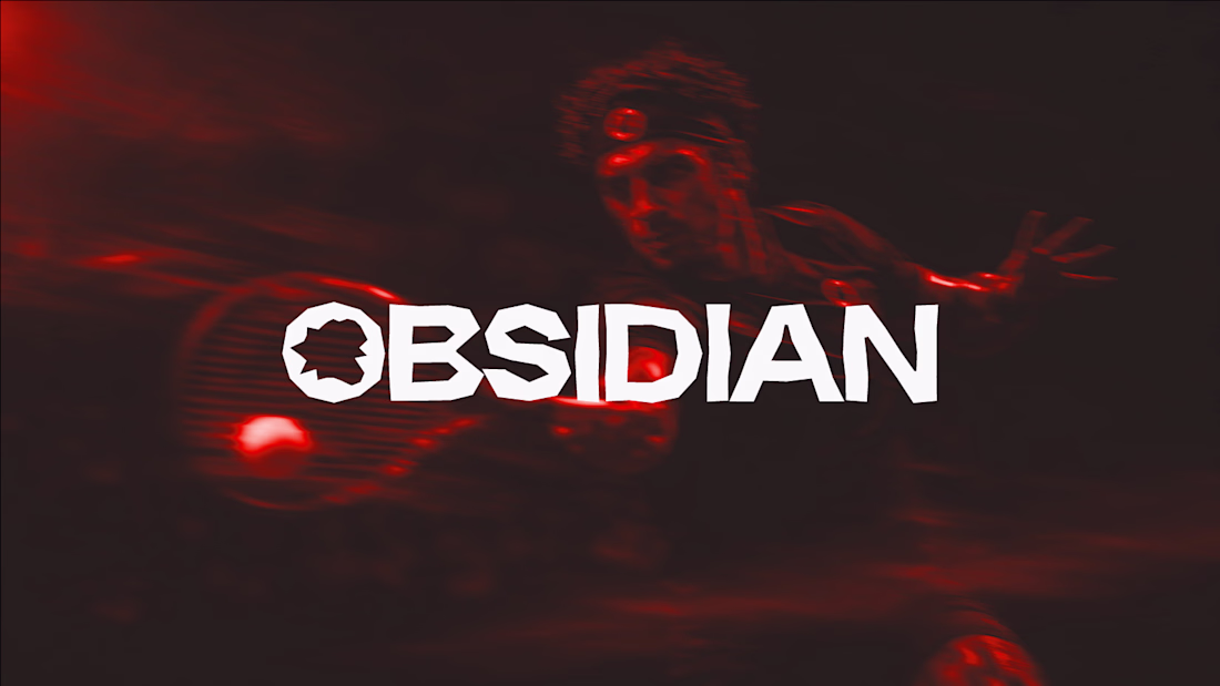
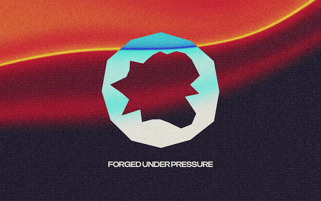
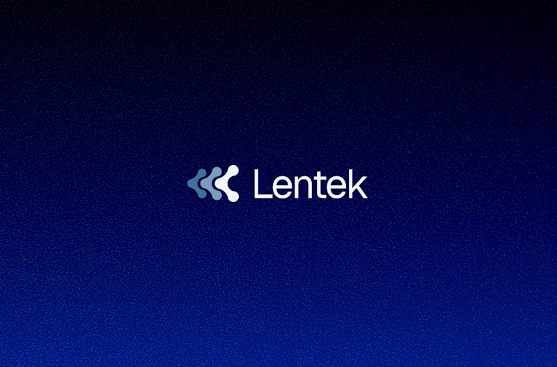
Most logos try to look perfect. Ours is intentionally broken.
Obsidian forms when volcanic glass cools too fast to crystallize, and it cracks into sharp, jagged edges instead of smooth curves. We built the logo the same way. No symmetry. No clean lines. Every notch is on purpose.
Would you keep a "flawed" logo like this, or smooth it out for safety?
Curious what you'd do.
The network for creativity
Join 1.25M professional creatives like you
Connect with clients, get discovered, and run your business 100% commission-free
Creatives on Contra have earned over $150M and we are just getting started
Related posts
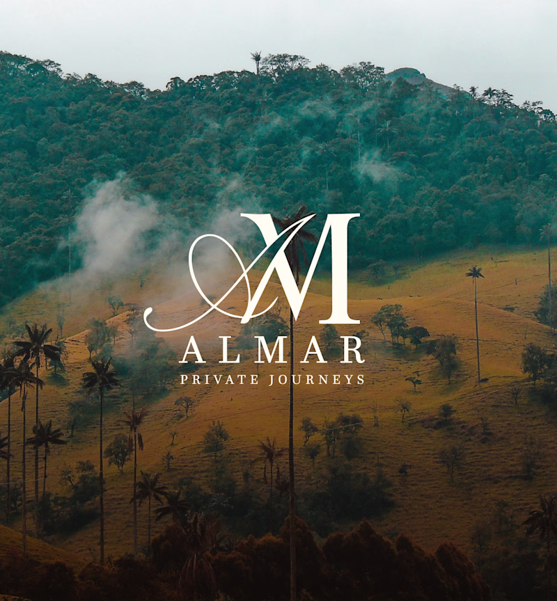
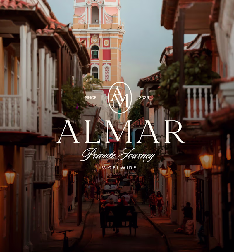
Working on the brand identity for ALMAR Private Journeys, a luxury travel company offering bespoke experiences across Colombia.
I’ve developed two logo concepts and would love community feedback.
Which one feels more premium, trustworthy, and exclusive?
17 voted
68%
8 voted
32%
25 votes
Closed
Will go for V2
Two logo explorations for a spine technology company. Which direction would you take?
26 voted
87%
4 voted
13%
30 votes
Closed
I can't actually choose logo base on look I need to understand what the brand purpose, story to understand which works
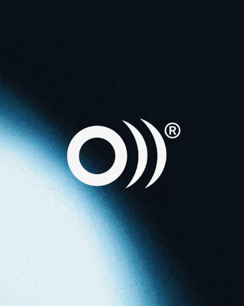
The sound behind the symbol.
A preview of the visual identity for La Original, a brand that has connected musicians with authentic instruments and trusted brands since 1979.
The identity begins with a simple observation: instruments may change, styles may evolve, but they all share the same purpose.
Sound.
The symbol combines the initial O from Original with expanding sound waves, expressing the moment where every musical experience begins. It avoids representing a single instrument because the brand has never belonged to just one. It belongs to everything that makes music possible.
Its simplified form allows the symbol to adapt across every touchpoint while preserving its clarity over time.
Like music itself, the symbol is not only meant to be seen.
It is meant to be felt.
Brand DesignIllustrationUser ResearchAdobe IllustratorAdobe SuiteFigmabranddesignericondesignerbrandingstudio
Killer identity work. "The sound behind the symbol" is such a clean thread to build a brand around, you can feel the intention.
Trending
Claude
Claude has entered the design space. How are you using Claude Design?
Contra University
Learn from expert creatives how to earn more using next-gen AI tools.
MagicPath
The canvas is infinite, and exploration is becoming the workflow. How are you using MagicPath?
creativeaiflow
Creative AI workflows are evolving. What tools do you use, and what are their strengths and weaknesses?
freelancerlife
Freelancer life is wins, pivots, and everything in between. What’s yours right now?