The network for creativity
Join 1.25M professional creatives like you
Connect with clients, get discovered, and run your business 100% commission-free
Creatives on Contra have earned over $150M and we are just getting started
Back to feedPost
Taste Test
Working on the brand identity for ALMAR Private Journeys, a luxury travel company offering bespoke experiences across Colombia.
I’ve developed two logo concepts and would love community feedback.
Which one feels more premium, trustworthy, and exclusive?
17 voted
68%
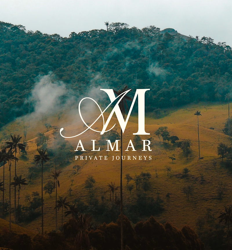
8 voted
32%
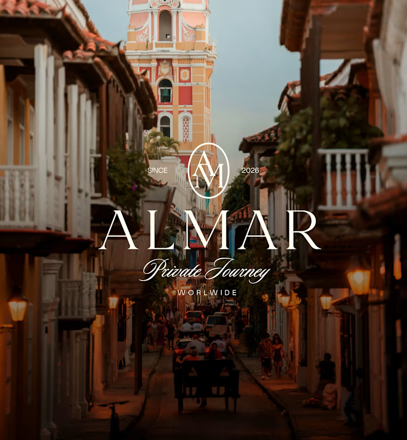
25 votes
Closed

Both are cool actually

Thanks


The 2.0 is exclusive
I thought that too more minimalist and elegent

I like V2 more.
Thanks

I think ver.1 is good
It took me more time then V2 so i must like it too hahaha

Logo V1.0, I really liked it. good job 👍

Will go for V2


1.0 is beautifully and Unique. Well done.


We need more designer who can combine luxury and minimalistic in elegant way like you. This is outstanding work!

I'd go with V1.
The composition feels calmer and gives the logo room to breathe. My eye naturally goes from the monogram to "ALMAR" and then to the subtitle, which feels more in line with a luxury brand.
V2 has beautiful photography, but the busy background competes with the...

V1 gives a classic look

Nice idea. 2


I know voting has ended, the second one gives a premium vintage style.
The network for creativity
Join 1.25M professional creatives like you
Connect with clients, get discovered, and run your business 100% commission-free
Creatives on Contra have earned over $150M and we are just getting started






Related posts

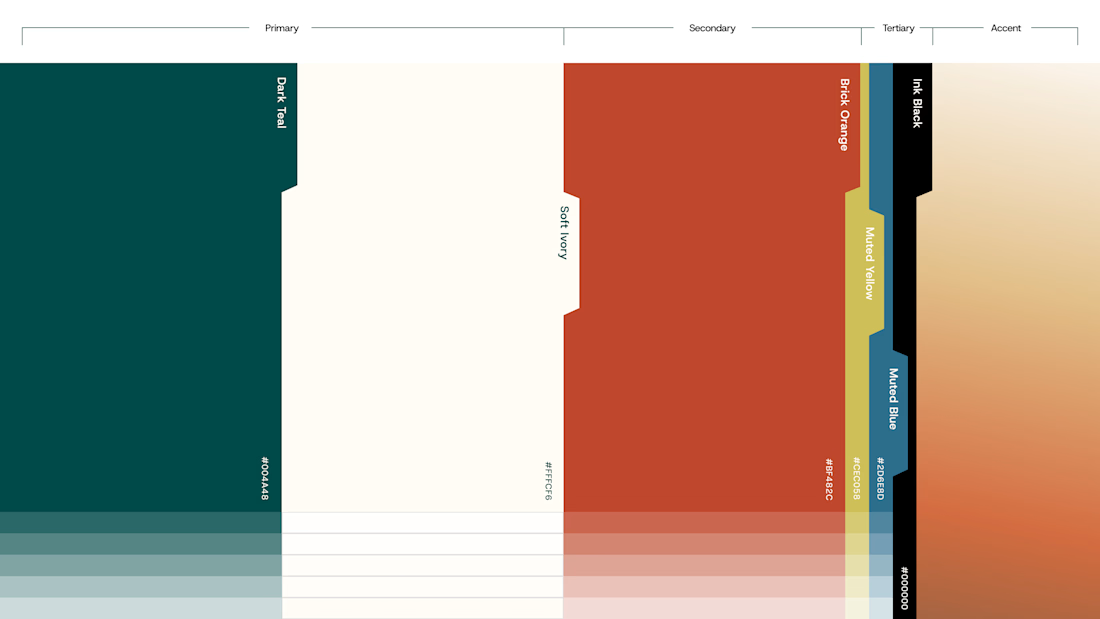
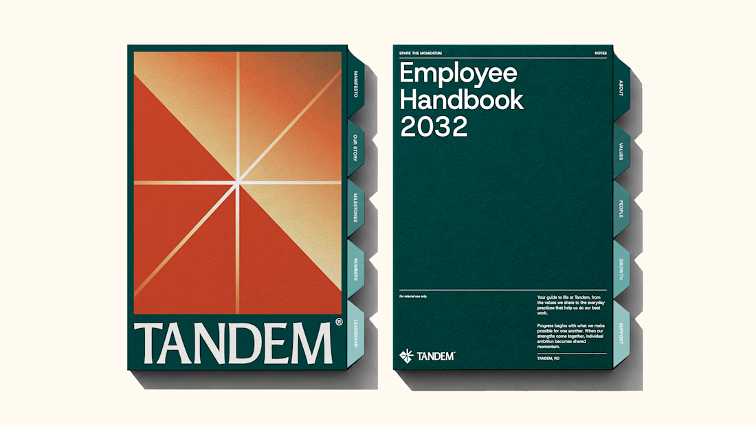
The new brand identity for Tandem is live!
Quite a lot of thought and work went into building this one, and I'm excited to finally share it. Would love to hear your thoughts!
We developed a complete brand experience for Tandem, covering:
1. Brand Strategy
2. Brand Naming
3. Logo Desig
4. Visual Identity
5. Brand Collaterals
6. Brand Guidelines
7. Motion Design
The complete project is now live. Take a look and explore the full identity here



Great work!!

Which one would you rather see on a muddy Sunday morning?
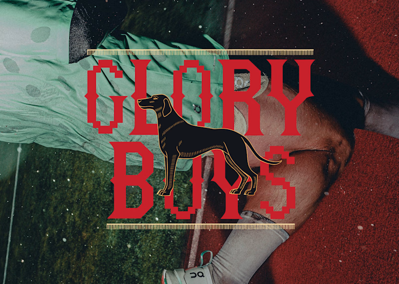
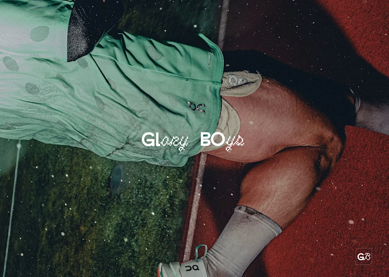
Two logos for the same five-a-side team. Same photo, same sweaty energy, very different personalities.
Option A: red slab serif with pixel notches, a black hound in the middle, gold ticker rules top and bottom. It looks like a pub sign that got into a video game. Loud, heritage, a bit smug.
Option B: tiny white wordmark, half clean sans, half pixel script, with a little G8 stamp in the corner. It looks like it already has a sponsor and a good agent. Quiet, modern, a bit cool.
One screams “we have a trophy cabinet.” The other whispers “we are not telling you about the trophy cabinet.”
Reply A or B. Be honest, nobody’s feelings are on the line except mine.
17 voted
57%
13 voted
43%
30 votes
Closed


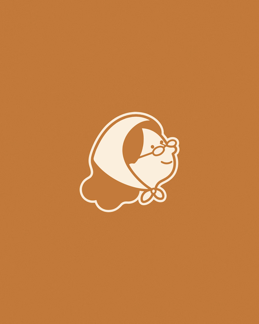
Creating 2 concepts for a project, this is the first one.
I’m really enjoying the process!
Right now, we’re defining the strategy and visual direction, which will later serve as the foundation for developing the final brand identity.
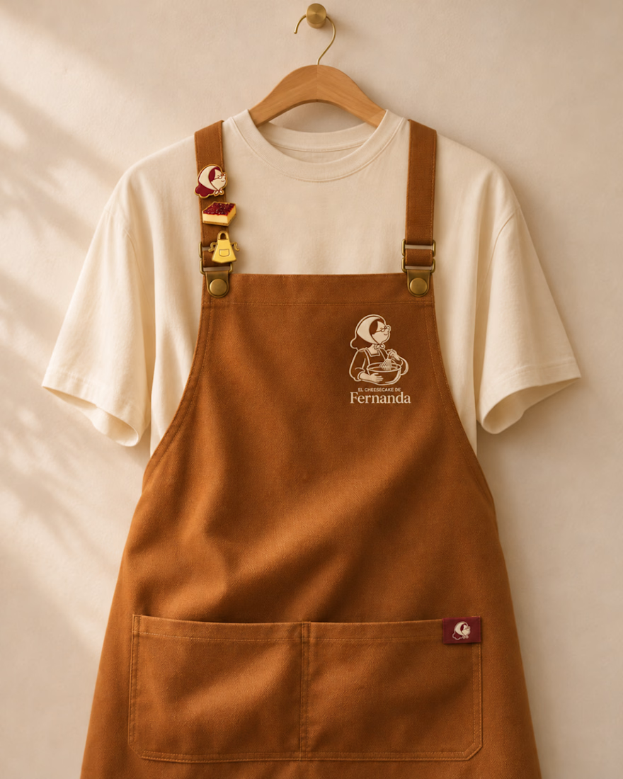
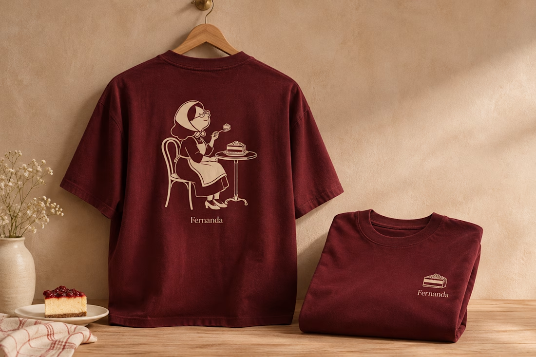

Nice logo design I like how logo is placed in clothes