The network for creativity
Join 1.25M professional creatives like you
Connect with clients, get discovered, and run your business 100% commission-free
Creatives on Contra have earned over $150M and we are just getting started
Back to feedPost

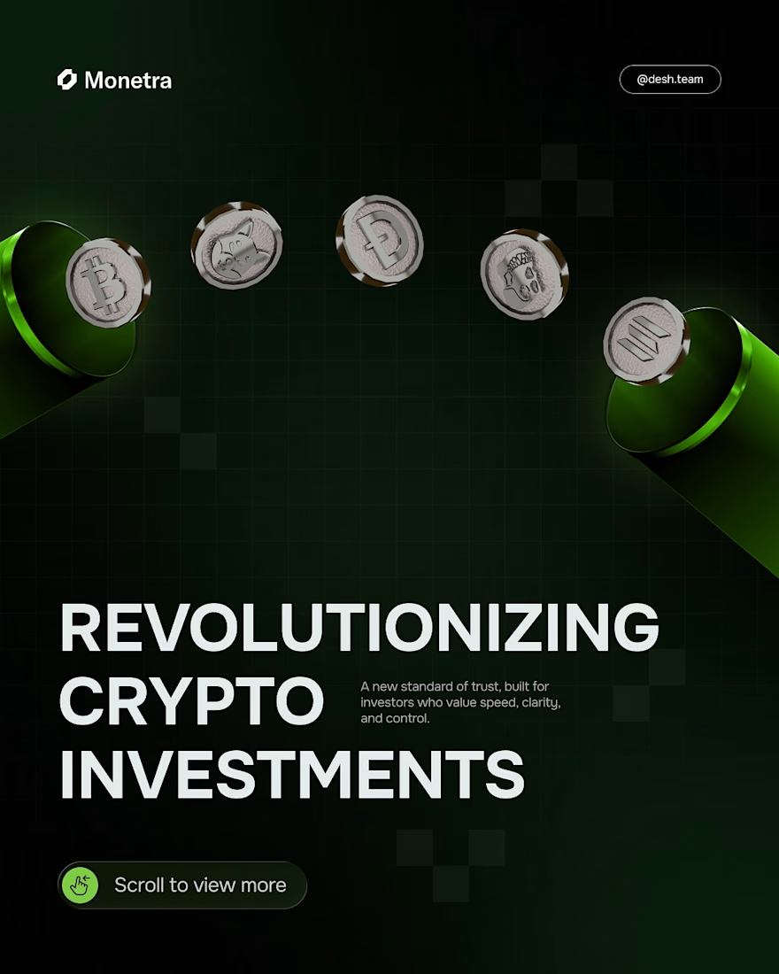
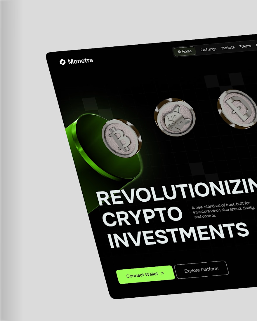
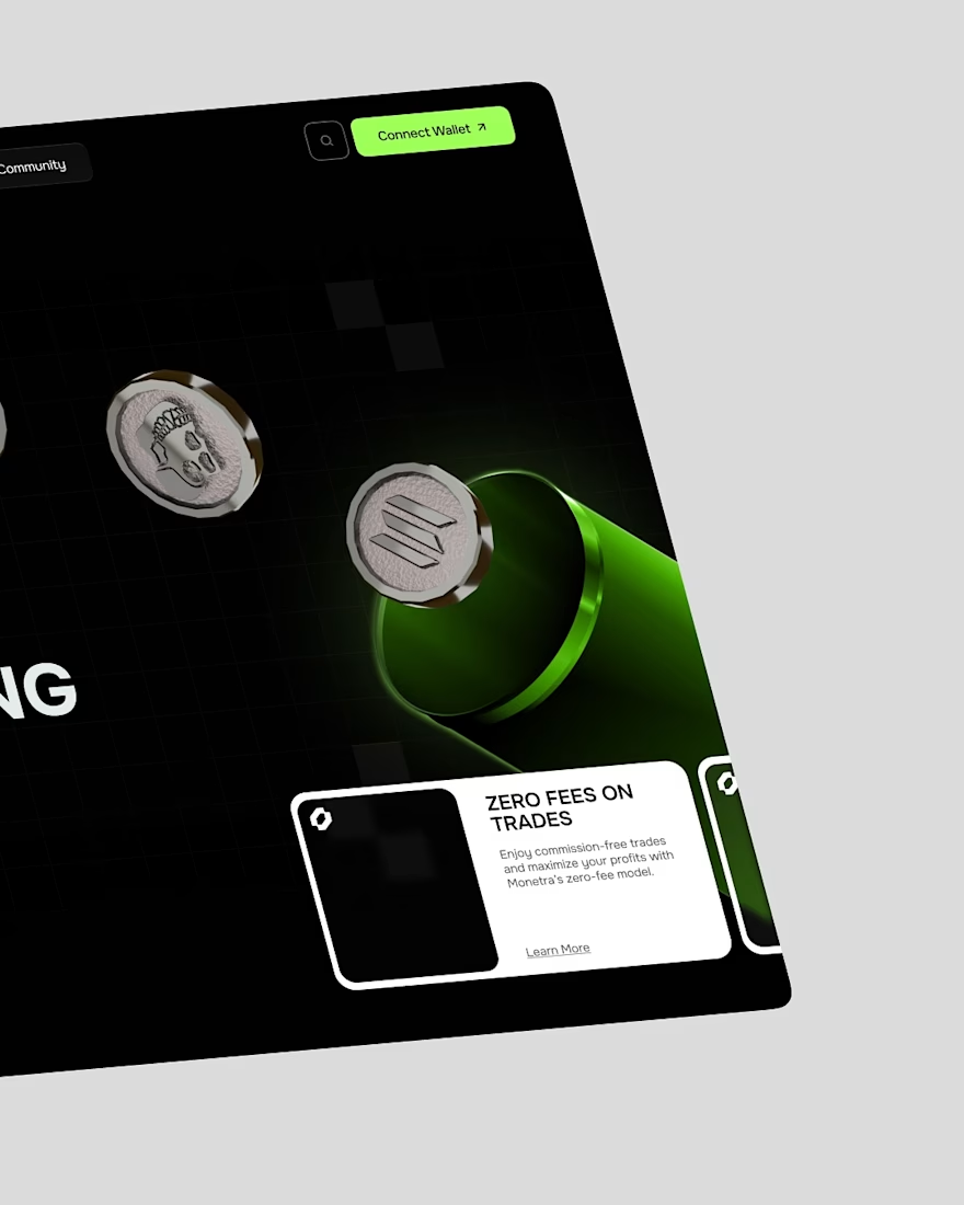
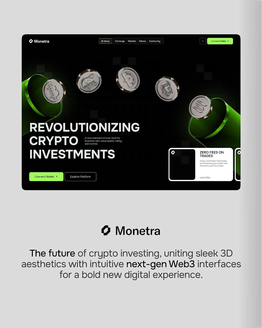
Monetra explores what a modern crypto platform could feel like when strong visuals meet a clear user journey.
For this concept, we leaned into bold 3D elements, high-contrast typography, and a minimal interface that keeps the focus on what matters. Every section is designed to guide users naturally, making complex products feel approachable from the very first interaction.
A clean landing page can shape how people perceive trust before they even connect their wallet. This concept was built around that idea, combining a futuristic aesthetic with an intuitive experience that feels familiar from the first scroll.
What do you think of this direction? 👀



Amazing work!
Many thanks 👍

This gives me Wise vibes!
Thanks, fam 😊


Looks really clean. The balance between bold visuals and a simple layout works really well.
Much appreciated 👍

Really nice thing!
Thanks a lot 💯

Love it!
Much appreciated, mate 🌟

Nice work1
Much love ✨

Thank you 💯

Me encantó !

Really strong direction. The balance between the futuristic 3D visuals and the clean user journey makes the concept feel modern without becoming overwhelming. The focus on building trust through the landing page is especially well thought out. 👏

The trust before the wallet connects framing is the strongest idea here, and keeping the interface minimal is what makes it land, because bold 3D and high contrast type read as hype in crypto unless the restraint around them signals a platform that is confident rather than loud.


the 'familiar from the first scroll' line is doing a lot of work here. crypto users have seen enough slick interfaces that the visual language alone does not build trust anymore... what tends to land is when the journey itself feels predictable and low friction before anyone has to commit anything
The network for creativity
Join 1.25M professional creatives like you
Connect with clients, get discovered, and run your business 100% commission-free
Creatives on Contra have earned over $150M and we are just getting started
Trending
retrofuturism
Share your favorite designs from the past exploring the distant future. Or your own take on the aesthetic 🚀
halftone
Dots. Texture. Grain. Let's see your designs using the halftone technique.

Midjourney
Creatives are showing off what they're making with Midjourney.
colorgrade
Video editors sound off: How do you enhance the mood of your video in color grading?


Related posts

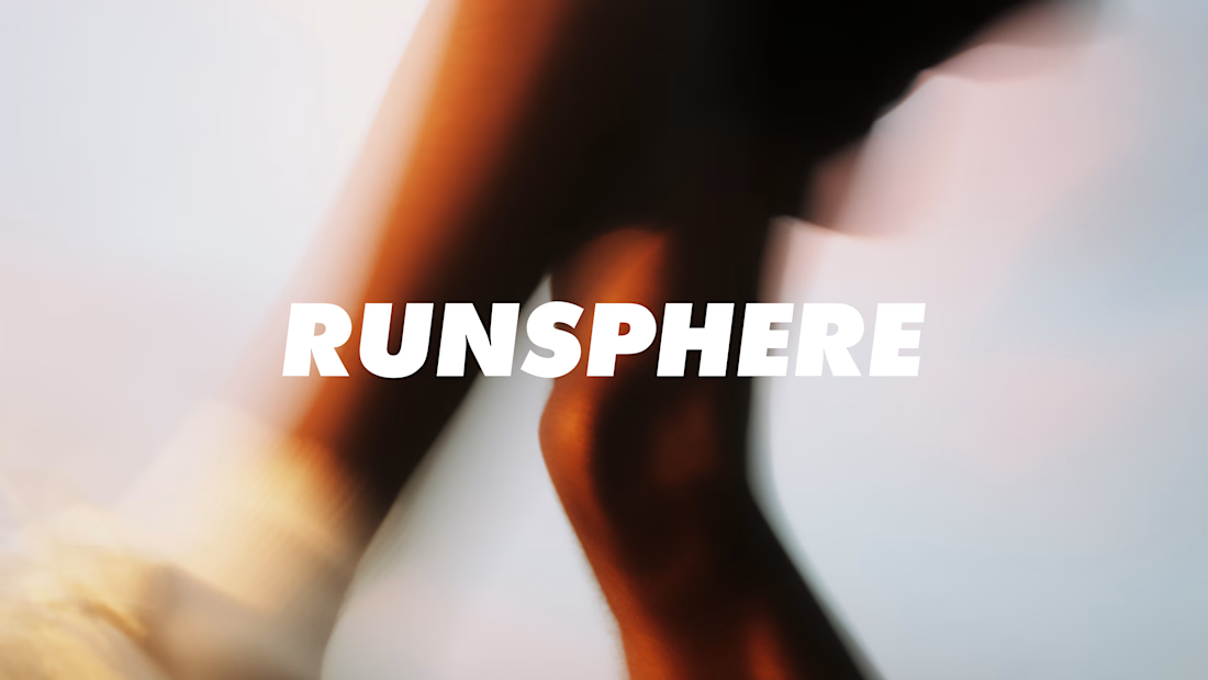
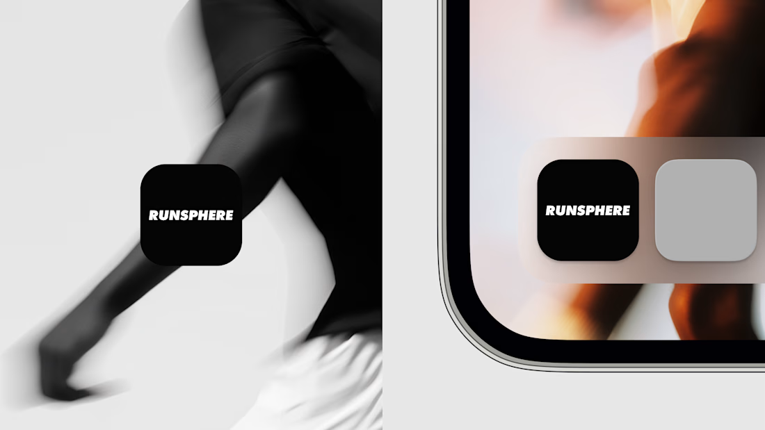
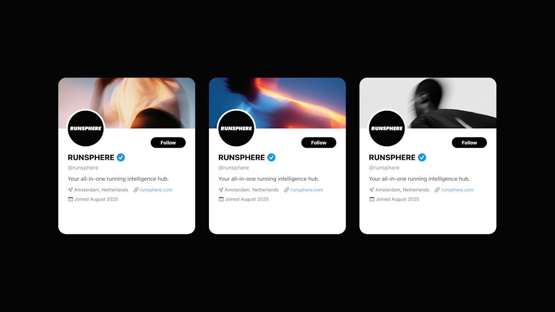


Most apps get one photoshoot, then watch the brand slide out of shape as every picture after it comes back looking a little different.
This project fixed that. Built a repeatable photo style for the app's brand using @Krea , so the team can make new shots any time and they still look like they belong together.
Here's a preview. Different actions, angles, and faces. Still clearly one product.
The team can make more next month without me and it holds. App Store, website, ads, all looking like the same company.
The alternative is what most products live with. Every new picture a little off, until the brand looks like a different company in each place someone runs into it.

The real win isn't the visual consistency, it's that the team can generate new on-brand shots next month without you in the loop. That's the line between a style and a system.

This is a preview of one mark from my full collection. You can check out the complete Logofolio & Mascot Showcase on my Behance!
Thank you for watching!

simple but chic, love it