The network for creativity
Join 1.25M professional creatives like you
Connect with clients, get discovered, and run your business 100% commission-free
Creatives on Contra have earned over $150M and we are just getting started
Back to feedPost
Taste Test
Im running a quick A/B vote on the hero design. V1 uses an illustrated scene to feel friendly and product-led, while V2 uses a real ocean photo for a more premium, realistic vibe. Which one feels clearer, more trustworthy, and makes you more likely to hit “Join Waitlist”?
1 voted
13%
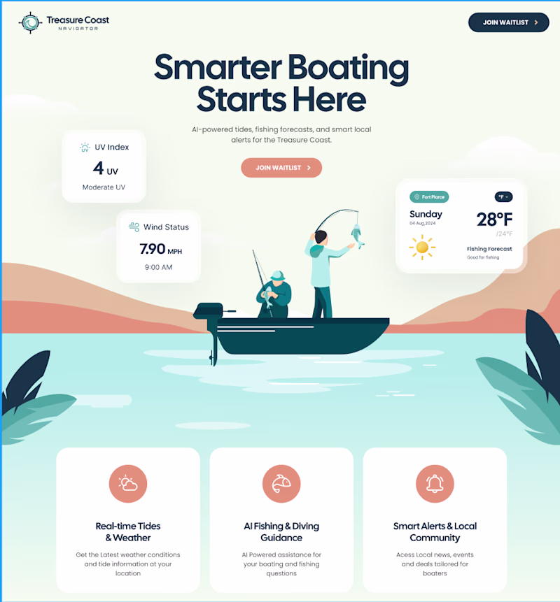
7 voted
87%
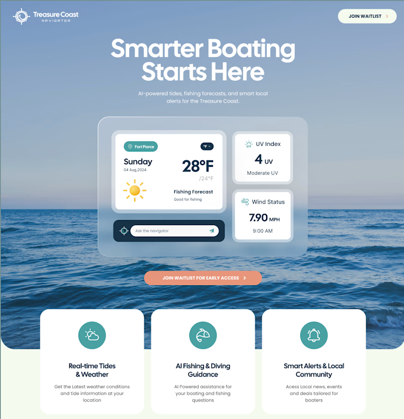
8 votes
Closed
Even though I really like illustrative web/UI designs, the real ocean photo makes it more relatable and visually adds a nice depth to design 👍
Version 2 for me, the real ocean photo gives it a more aspirational feel that matches the premium positioning of a boating app.
Version 2
great work
The network for creativity
Join 1.25M professional creatives like you
Connect with clients, get discovered, and run your business 100% commission-free
Creatives on Contra have earned over $150M and we are just getting started
Related posts
I’m exploring two homepage hero directions for a Coffeebar concept and testing which one feels stronger for the brand.
Direction 1 leans more editorial and product-focused, with a cleaner cream layout, image grid, and a stronger emphasis on coffee culture and product discovery.
Direction 2 feels more immersive and lifestyle-driven, using full-bleed photography, darker overlays, and a warmer coffeehouse atmosphere to create more emotion and brand personality.
Both directions can work, but they communicate slightly different things:
Direction 1: clean, curated, product-forward
Direction 2: warm, emotional, lifestyle-focused
I’m leaning toward the second direction because it feels more human and memorable, but I’d love to hear which one feels stronger at first glance.
11 voted
41%
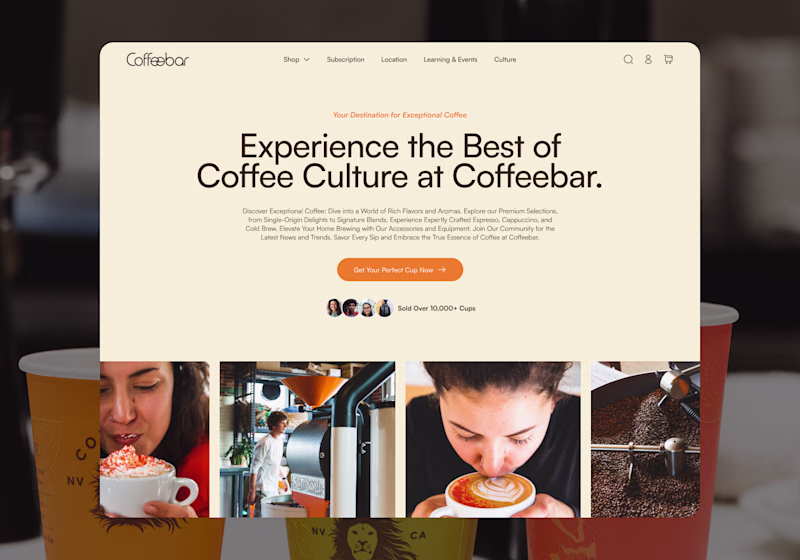
16 voted
59%
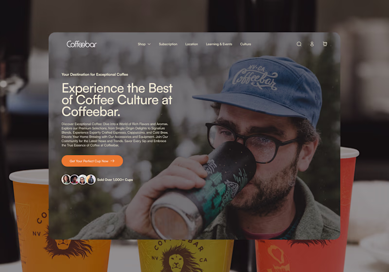
27 votes
Closed
Direction 2 for me — full-bleed photography creates that 'I want to be there' feeling instantly. Direction 1 is clean but Direction 2 has soul.
Built a concept website for an autonomous surveillance robot fully interactive 3D scene running live in Spline.
Dark environment, electric blue lightning, the unit sitting right in the middle of it. The kind of hero section that doesn't need a headline to make a point.
Creativity out of roof. Amazing website 😍
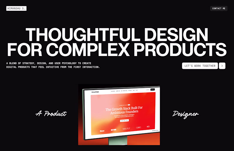
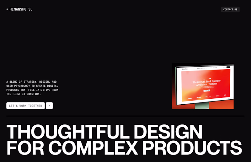
Working on hero section for my portfolio site.
Which one stands out?
6 voted
55%
5 voted
45%
11 votes
Closed
The one on the right has more visual impact in my opinion :)
Trending
Claude
Claude has entered the design space. How are you using Claude Design?
Contra University
Learn from expert creatives how to earn more using next-gen AI tools.
MagicPath
The canvas is infinite, and exploration is becoming the workflow. How are you using MagicPath?
creativeaiflow
Creative AI workflows are evolving. What tools do you use, and what are their strengths and weaknesses?
freelancerlife
Freelancer life is wins, pivots, and everything in between. What’s yours right now?