The network for creativity
Join 1.25M professional creatives like you
Connect with clients, get discovered, and run your business 100% commission-free
Creatives on Contra have earned over $150M and we are just getting started
Back to feedPost
Taste Test

Im running a quick A/B vote on the hero design. V1 uses an illustrated scene to feel friendly and product-led, while V2 uses a real ocean photo for a more premium, realistic vibe. Which one feels clearer, more trustworthy, and makes you more likely to hit “Join Waitlist”?


1 voted
13%
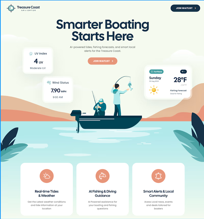
7 voted
87%
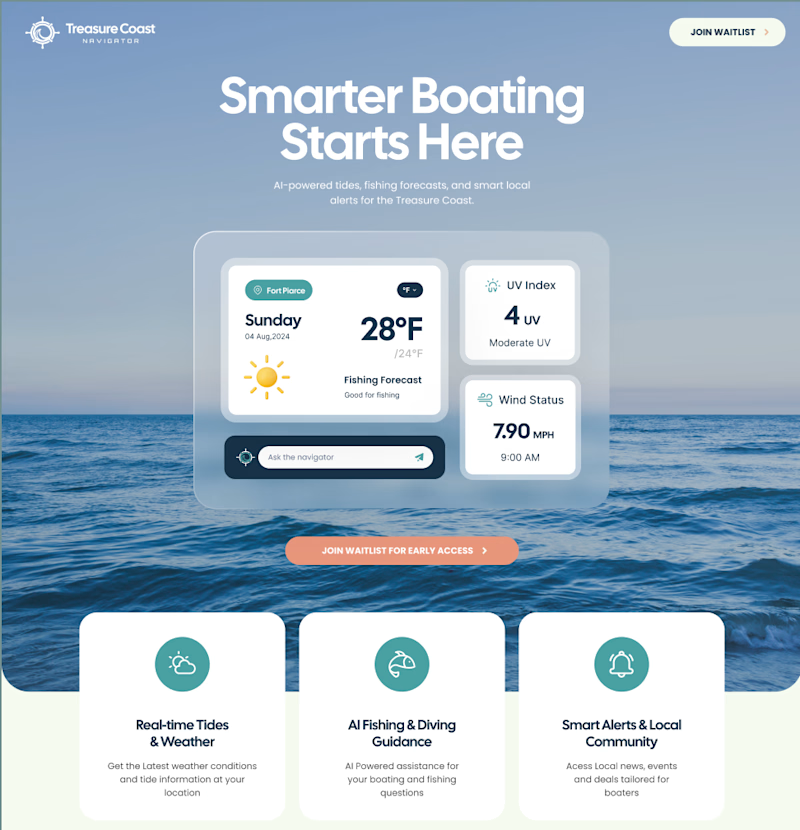
8 votes
Closed

Version 2 for me, the real ocean photo gives it a more aspirational feel that matches the premium positioning of a boating app.

Version 2

Even though I really like illustrative web/UI designs, the real ocean photo makes it more relatable and visually adds a nice depth to design 👍

great work
The network for creativity
Join 1.25M professional creatives like you
Connect with clients, get discovered, and run your business 100% commission-free
Creatives on Contra have earned over $150M and we are just getting started





Related posts


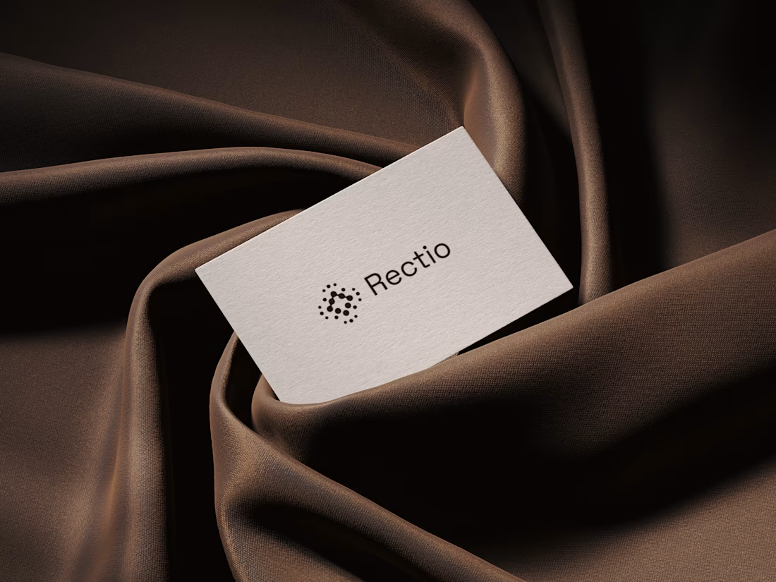
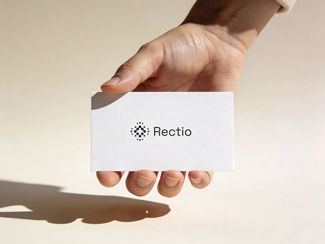
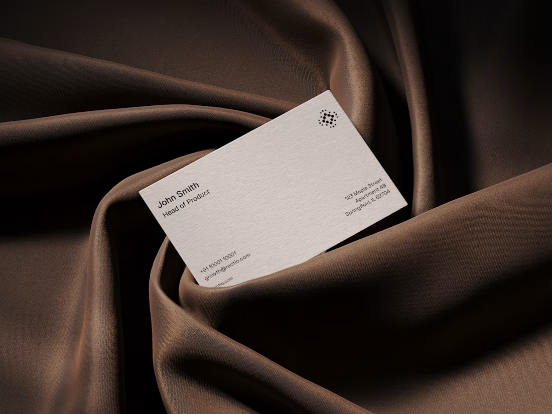
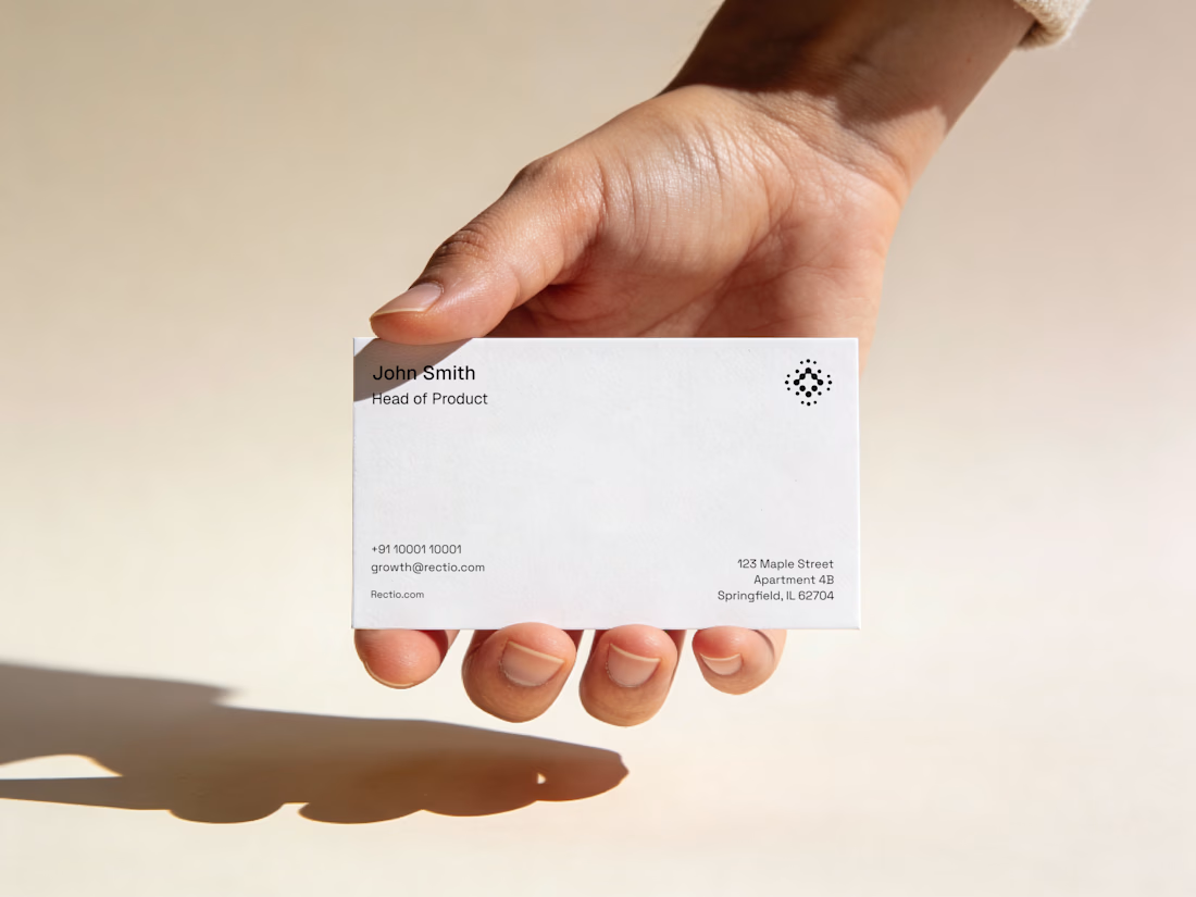
Rectio — Brand Identity
Brand Identity • Visual Direction • Business Cards • Mockups
A modern and minimal branding direction for Rectio, from visual identity to business card applications.
Created by Artonest Design Studio — artonest.design



I haven’t posted much lately because the work got intense.
Two Webflow builds I’ve just finished: MavBio and Jemba9.
One works with biomaterials for medical and research applications. The other builds mission-critical technology for the space industry.
Very different worlds, and genuinely exciting projects to work on.
I’ve also wrapped up a much larger wellness platform that is now being turned into a full case study, while a few new projects are already underway.
A small preview for now. More soon!


wow, the smoothness is mindblowing here

Bring back mascot logo's 🙌
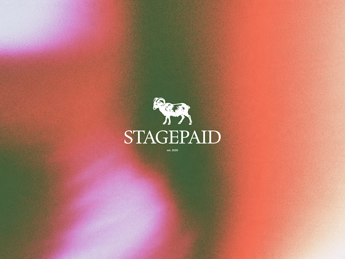
Ram logo 'Stagepaid'.




cool work! love mascot logos :D