The network for creativity
Join 1.25M professional creatives like you
Connect with clients, get discovered, and run your business 100% commission-free
Creatives on Contra have earned over $150M and we are just getting started
Back to feedPost
In boutique hospitality, resonance isn’t accidental - it’s plated. Every texture, color, and aroma designed to echo memory and desire. This is an image from my 'Engineered Resonance' case study for social media.

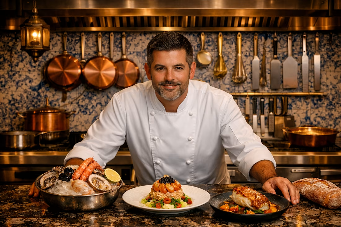

This image resonates because it doesn’t just show a dish - it stages anticipation. The textures, colors, and symmetry invite the eye to linger, while the chef’s presence signals confidence and craft. Viewers are drawn in because they sense more than food; they sense a story engineered to be remembered.
The network for creativity
Join 1.25M professional creatives like you
Connect with clients, get discovered, and run your business 100% commission-free
Creatives on Contra have earned over $150M and we are just getting started











Related posts

Second Serve Club — Exploring Visual Identity Through AI & Design.
For this branding challenge, I created a series of original logo marks in Adobe Illustrator, inspired by vintage tennis culture.
I then explored how these designs could come to life by combining my own typography, monograms and colour identity with AI-generated visuals using ChatGPT.
From the texture of a clay court to embroidered details on tennis balls, the goal was to bring the brand identity into a more tangible, realistic setting.
An exploration of how traditional graphic design and AI can work together to create a cohesive visual world.
Designed by me. Visualised with AI. 🎾
Full brand identity case study coming soon.
#BrandIdentity #VisualIdentity #GraphicDesign #AIDesign #ChatGPT

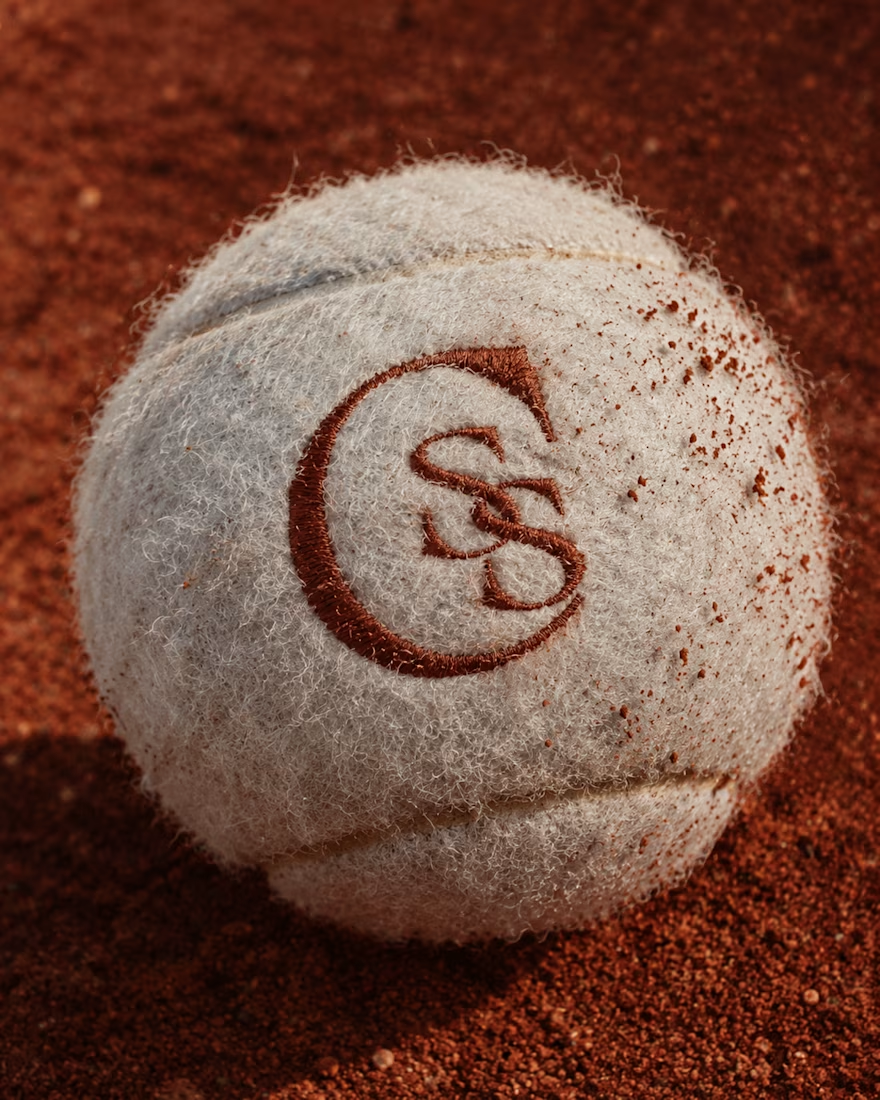
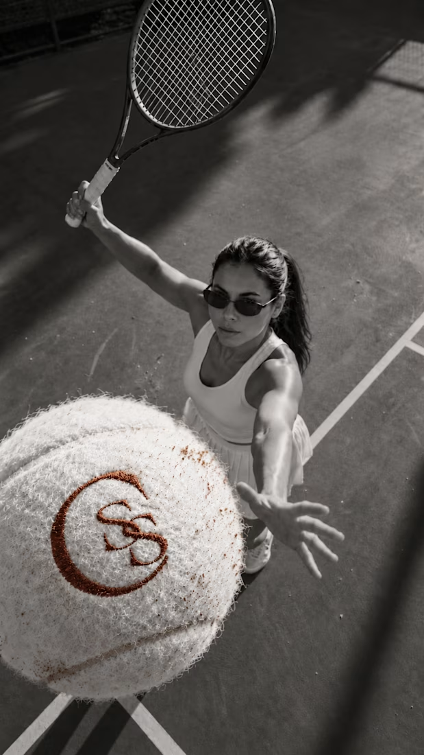
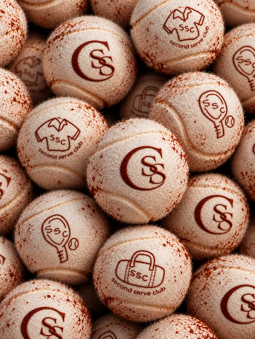

The SS mark stamped into the tennis ball felt is a great detail. Looks very real on the clay court.

From the court to the little details, every touchpoint is an opportunity to bring the brand to life.
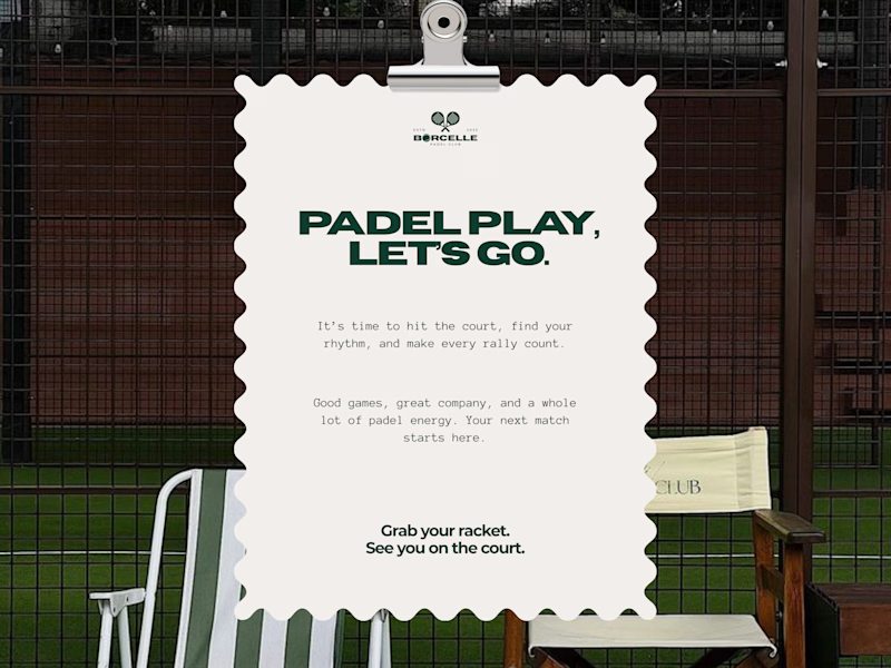
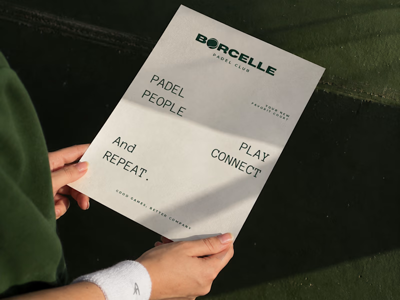
Good games, better company. 💚
What do you think of this direction?
11 voted
69%
5 voted
31%
16 votes
Closed

Amaizing

It’s been a minute since my last post here on Contra.
While my main focus usually lives in photo editing and digital design, I was digging through the archive recently and thought it’d be fun to share a couple of branding projects from the past:
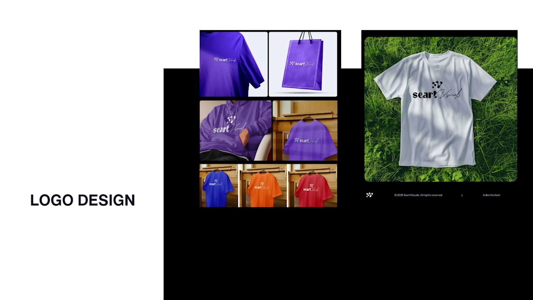
Slide 1: Seart Visuals apparel & merchandise branding (1 year ago)
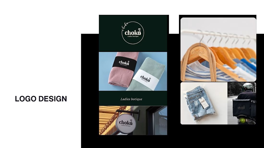
Slide 2: Choku Ladies Boutique identity and mockups (2 years ago)
Brand identity isn't my everyday lane, but tackling projects like these taught me a lot about visual consistency across different mediums. I’d love to hear your thoughts or see any feedback from fellow designers. Great to connect with the community again.



That's really great typography logo design❤️❤️