The network for creativity
Join 1.25M professional creatives like you
Connect with clients, get discovered, and run your business 100% commission-free
Creatives on Contra have earned over $150M and we are just getting started
Back to feedPost
Taste Test


Color Changes Everything
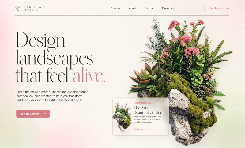
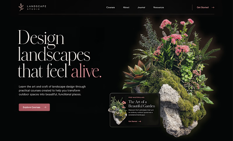
Sometimes, all it takes is a change in color – and the exact same design can feel completely different.
The light version, with soft pink tones and natural textures, feels fresh, light, and airy. It creates a sense of calm, natural beauty, and a closer connection to nature.
The dark version tells a completely different story. A black background immediately adds depth, character, and a sense of luxury. The design becomes more expressive and even slightly dramatic.
So, which version speaks to you more – light and airy or dark and luxurious?

128 voted
66%
66 voted
34%
194 votes
Closed

Love the light version more.
Weldone

The light version feels much more like the product than the dark version . It feels like nature itself

I'm a lover of dark themes but I think in this case, the light version appeals more to me

I prefer the dark version

Both looks fine, light version fell alive with the background gradient.
I'm interested to see the dark version with subte noisy gradient background

Hard choice because both look great, but white for me. It has a softer, more natural feel.

i prefer the light version

The thing about colors is it needs to follow the brand’s attributes & positioning, you mentioned how they feel in a great way, but the choice comes down to the brand’s positioning strategy.
if its a luxury brand & will charge a premium for their services/products then go with...

Definitely the light version for me. It feels much more inviting 👌

Bro both are looking good


dark one, not close

At thr beginning I felt that the light mode is better but after few seconds I found the dark looks more natural and elegant

The light version feels more aligned with the product.

I love the light version. As an advocate for dark mode. The light mode feels more like nature as the brand story line says.

Both look fine

I like the dark version. The light version's CTA "Get Started" and the "alive" highlight gets washed out in the light version and lines look heavy as well. General feedback the info card from light to dark is inconsistent and in both light and dark the image could be freed out better. Good start!

Light is more attractive and professional

Dark feels premium but not always, go with light one here

The UI is visually appealing while keeping everything clean and easy to use. Good job!

we see garder at day most of time 😂

Dark One🔥

Light


Light version looks better

That is true

True

Dark version all the way. That black background gives it so much more presence and the typography really pops against it.

Looks nice =)
Light feels better to me.
The glow around the plants against a solid black bg in the dark theme throws me off.
Good job on both!

Both

The light version wins because, it makes the design feels alive.

Good combo

The network for creativity
Join 1.25M professional creatives like you
Connect with clients, get discovered, and run your business 100% commission-free
Creatives on Contra have earned over $150M and we are just getting started

Challenges
View all


Related posts


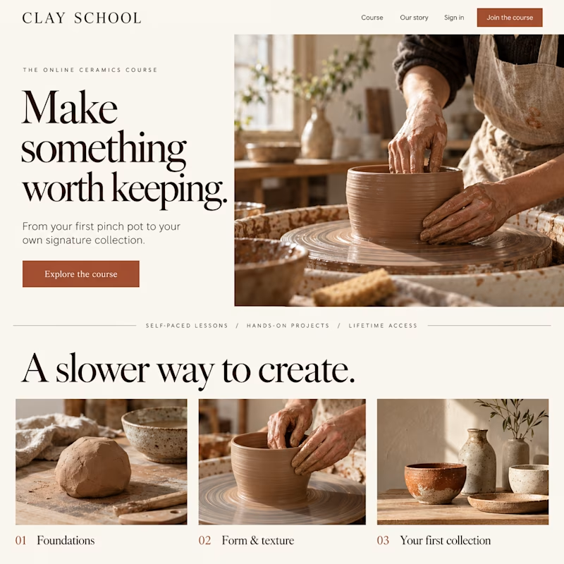
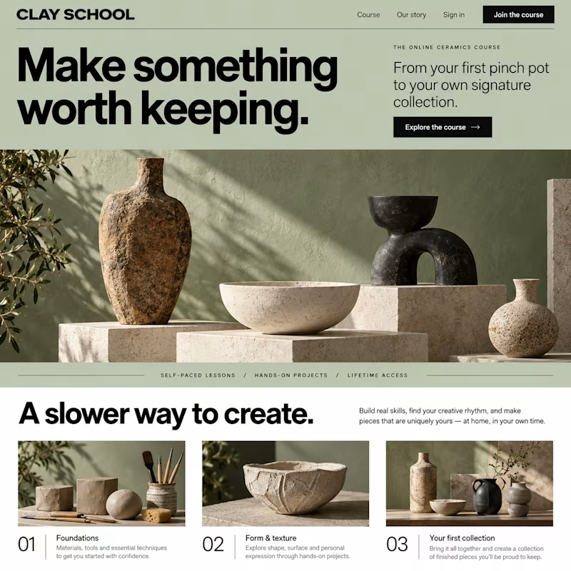
Which design would make you more likely to join this ceramics course?
Two new AI-generated Kajabi landing-page concepts for Clay School: warm editorial or modern gallery. Same course, two different directions. Pick your favorite below.
18 voted
46%
21 voted
54%
39 votes
Closed


So excited to see Creative Intelligence 2026 by @Contra Labs out in the world!
At @Heed Collective , we had the pleasure of designing both the website and the report. We’re incredibly grateful for this collaboration!
Our creative exploration started with a question:
What does Creative Intelligence mean today?
We believe it lives at the intersection of creativity and analysis, imagination and insight.
We translated this into a visual story that begins in space — vast, dreamy, full of possibility — and gradually moves closer to Earth, grounding imagination in something tangible and human.
Huge congrats to the whole team, @Erin Horner, @Ben Huffman, @Mark Vassilevskiy, @Alex Karpodinis, @Stacy · Heed Collective, @Heed Collective , and the entire @Contra Labs team 👏


Incredible work, congrats!

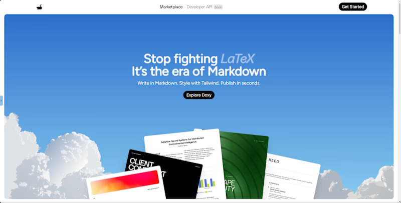
Which hero direction feels right for Doxy? 👀
Doxy is a PDF and report editor built to make PFE writing easier,from writing and diagrams to formatting and exporting a polished final report.
14 voted
64%
8 voted
36%
22 votes
Closed

immersive


