The network for creativity
Join 1.25M professional creatives like you
Connect with clients, get discovered, and run your business 100% commission-free
Creatives on Contra have earned over $150M and we are just getting started
Back to feedPost
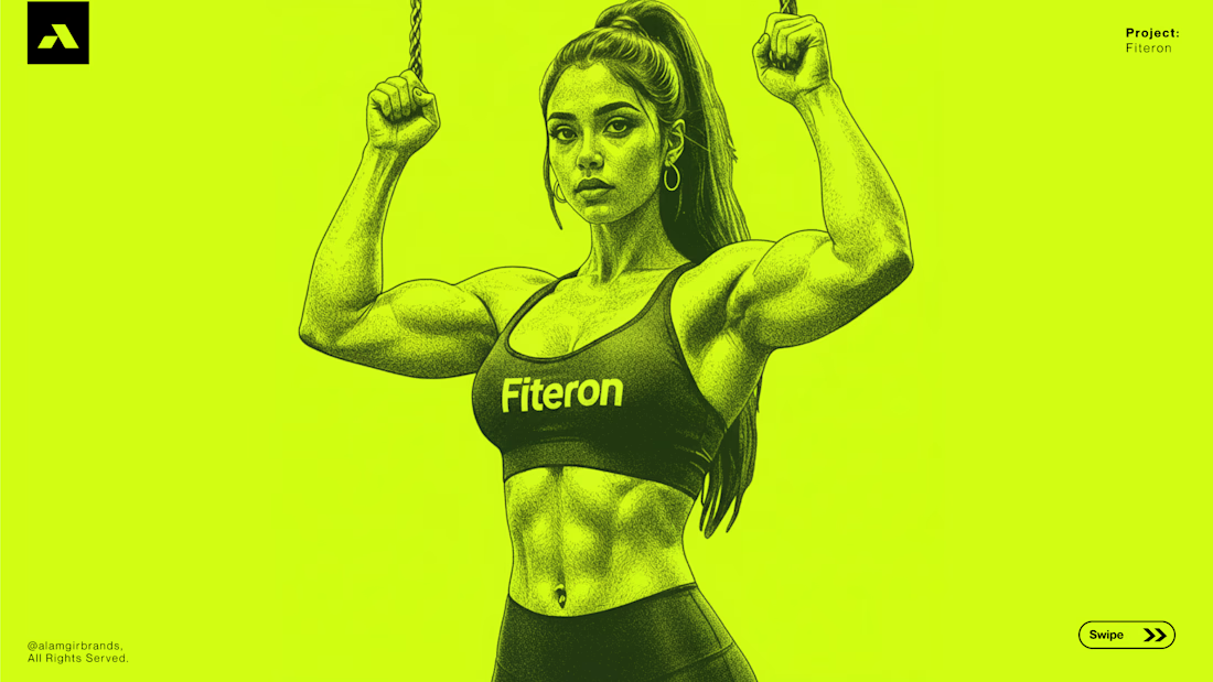
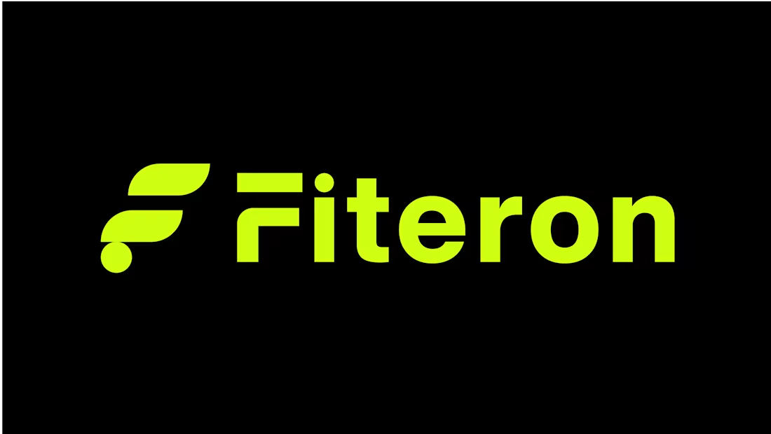
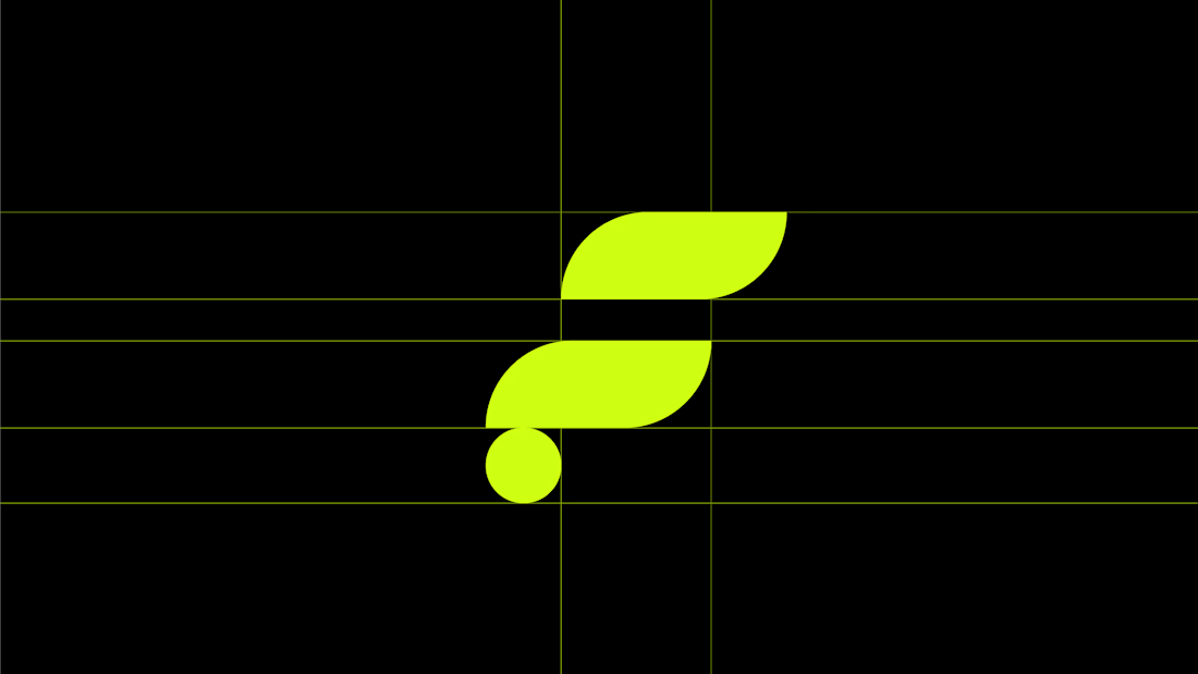
A closer look at the Fiteron logo I designed.
The mark is built from two curved forms stacked into an F, with a small dot anchoring the base — a shape that reads fast even at a glance. The wordmark sits bold and condensed next to it, so the two feel like one unit rather than a symbol plus text.
The brand leans on one loud color, so the logo had to work without relying on it — clean in black, clean in lime, no in-between needed. Simple curves, but enough weight to carry a page on their own.

Professional work bro

thanks bro
The network for creativity
Join 1.25M professional creatives like you
Connect with clients, get discovered, and run your business 100% commission-free
Creatives on Contra have earned over $150M and we are just getting started

Challenges
View all


Related posts


I love it


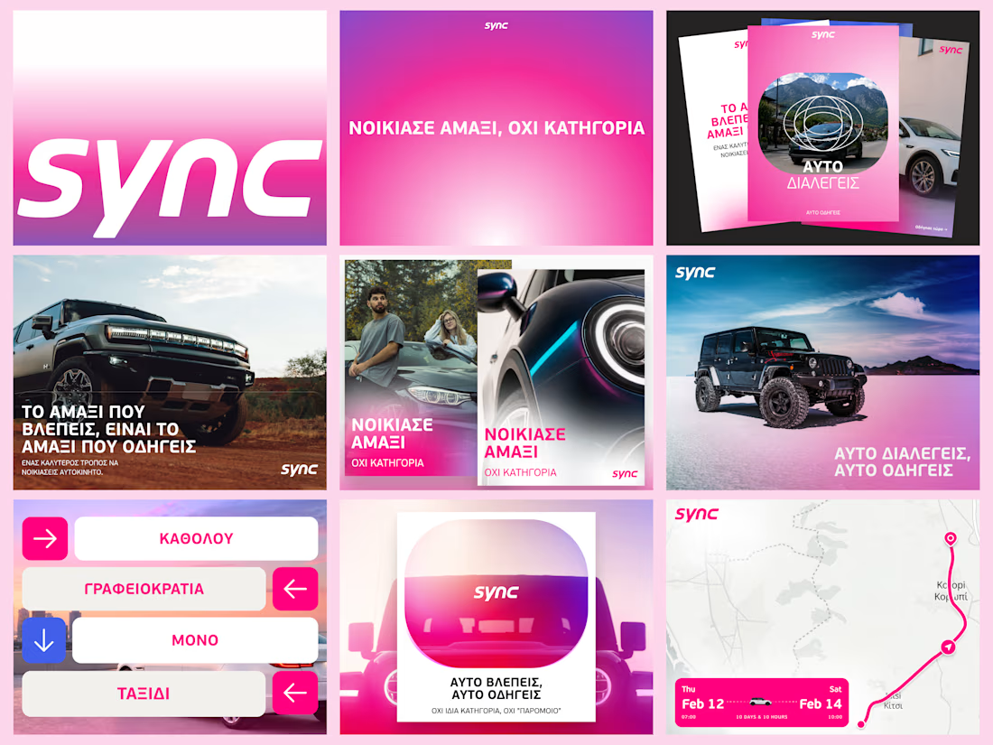
A few more pieces from my work on Sync’s identity.
The idea was to give this Greek car rental brand enough polish to sit next to the big names, with a personality of its own.
The pink was already there. I gave it more space and paired it with bold Greek typography and a frame inspired by a car’s side mirror.
Here’s a closer look at how it works across the layouts.


Great work.