The network for creativity
Join 1.25M professional creatives like you
Connect with clients, get discovered, and run your business 100% commission-free
Creatives on Contra have earned over $150M and we are just getting started
Back to feedPost


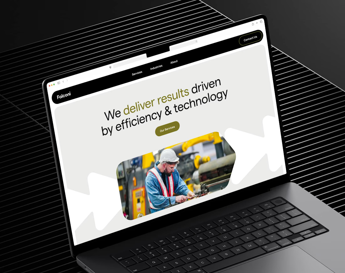
The call we made early on this one was bold but simple: black, icy green, nothing else. Falconi is a Latin American consultancy entering the US, most their competitors look identical - navy and grey.
A near-black site with one sharp green running through still looks serious enough for enterprise buyers, it just stops looking like everyone else.
Do you agree?


bold choice but it works so well. that green on near-black is such a good contrast - instantly different from all the navy/grey consultancy sites. nice one

Completely agree, green gives it a clear identity without losing that enterprise feel!🙌

Absolutely love it!
Nice work👍

The black + icy green call is sharp — reads enterprise without sliding into the usual navy/grey sea. +39% CR backs up the instinct.
The network for creativity
Join 1.25M professional creatives like you
Connect with clients, get discovered, and run your business 100% commission-free
Creatives on Contra have earned over $150M and we are just getting started







Related posts

$10K earned on Contra. 🎉💸
Grateful for every client who took a chance on me. This is just the beginning. More great products, more real partnerships, more milestones to hit. 🙌
Thank you to everyone who's been part of it. Onward. 🚀
#10k #contraearnings #Freelance #Webflow #Framer #Webdesign


Congratulations nice job 🎉🎉

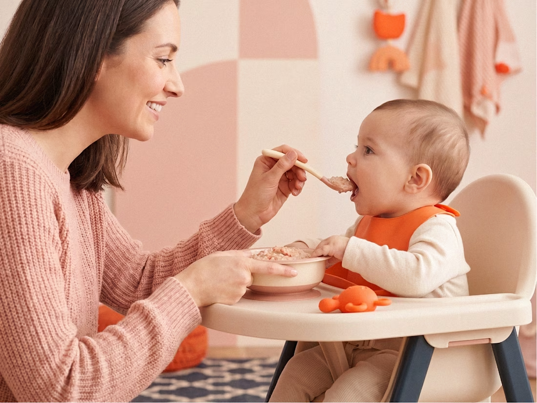
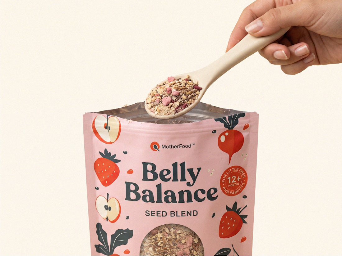
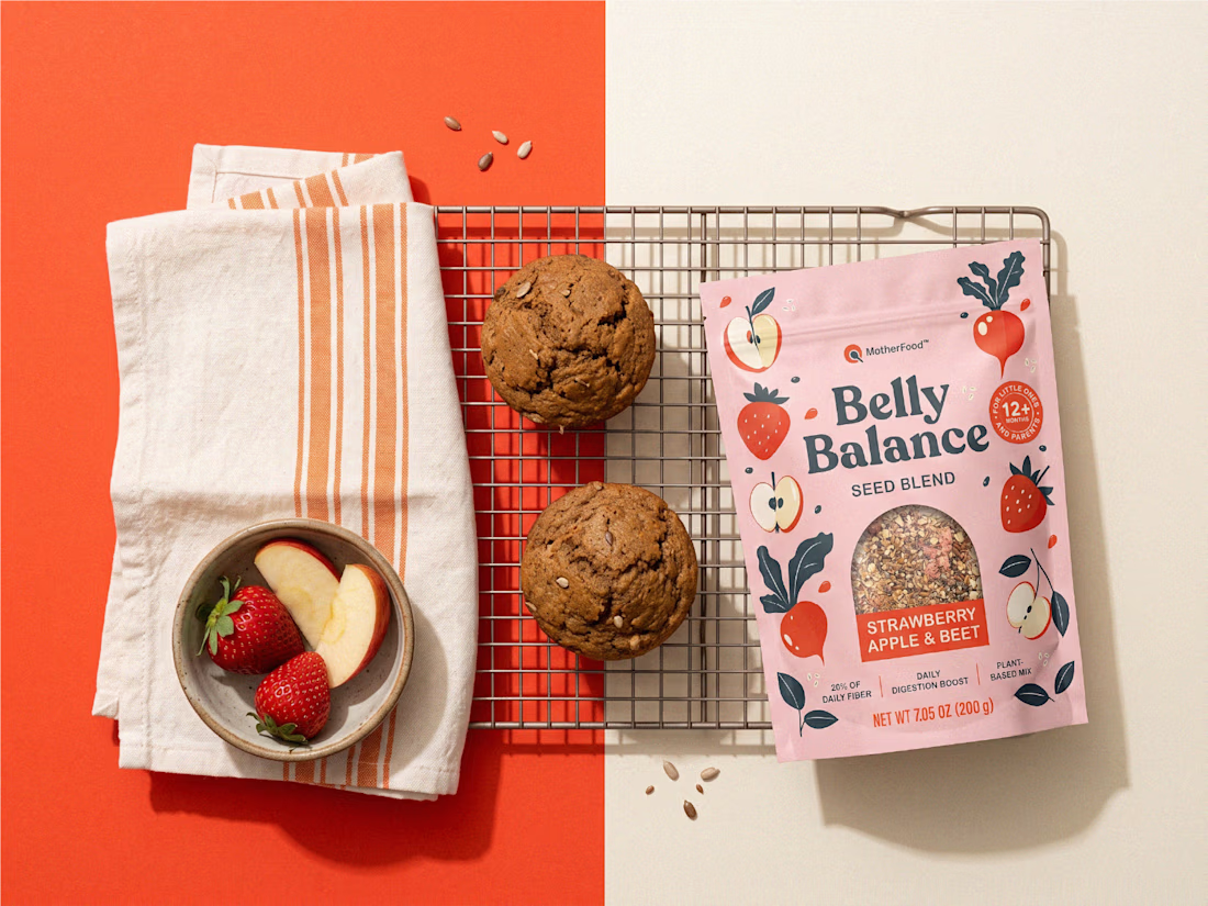
Digestive health for little ones doesn’t need to look clinical to feel credible.
For Belly Balance, I took the brand in a more joyful, approachable direction — using soft colors, playful illustrations, and a clean packaging system to make the product feel friendly without losing clarity.
The goal was simple: turn a functional product for babies and toddlers into something parents would feel good choosing every day.


premium work


Twenty-five years of credits, finally on a website that looks the part.
Just take a look at what kind of web we create ✨👇
Reflection of the brand history with taste, precision, and premium branding.
Scroll responsibly: https://productionportugal.com 😉🔥


Wow! Nice setup 🎥