The network for creativity
Join 1.25M professional creatives like you
Connect with clients, get discovered, and run your business 100% commission-free
Creatives on Contra have earned over $150M and we are just getting started
Back to feedPost
Minimalist Corporate Brand Identity & Logo Design..
Kingsway is a real estate firm focused on delivering premium and reliable services to their clients. They needed a brand identity that projected authority, stability, and modern professionalism while remaining highly recognizable.
The Challenge
The objective was to design a logo that avoided visual clutter. The client required a versatile mark that could function seamlessly across various touchpoints—from large corporate signage and print materials to digital platforms and tiny social media avatars—without losing its impact or legibility.
My Approach & Solution
I opted for a minimalist, geometric wordmark paired with a strong letter mark.
The Emblem: By isolating the "K" inside a solid structural block, I created a powerful standalone icon. This block represents a solid foundation and acts as an immediate visual anchor, perfect for use as a favicon or app icon.
Typography: I selected a bold, highly legible, and modern sans-serif typeface. The clean lines communicate transparency and forward-thinking, while the weight of the letters grounds the brand.
Color Palette: I chose a monochromatic deep navy blue (#0A2540 or similar). In color psychology, deep blue evokes feelings of trust, intelligence, security, and corporate authority—perfectly aligning with Kingsway's brand values.

The network for creativity
Join 1.25M professional creatives like you
Connect with clients, get discovered, and run your business 100% commission-free
Creatives on Contra have earned over $150M and we are just getting started
Related posts
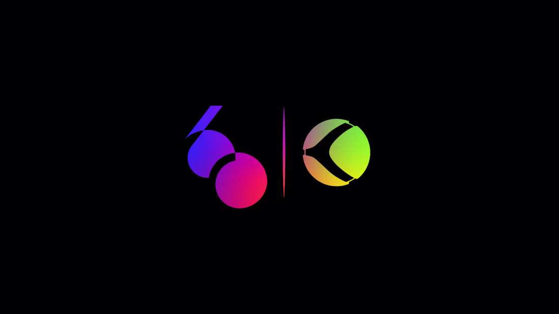
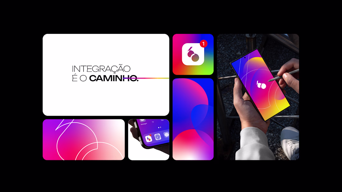
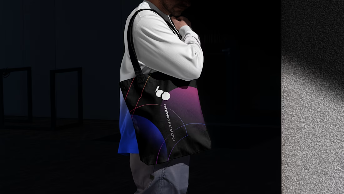
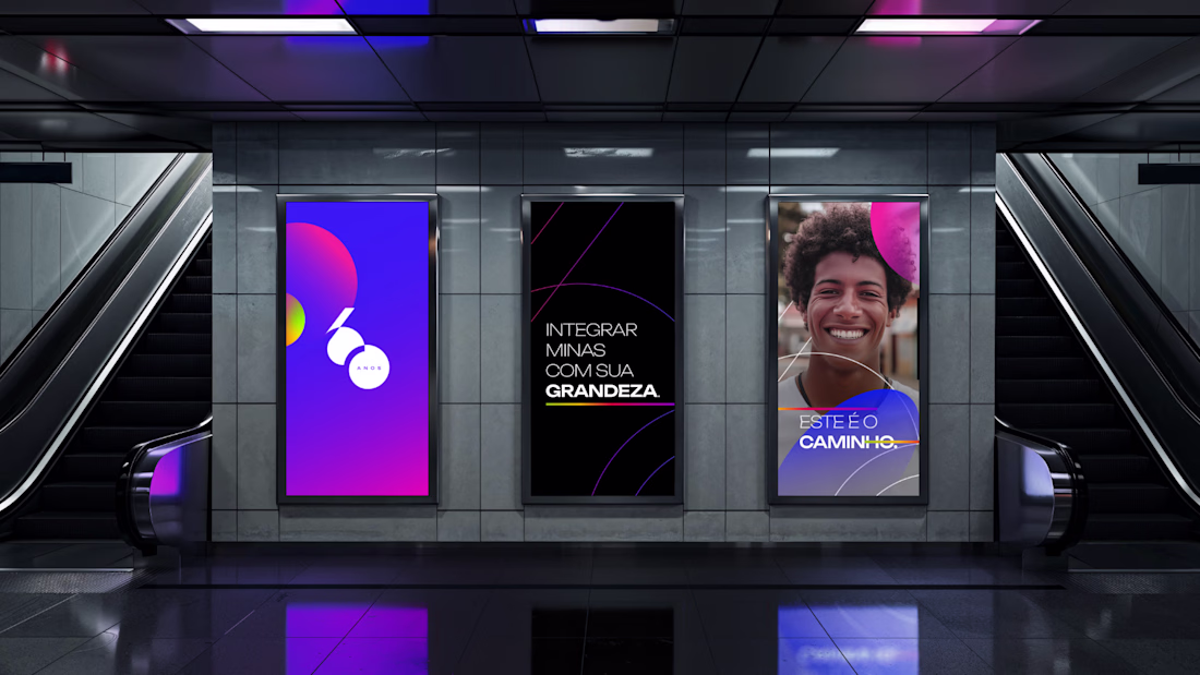
Developed the commemorative 60-year anniversary seal for TV Integração, one of the most established regional broadcasting networks in Brazil.
The project was built around the idea of continuity, connection, and legacy — translating six decades of communication into a contemporary graphic system. The symbol explores fluid geometry, visual integration, and structural balance to create a mark that feels both celebratory and institutional without relying on obvious commemorative clichés.
The goal was to preserve the brand’s recognition while introducing a more current, scalable, and digitally adaptable visual language.
#branding #brandidentity #logodesign #visualidentity #graphicdesign
Really strong balance between heritage and modernity here. Anniversary identities can easily become overly decorative, but this still feels institutional, refined, and genuinely connected to the core brand system.
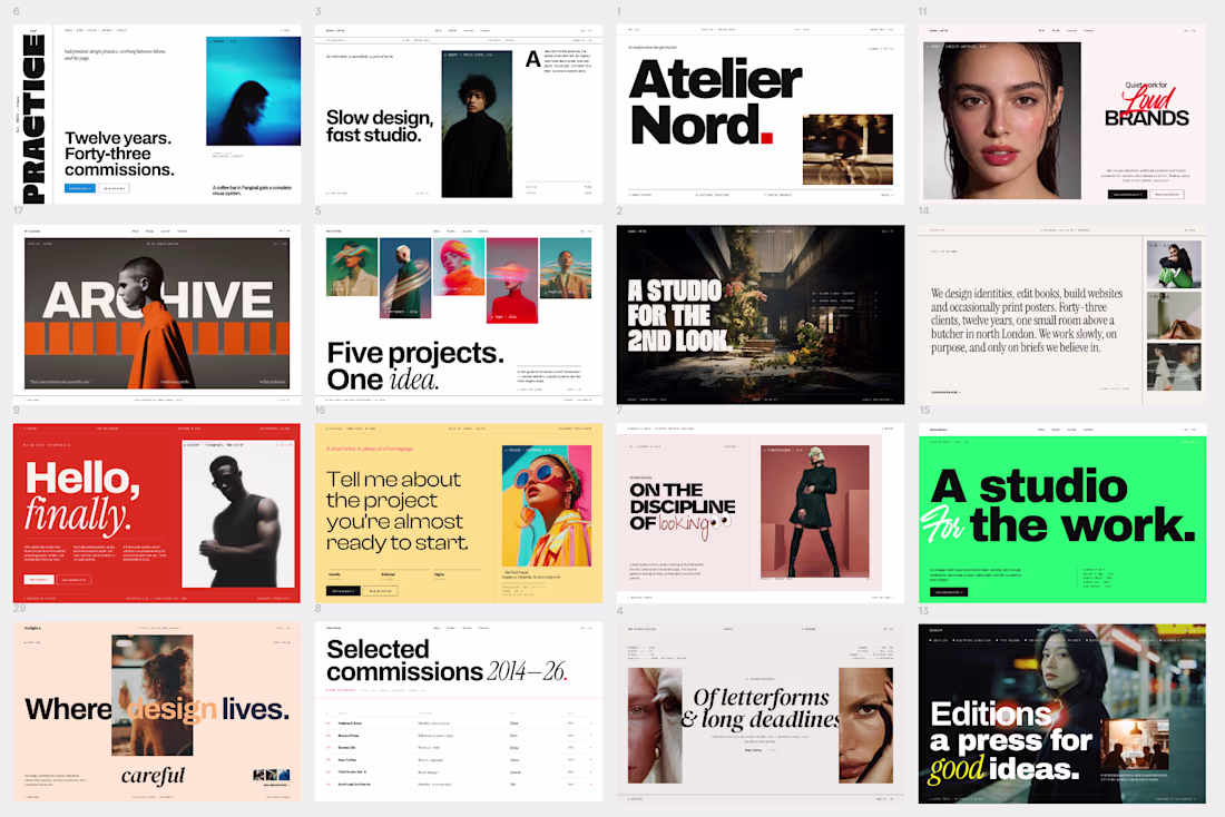
Love the color blocking and section pacing on display.
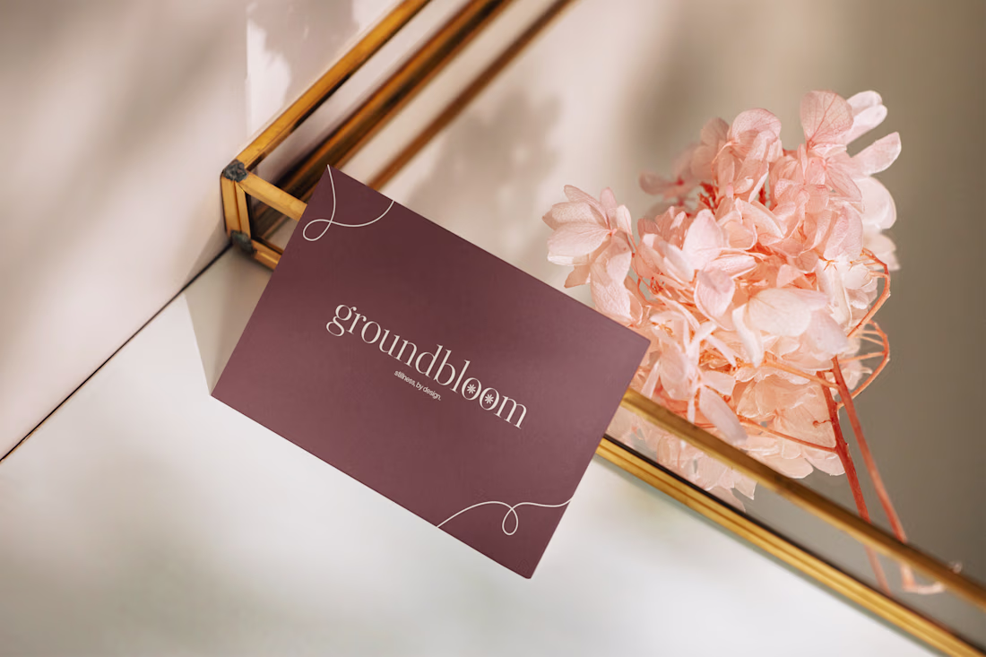
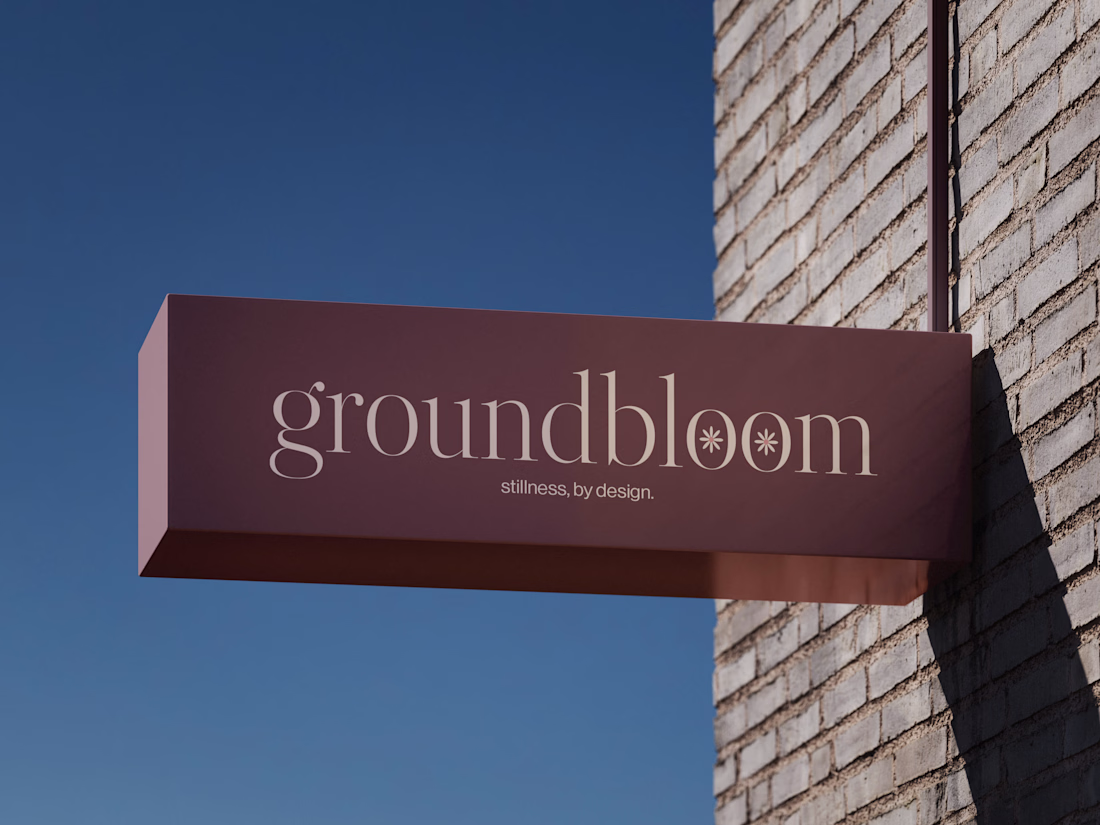
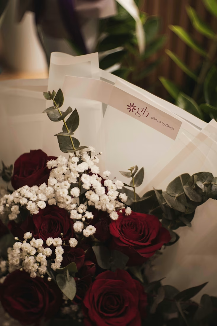
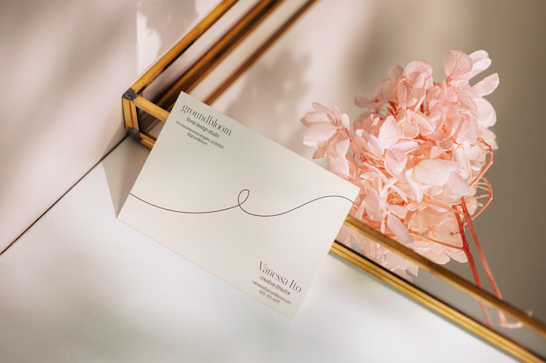
I love working on branding concepts for fictional brands as design practice! Here's some branding I did for groundbloom: a floral design studio founded and run by an all-female team. I wanted the brand to feel feminine, bold, and slightly luxurious.
Trending
Claude
Claude has entered the design space. How are you using Claude Design?
Contra University
Learn from expert creatives how to earn more using next-gen AI tools.
creativeaiflow
Creative AI workflows are evolving. What tools do you use, and what are their strengths and weaknesses?
portfolioreview
The best portfolios tell a story, not just show a grid. Share yours for feedback.
freelancerlife
Freelancer life is wins, pivots, and everything in between. What’s yours right now?