
Rodner Matias
Brand designer crafting meaningful brands.
New to Contra
Rodner is ready for their next project!
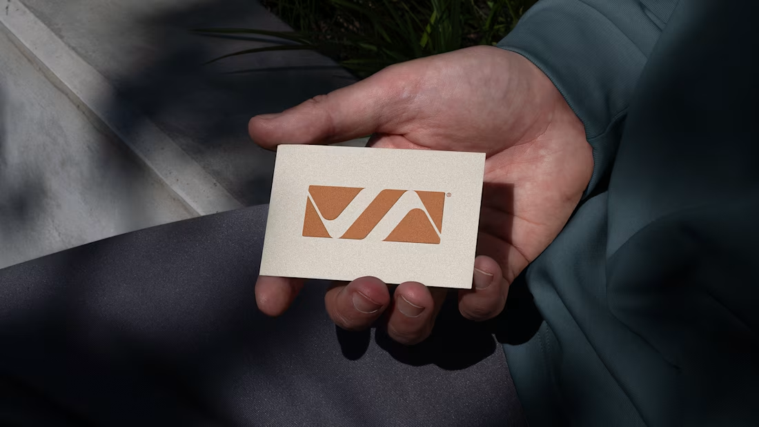
Vila Osvaldo is a contemporary lifestyle and commercial space designed to create connection, visibility, and everyday experience through architecture and branding.
The project involved the development of a refined visual system focused on environmental communication, signage, spatial integration, and brand presence across different touchpoints. The goal was to balance functionality and sophistication while enhancing the public experience throughout the space.
1
19
Developed the commemorative 60-year anniversary seal for TV Integração, one of the most established regional broadcasting networks in Brazil.
The project was built around the idea of continuity, connection, and legacy — translating six decades of communication into a contemporary graphic system. The symbol explores fluid geometry, visual integration, and structural balance to create a mark that feels both celebratory and institutional without relying on obvious commemorative clichés.
The goal was to preserve the brand’s recognition while introducing a more current, scalable, and digitally adaptable visual language.
#branding #brandidentity #logodesign #visualidentity #graphicdesign
2
5
186

Groa is a digital platform focused on the commercialization of treated seeds, connecting producers, specialists, and suppliers within an ecosystem driven by agility, trust, and performance.
The visual identity was built around the idea of connection and diversity within the agricultural supply chain. The symbol uses multiple points arranged in a radial expansion to represent variety, integration, and reach, reinforcing the platform’s ability to connect different players, demands, and opportunities within a single environment.
The logotype combines geometric rationality with a technological visual language, positioning Groa as a contemporary and efficient solution aligned with the digital transformation of the agricultural sector.
1
80
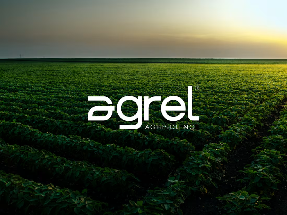
Agrel is a company specialized in industrial seed treatment and the production of agricultural inputs. Its operations involve protection, coating, and grain enhancement processes through technologies such as Film Coating, combining technical precision with biological development.
The visual identity was built around the idea of transformation in its earliest stage. The symbol carries an organic and progressive visual language, evoking growth, activation, and evolution without relying on literal representations. The result is a solid, contemporary brand aligned with the technological and biological landscape in which Agrel operates.
1
88