The network for creativity
Join 1.25M professional creatives like you
Connect with clients, get discovered, and run your business 100% commission-free
Creatives on Contra have earned over $150M and we are just getting started
Back to feedPost
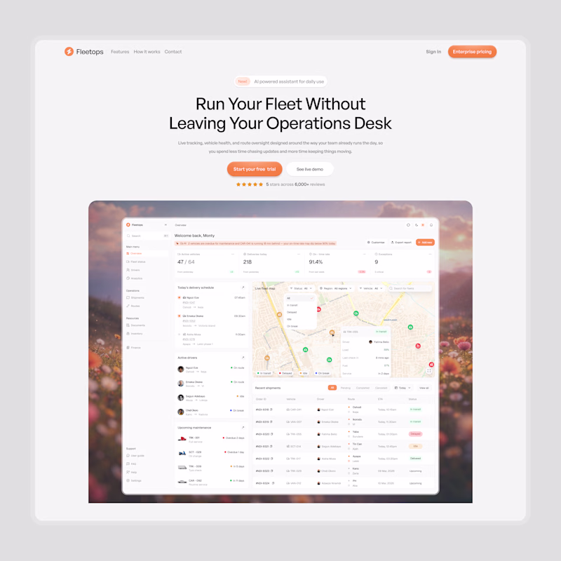
Taste Test
I worked on an hero section concept on Saturday. Still not sure if I will be building the complete website, because the vibes are off.
I worked on 6 screens, same layout but different background colors, header font roundness, and color scheme.
But, what do you think of light or dark mode.
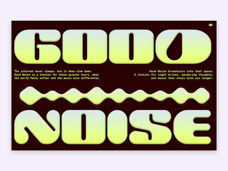
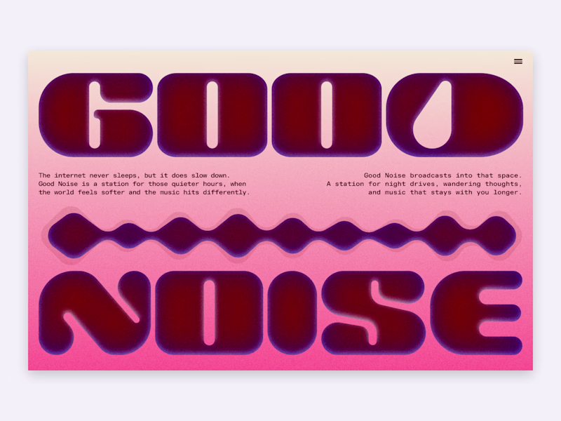
6 votes
Ends in 14h
Red Linear for me
Sharper header font
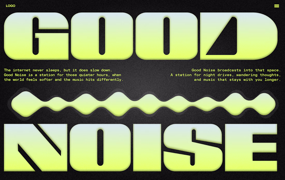
Dark Brown i think
I think so too. But I really like the linear version too.
The dark brown still goes well than the red linear😊
Yeah. Will probably move forward with the dark brown.
I will go with dack man weldone
Thank you!
The network for creativity
Join 1.25M professional creatives like you
Connect with clients, get discovered, and run your business 100% commission-free
Creatives on Contra have earned over $150M and we are just getting started
Related posts
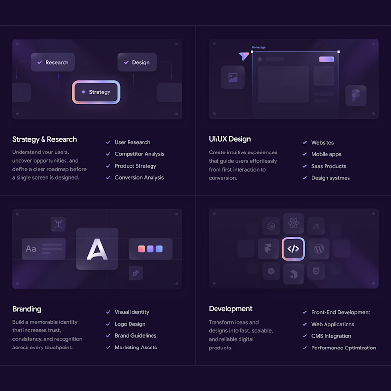
Working on a new project and can't decide which services section works better.
☀️ Light or 🌙 Dark?
40 votes
Ends in 1d
The Dark section feels more responsive.
Redesigned this Lead Generation Dashboard in both Light and Dark modes.
👀 Which version would you prefer for daily use?
☀️ Light Mode
🌙 Dark Mode
I'd love to hear your thoughts and feedback!
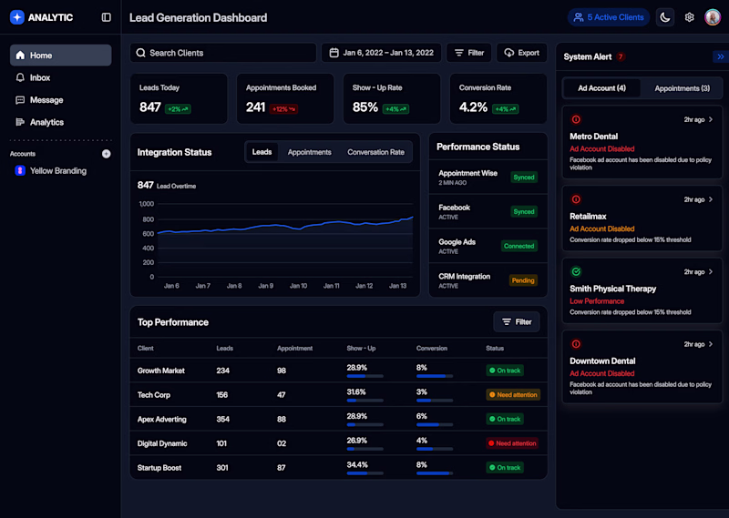
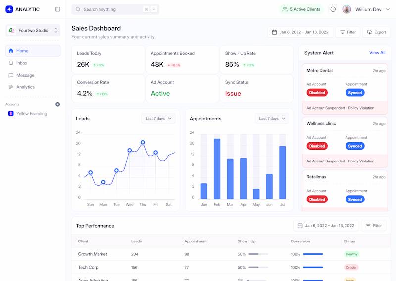
3 votes
Ends in 1d
Exploring two hero section directions for the same product.
A or B?
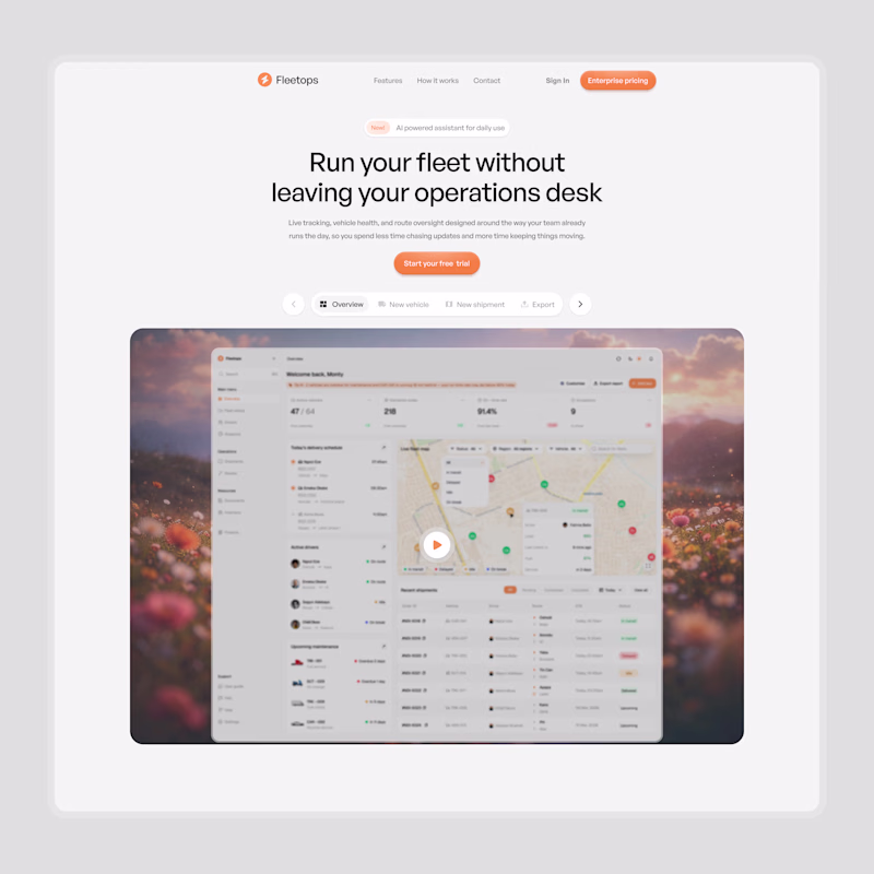
10 votes
Ends in 1d
i wil go with B,
Trending
Claude
Claude has entered the design space. How are you using Claude Design?
Contra University
Learn from expert creatives how to earn more using next-gen AI tools.
creativeaiflow
Creative AI workflows are evolving. What tools do you use, and what are their strengths and weaknesses?
portfolioreview
The best portfolios tell a story, not just show a grid. Share yours for feedback.
freelancerlife
Freelancer life is wins, pivots, and everything in between. What’s yours right now?